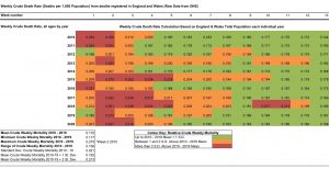
Another blog reader send me this chart, which provides another way of looking at current and recent UK death figures (it goes up to March 27, the end of week 13). He says:
It shows weekly crude death rate (deaths per 1,000 population each week – all causes) and is colour coded to show deviations from the weekly crude death rate 10 year Mean (2010-2019 all weeks) in terms of Standard Deviations.
The crude weekly death rate is more informative than Absolute Mortality numbers as it controls more precisely for variations in the (annually determined) total population of these territories (England & Wales).
The chart is cropped to show the first 13 weeks of each year in the range 2010-2020 (at the time of writing the most recent total mortality figures for 2020 run to Week 13).
Green means within 1 standard deviation, orange is 1-2 s.d., and red is above 2 (click to enlarge).