This is an article by John Church. John is an oil and gas professional and has spent some 30 years working for one of the biggest oil companies in the world.
A few weeks ago, I created an age-dependent mortality model.This was a top-down approach, trying to make a predictive model that honoured various observations and data, and I have updated and fine-tuned it as more information has become available. The model has remained robust and has recently been validated by an analysis of the recent Spanish serological study from which age-dependent mortalities were calculated, leading to very similar numbers.
I now want to build in the additional observation that amongst most populations, regardless of any measures in place, the infections stop growing exponentially once a certain level of infection has been reached. Infection cases always appear to plateau at or before ~ 25% of infection levels within the population. The question I am posing is: why does this happen?
It is also clear that children do not fall ill from the virus, and even if they are infected the disease is almost always asymptomatic. My previous post postulated that the reason that African countries do not have a Covid-19 problem is because the large percentage of children in their populations create a form of automatic herd immunity. My limited understanding of the biomedical sciences (mainly gained from my daughter who is a 3rd year student at Newcastle University) is that, while the immune response to the infection is not yet fully understood, it is clearly more effective in children and declines with age. It stands to reason that this resistance, whatever the cause, does not suddenly stop at a certain age, but will decline is some natural fashion. As is the way with most natural phenomena.
With these two observations, I have put together a model that postulates that this body of resistant people contributes to the overall infection population such that herd immunity is effectively reached when ~ 25% of infection levels have occurred, which would then explain why cases of new infection plateau, instead of continuing to rise. The graphs below outline the theory and the results.
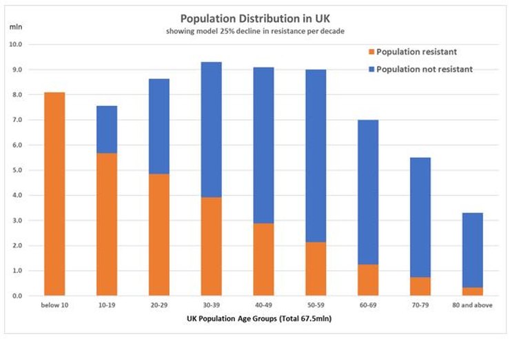
The key decline rate per decade of resistant individuals is determined by calculating what would be required to get an overall resistant population to 40 million (which is equivalent to the quoted ‘herd immunity 60% threshold) with an infection rate of the susceptible population of about 25%, which is the maximum that has been observed in any population. It turns out that the decline rate per decade which meets these criteria is also 25%.
Using the output from this simple resistant/susceptible model, I then apply the previously calculated mortality model to the resistant population only and compare the output with the actual deaths in each age group, as below.
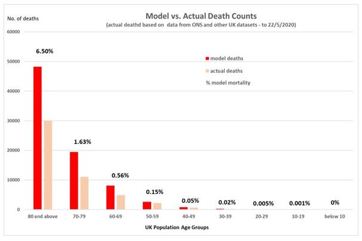
By inspection, there is a very reasonable fit to the actual deaths that have occurred, in terms of the distribution of deaths between the decadal age groups. It also shows that the number of deaths that have occurred is about 2/3 of a maximum of what might be expected under this model, if everyone in the susceptible group became infected.
The idea of large segments of the population being differentially susceptible is currently being discussed by others. Whilst the cause for this is unclear, and multiple reasons are being discussed (eg. Vitamin D, genetic variations, previous exposure to coronaviruses, variable innate immunity, etc.), it is also unclear if such resistance just prevents symptoms or prevents the infection itself. Also, whether antibodies are produced or not, which might explain why the pandemic dies away even though less than 10% of a given population appear to have been infected, as is the case in the recent Spanish study.
I have no idea if this mathematical approach accurately reflects what is happening in the real world. And we won’t until the mechanism for any natural resistance is understood. But it demonstrates that the data we currently have cannot be fully squared by just assuming that everyone in the population can become infected, as was the assumption with the Imperial model. And if there is a large portion of the population which is naturally resistant, it means we have seriously overestimated the potential number of deaths and the overall average mortality. It also means the epidemic in the UK may be finished.
40 thoughts on “John Church: Just An Idea”
“… if there is a large portion of the population which is naturally resistant …”
With all due respect, why the “if” ?
All those months ago, the Diamond Princess cruise ship demonstrated on a significant sample size that about 80% of the population (NOTE: “population”, not “herd” — your fellow citizens are not cattle) are naturally resistant. Models must always give way to observations — even (or especially) when the observations do not fit the Politically Correct narrative.
I suspect like many things we need to accept that we know less about the natural world than we think we do. Vitamin D is a classic example of our lack of complete understanding. Extremely complex multifactorial problems and systems can and do have many and often interlinked effects. Your work seems to echo Professor Karl Friston’s who has coined the phrase “immunological dark matter” to describe a number of possible contributory sources. The point is that Prof Friston, you and others seem to be focusing in on a number that reflects observations and for now that should be more than enough for those enforcing lockdowns to consider their positions, change direction and start to rebuild what they destroyed.
“I suspect like many things we need to accept that we know less about the natural world than we think we do.”
so true Rick; in medicine, first do no harm; https://www.youtube.com/watch?v=nMsaEqGzU0A
“Using the output from this simple resistant/susceptible model, I then apply the previously calculated mortality model to the resistant population only and compare the output with the actual deaths in each age group, as below.”
Should the second occurrence of ‘resistant’ in the sentence quoted in fact be ‘susceptible’?
Excellent article.
John: “But it demonstrates that the data we currently have cannot be fully squared by just assuming that everyone in the population can become infected, as was the assumption with the Imperial model.”
Do we know why they made that assumption, and has there been any pandemic that has been able to lethally infect the whole population rather than only a subset due to biological reasons (virus mutating to become less lethal and/or some people having a natural immunity)?
Gavin L: ” the Diamond Princess cruise ship demonstrated on a significant sample size that about 80% of the population …are naturally resistant.”
No, it didn’t. Infections reached 20% on the day before disembarkation and on that day (and the previous days) the rate of increase of cases was consistent with R0~2.8. There’s no evidence from DP that 20% was the limit of infections rather than the fraction reached just before disembarkation; quite the contrary as R0 looked quite steady. Thereafter passengers weren’t able to infect one another and so infections stopped rising.
DP showed that when the infection rate reached 20% it was still rising as expected for an R0 of 2.8 and that when infected people are separated from non-infected the former can no longer infect the latter, scarcely a revelation.
This is evident when you look at the data… https://www.eurosurveillance.org/content/10.2807/1560-7917.ES.2020.25.10.2000180
Simon A. — Your comments on the Diamond Princess bring back memories of Nobel laureate Bragg’s observation: Scientific progress depends on knowing which half of the data to ignore.
Are you also ignoring the similar data from US Aircraft Carriers which also showed that only a small part of the population is Susceptible to this virus?
Gavin L: Ah – when losing an argument, pompously bluster and try to change the subject.
You made a claim about the DP. The claim is untrue, clearly and without qualification. If you’d looked at the data, you’d know this. Either you haven’t looked at the data and are simply repeating erroneous claims you’ve read elsewhere or you have looked at the data and have made an error of your own. In either case, the claim you made is false. It would help your credibility if you accepted this graciously and stopped repeating false claims.
Would I be correct to assume that you’ve done a similar level of due diligence on your diversionary tactic of the “data from US Aircraft Carriers”? No matter; if you’d like me to look at the data and explain its significance or otherwise to you, please provide me with a link and I’ll do so.
Simon
Your statement that the DP didn’t illustrate 80% were unlikely to be affected (remember we are talking about affected, asymptomatic or symptomatic) is a reflection of trying to fit model predictions to real life. R0 at 2.8 suggests that the DP was a community with normal associations applicable to the real world. Infections do not wait to infect in order to follow a nice model trajectory. If I asked you to enter a room with a high virus load in the atmosphere and told you not to worry because 3 others add been in that day and all got infected and that the room R0 was 2 would you enter? I suspect not even if I show you a long running tally for my experiment in which 10 people enter every day and the mean infection rate for that exposure level is 1.9 per day. The fact that a substantial number of infections occurred after 5th Feb quarantine order could suggest all sorts of things most of which were not discussed in the paper you refer to. The fact remains that even with quarantine and accounting for the delay in infection to symptomatic disease, a very extraordinary set of circumstances in terms of close association etc still suggested a ceiling of infection well below 80% used in the worst case projections.
Rick: There’s no “model fitting” involved. You just need to look at the daily case numbers. If you do that, you’ll see that they’re increasing exponentially. A way to quantify that is via R0; it’s not a model, just a particular way to describe the growth. I can provide others if you like – say doubling every 3.6 days.
I don’t think I at any point said the DP was “normal”. I pointed out that the claim that Gavin made (and to which it seems you subscribe) that the DP shows a ceiling to infections, is false.
As I said, data from DP shows only that when the infection rate reached 20% it was still rising and when infected people are separated from non-infected it stopped rising. There’s nothing magical about that 20%. At the rate of increase when passengers disembarked, it would have reached 40% in 3.6 days. There’s no sign in the data that infections had reached or were anywhere near a ceiling. Just take the data given in the paper, put it into a spreadsheet, draw a chart and you’ll see what I mean.
Simon, I am looking at the Table in the report you quote. I see symptomatic cases level and asymptomatic cases increasing in line with the number of tests. I do not see what you infer.
Anyway the older experienced experts in this field have been saying from the start that they expected 20% or so to be the peak, it always is for a variety of reasons with coronavirus and there is no evidence from anywhere that disputes this.
The idea of 60% was always ridiculous.
But it doesn’t stop the continued fear mongering of 2nd wave etc ( as if spanish flu in 1918 has any bearing on this). Now we are into face mask fascism as the latest attemp to cower the populace.
Its over in Europe, its gone. And except for some remaining infected wards in hospitals and care homes, its over in the UK as well.
But of course, like everything else in this crazy world, it won’t really be over until the US says it is. So we have another 4/6 weeks of this insanity to endure before hopefully we can pick up the pieces and get back to ‘old’ normal ( sans bloody face masks).
Re. Adam : Should the second occurrence of ‘resistant’ in the sentence quoted in fact be ‘susceptible’?
Yes. Well spotted. Apologies for that. Thanks.
@John Church, Interesting and tend to agree
I believe a large portion of the population is naturally resistant due to many factors: Genetics, Vit D level, prior infections, strength of immune system, ability of immune system to respond. Some reports suggest rapid T cell production and adaptation is a factor
Child immunity and non-transmission is important, but persistently ignored – Prof Hugh Pennington one exception
btw Peter Hitchens today dicusses Youtube censoring disent of Gov’t/WHO narrative
@Simon
At least Gavin replied…
I see a lot of projection in your reply to Gavin
How can real deaths be 2,000 below predicted and a significant excess?
NI still no excess. I raised few black/brown last week ~1.7% non-white:
https://hectordrummond.com/2020/05/30/late-may-graphs-from-christopher-bowyer/#comment-22000
Thought about NI “whiteness” .more. I’d suggest about 50% of non white are orientals who also not at more risk
In NI mid 1960s almost every city and, town had a Chinese restaurant/take-away.
Until I moved to GB in late 70s the only black/brown I’d seen were the occasional black soldier. Even in GB, the only non-whites at school/uni were orientals
Decided to see if close to correct:
NI population 1.882 million
1.72% non white = 32,370
Irish Travellers – do they class themselves as white? Non-white (green, white & yellow)?
0.35 percent Chinese is the lower bound. Chinese groups claim 14,000 in NI = 42% of non whites
From IFS Nufifeld Deaton Review
Fewer black/brown genes?
In NI, we’re easy going – if you assimilate
Today again mate and I had a coffee & chat in sun outside Morrisons (no queue) – in 2 hours non-white; two young teen brown sisters. London is very different from rest of UK
Simon, you say,
“There’s no “model fitting” involved. You just need to look at the daily case numbers. If you do that, you’ll see that they’re increasing exponentially. A way to quantify that is via R0; it’s not a model, just a particular way to describe the growth. I can provide others if you like – say doubling every 3.6 days.”
However, you have used a model and that is a model of exponential growth. I have downloaded the data from the article you reference and plotted the data. Given the low numbers, to minimise noise one is best to look at the cumulative number of cases. If I do this then I find that an exponential model is not a good fit in the sense that the residuals to any exponential fit are decidedly non random and indicate that on a semi-log plot the cumulative number of positive cases is an upwards convex curve rather than a straight line. This indicates that the rate of growth was slowing as the on board epidemic progressed.
There is a period roughly from day 6 to day 12 where one might infer a doubling every 3.6 days but after this the rate of doubling slows consistently between days 12 and 16. The rate of doubling at the start is just 1 day, slowing to 3.6 days by day 6 and by days 15 to 16 is close to 6 days.
A much better fit to such a curve of cumulative number of cases is a Gompertz function. If I fit such a function then I find a suggested maximum number of on board cases of about 870, perhaps 25% of the cohort. Of course we will never know if this is an accurate projection because this is just another model choice. However, it is one that represents a much better fit to the data than a simple exponential growth function. It is also consistent with just about every other example of country or regional data where cases and death data are observed to follow a Gompertz distribution and not exponential, even in the early days of the epidemic. Thus it is entirely reasonable that such a distribution might also apply to the Diamond Princess.
That the epidemic does slow down straight away is telling us something about the dynamics and transmission and this needs exploring in order to understand the underlying causes from an epidemiological point of view.
Unfortunately the data set for the Diamond Princess is not of sufficient duration to resolve this debate. A longer period is needed in order better to better evaluate the models.
However, the point I really want to make is that we are choosing models when we decide to fit a particular function to the data and we should be aware of and critical of this. The models we choose have significant impacts on our understanding of the transmission of the virus.
Simon Anthony advised: “… when losing an argument, pompously bluster and try to change the subject.”
Thanks for the demonstration, Simon. (Smile).
John Church’s central point is that less than 100% of the population is Susceptible to infection by C-19. That seems a very reasonable hypothesis, given that even the Medieval Black Death did not kill everyone.
The Diamond Princess experience supports Mr. Church’s hypothesis — even if a particular model presumes that everyone would have ended up infected if they had just been kept on the ship long enough. (Hint: That model assumes 100% are Susceptible, so the model is telling us only what the model builder told it to say). The aircraft carrier experience shows the same as the cruise ship — in the real world, lots of people are apparently not Susceptible.
Serious question — Is there any real-world observed data which suggests that 100% of the population is Susceptible to C-19 infection?
OT: I’ve suddenly had a thought about all this, and specifically the UK seemingly being worse hit by the virus – could the ‘excess’ of coronavirus deaths in the UK be showing us the true number of people in the country? Where would the UK sit in international comparisons if you worked out the deaths per 100k population figure with maybe 5m extra people on the official census figure? Everyone is assuming the UK has been hit disproportionately hard, maybe the stats are telling us something else entirely?
JimW: I don’t seem to have a button to reply directly to your post so I hope you see this.
“I see symptomatic cases level and asymptomatic cases increasing in line with the number of tests. I do not see what you infer.”
What you say is roughly true but cases proportional to tests doesn’t show that the infection isn’t growing, possibly very rapidly, except in favourable circumstances and/or well-thought out and controlled testing regimes. It’s a particular problem with small numbers of people.
Some examples to show what I mean. Suppose a group of 3,000 people, 500 tests each day.
Day 1: 500 tests; 100 positive. Infer that there’s a 20% infection rate of 3,000 people; 600 infections in total. Exclude the 100 infections from subsequent tests.
Day 2: 500 tests; 100 positive. 20% IR of 2,900 people. 580 infections. To which 100 from yesterday are added. Total infections: 680. Exclude the new 100 infections from subsequent tests.
Day 3: 500 tests; 100 positive. 20% IR of 2,800 people. 560 infections. Add 200 from previous days. Total 760.
Constant rate of infections per test but number of people infected rises from 600 to 760 and the implied overall infection rate goes from 20% to 25%.
The first example assumes that – except for those excluded by having tested positive – people are chosen for testing at random. In practice that’s not true. With a limited number of tests, the first people to be tested will be those in close contact with those who’ve been found to be infected. A second example: again, 3,000 people, 500 TpD, 20% rate of positive tests.
Day 1: 500 tests; 100 positive; inferred IR of 20% of 3,000 people; 600 infections in total. Exclude the 100 infections from subsequent tests.
Day 2: Determine who are the travelling companions of the infected, people they spend time with on board, sit next to at meals. These are the first people to be tested Assume there are 2.5 of these people for each infection so 250 tests are allocated to these people. Again, as in first example, 500 tests; 100 positive; inferred IR of 20% of 2,900 people; 680 infections in total.
Day 3: Again find companions of infected: 500 people this time – 250 from first infections (they’ll need to be re-tested) + 250 from second day. Again, 500 tests, all allocated to friends and family. 100 positive. 20% IR of 2,800 people. 560 infections. Add 200 from previous days. Total 760.
Day 4: (nearly there). 500 tests all on F&F, all of whom have been tested before. 100 positive. 20% IR of 2,700 people. 540 infections. Add 340 from previous days. Total 840.
But for the past 2 days, essentially the same group of 500 people have been tested and there have been 200 positive tests, an IR of 40%. So now the infection seems to be spreading at a much faster rate than in example 1.
I’m not claiming that DP used either of these schemes but I think they would have used some ad hoc mixture of the two, no doubt with added variations. I’m just illustrating that a constant infection rate can mean very different things and can’t be interpreted properly without knowing the details of the testing regime.
Finally, a weakness even of the “ideal” case in which all 3,000 people are tested every day of whom 600 people are found to be infected. Constant 20% IR. Isolate the infected and contain the infection. Unfortunately, from what I’ve heard and read, the tests have a high false negative rate, ~30% but a very low false positive rate. So those 600 positives are almost certain but there are likely to be ~180 more positives than found in tests. So the “real” IR is ~26% and those unknown 6% are able to pass on infections. Subsequent testing days will detect some of those 6% but it’s a gradual process and if the rate at which the infection spreads is faster than the detection rate of false negatives, the disease spreads.
Anonymous.
“A much better fit to such a curve of cumulative number of cases is a Gompertz function.”
For fairly obvious reasons, I’m not sure whether you’re the same “Anonymous” who raised a similar point in an earlier discussion (have you thought of being a more distinctive Anonymous?). In answer to the earlier observation, I said that the uncertainties and errors are such that any number of G curves can be fitted to within a good approximation. In the case of DP, that’s even more strongly the case, as you’ll know from what you’ve done.
I take your more general point that fitting a curve to an exponential is to make an assumption. I’m trying to differentiate between “mere” curve fitting and an underlying “model”. Obviously growth of a disease (or anything at all in a finite universe) can’t continue exponentially forever and, in the case of a disease, strictly speaking it stops growing exponentially immediately the infection is passed on. So an exponential is always “wrong”. In the case of DP, I suggested an exponential fit just to illustrate that there was no compelling evidence from DP that the ceiling of infections was ~20% rather than something significantly higher, as, judging from some of your comments, I think you recognise.
Gavin L
“Thanks for the demonstration, Simon. (Smile).”
Damn – should have seen that coming. (Wince)
On your other points, as you know, there’s no proof that the population is 100% susceptible. It’s presumably less that 100% but it’s currently unknown how much less. My point is just that the DP doesn’t show that it’s necessarily around 20% and, given the rate of growth of infection pre-disembarkation, it could be much higher.
Jim
“the UK seemingly being worse hit by the virus ”
I think people may be misinterpreting the data. If you take account of population density, the UK is third least “worst hit” among the larger European outbreaks for C-19 deaths, behind Germany and the Netherlands but a long way ahead of France and Spain.
” If you take account of population density, the UK is third least “worst hit” among the larger European outbreaks for C-19 deaths, behind Germany and the Netherlands but a long way ahead of France and Spain.”
Thats my point, if you compare the UK to similar European countries in population terms, and racial makeup, and that have large urban areas, then the UK seems to have been hit harder on a cases per head of population basis. But what if we haven’t, its just that there’s far more population than we are told? Dead people show up in the stats regardless of their immigration status, so the ‘excess’ UK deaths might just be a result of a higher than admitted population.
Jim
“what if we haven’t, its just that there’s far more population than we are told”
My point was that you don’t need undocumented people to show that the UK has done better than some other countries. You just need to properly account for known population density (since the infection rate is directly proportional to the population density, it should be divided out to compare how well or badly countries have done).
The numbers below are no of deaths due to C-19, divided by population (in millions), divided by population density (area in 10^3 of sq km).
Germany 0.4
Netherlands 0.7
UK 2.1
Belgium 2.2
Italy 2.8
France 3.8
Spain 6.3
US 10
Sweden 20.1
UK is third, a long way behind D and NL but a long way ahead of F and E. And as for Sweden…
Jim: “Thats my point, if you compare the UK to similar European countries in population terms, and racial makeup, and that have large urban areas, then the UK seems to have been hit harder on a cases per head of population basis. But what if we haven’t, its just that there’s far more population than we are told? Dead people show up in the stats regardless of their immigration status, so the ‘excess’ UK deaths might just be a result of a higher than admitted population.”
Even if the undocumented population is high enough to noticeably affect per capita death figures, that would only matter in comparison to other countries if they didn’t have a similar proportion of illegals. And how would we know?
Simon
Population density is a very crude stick to hit the Swedes! I could pick all sorts of statements and illustrate why the Swedes have done soooo badly in your view. Blonde hair could be a factor? Having ABBA tracks on a gym playlist? Making an assumption that population density is the thing to divide your calculation by is supported by what evidence? Try it with Japan? Population dynamics and adapted behaviour are so varied and complex that much of the input to any calculation is little better than fiction. What is obvious is that regardless of country and population density sending sick folks into poorly protected care homes and creating infection hubs in hospitals will infect more of the very population you are trying to protect. The DP debate no doubt will rage for a bit, yet the fact remains that much of the infection detection was after isolation and quarantine. Once disembarked the crew and passengers continued to be quarantined tested and monitored with a few more positive cases being detected. Did this land regime differ significantly from the ship regime? The study does not say. Yet the total infection rate totalled at about 17-20%. It was an indication of a possible limit to infection not a definitive study. Other distinguished scholars and researchers have a similar view. If you contain a group of people in a small area with an unknown susceptibility to infection the curve can grow very fast and then fall off a cliff once it runs out of ‘steam’. I was in Japan during this period and news reports suggested the authorities would not allow the bulk of passengers or crew to disembark (other than positive tests or very ill) until the situation in terms of infection spread was under control. This was not considered by the study you originally flagged. So what is the evidence that the infection was still raging on a quarantined ship and the Japanese authorities suddenly decided to allow them off? Genuine question. I do not know the answer but would doubt they caved to social media pressure.
Rick
“Making an assumption that population density is the thing to divide your calculation by is supported by what evidence? ”
I think it’s a fairly uncontentious assumption. Probability of being infected is proportional to the number of people you meet. If the population density is, say, 10x higher in one area than another, each person in the first area typically encounters 10x as many people as in the other and so, everything else being equal, the area with the higher population density will have 10x as many infections as the lower.
Neither population number nor population density is the result of current government policies. All else being equal, the number of infections is proportional to both factors, therefore both should be divided out for comparison.
Of course, as you imply , it isn’t particularly fair on Sweden because the Swedish population is concentrated in particular areas and so the “relevant” population density is much higher than if people were evenly spread. But there are large parts of the UK which are sparsely inhabited and so adjustments would be needed for the UK’s “relevant” population density.
The detailed results of the calculation aren’t particularly important. The point is that a factor to which infections numbers (and hence deaths) is directly proportional – population density – which governments can’t do much about should be accounted for. If it’s not, comparisons are unfair to more densely populated countries.
@Jim
Yes, I raised the issue of illegal immigrants last week: and is another reason I find NI stats and no excess deaths interesting
– https://hectordrummond.com/2020/06/02/usa-all-cause-mortality-2015-2020-weeks-1-19/#comment-22263
– https://hectordrummond.com/2020/06/02/usa-all-cause-mortality-2015-2020-weeks-1-19/#comment-22292
Based on supermarket data, actual UK pop is ~13% larger than official pop, and most will from higher risk black/brown demographic
Interestingly Gov’t has said illegals can receive free NHS C-19 treatment
Simon
Agree it can and should be considered but a straight divide by in the calculation? Is it not more relevant perhaps to consider how people interact not just the number per square whatever? So Japanese culture involves little hugging, kissing and hand shaking unlike Italy for example. One could argue more socially distanced by default. My main point in relation to the article is that complex matters are often beyond ‘modelling’ if we want to get an accurate and meaningful outcome because we often have no data on the numerous variables that may make a significant difference. We literally do not know what we need to know sometimes.
Simon
” If the population density is, say, 10x higher in one area than another, each person in the first area typically encounters 10x as many people as in the other..”
One omission from my reply above was point about this notion. The statement seems plausible like the question of going to a mass gathering (sporting event) or a private garden party surely you bump into more people at a football stadium or a race course than a friends garden but the reality is often different. Contact for transmission again has lots of variables with environment, time and closeness all in the mix.
Rick.
I agree the “correct” way to account for population density is complicated. Perhaps something along the lines of including only the area in which ~90% of the population of a country lives might be a better start. This would help with countries like Sweden which have large, very sparsely populated areas (and the US which also suffers when population density is included as a simple factor).
Also, if the aim is to understand the different factors, it would be more useful to use the number of infections rather than deaths, since the former is obviously much more directly affected by population density while the subsequent mortality rate depends on many other factors. Unfortunately, as testing has generally been so variable, confused and subject to continual change, it may be impossible to get very robust numbers even when things are calmer.
Simon
It’s a shame we cannot debate this over a coffee or a beer! Rather than reply tennis. I think my wider point is that for some things the complications make model projections a very risky method to apply when considering untested vast policy decisions. If we do use them or have nothing better, surely we need to treat them like they are radioactive (useful sometimes but very dangerous in the wrong hands). Your idea of looking at areas with population rather than counting empty space may be an improvement but I would counter with the assertion that behavioural mechanics, both endemic cultural norms and altered behaviour due to a given problem (also related to how this is propagated through the media streams etc) are the most telling. I then accept that this is a very difficult problem to quantify. The other current issue is the tendency to apply multiple policy factors to a problem without waiting to measure outcomes. For example it may well ‘prove’ to be the case that hand washing and some social distancing was enough to slow infection rates to managable levels. If we look at peak infection in the UK that tends to fit with the data. But we then add in other measures and exceptions all trotting along with little time to view outcomes from any particular policy. It’s a fog through which results can be claimed for all sorts of stuff and disproving any assertion becomes very difficult. If I wanted to design a system to cover my ass this would fit the bill nicely.
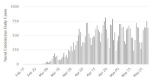
Regarding the Diamond Princess, when I built the initial age dependent mortality model using this dataset, I did look at the infection spread. To infect 712 people in 14 days requires a ‘doubling’ of infections approx. every 1,5 days or so. And there must be some critical point where the rate of new infections starts to slow.
So I think the truth is in the middle – no doubt some people were naturally immune, but also some people didn’t get infected because they were isolated after 14 days. We know most of the people on board were in their 50’s and 60’s and my model (as above) would mean that about 15% of the total population might have been naturally resistant .
But this is just a model and not very meaningful until it’s known what the cause of natural resistance is. Once we know that we will be able to use the DP dataset to really understand the Covid19 epidemiological spread. But until then …..
It also means that locking down with the consequent trashing of global economies, many associations and ultimately many many individual’s livelihoods, (most of whom are the more disadvantaged and least financially robust of the populous,) is the biggest collective global policy faux par in the past few centuries!
John
The DP infection spread over a much longer period. First known passenger with symptoms embarked on 20th January. Positive test infections continued to rise through quarantine and even after all remaining passengers and crew disembarked some 32 days later. Other passengers may have embarked with no or few symptoms the assumption there was only one seed case is a guess. It tends to illustrate to me that this disease does not necessarily spread that easily even in a confined and concentrated environment like a cruise ship. This may be due to a large proportion of persons being resistant (for a whole range of reasons, the ‘dark matter’) or that extensive and prolonged very close contact is needed. If primarily spread by symptomatic cases then even self isolation when feeling sick will reduce contacts during most contagious period and slow spread. This is illustrated by some index case tracing data in which few infections were found even when people had close extended contact, usually close family members/spouse.
Rick
Some other comparisons, correcting for population and population density, for England & Wales regions (same units as previously for international comparison):
London 0.2
South East 1.5
North West 1.8
West Midlands 1.9
South West 2.0
Yorkshire and The Humber 2.1
East 2.2
East Midlands 2.2
North East 3.0
Wales 4.6
In this list, smaller numbers are better. London is obviously a dramatic outlier.
Although its population density is ~10x that of NE and NW, all three have about the same DpM, hence the very different numbers in the list. It’s as though London’s population density has had essentially no effect on its mortality rate.
I thought it might be interesting to combine the results of several different comparisons. For 9 countries (D, E, B, F, I, Sw, US,UK,NL) rank them according to the numbers of C-19 deaths corrected for population (DpM), population + population density, and GDP/capita (wealthier people would be expected to have a lower mortality rate) and also rank them by case fatality rate . Then the first ranked gets 9 points, second gets 8 and so on (like a rather grim version of Eurovision). Results are:
Germany 36
Netherlands 27
US 22
Spain 21
Italy 17
France 17
UK 16
Sweden 14
Belgium 10
Obvious points: D does best on each of the criteria, NL is second overall but a long way behind. Then a further step down to US and E followed by another step to I, F, UK, Sweden which are much the same as one another in the lower half table. B is some way behind.
Simon
Interesting. So how do we begin to explain London in the first list? Death certificate protocols? Certainly changes were made with London ahead, so more deaths certified and counted as CV19 in regions outside London when actually something else? Death certs are a nightmare but not convinced this would make a huge difference to your findings. Care home density both actual sites and number of residents? Many retire to the sticks and coastal regions. Again I have no data not even sure it is readily available.
In relation to the ‘CV Eurovision’ again this suggests (with a whole container ship of the usual caveats) that how a country dealt with the actual vulnerable population and how, if indeed it did, control nosocomial spread. This last point seems to be where the focus needs to be. Sweden at least held its hands up to a failure in relation to care homes. This takes guts and strong adult leadership.
Rick
There’s a simple way to account for the apparent irrelevance of London’s much higher population density but it may not be credible for other reasons.
NE, NW and London all currently at between 900 and 950 DpM although London’s population density is 10 or 15x as great. If this is some sort of ceiling on DpM, which applies irrespective of population density, it would imply a corresponding ceiling on infections/million (assuming constant case fatality rate), aka “herd immunity”.
I’m not sure there’s any other compelling evidence for HI to have happened so I’ll see if I can come up with other reasons for why London’s population density seems not to have affected its DpM relative to other areas.
I found that case density and population density have a power law relationship: this chart is based on Pillar 1 data, so “proper” cases.
https://datawrapper.dwcdn.net/K3uOD/1/
London doesn’t have a commensurate death rate simply because it is deficient in older people: when they retire, many sell up and move out as they no longer need to be there.
https://www.ons.gov.uk/visualisations/dvc745/heatmap/index.html
Use the right arrow to move to 2020.
Footnote:
The Santa Fé Institute also found power law scaling:
https://www.santafe.edu/news-center/news/transmission-t-025-chris-kempes-and-geoffrey-west
Comments are closed.