Latest graphs from Christopher Bowyer. Many thanks to Christopher for doing these, not just from me, but from many, many other people (these graphs end up all over the web, and social media).
ONS data here. NHS England data here.
All graphs can be clicked to enlarge.
England deaths with Covid-19 by absence (yellow) or presence (green) of a pre-existing condition. Data from NHS England data.

Percentage of deaths with Covid-19 by pre-existing condition. (95.19% have one or more P.E.C.) NHS England data.

Note that the most common pre-existing conditions are diabetes, followed by dementia, chronic pulmonary disease, and chronic kidney disease.
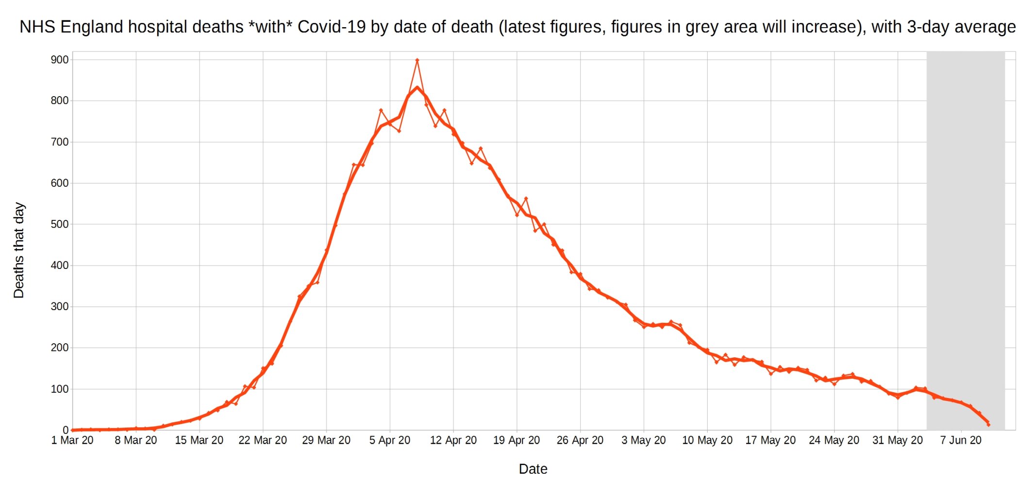
Covid-19 deaths in England by date of death, with 3-day moving average trendline (the thicker line). (Note that numbers in grey area may increase over the next few days.) NHS England data.
A graph of deaths with Covid-19 in England which occurred each day, by the delay in reporting. Thick line is overall daily announced deaths. NHS England data.

Trendlines (3-day average) for Covid-19 deaths by England NHS region, by date of death. (Note that the numbers in the grey area may increase over the next few days.) NHS England data.

Trendlines (3-day average) for Covid-19 deaths per million by England NHS region, by date of death. (Note that the numbers in the grey area may increase over the next few days.) NHS England data.

English daily deaths with Covid-19 by date of death. Blue line is all Covid deaths, red line is hospital Covid deaths, and green line is non-hospital Covid deaths. NHS England data.

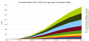
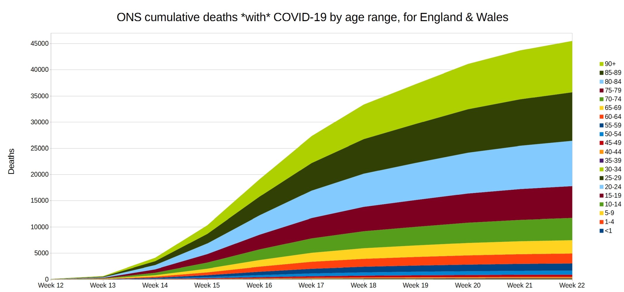
England and Wales weekly cumulative deaths with COVID-19, by age range. ONS week 22 data.
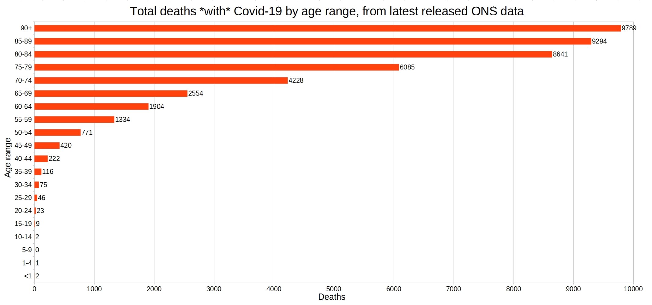
England and Wales total deaths with COVID-19, by detailed age range. ONS week 22 data.
England and Wales weekly Covid and non-Covid care home deaths. ONS week 22 data.

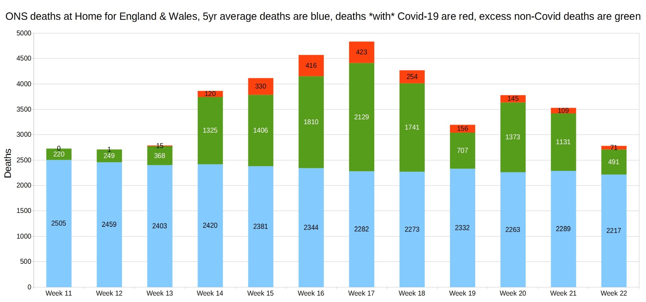
England and Wales weekly Covid and non-Covid deaths at home. ONS week 22 data.
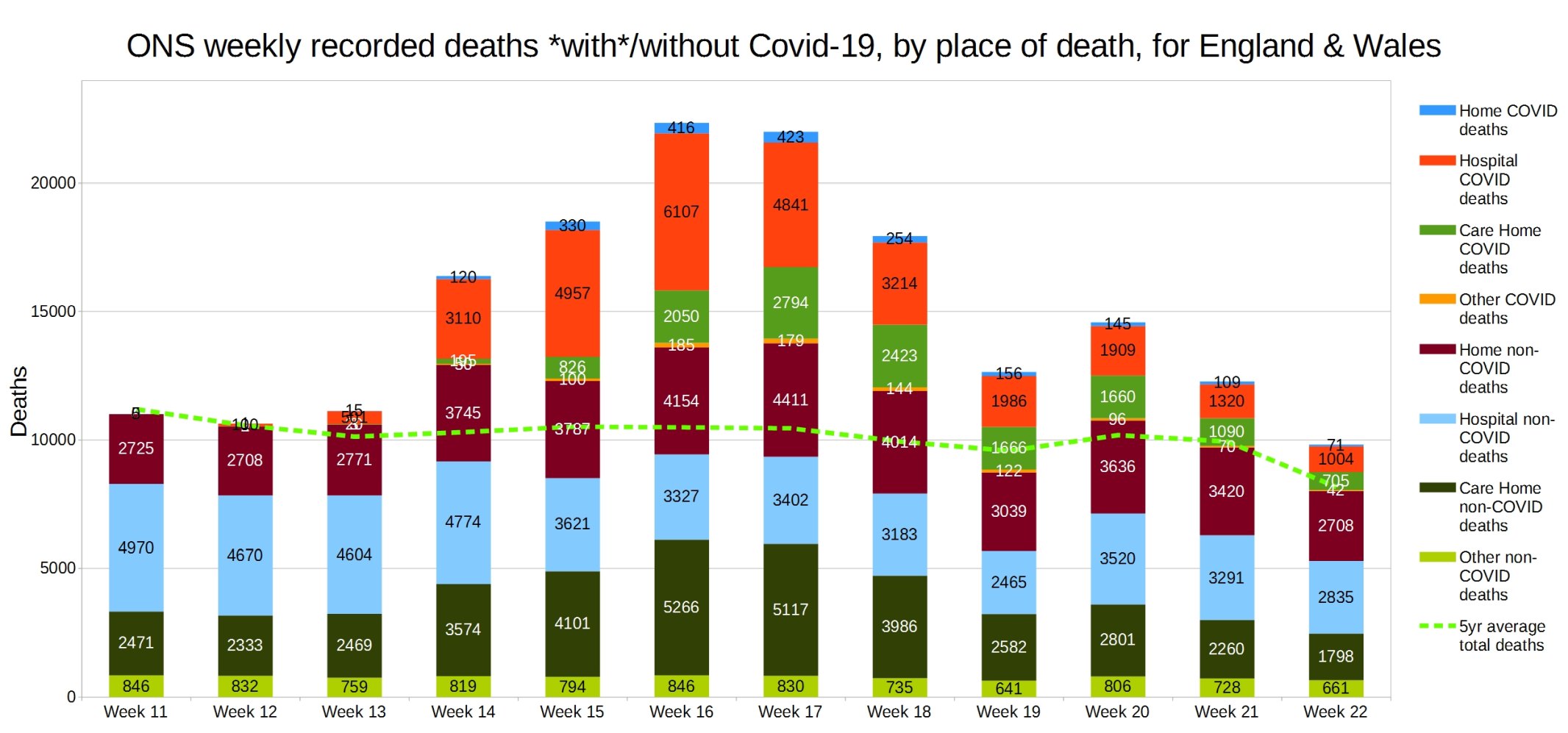
England and Wales weekly Covid and non-Covid deaths by place of death. ONS week 22 data.
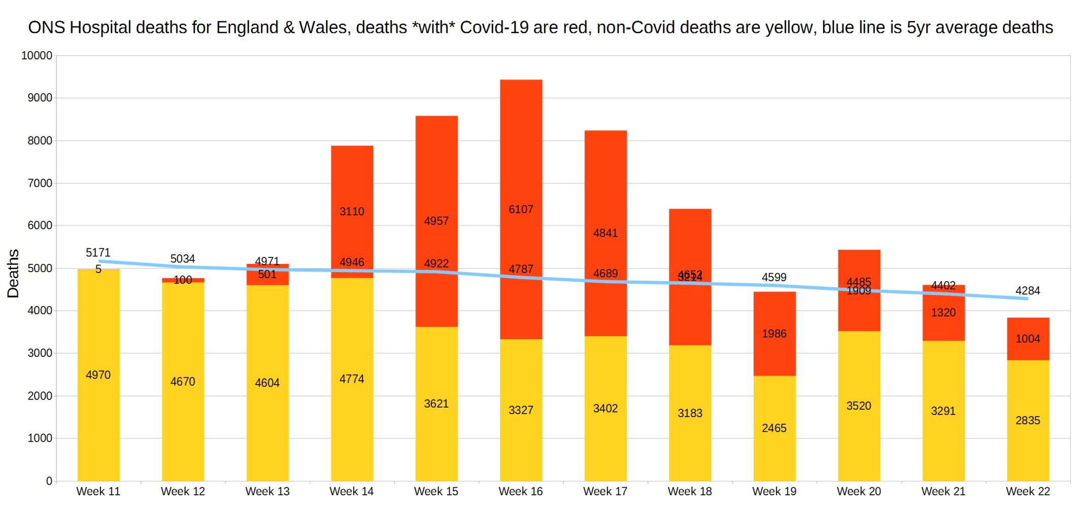
Hospital deaths for England and Wales. ONS week 22 data.
7 thoughts on “Week 22 graphs from Christopher Bowyer”
What is shocking is are the home and carehome deaths that are non-Covid related that happened in from week 15 onwards. They are welll above the 5 year average but non Covid related. These are people that might no have died if they had gone to hospital, but didn’t because of the Covid scare.
The road to hell is paved with good intentions.
@John Church: my teenage son spotted exactly that within a five minutes of looking at the ONS raw figures. No graphs needed. He’s a bright lad, but still… Is the further (perhaps) shocking thing is that MSM and government is are failing to see, comment on or investigate this, or that they are carrying on hoping that no one notices.
We can never know, but what is your best guess for the inflation of Wuhan Virus deaths in the official statistics? My guess is fully half of USA deaths marked as Wuhan Virus related were caused by other factors. Some graphs shown here a while back showed respiratory and flu deaths and IIRC non-Wuhan Virus deaths were significantly down.
@Christopher,
Thanks again
A suggestion: change “no pre-existing condition”
to “no diagnosed pre-existing condition”
@Hector
Landless https://hectordrummond.com/2020/06/15/week-22-graphs-from-christopher-bowyer/#comment-22780
Is spam – promoting snake oil
found this thanks to UKColumn excellent representation of the situation
Lovely graphs. The excess non-Covid deaths in care homes won’t just be ‘lockdown can’t get medical attention’ deaths though. They will in part be people who had Covid which wasn’t recognised. Covid causes hyper coagulability in the blood and may present as a stroke, myocardial infarction or pulmonary embolism.
Also it can’t be assumed that all or even most of the people with comorbidities were expected to die soon anyway. Most of the conditions are chronic and compatible with years or decades of life. Despite this there will though be quite a lot of people with advanced malignancies and a prognosis of weeks who happened to test positive and therefore get misclassified as a Covid death.
The excess deaths graphs over the summer are going to be very interesting. My hunch is that there will be significantly fewer deaths than expected which will support the argument made on this site that a substantial number of Covid deaths were in the very frail who had a limited prognosis.
Notwithstanding the comments above I share the view that the risk of death fromCovid for people under retirement age has been vastly over-estimated by the public. It is perverse and illiberal to shut down the economy for so long in my view and we should move to a policy of protecting the vulnerable.
@Christopher
What is the total number of excess deaths in 2020 to date based on normal UK avg 1,668 pd?
18 May 2020 is day 139 and normal deaths to date would be 231,852 – ignoring seasonal variations
@Passive Investor
Good points
However, with co-morbidities, those in care homes are there as they are no longer mentally/physically well enough to live without 24/7 care & assistance. Hence, “God’s Waiting Room”
The median length of stay in [BUPA’s 305] residential care homes is 462 days from time of admission to death
Comments are closed.