More graphs from Christopher Bowyer. Christopher sent these to me last week but with all the Parler happenings I haven’t had time to get them up until now. (Similarly, if I haven’t replied to your e-mails it’s because I’m behind, will catch up soon.)
ONS data here. NHS England data here.
All graphs can be clicked to enlarge.
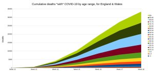
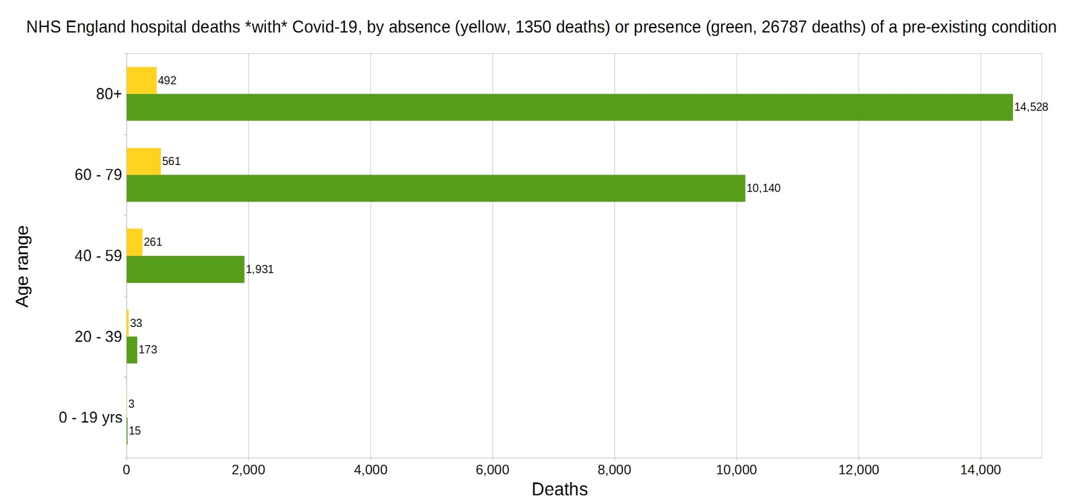
England deaths with Covid-19 by absence (yellow) or presence (green) of a pre-existing condition. Data from NHS England.
Percentage of deaths with Covid-19 by pre-existing condition. (95.2% have one or more P.E.C.) NHS England data.
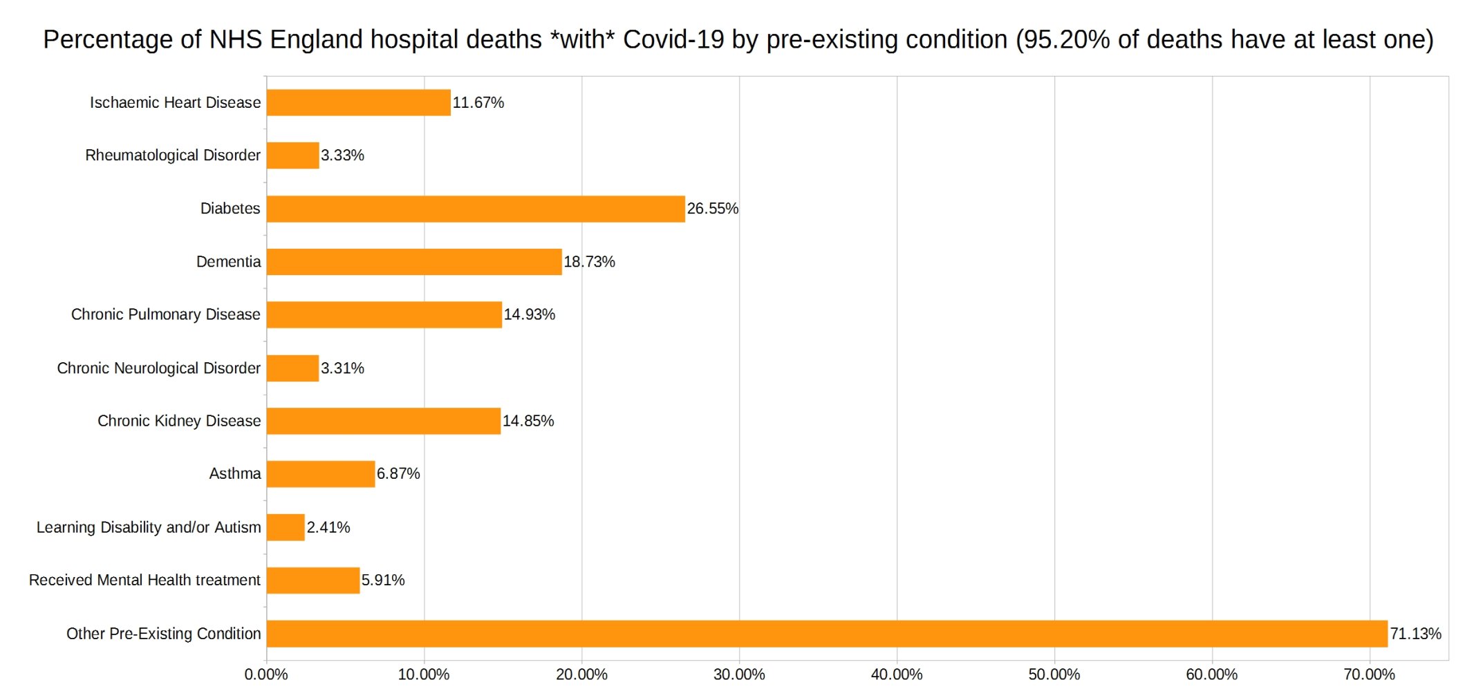
Note that the most common pre-existing conditions are diabetes, followed by dementia, chronic pulmonary disease, and chronic kidney disease.
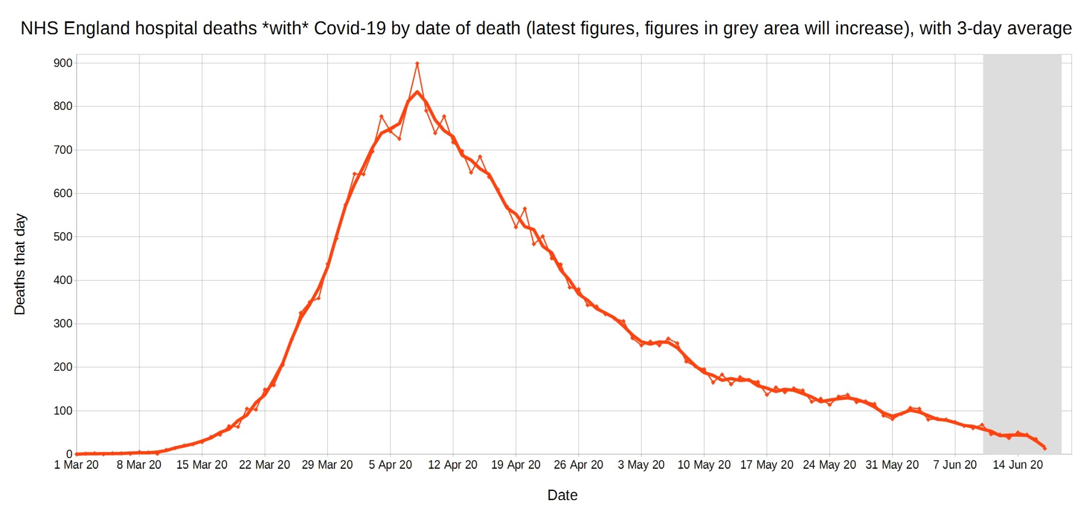
Covid-19 hospital deaths in England by date of death, with 3-day moving average trendline (the thicker line). (Note that numbers in grey area may increase over the next few days.) NHS England data.
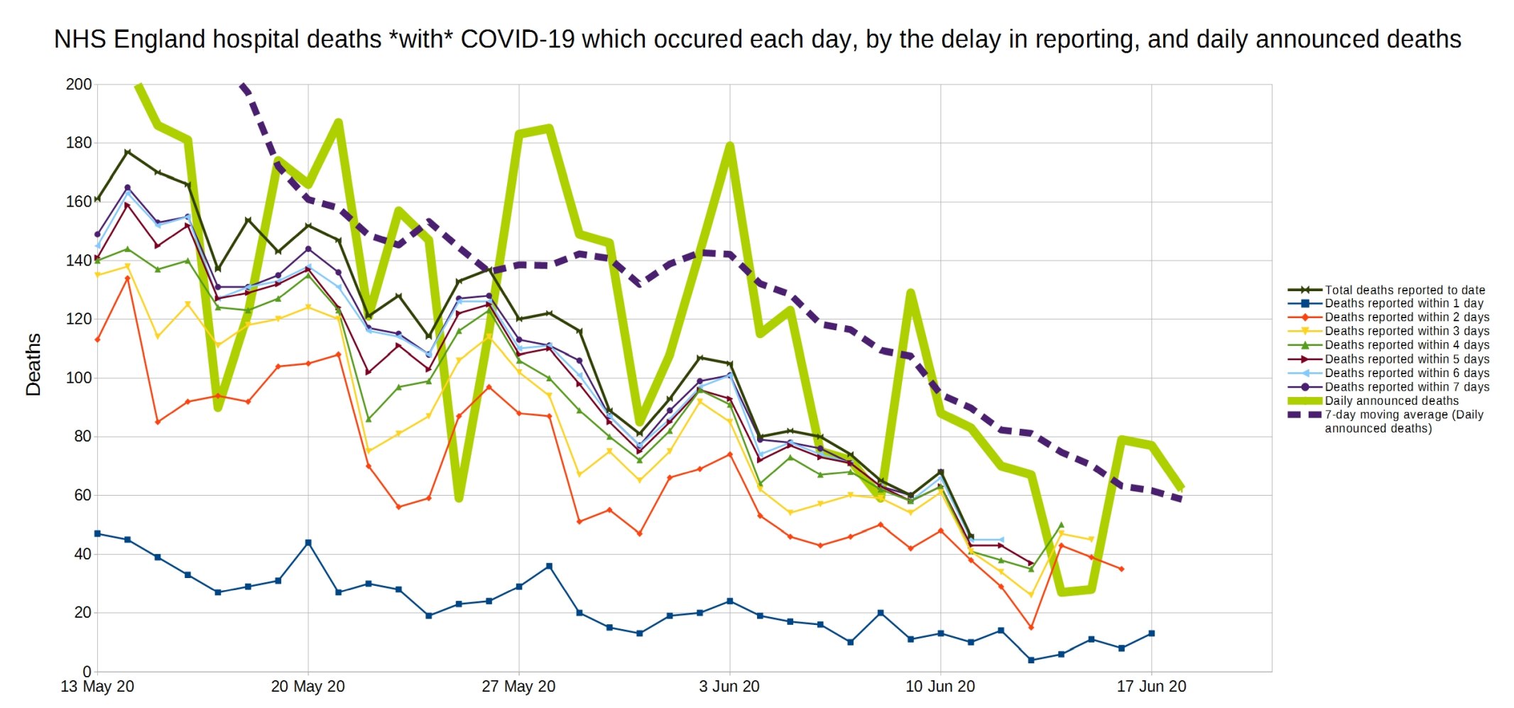
A graph of deaths with Covid-19 in England which occurred each day, by the delay in reporting. Thick line is overall daily announced deaths. NHS England data.

Same again, but a close-up on the last month.
Trendlines (3-day average) for Covid-19 deaths by England NHS region, by date of death. (Note that the numbers in the grey area may increase over the next few days.) NHS England data.
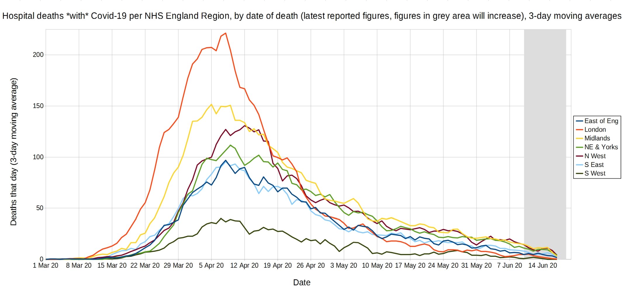
An enlarged version of this graph.

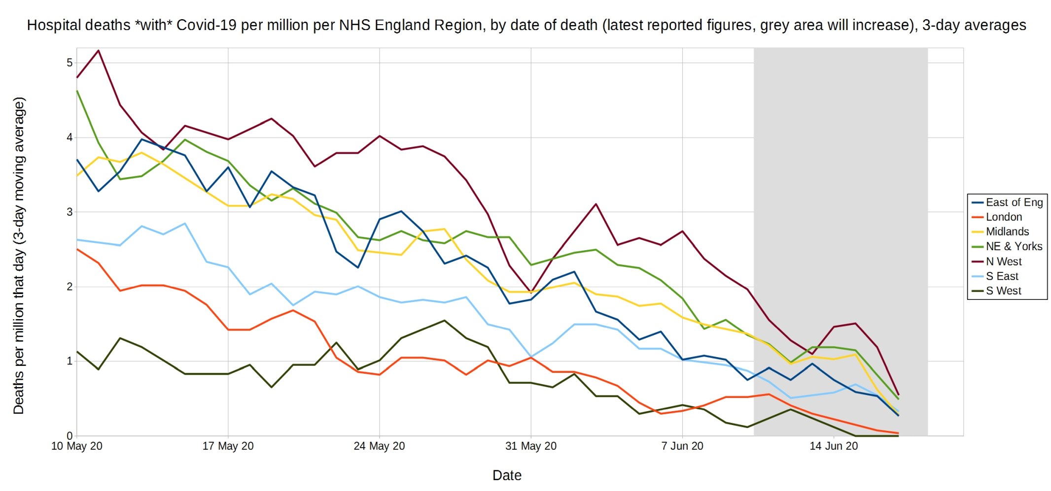
Trendlines (3-day average) for Covid-19 deaths per million by England NHS region, by date of death. (Note that the numbers in the grey area may increase over the next few days.) NHS England data.
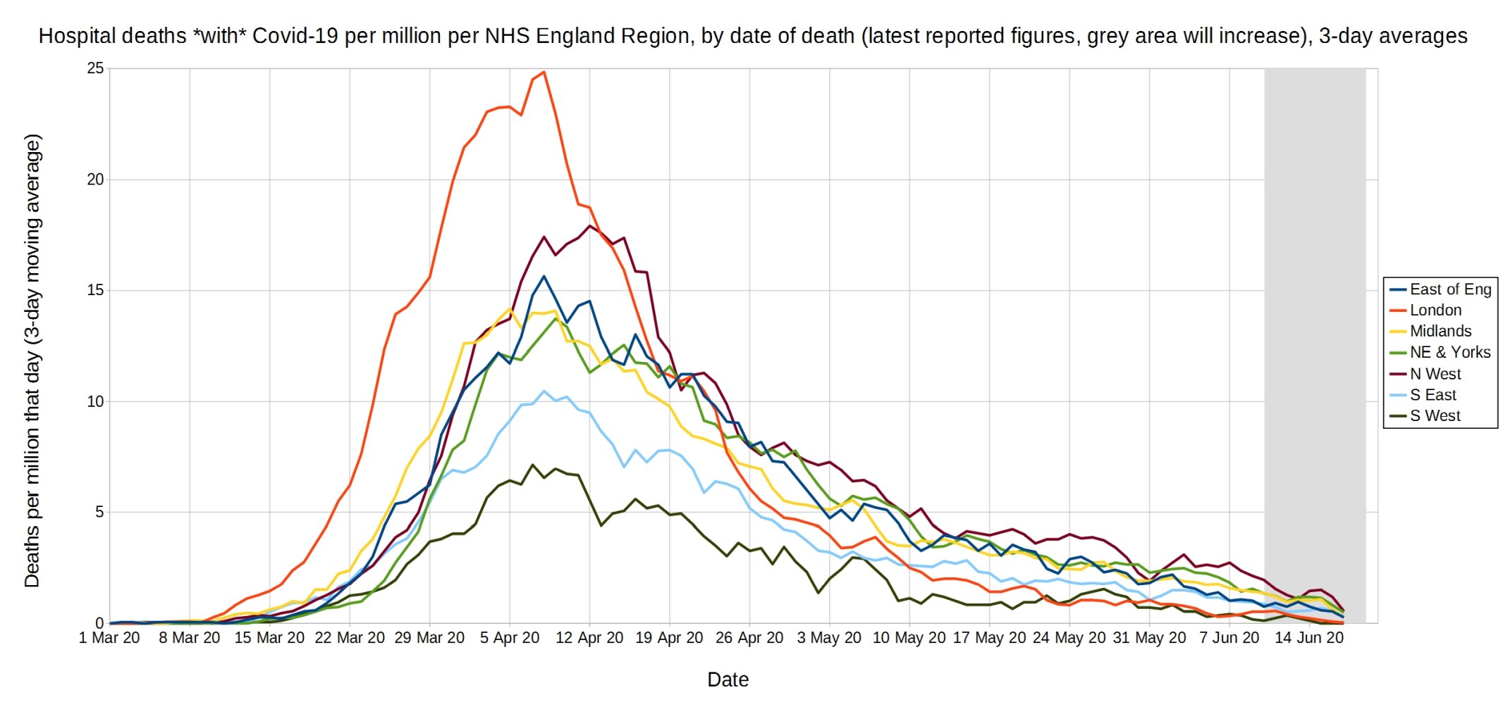
An enlarged version of this graph.
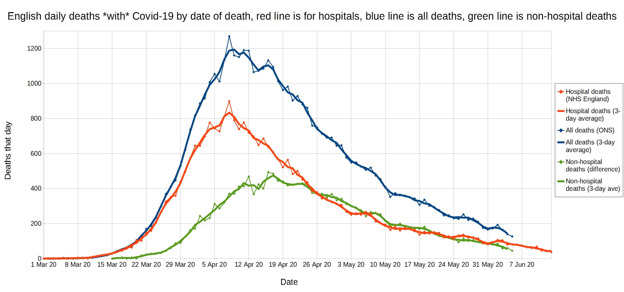
English daily deaths with Covid-19 by date of death. Blue line is all Covid deaths, red line is hospital Covid deaths, and green line is non-hospital Covid deaths. NHS England data.
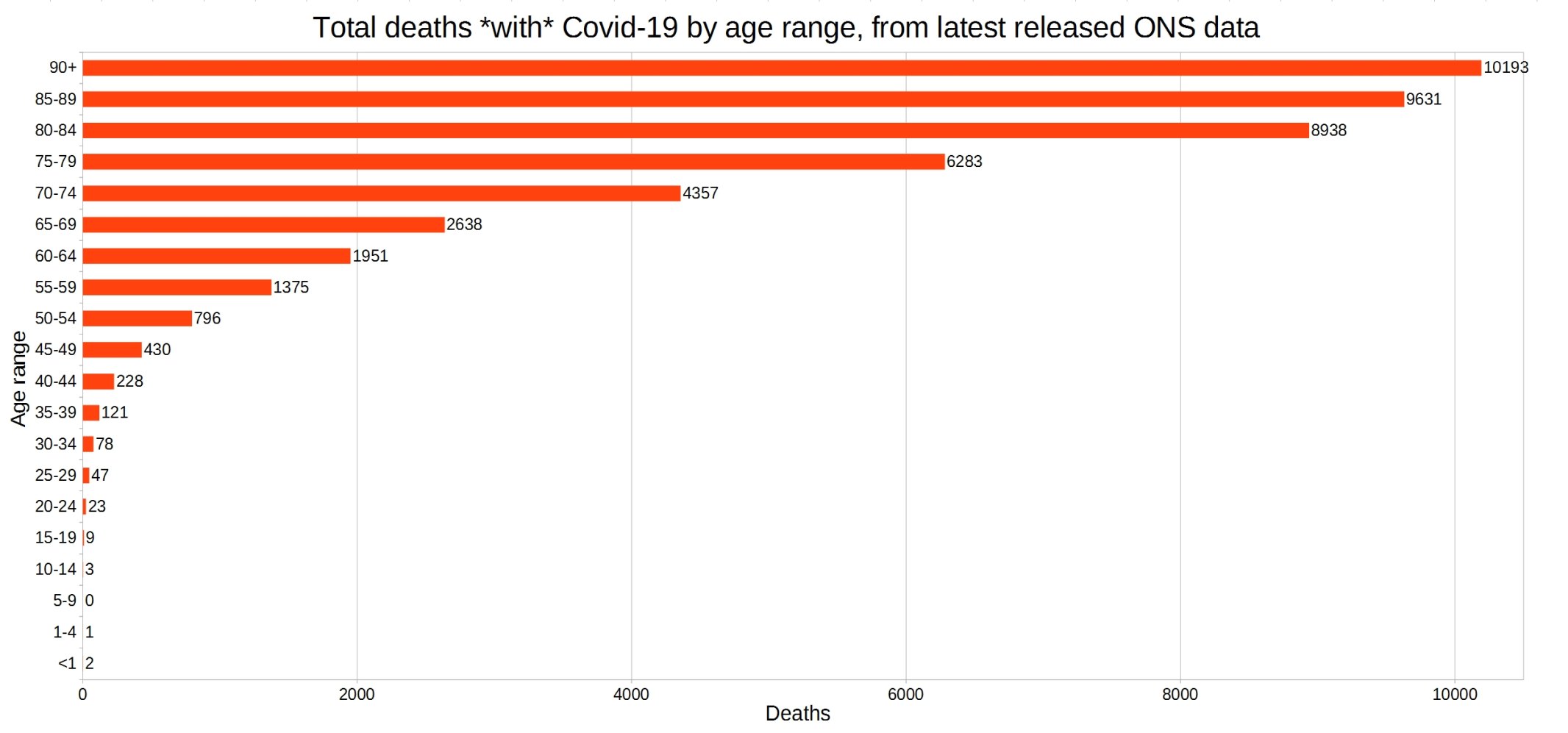
England and Wales total deaths with COVID-19, by detailed age range. ONS week 23 data.
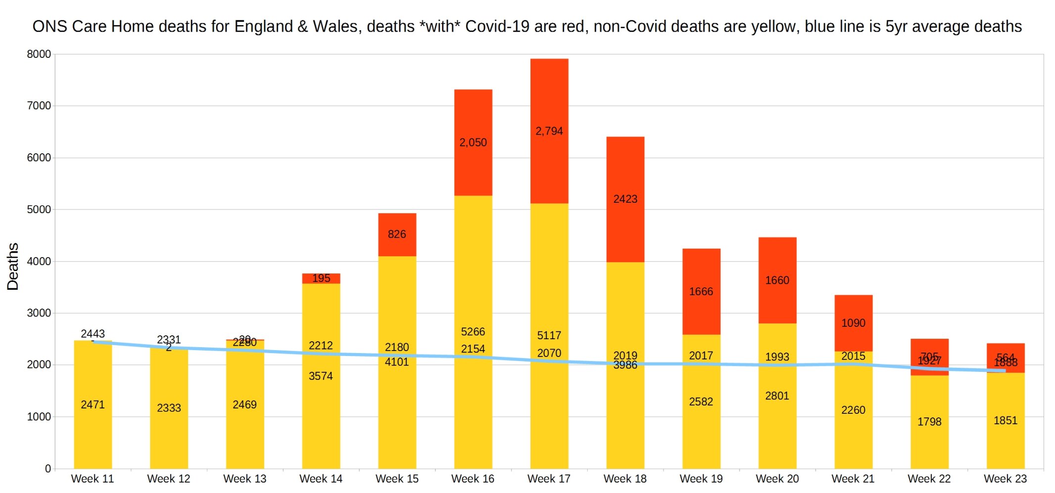
England and Wales weekly Covid and non-Covid care home deaths. ONS week 23 data.
England and Wales weekly Covid and non-Covid deaths at home. ONS week 23 data.

England and Wales weekly Covid and non-Covid deaths by place of death. ONS week 23 data.

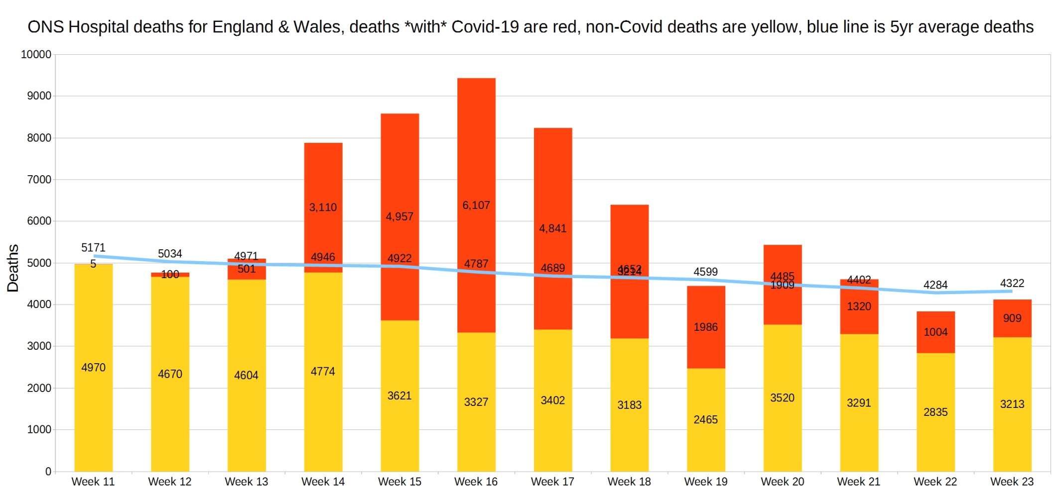
Hospital deaths for England and Wales. ONS week 23 data.
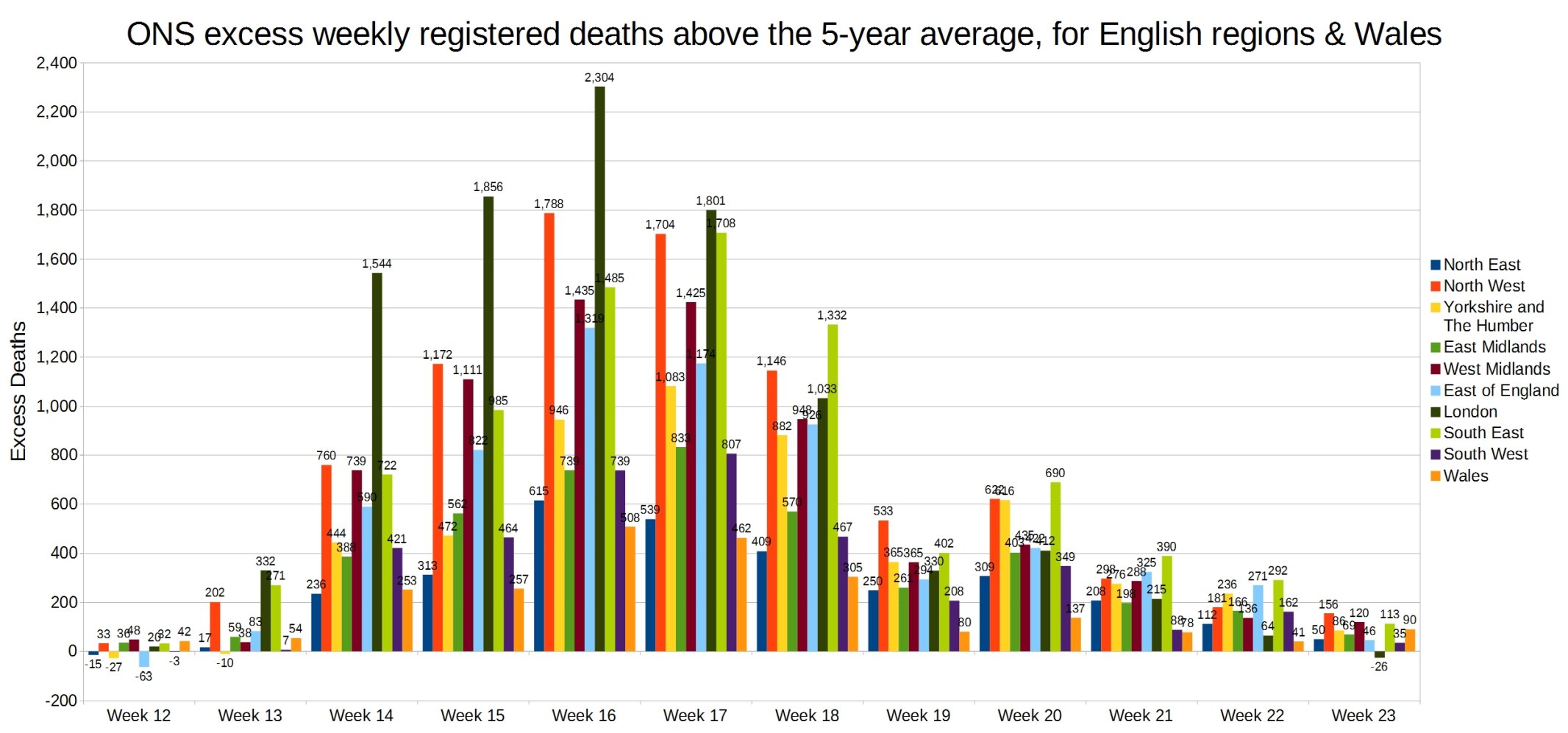
Weekly excess deaths above the 5-year average, for English regions and Wales. ONS week 23 data.
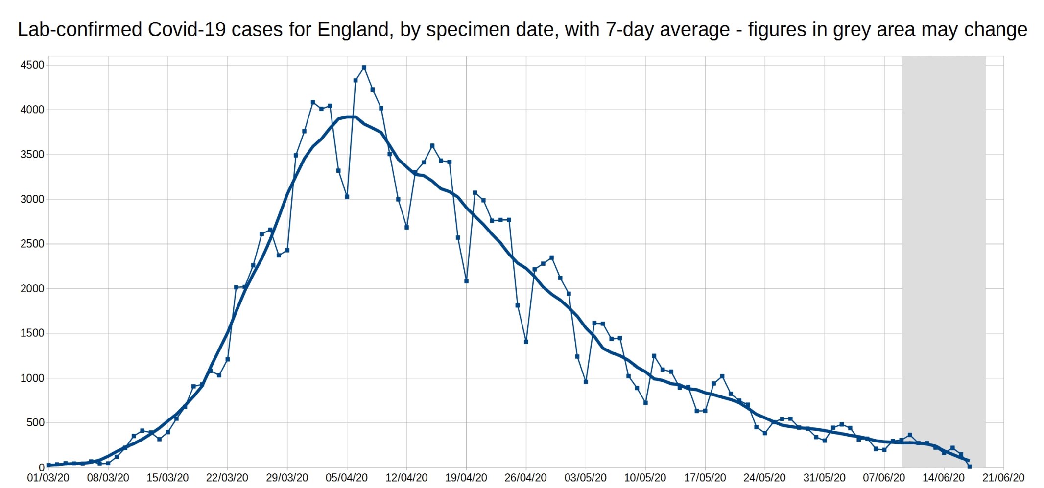
A graph of daily Covid-19 positive tests (by specimen date), for England, with a 7-day average trendline (the thick line). The data shown in the grey area may increase, as it takes a few days for all the test results to come in, especially over weekends.
Graph of the 7-day average positive tests (by specimen date) for each of the English regions. Daily test data removed, as it made the graph too complicated. As before, the data shown in the grey area may increase.
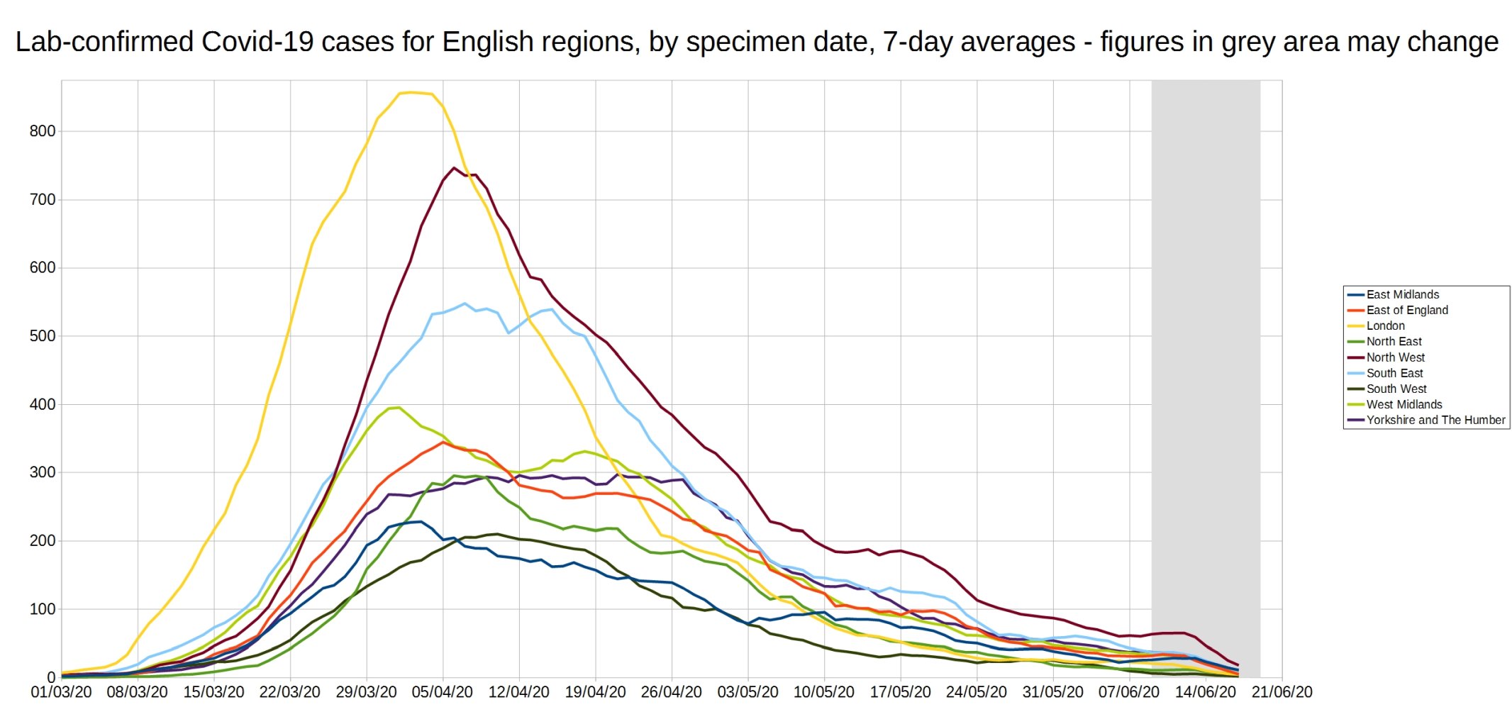
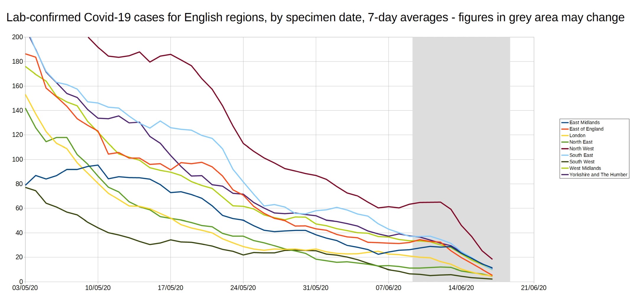
An enlarged version of this graph:
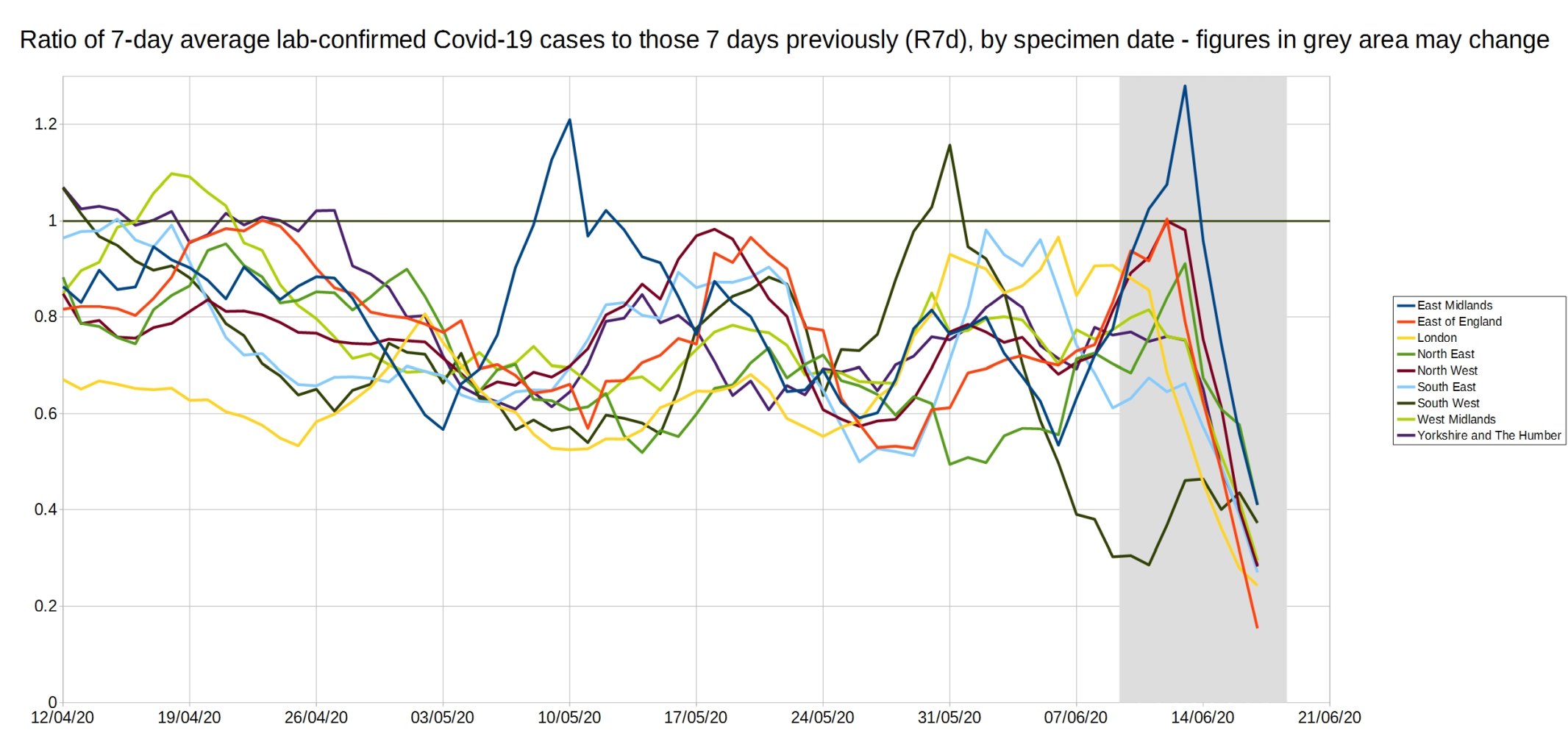
Graph of the ‘R7d ratio’, the ratio between each day’s 7-day average positive tests, and the 7-day average from 7 days previously.
Like the R0 number, this ratio is above 1 when case numbers are increasing, and below 1 when case numbers are decreasing.
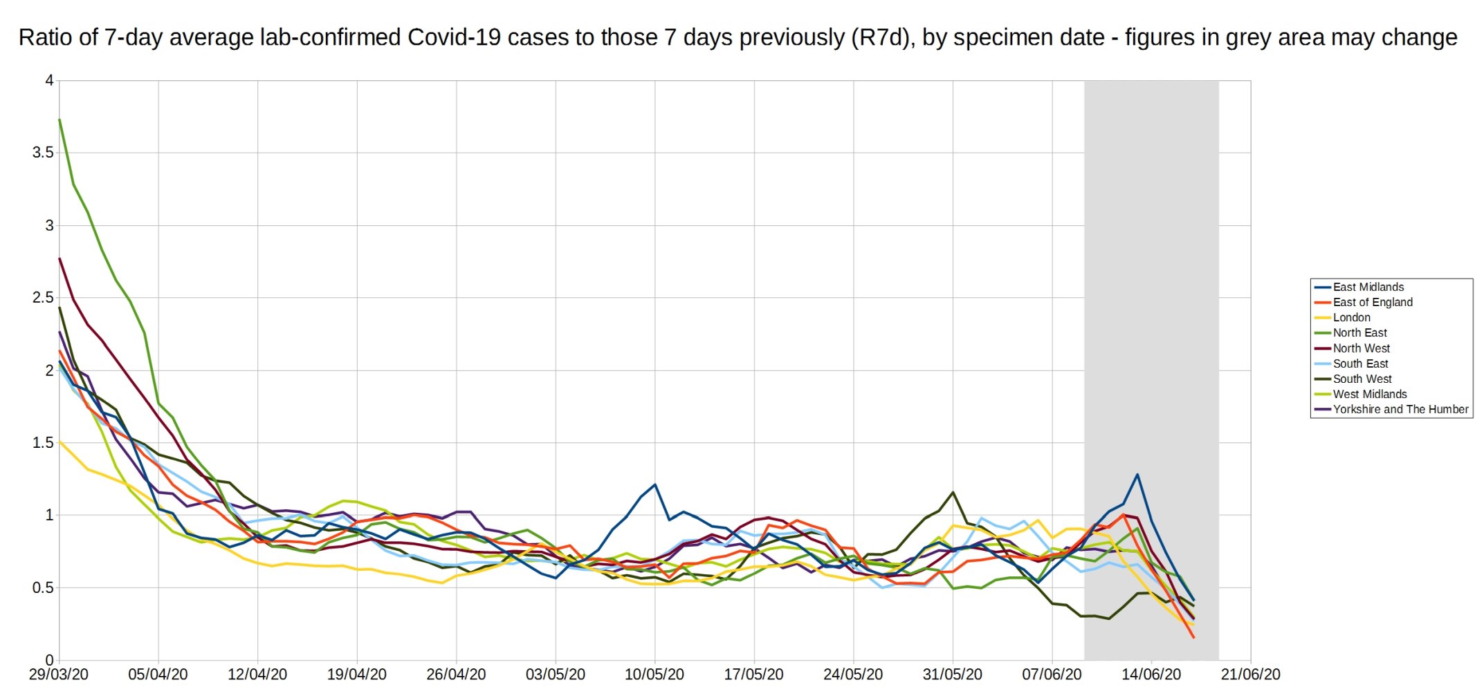
An enlarged version of the R7d ratio.
Graph of the R14d ratio, the ratio between each day’s 14-day average positive tests, and the 14-day average from 14 days previously.

23 thoughts on “Week 23 graphs from Christopher Bowyer”
This collection of graphs provides an incredibly detailed insight into how the virus has progressed over the last few months. Unfortunately, however, I think that the underlying data is practically useless for answering the question: how many people have died because of Covid-19? For example, if Covid-19 can be put on a death certificate without having been confirmed by a test, then we actually have no idea whether or not a patient is infected with Covid-19. We also have no idea how many patients died because of, rather than with, Covid-19. Maybe I’m just a pedant, but surely measuring a phenomenon accurately is a crucial part of the scientific method? To confirm, I’m criticising the underlying data and not Christopher Bowyer’s excellent analysis. Also, I completely accept that the underlying data can be used to put the virus into context (e.g. weekly population-adjusted excess mortality), which, given the overreaction, is a very useful thing to do (even if such contextualising is completely ignored).
Mark, for that reason the all-cause mortality is the most important figure, but we have to wait until we have it over a properly interesting time-frame. It will include the effect of lockdown deaths occurring over the time period we look at, not just COVID deaths or COVID deaths averted by lockdown.
All-cause mortality (and various specialised ways of looking at it) is the only serious endpoint in clinical research where death is an endpoint at all, for just that reason. It isn’t contaminated by the subjective opinion of a medic on what caused the death, and captures deaths caused by, not just those averted or delayed by, the treatment you are investigating.
Stand-out for me is the grand total of 15 deaths among children compared to those over 90, an age few of us dare dream of ever reaching. I know with my comorb I will almost certainly be gone long before drawing my pension, but, of course, how heartless of me to accept the death of even one child so that I can have a normal life in my remaining time. Surely we must shut down society forever rather than risk a single child’s life. Better ban cars, trousers, pot plants, pet dogs, tree climbing, and every imaginable scrape kids get into then…
Thank you for the response. Good to know that all cause mortality is the measurement of choice in clinical research. I was actually plotting the all cause weekly deaths during March and April. And, I noticed that, even after the most dramatic weeks, the cumulative deaths for 2020 were comparable to a couple of previous years when adjusted for population.
Out of interest, what timescale would you use to examine the impact of Covid when using all cause mortality data?
And it goes without saying that you are a very bad person indeed for wanting to expose children to such a high level of risk!!!
As for your comorbidity, I sincerely hope you surpass your own expectations.
The current geographical picture in England
https://datawrapper.dwcdn.net/nI8ll/1/
How case rates have been changing
https://datawrapper.dwcdn.net/0QXpt/1/
The epidemic continues to fizzle out. Inconclusive evidence of a handful of cases in the London area that might be due to demonstrations – but are probably nothing to do with that at all.
Mark,
End of the year. Which is part of the problem – you can’t wait that long to see what is happening, but that’s when the data will be really robust.
Even Neil “computer says millions will die” Ferguson said a lot of the deaths will be those brought forward from the coming winter’s seasonal ‘flu. I wonder how many were simply delayed by not having a bad seasonal ‘flu for the last 2 years?
Mark and BiG,
Agree entirely.
Excellent work by Christopher, but based on ONS information that I’ve long felt to be very suspect. When the cynical 2020 Coronavirus Act “allowed” death certification to be made at the very least, vague, then I became really sceptical. I think that by doing so, the government now possess a very large unopened can of worms with regard to future death certification. Unless this useless Act is repealed, which of course it won’t be, then I think we’re heading for ever larger problems if doctors continue to have this leeway in reporting deaths.
>I wonder how many were simply delayed by not having a bad seasonal ‘flu for the last 2 years?
I’m working on a paper about that now (and had a post on it months ago).
A peer-reviewed paper? I look forward to reading it peer-reviewed or not.
All-Cause Mortality Surveillance
1/ Following on from Mark Ashby’s comment 23rd June at 21:59, I’m amazed that no blood was retained from suspected Covid deaths in order to do a test when things calmed down. I can understand (just) a rationale for lowering the bar on death certification in the initial political panic phase. However alongside that surely it would have been possible to require a retained sample for confirmation later? Would that not have answered the inevitable criticism about data quality (eg as made by Dr John Lee, pathologist).
2/ Are we now in a zone where number of infections or indeed deaths is comparable to the proportion of false positives from the test? That question leads me into several others: Would that imply that it’s now difficult to tell whether the disease is still active? (ie is zero masked by false positives?) Would it also imply that dropping below current levels is unlikely until the tests improve on false positive discrimination? And is this one of the few diseases to be “studied” at this low number of cases nationwide?
Hoping there’s an expert or two to shed light on this.
Hi – can we have a look at total deaths per year from as far back as you can get the data (when I was living in Edinburgh during the winter of 1998-99 hospitals were using freezer lorries to house the dead), and if it is possible to split and show causes of death it would interesting to see how it relates to this year.
Thanks 🙂
The reason I am interested is because I am beginning to suspect that this coming winter lots of people who should/would have died this past winter, and had their lives extended by shielding and lock-down, are going to die this coming winter. This, I suspect, will massively increase all cause deaths and result in further laws being thought up and implemented.
NeverReady, one of the reasons I’m so busy at the moment is I’m writing a paper on these topics. I have graphs of long-term deaths ready to go (although ideally I’d do one that adjusts for population increase), and I’m analysing the winter excess deaths again (turns out there are trickier issues there than you’d think).
@Hector
🙂 Thanks, brilliant minds and fools and all that….will be very interesting.
Just dug these articles out, notice in one of the pictures that the nurse treating a flu victim is wearing…no PPE.
http://news.bbc.co.uk/1/hi/health/249320.stm
http://news.bbc.co.uk/1/hi/health/247718.stm
http://news.bbc.co.uk/1/hi/health/243501.stm
@DuncanPT
Re Dr John Lee
Legal Challenge of Ofcom censoring reporting of Covid-19
Ony scare mongering permitted in UK
https://lockdownsceptics.org/2020/06/23/latest-news-63/
Aus
The modelling around COVID-19 fatality rates has been consistently inaccurate
https://www.youtube.com/watch?v=asBIcSJ-E9g
@NeverReady
ONS eg
The 7-day rolling average of daily new Covid-19 cases is now approx 3k for the European Union, and 30k for the US. Both peaked (the first time) in the same week of April, and at the same approx number – the US slightly over 30k, the EU slightly under 30k. But 10 weeks later, one of them, the EU, has seen daily cases drop 90%, while the other has seen them surge to a second equal peak. The US shut down late, and loosely, and opened early. So we now have a very good idea of the effectiveness of social distancing and isolation measures, and what happens in a country that chooses to ignore all the science – and let’s please not pretend otherwise.
@Pcar – yes, those are excess deaths. We really need to know total number of deaths and causes of all deaths. And where. Then we can have a root about and see what’s occurring.
“Anonymous” hid her identity (perhaps understandably) and wrote: “So we now have a very good idea of the effectiveness of social distancing and isolation measures …”
Hardly. You don’t sound like the kind of person who thinks for herself, Anonymous. But if you are, can you please address this aspect — What constitutes a “case”?
Europe and the USA both have many jurisdictions (probably in the order of 100 combined) reporting “cases”. Are they all using the same definition of “case”? Might the number of individuals who are tested have some impact on the number of “cases”? Does testing occur at proportionate rates in all jurisdictions? How many “cases” are asymptomatic (i.e. a positive test from a person who is completely healthy)? What is the rate of False Positives in testing, and does it vary between jurisdictions?
Maybe you are right, Anonymous, that European superiority shines through once more. Maybe you are completely wrong. The only firm conclusion is that you cannot make any meaningful assessment from the very limited information you quoted.
@Anonymous
Scare mongering again
Silly boy. USA is testing ~700,000 and rising per day, many more than EU, hence Trump’s joke about stopping testing
Also, cases does not mean hospital/death despite msm portraying it does
Which countries “ignored all the science”?
Certainly not USA. Nor Japan and Sweden who didn’t lock down
@NeverReady
UK Annual deaths per year and causes are on ONS
Average daily all cause deaths in 2019 was 1,668
I’ve been impressed by the data shown on this site – and the number of intelligent comments that follow.
My ha’penny’s worth, is based on analysing ”all cause” ONS mortality data for the winter/spring infection season (up to Week 20) for the 27 years from 1993/94 to 2019/20.
A few summary points :
1. Data that is not corrected for population size is a hopeless measure, given the c. 18% population increase over a quarter of a century.
2. The term ‘excess deaths’ is virtually meaningless, as shown in the Oxford CEBM paper on the massively different figures reached by different methods of calculation.
(See : https://www.cebm.net/covid-19/thoughts-on-estimating-excess-mortality-from-covid-19/)
Probably, the best way of thinking about the term is that it is simply a measure of the error of any given model in forecasting actual deaths in a given period. (And we know where inaccurate modelling can land you)
3. As others have said – we end up with ‘all cause’ mortality being the only reliable metric of the nature of this latest infection season, given the total mess made of data by (a) revisions to death registration and the attribution of cause of death and (b) the ‘moving target’ of number and reliability of tests.
4. Given the above, this simple analysis sticks to easily verifiable descriptive statistics. Inference is avoided. The basic metric used is the variation of each season from the overall median of cumulative mortality for the 27 seasons, expressed as percentage mortality for the estimated population in each year.
… which shows :
(a) that 2019/20 did have a relatively high rate of mortality, but not what might be termed ‘exceptional’. In comparative terms, it ranked eighth in the run of 27 years, at approximately the third quartile.
(b) The weekly data shows no feature that could safely be attributed to ‘lockdown’ measures in 2019/20.
(c) In relation to elderly/vulnerable mortality, a striking feature of the charting is the comparably *low* mortality of 2018/19 – almost mirroring its opposite in the last season. It seems highly likely that this led to a much larger number of infection-susceptible individuals surviving an addition period, with their deaths occurring in 2019/20. It is interesting that the mean mortality for the two years is almost exactly at the overall median level (c. 0.55% of population).
The conclusion about current levels of infection leading to mortality is clear, and provides absolutely no support for the need of the sort of exotic containment measures that have been used in no other season.
@Pcar I think RH answers one of the questions I was thinking about, that lower mortality of older people (shielding/lockdown/sanitary measures) in 2019-20 may result in a larger amount of deaths in 2020-21. But, as RH states…(and shows I was way off the mark)
“…(c) In relation to elderly/vulnerable mortality, a striking feature of the charting is the comparably *low* mortality of 2018/19 – almost mirroring its opposite in the last season. It seems highly likely that this led to a much larger number of infection-susceptible individuals surviving an addition period, with their deaths occurring in 2019/20…”
@RH Thanks for the analysis
@RH
Excellent info and points. Thank you
Comments are closed.