More Covid-19 graphs from Christopher Bowyer. ONS data here (up to week 24, week ending 12 June). NHS England data here. (NHS data is more recent, see dates on graphs).
All graphs can be clicked to enlarge.
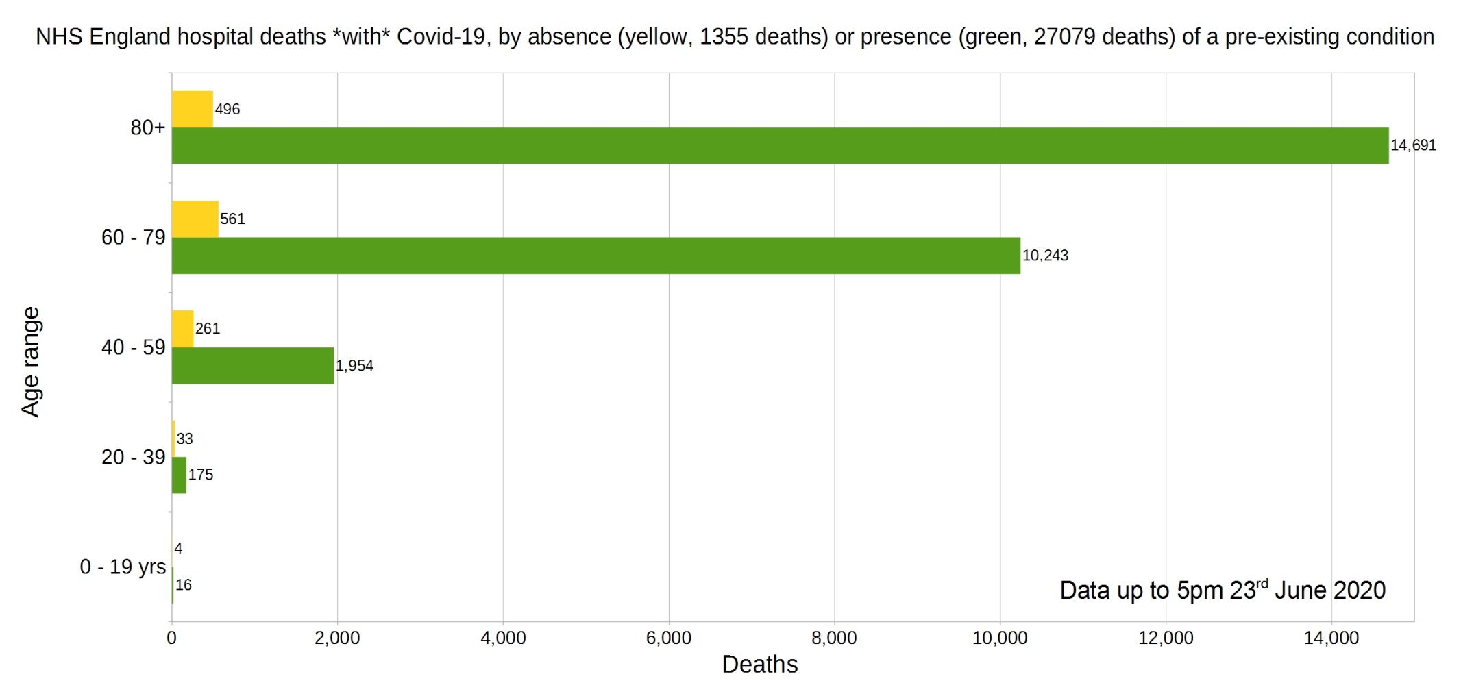
England deaths with Covid-19 by absence (yellow) or presence (green) of a pre-existing condition. Data from NHS England.
Percentage of deaths with Covid-19 by pre-existing condition. (95.23% have one or more P.E.C.) NHS England data.
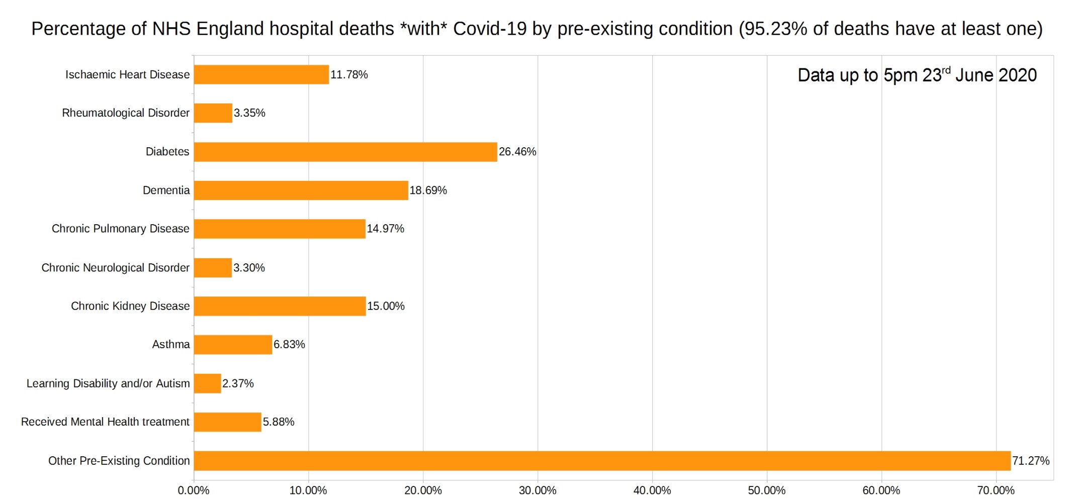
Note that the most common pre-existing conditions are diabetes, followed by dementia, chronic pulmonary disease, and chronic kidney disease.
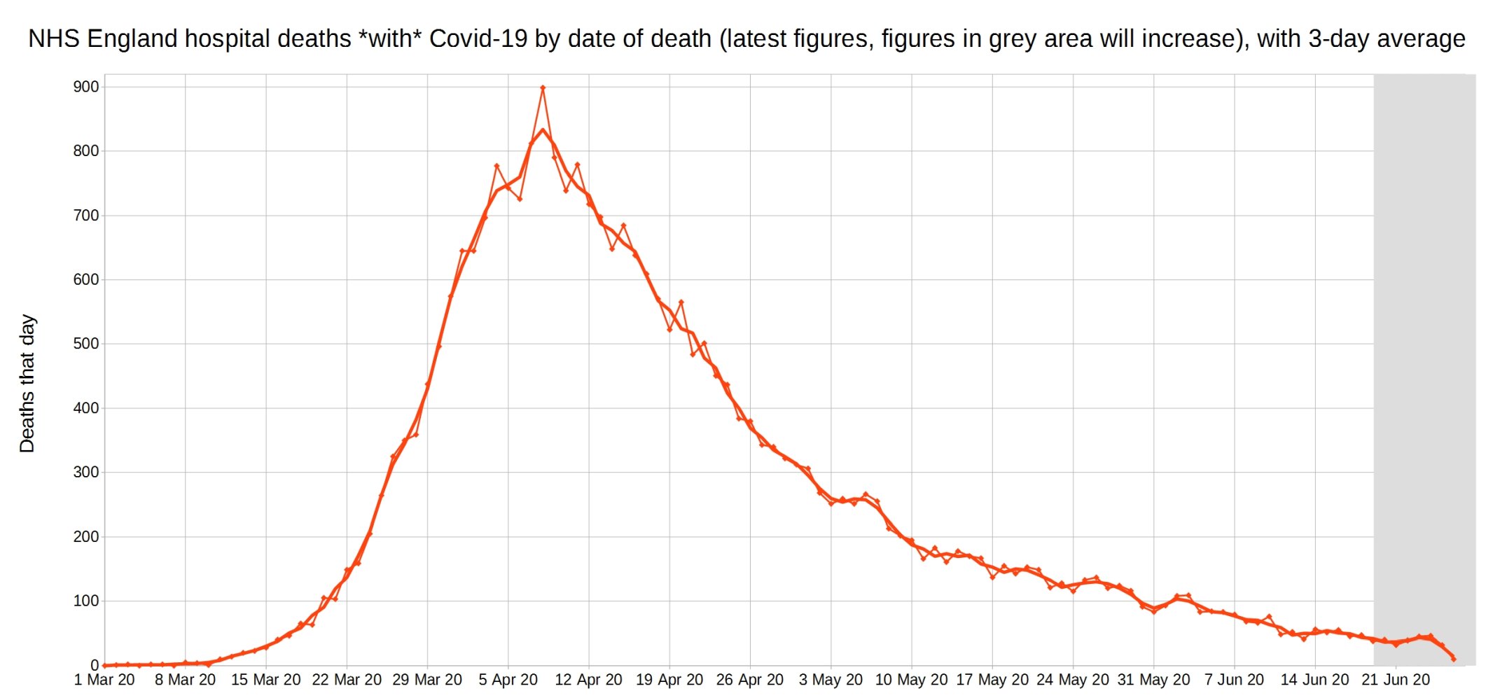
Covid-19 hospital deaths in England by date of death, with 3-day moving average trendline (the thicker line). (Note that numbers in grey area may increase over the next few days.) NHS England data.
A graph of deaths with Covid-19 in England which occurred each day, by the delay in reporting. Thick line is overall daily announced deaths. NHS England data.
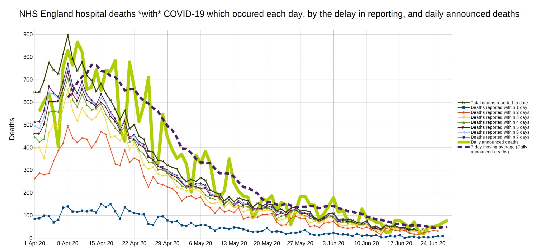
Same again, but a close-up on the last month.

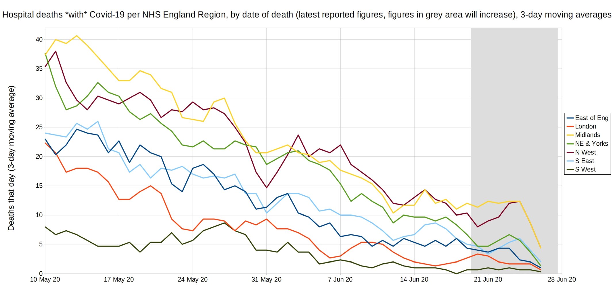
Trendlines (3-day average) for Covid-19 deaths by England NHS region, by date of death. (Note that the numbers in the grey area may increase over the next few days.) NHS England data.
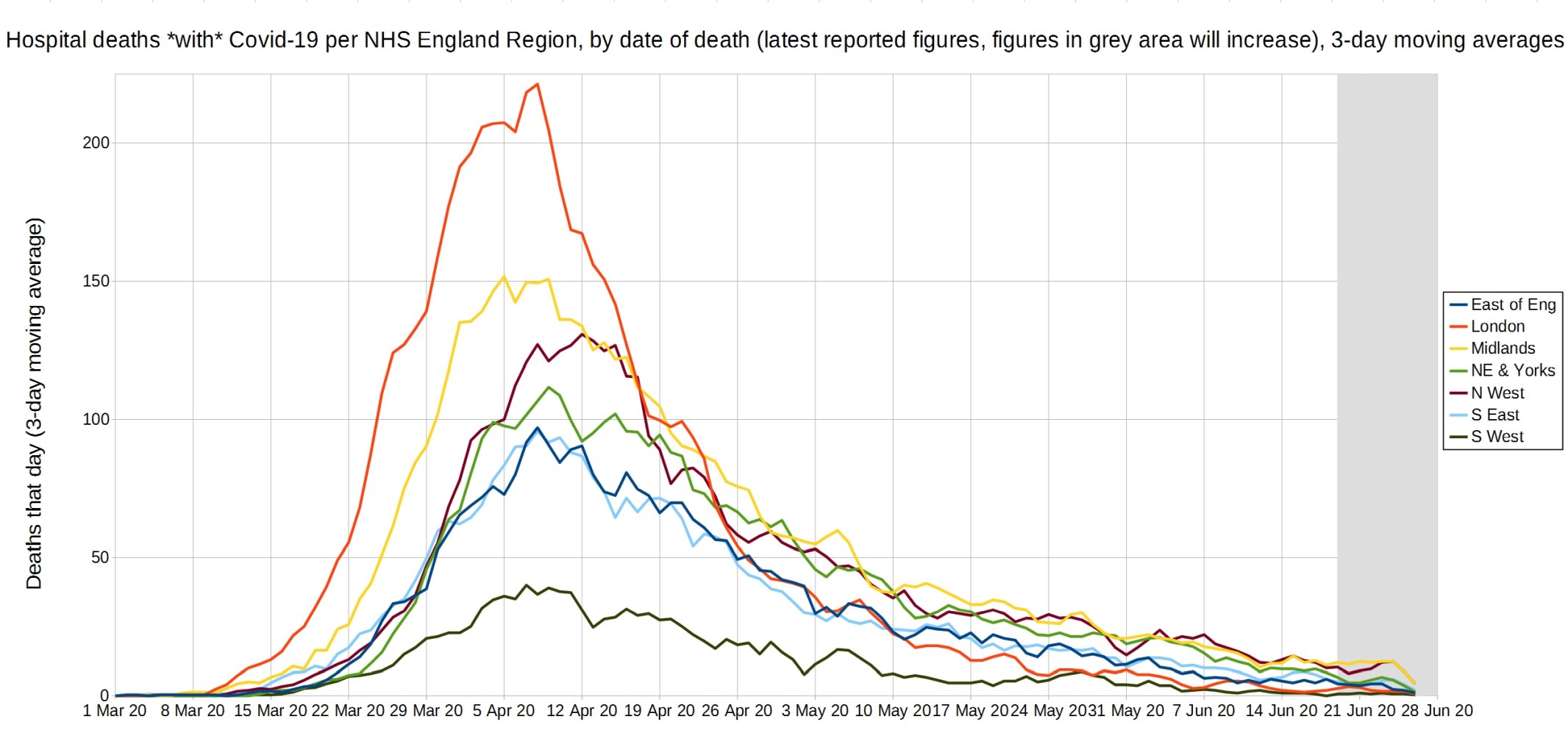
An enlarged version of this graph.
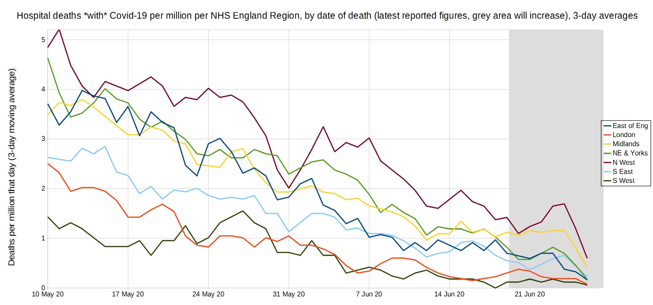
Trendlines (3-day average) for Covid-19 deaths per million by England NHS region, by date of death. (Note that the numbers in the grey area may increase over the next few days.) NHS England data.
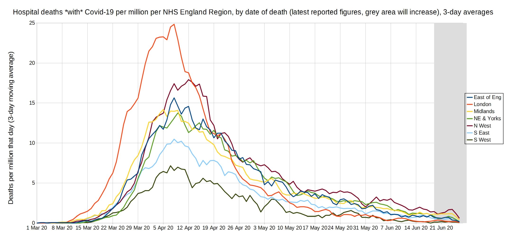
An enlarged version of this graph.
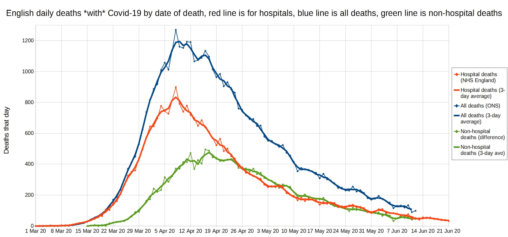
English daily deaths with Covid-19 by date of death. Blue line is all Covid deaths, red line is hospital Covid deaths, and green line is non-hospital Covid deaths. NHS England data.
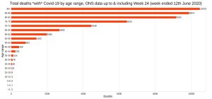
England and Wales total deaths with COVID-19, by detailed age range. ONS week 24 data.

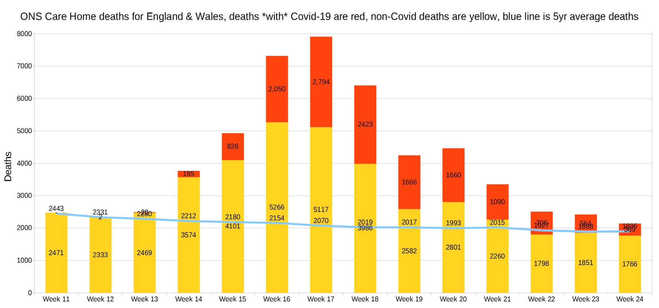
England and Wales weekly Covid and non-Covid care home deaths. ONS week 24 data.
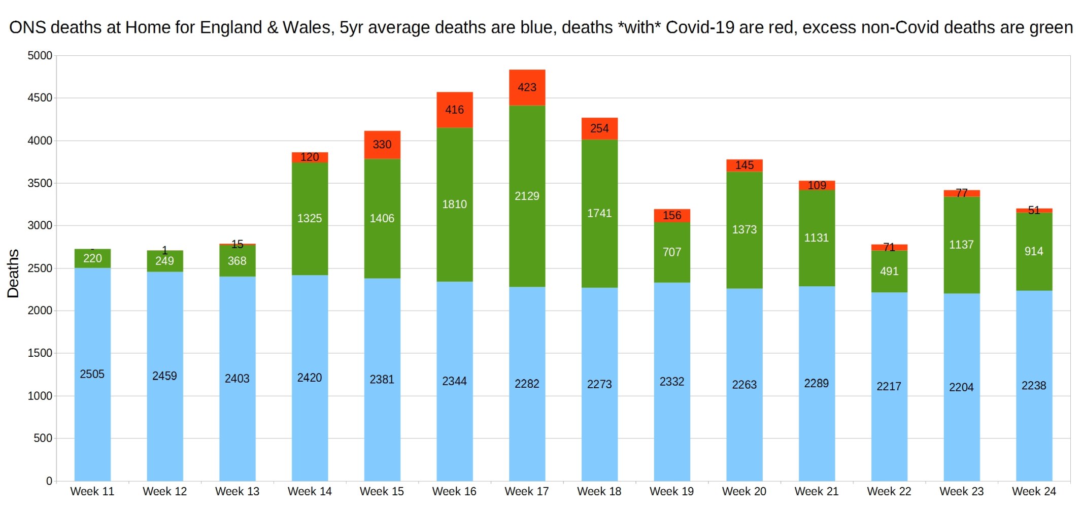
England and Wales weekly Covid and non-Covid deaths at home. ONS week 24 data.
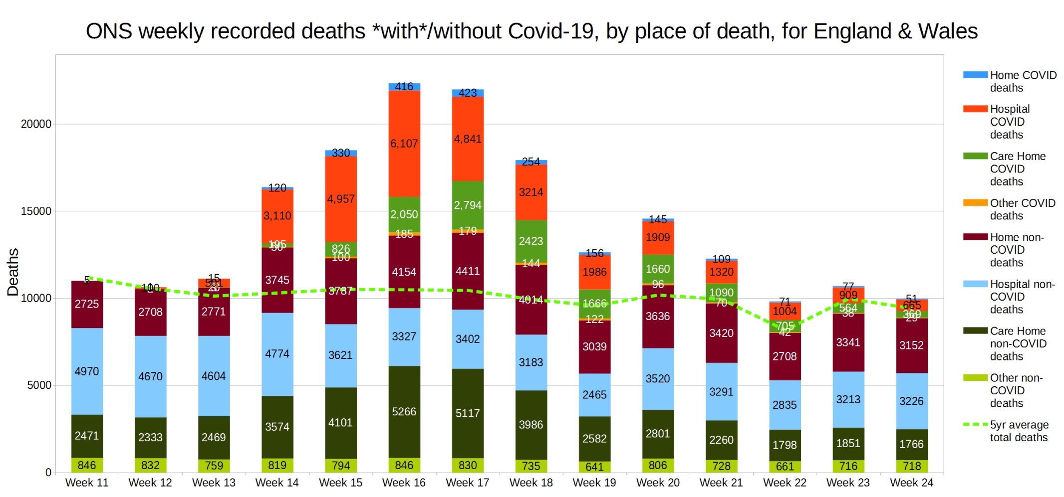
England and Wales weekly Covid and non-Covid deaths by place of death. ONS week 24 data.
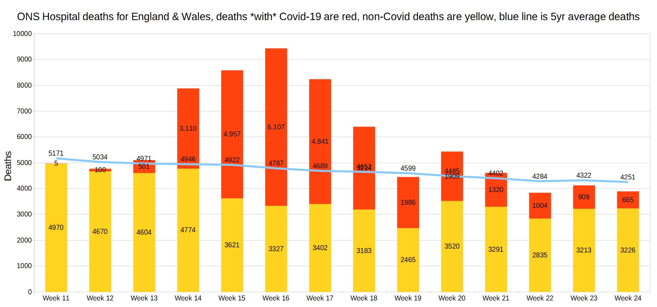
Hospital deaths for England and Wales. ONS week 24 data.
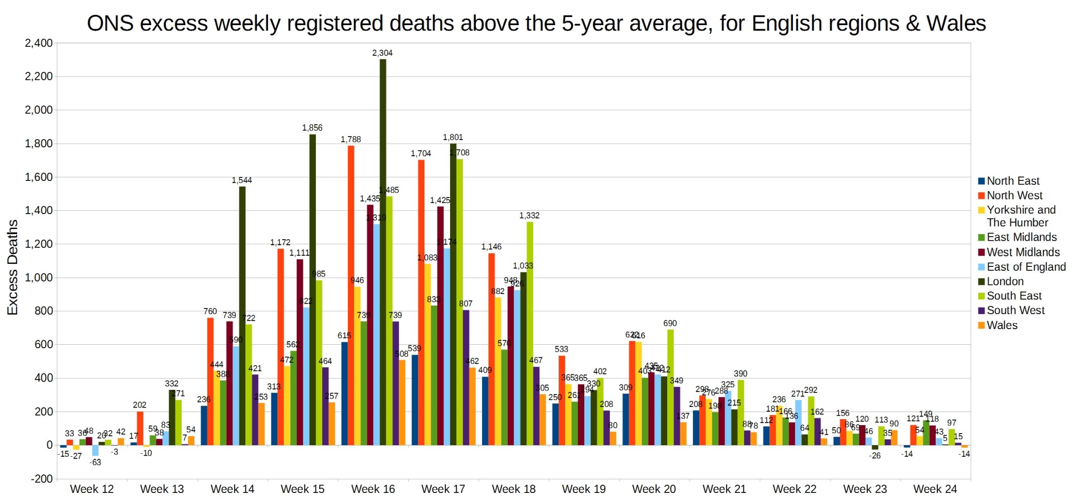
Weekly excess deaths above the 5-year average, for English regions and Wales. ONS week 24 data.
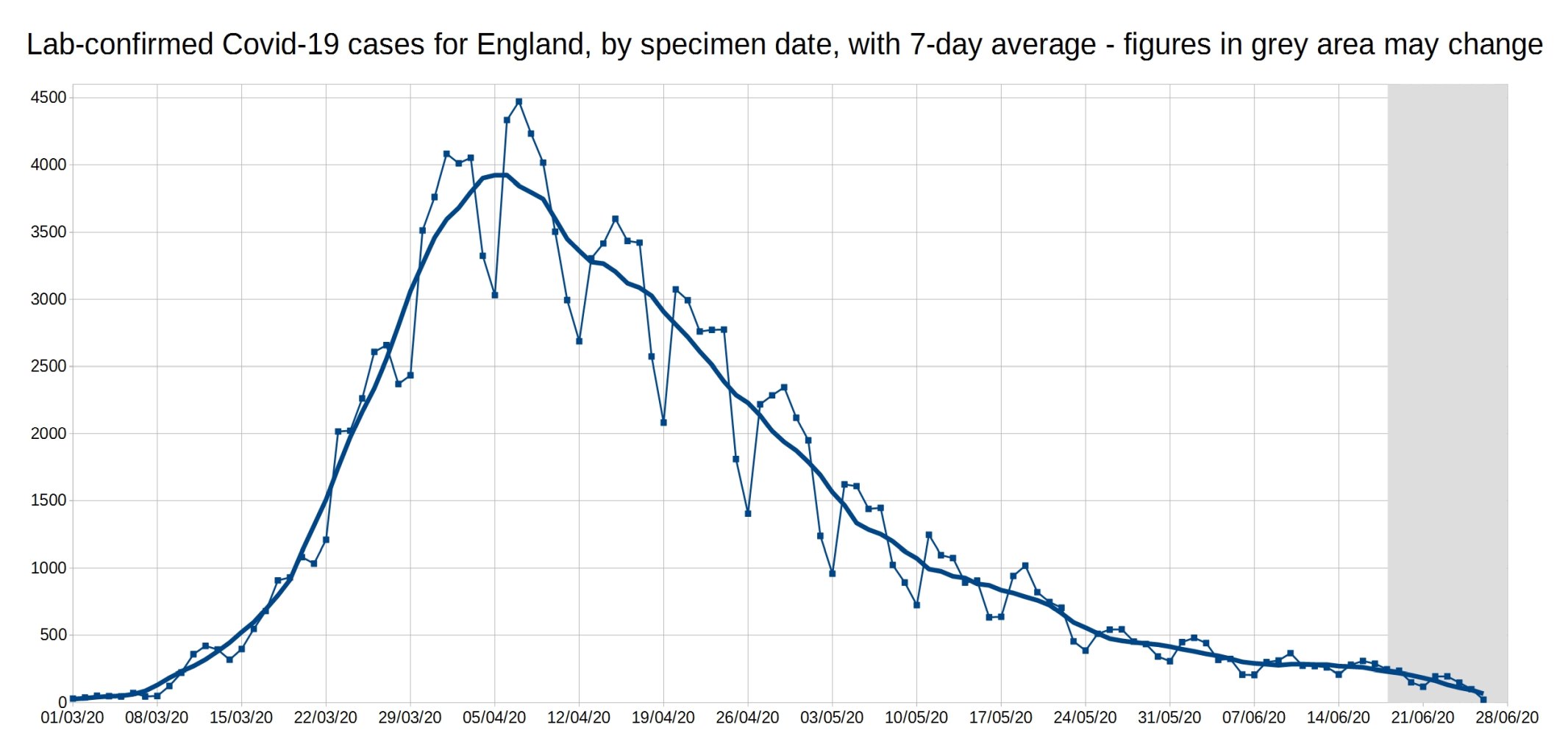
A graph of daily Covid-19 positive tests (by specimen date), for England, with a 7-day average trendline (the thick line). The data shown in the grey area may increase, as it takes a few days for all the test results to come in, especially over weekends.
Graph of the 7-day average positive tests (by specimen date) for each of the English regions. Daily test data removed, as it made the graph too complicated. As before, the data shown in the grey area may increase.
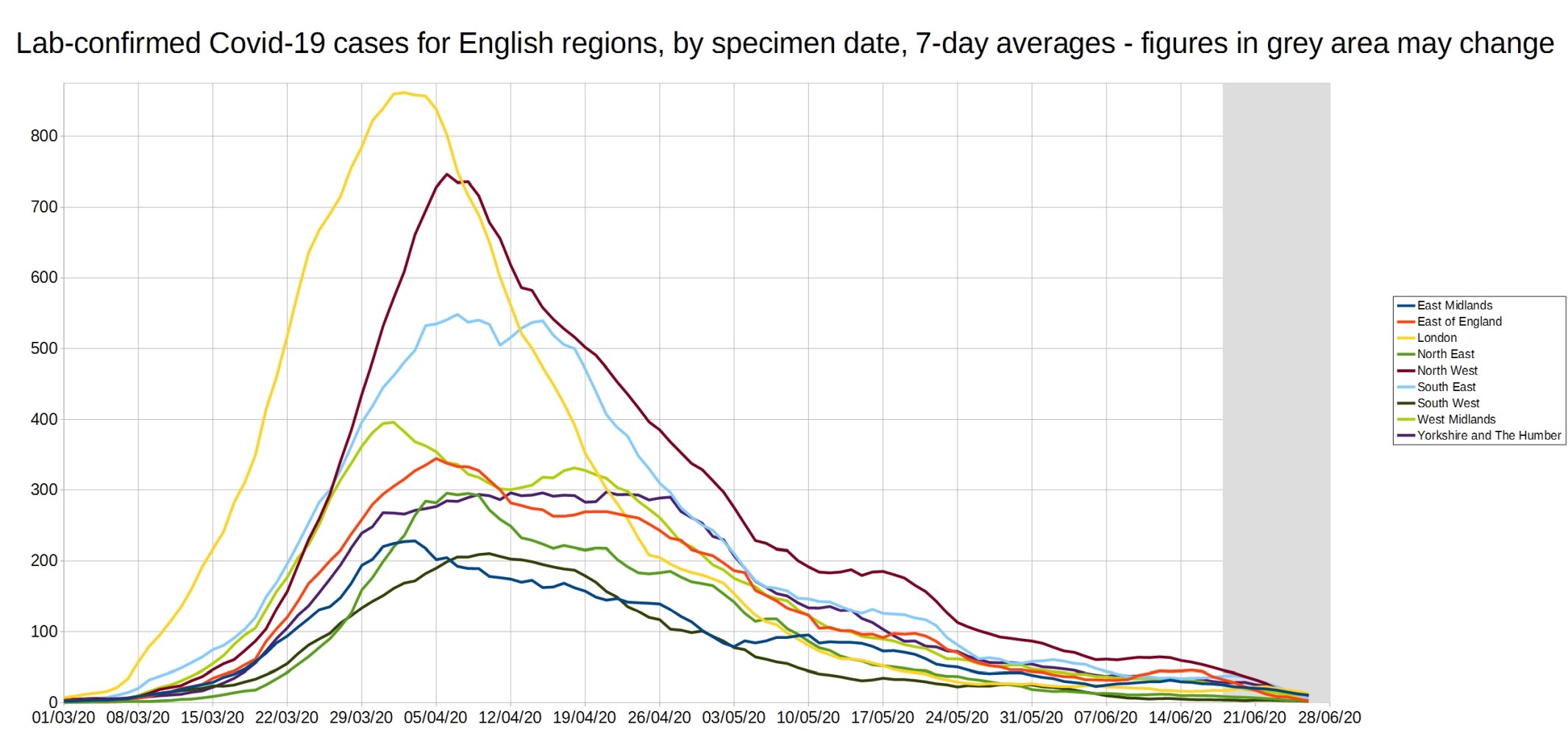
An enlarged version of this graph:

Graph of the ‘R7d ratio’, the ratio between each day’s 7-day average positive tests, and the 7-day average from 7 days previously.
Like the R0 number, this ratio is above 1 when case numbers are increasing, and below 1 when case numbers are decreasing.
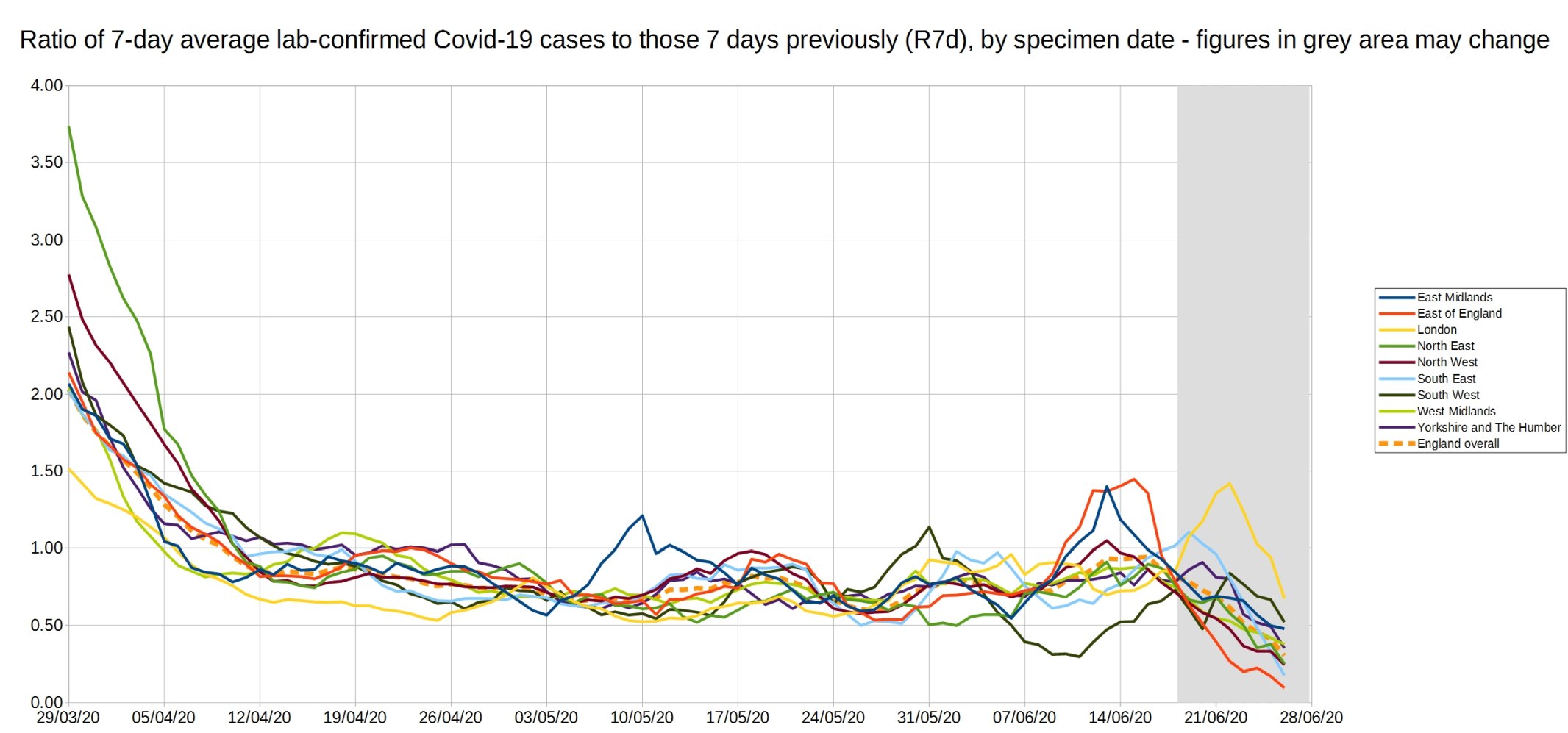
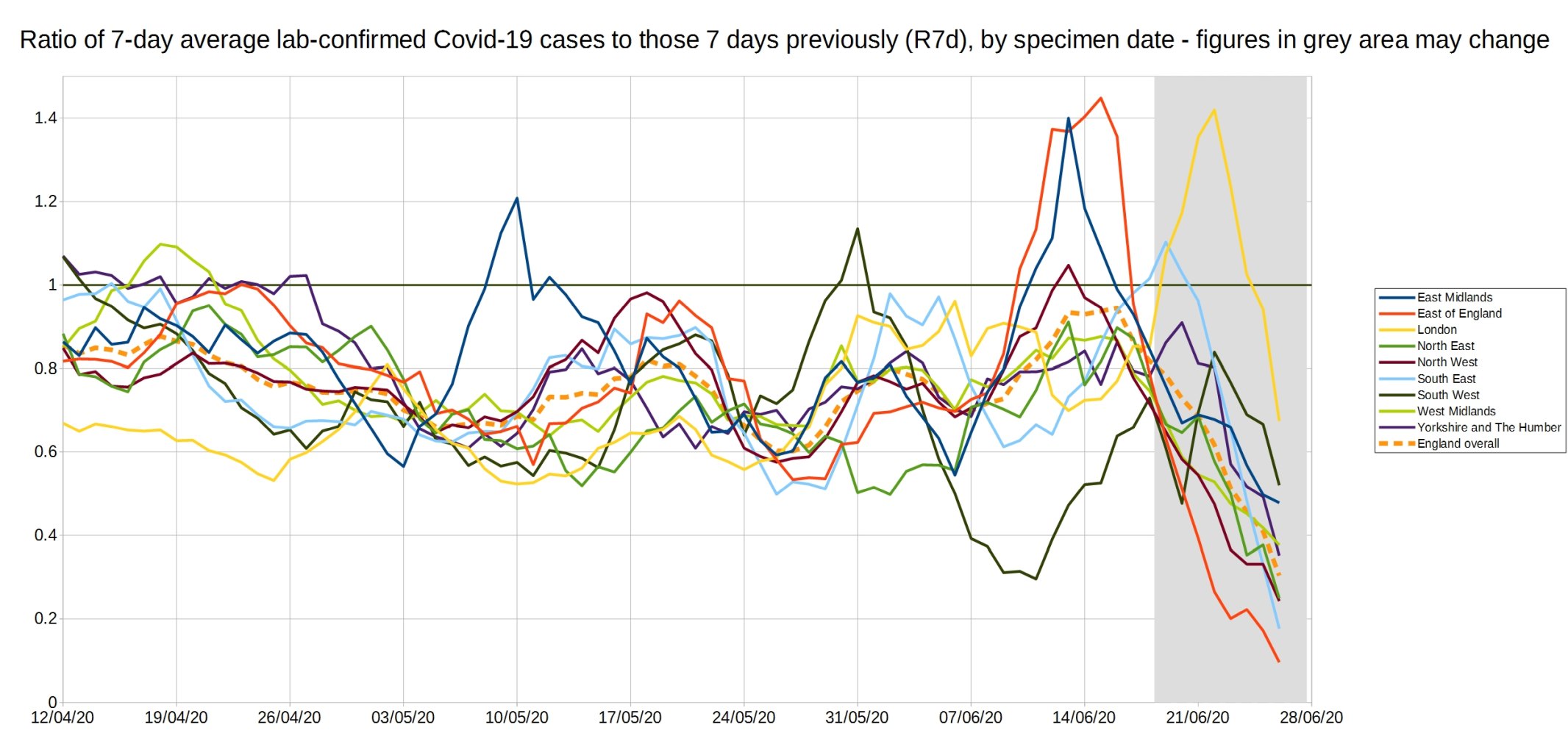
An enlarged version of the R7d ratio.
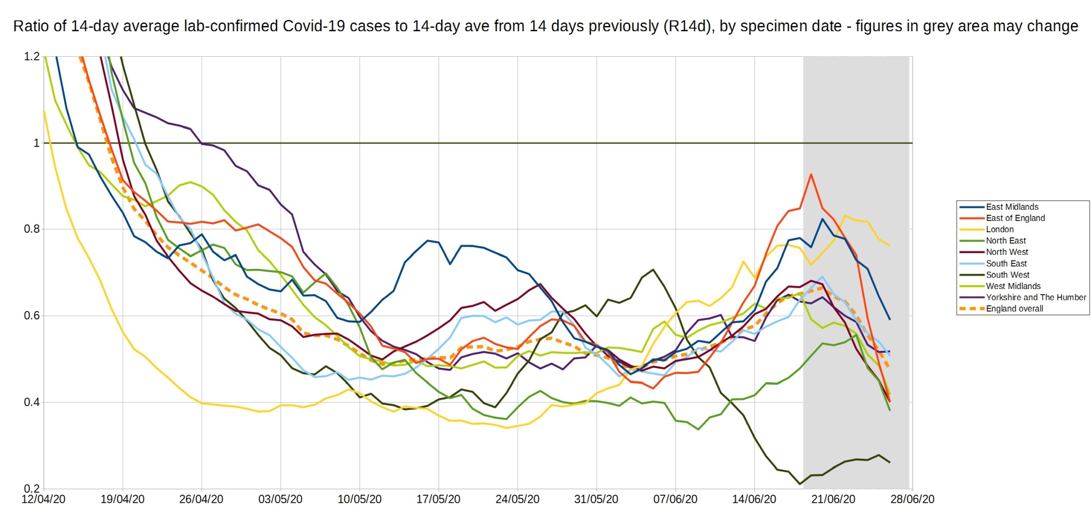
Graph of the R14d ratio, the ratio between each day’s 14-day average positive tests, and the 14-day average from 14 days previously.
8 thoughts on “Week 24 graphs from Christopher Bowyer”
I’ve been catching up on recent articles on this blog, and was interested to see that it’s not only me who has difficulty in easily locating (one would suppose) basic ONS time-series data on population.
Back at the beginning of this charade, my suspicions about the exclusionary reporting of basic information about Covid-19 led to my own examination of historical all-cause mortality (as the only reasonably reliable metric) in relation to population size.
It seemed (as to others here) that any attempt to put figures into a proper context was studiously avoided in general reporting in favour of scaring people with ‘big numbers’ and tragic but isolated cases.
I therefore looked at the mortality figures for Winter/Spring seasons from 1993/94 to 2019/20, mapping against median and mean values for the 27 year run. The mortality was expressed as a percentage of the total population for each year, thus standardising the data.
I avoided the idea of ‘excess’ deaths, since this is a construct essentially, no more than the error component of a given projection model, whether using a moving average or something more sophisticated. Instead, the exercise was simple comparison over a reasonable time span.
In brief :
1. It is apparent that, over the last quarter of a century, the pattern of mortality has followed a curve that closely mimics a sine-wave. This illustrates that linear models are inappropriate in modelling trends.
2. Currently, we are in a period of apparently growing yearly mortality after a run (c. a decade) of comparatively low percentages.
3. In terms of comparison, the 2019/20 Winter-Spring period ranks only *eighth* in terms of percentage mortality – lying at about the third quartile of the 27 years. Although above the median value, this is not an outstandingly ‘excessive’ season.
4. Even the notably high mortality amongst older/more vulnerable groups is less alarming when put into context, since 2018/19 was a season of notably *low* all-cause mortality. It is logical that a higher percentage of the vulnerable survived into 2019/20, and were consequently even more vulnerable to higher infection rates. In fact, if the two seasons are taken together, this balancing hypothesis is borne out, with the combined average lying very close to the overall mean for the time series.
It is still jaw dropping to look at that graph of the care home deaths over the last 3 months. Not only could all those ‘red with covid’ deaths have been prevented by simply placing rigorous hygiene and visitation procedures around care homes, but all those ‘yellow non covid’ deaths are the result of people who should have gone to hospital but didn’t. Or they just died in loneliness and despair as no one could visit them. All those people, about 25,000 by my count. Lives well lived, who spent their final hours without the care and comfort of their families who had the chance to say goodbye and thank you to their loved ones denied. Totally unnecessarily because of the flawed decision making in the face of a self-inflicted and totally unnecessary panic. It makes me mad.
One of the key metrics for Covid is the case mortality rate (CMR). In May, ONS calculates this to be 210 per 100000, or 0.21%. Earlier months may have shown higher figures, either because of less comprehensive testing, or, perhaps, better treatment methods emerging.
Now consider flu, where the mortality rate is perhaps 0.13%. Flu is an age-dependent infection; older people, with a longer history of vaccinations, are less susceptible than the young. Covid is age-independent; nobody is immune. So the age profile of Covid infectees is older than flu infectees.
Older people are more likely to succumb to a respiratory infection than younger people, so you would expect a higher mortality for Covid. We see that, but only just.
Conclusion: Covid is no more deadly than flu, but nobody yet has immunity. So it kills the weakest, ie primarily the old and sick. Is that worth this unprecedented blanket lockdown? The figures suggest a resounding No.
I too have navigated the ONS site and found it impossible to check statistics. For example I wanted to check what is happening in Leicester. Last week someone posted Datawrapper stats but that too seems to be difficult to navigate to find this week’s trends. It would be useful if there was a link to ONS figures region by region; or a reference to the latest Datawrapper region by region graph.
Hindsight as we all know can be very clever. However, the UK was a little behind the pandemic curve and it will be interesting to know how well the health statistics collected by those countries ahead of us reflect those of ours. I would expect them to approximate to them however. If our epidemiologists had seen that the most vulnerable group was the elderly sector (over 54), particularly where there were underlying health problems, things could have been remarkably different. Why did we not concentrate on locking those down rather than restricting all age groups which has resulted in severe damage to the economy. Had we concentrated on this group, hospitals, elderly homes we would have saved a lot more people with a situation more akin to a severe outbreak of flu.
As a retired environmental health officer I am concerned that much of the advice that Government and Public Health England have given out is vague and very general rather than specific where necessary. As examples I would include the methods of making and the correct wearing of masks and face coverings: I have seen numerous people, including news reporters on tv, wearing masks while broadcasting with their nostrils uncovered.
I don’t believe that sufficient thought has been given to the return from lock down. This includes return to school which I believe is fraught with problems including the large numbers of school children who congregate with no disciplined control after school while waiting to catch public transport after school. With regard to all forms of public transport I have written to Public Health England suggesting an urgent, if only temporary, greater reliance on fresh air rather than air conditioning much of which relies on re-circulated air through poorly maintained systems.
>Why did we not concentrate on locking those down rather than restricting all age groups
If you watch Ferguson’s Unherd interview he explicitly says that would have been too hard.
>This includes return to school which I believe is fraught with problems including the large numbers of school children who congregate with no disciplined control after school while waiting to catch public transport after school.
We don’t worry about this with flu, why should we worry about it with Covid?
Tony Monk: “If our epidemiologists had seen that the most vulnerable group was the elderly sector (over 54)”
over 54? elderly?? Them’s fighting words, Tony! 🙂
More seriously, look again at Mr. Bowyer’s graph “England and Wales total deaths with COVID-19, by detailed age range. ONS week 23 data.” Protecting those over 75 would have prevented about 70% of the deaths ascribed to C-19; and most of the deaths below 75 are of unhealthy people with pre-existing conditions.
At the risk of sounding like a broken record, all of this was obvious months ago from the Diamond Princess cruise ship experience. Lots of people who looked at the data were pointing out the limited “At Risk” group at the time. But the Political Class in the Western world felt compelled to ape the Chinese kabuki response of Lock Down — and now, having tasted that power, those same politicians and bureaucrats are very reluctant to let go of it.
In the Forbidden Palace, the leaders of the Chinese Communist Party must be laughing their heads off at how easy it is to manipulate those super-smart Oxbridge alumni.
As Gavin Longmuir says : “Protecting those over 75 would have prevented about 70% of the deaths ascribed to C-19; and most of the deaths below 75 are of unhealthy people with pre-existing conditions.”
I think that may well be true, and the obvious flaw in this unjustified resort to locking everyone up has been the neglect of the long-recommended *targetted’ quarantine.measures.
… which should immediately set alarm bells ringing over the issue of motivation and momentum.
But, even though, the protection of the elderly/vulnerable certainly makes basic sense, it is necessary to see this high spike of age-related mortality in the context of two factors :
1. That in the 2019/20 infection season, there was a notably high percentage of he population who were extremely vulnerable, following the contrasting mild infection season of the previous year. This population will have been susceptible to a whole range of agents.
and
2. That it is totally obscure as to how many of those individuals actually died ‘of Covid’, since the post-mortem attribution to the virus was artificially encouraged – to the point even of guess work in some cases.
Take these issues and cases out of the equation for fatality rates, and you have a very different picture of the actual lethality of the disease.
Not that I’m suspicious …….
Comments are closed.