Hector Drummond Magazine reader and contributor Christopher Bowyer has done some Covid-19 test result graphs. The last one is particularly relevant to the current state of play, so please read to the end. (All graphs can be clicked to enlarge.)
Christopher notes that:
With the testing graphs, the https://coronavirus.data.gov.uk website has been redone, so now you can only download one lot of data at at time, rather than all the data in one big .csv file as before. So I have just done three graphs from the new website, one of positive tests in England, one of Eng hospital admissions, and one of hospital admissions per 1000 tests.
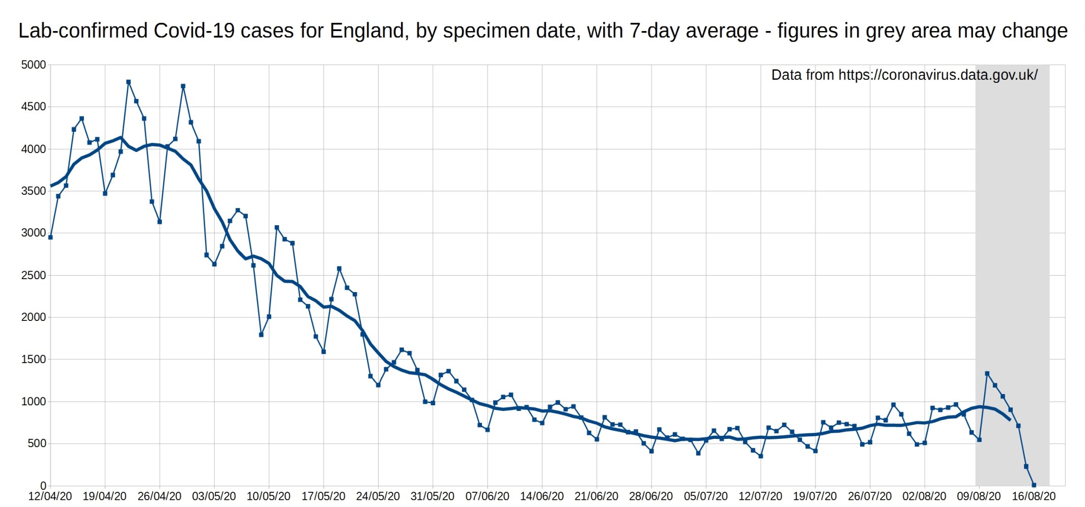
First up we have the graph of daily Covid-19 positive tests (by specimen date), for England, with a 7-day average trendline (the thick line). The data shown in the grey area may increase, as it takes a few days for all the test results to come in, especially over weekends.
Note that the coronavirus.data.gov.uk website now shows all the Pillar 1 and Pillar 2 tests, with no way of separating them, so these numbers are a bit different from earlier graphs due to this change.
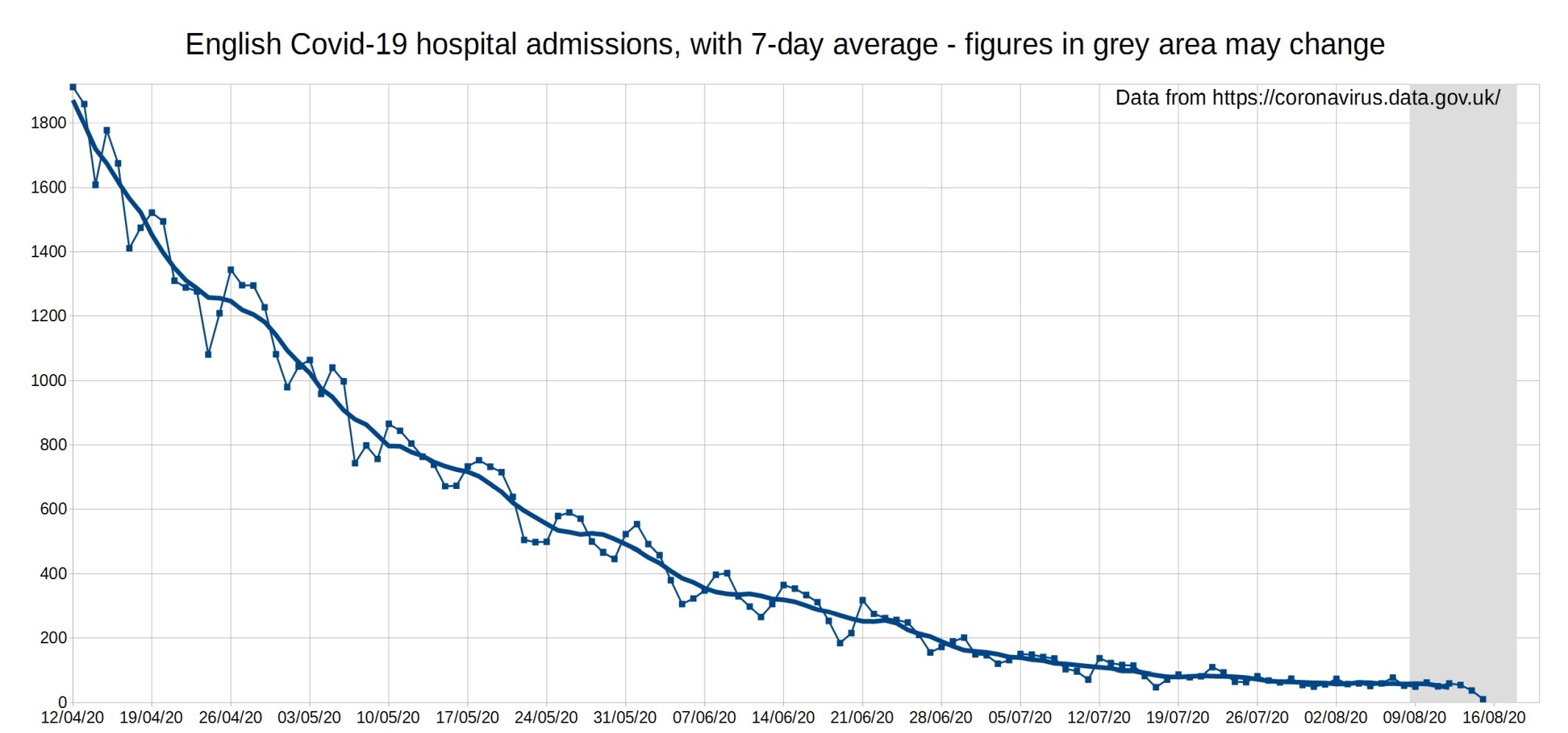
English Covid-19 hospital admissions. Data from coronavirus.data.gov.uk.
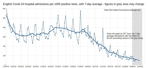
English Covid-19 hospital admissions per 1000 positive tests. Data from coronavirus.data.gov.uk.
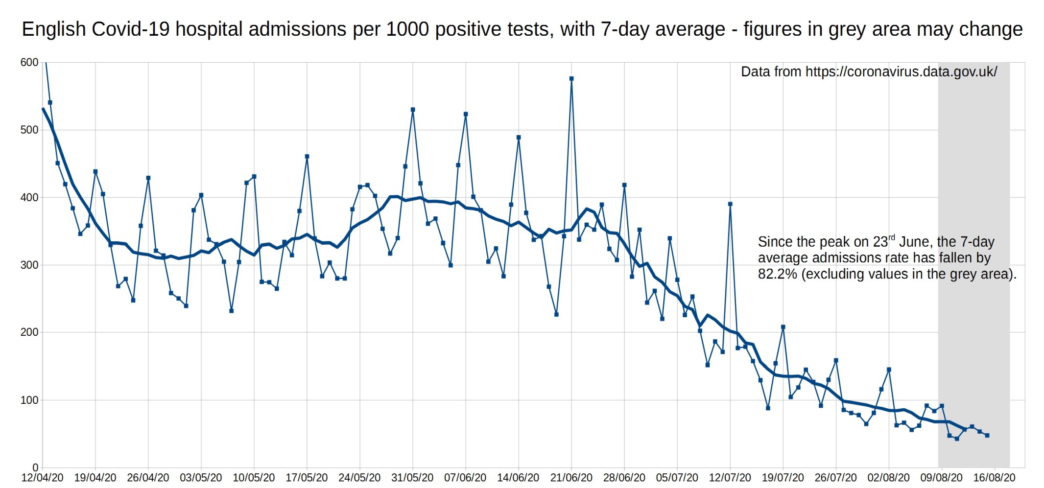
Of this graph, Christopher writes:
The last graph is really interesting, as from mid-April to the last week in June the 7-day average has been fairly consistent, between 300 and 400 admissions per 1000 positive tests. But since the last week of June, probably due to the increased testing, the admission rate has fallen sharply, from 375 per 1000 positive tests to less than 100 per 1000 positive tests. This might help put the recent media/government hysteria and fear of a ‘second wave’ into context, by showing that the small increase in cases (due to the ramped-up testing) has not caused a similar spike in hospital admissions, they have continued to fall.
6 thoughts on “Falling admission rates: Covid test result graphs from Christopher Bowyer”
Christopher
Interesting, thanks
Great analysis. I would imagine that most of the people testing positive and being hospitalised would be in the pillar 1 data.
Everyone I know who has been tested at the pop up test places has not been tested because they feel ill, yet their test results are affecting other people’s lives.
@Graham, I would expect that was the case, that most of the hospital admissions are pillar 1 data.
I also wonder how many of the hospital admissions are going into hospital for non-Covid reasons, as everyone who is admitted to hospital is tested – so the actual number of people being admitted to hospital due to Covid could be even fewer than the data shows!
@Christopher
Or tested positive 6 weeks before admission for ‘run over by a bus’
https://lockdownsceptics.org/2020/08/21/latest-news-110/#hospital-admissions-over-counted
Great stuff. I’d be interested to see how the “positive tests per X tests” graph is looking lately, as it appeared to be steadily decreasing last time…
Comments are closed.