David Clark sent me some graphs in July (up to week 25), which in all the chaos of the times I’ve only just now got around to sorting. ONS data is here.
Here are the graphs with David’s comments on them. (All graphs can be clicked to enlarge.)
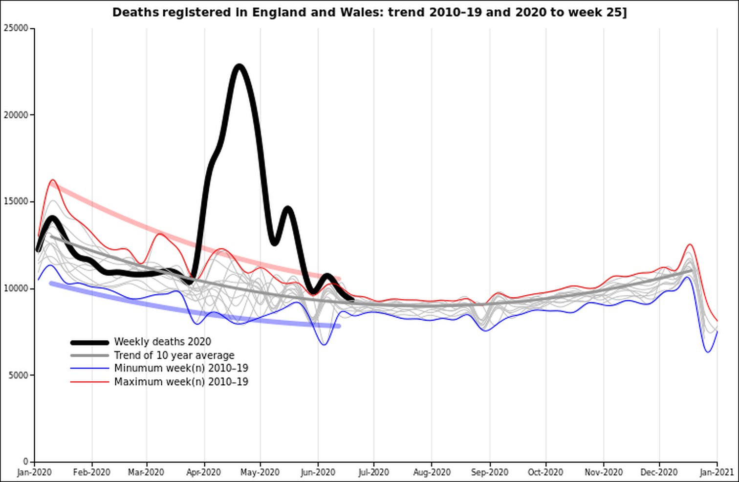
“This year in the context of the past ten years. All cause deaths are now down to normal levels for this time of year. Will they go below trend over the summer? If they rise in the autumn is that a ‘second wave’ or just normal as winter approaches?”

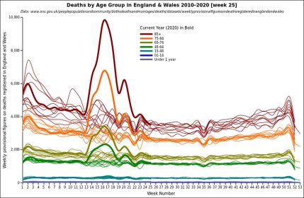
“This year by age group. Back to normal even for the very old and frail. If you are less than 45 years old there never was anything to worry about.”
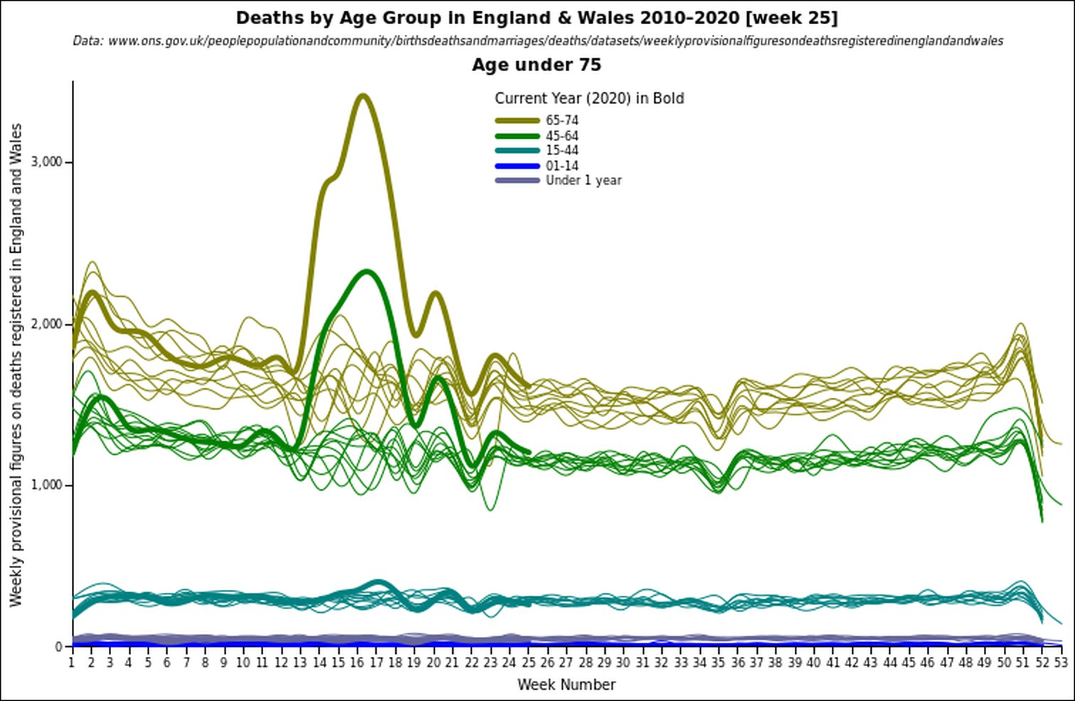
“Just to emphasise the low risk for the young and fit, the same data as above but scaled up to concentrate on those in the prime of life.”

“[Covid] Deaths by date of death rather than date of registration. Using England only to compare deaths in hospital attributed to COVID-19 with the total recorded by ONS. The difference being COVID-19 deaths not in hospitals.”
Update: David has sent me some updated graphs which I will put up in a few days. Also, please donate or buy my book in order to keep my work going (links on sidebar. Currently sorting out a Subscribe Star page if you prefer to use that for subscriptions.)
One thought on “David Clark’s July graphs”
I have posted the most recent version at http://djclark.co.uk/WuFluPanic.html
The COVID numbers continue to decline. There is a slight uptick in deaths registered from all causes this week; not unusual at this time of year but compared to past years the number in the 45–64 age range is more than past years. Is this the consequence of all those things our National Covid Service has not attended to this year?
As I noted to Hector in July, the epidemic is over, just the political fallout remains.
Comments are closed.