
New Covid-19 graphs from Christopher Bowyer. ONS data here. NHS England data here. Other Covid data here. (The ONS data is up to the end of week 34, the week ending 21 August. The other data is generally more recent, see each graph for the date.)
All graphs can be clicked to enlarge.
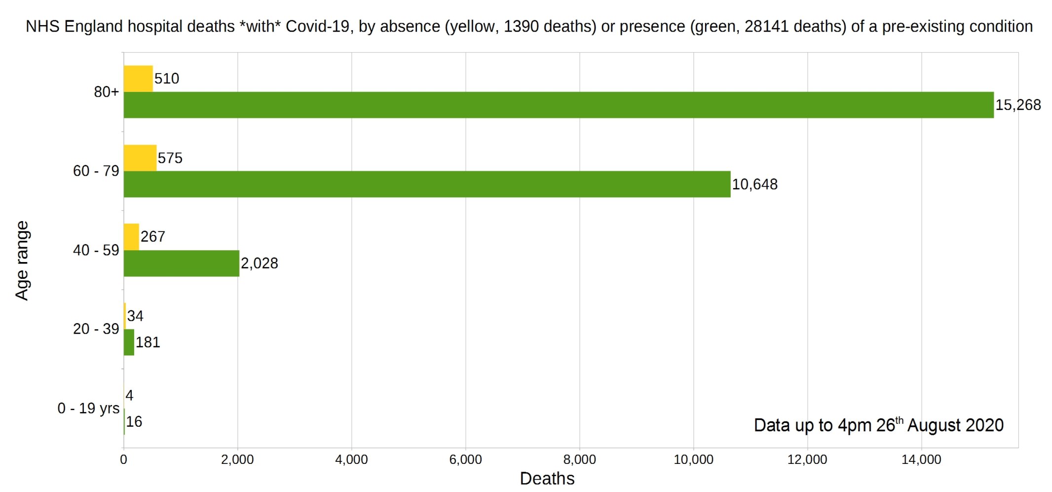
England deaths with Covid-19 by absence (yellow) or presence (green) of a pre-existing condition. Data from NHS England.
Percentage of deaths with Covid-19 by pre-existing condition. (95% have one or more P.E.C.) NHS England data.

Note that the most common pre-existing conditions are diabetes, followed by dementia, chronic pulmonary disease, and chronic kidney disease.
Trendlines (7-day average) for Covid-19 deaths by England NHS region, by date of death. (Note that the numbers in the grey area may increase over the next few days.) NHS England data.
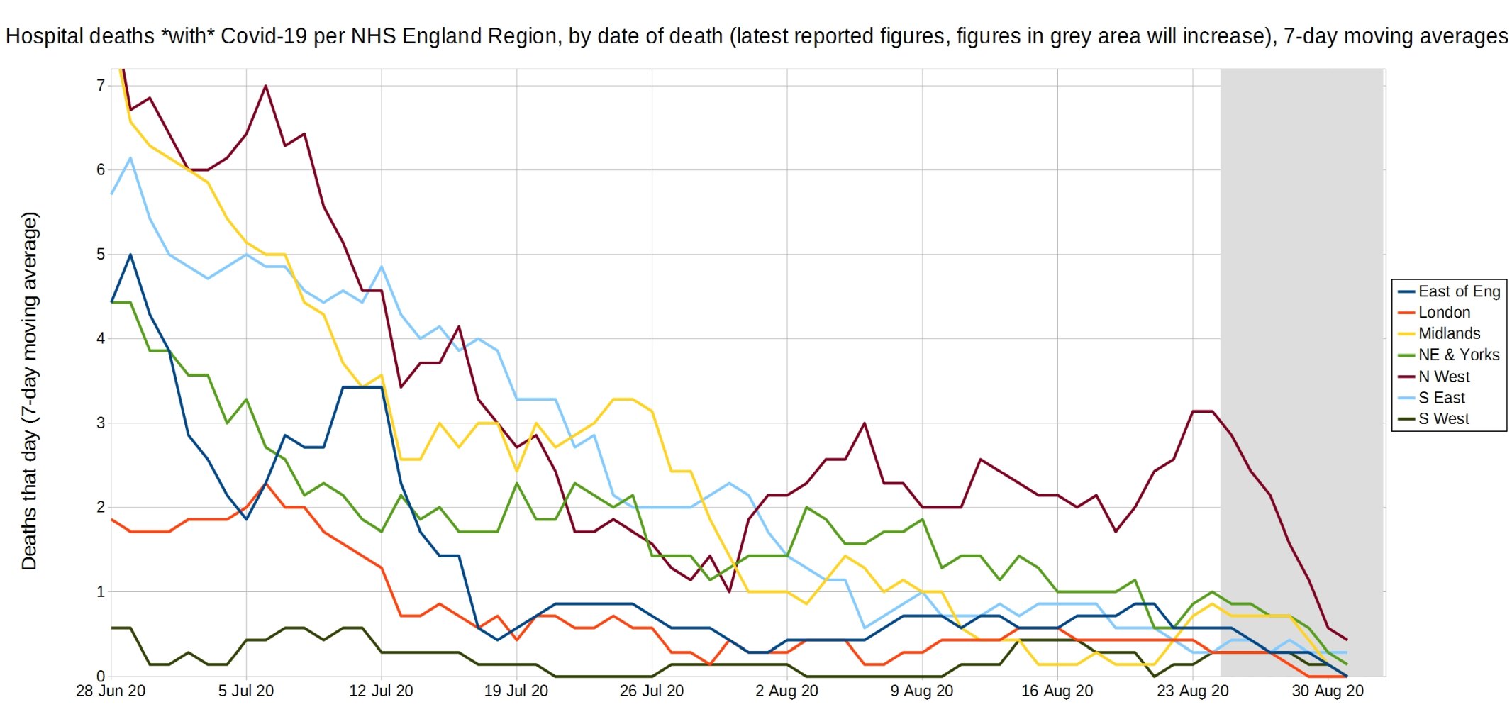
Christopher writes: “The bump in NHS England deaths around the 23rd August appears to be due to the North-West, as their 7-day average daily deaths rose to above three per day, whereas all other regions 7-day average deaths are one or fewer per day. Despite this, the 7-day average ONS deaths with Covid have been consistently below 20 per day since the end of July, and the NHS England deaths with Covid (positive test) are consistently below 10 per day over the same period”.
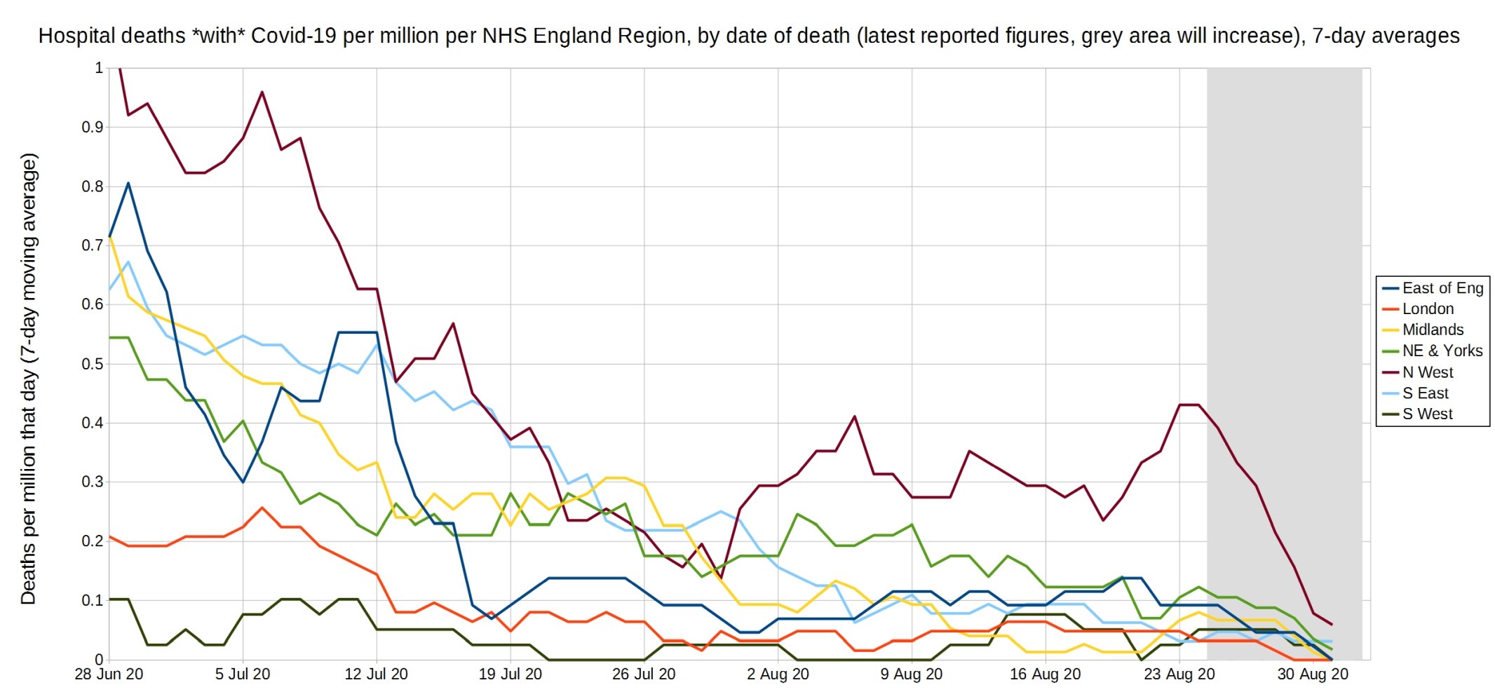
Trendlines (7-day average) for Covid-19 deaths per million by England NHS region, by date of death. (Note that the numbers in the grey area may increase over the next few days.) NHS England data.
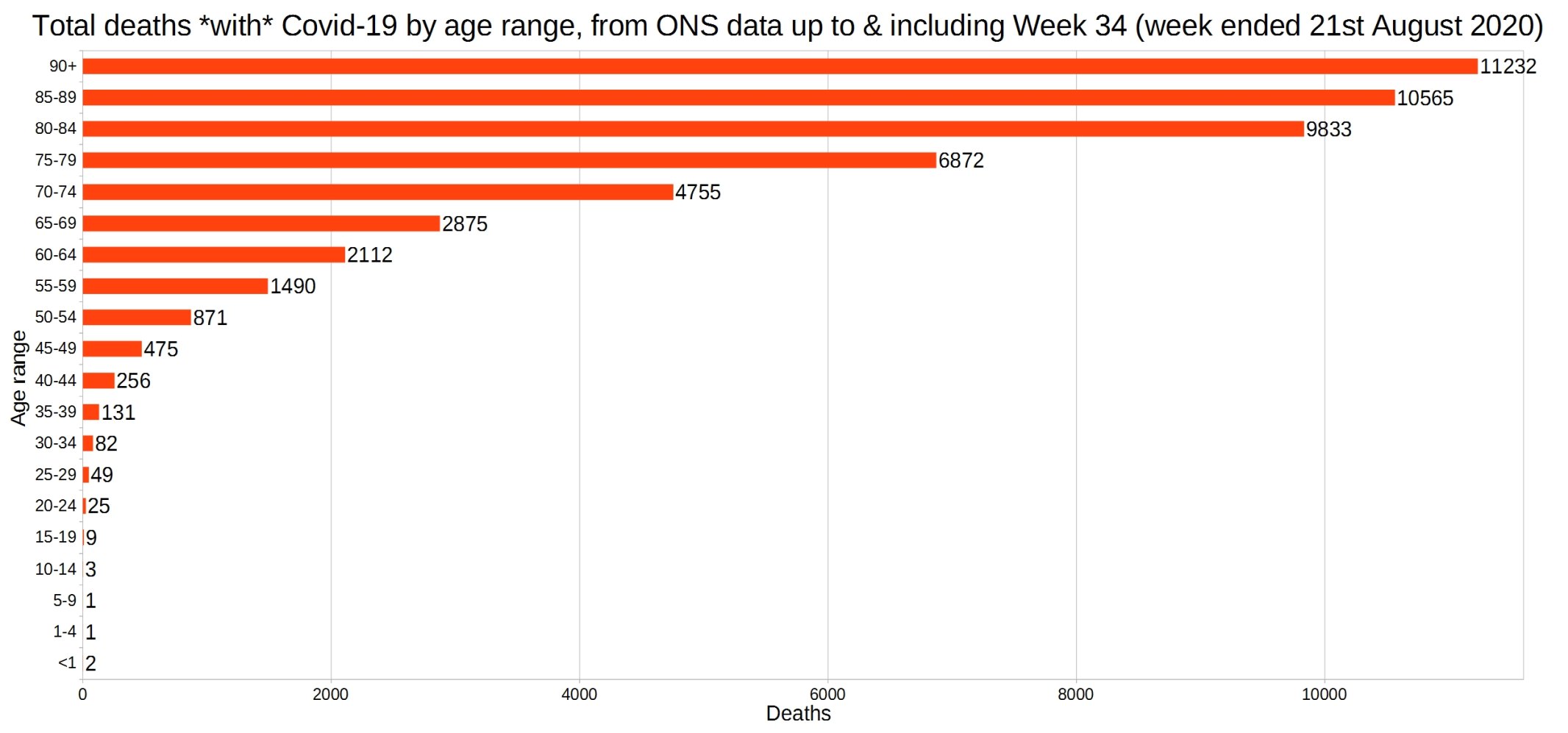
England and Wales total deaths with Covid-19, by detailed age range. ONS data.
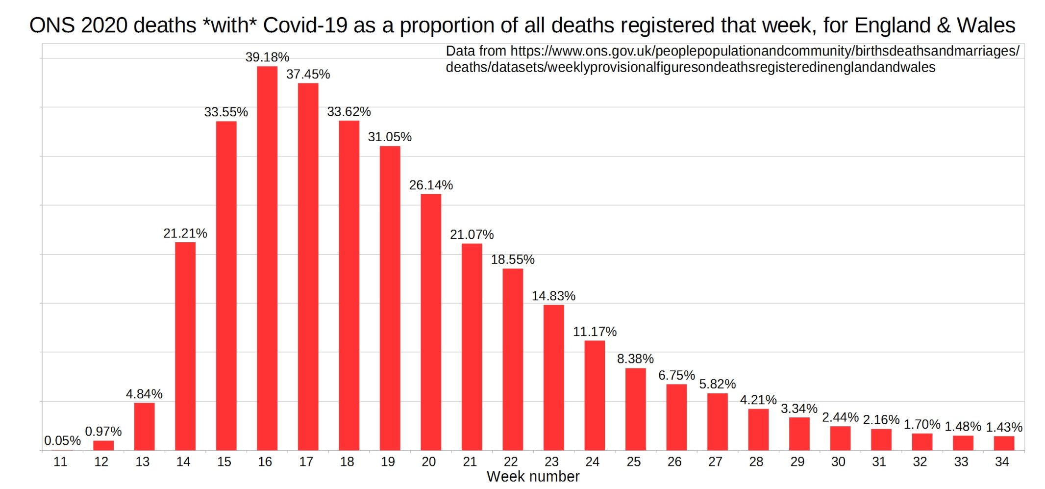
ONS England and Wales Covid-19 deaths as a proportion of all deaths registered that week.
ONS England and Wales weekly all-cause deaths compared with the five-year average.
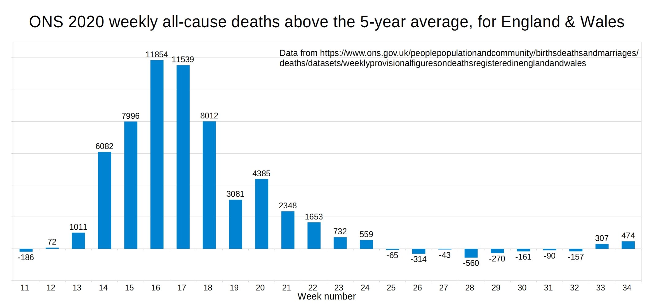
Christopher: “The ONS weekly registered deaths have been significantly above the five-year average for the past two weeks now. This could be due to excess deaths from the heatwave, or the lack of NHS treatment starting to show up in the deaths figures, or a combination of the two. It is not due to more deaths with Covid though, as these as a percentage of weekly deaths have continued to fall. It is also noticeable for these two weeks that deaths have risen across the board, in care homes, home and hospital settings”.
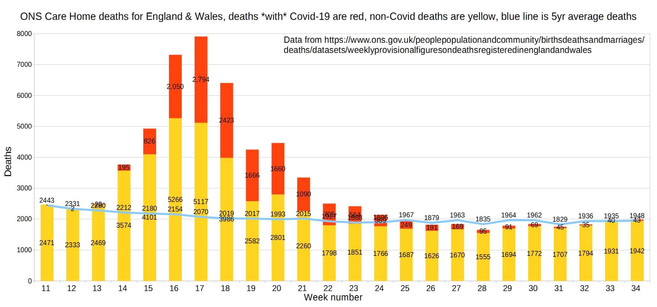
England and Wales weekly Covid and non-Covid care home deaths. ONS data.
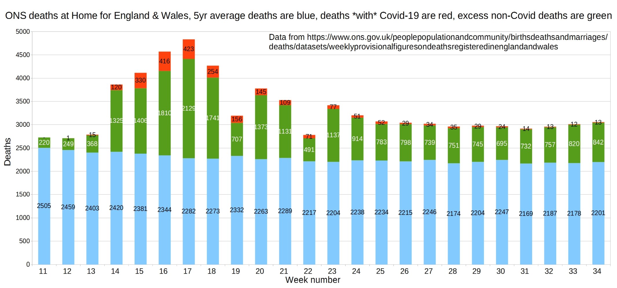
England and Wales weekly Covid and non-Covid deaths at home. ONS data.
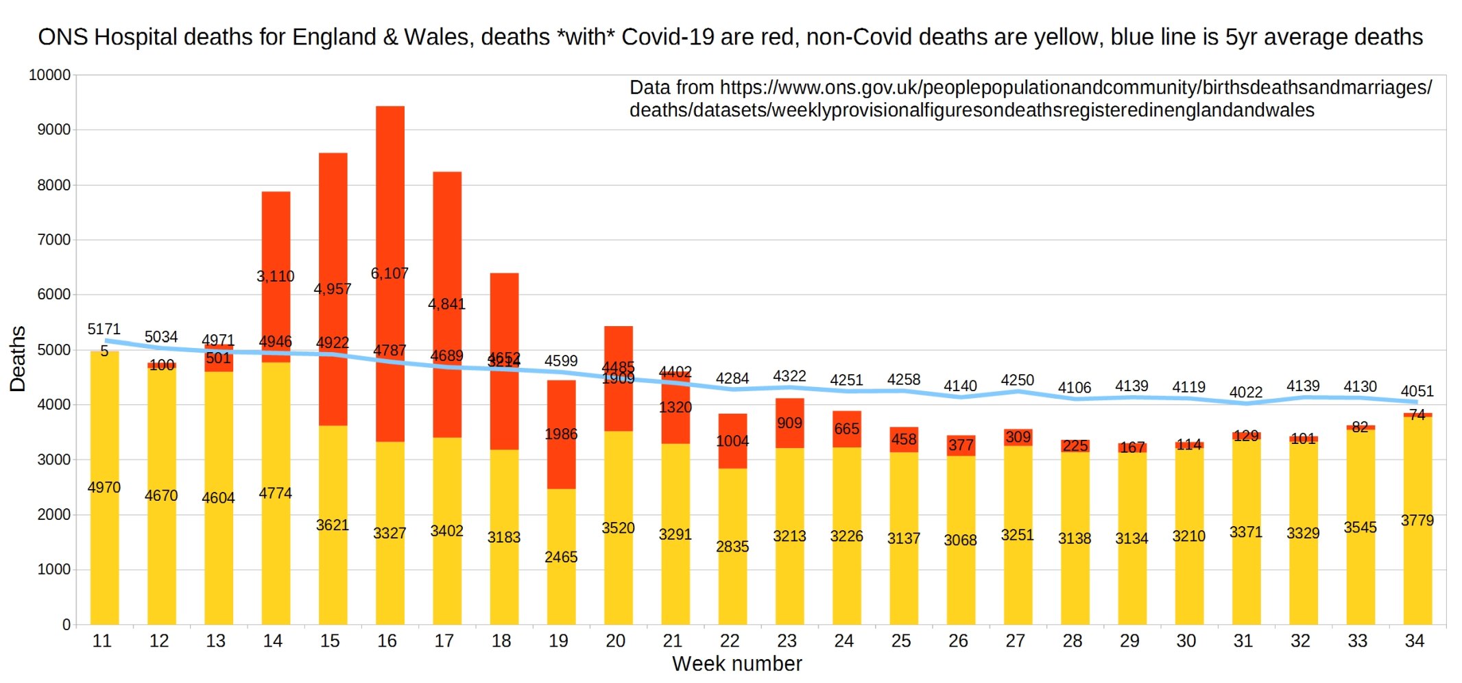
Hospital deaths for England and Wales. ONS data.
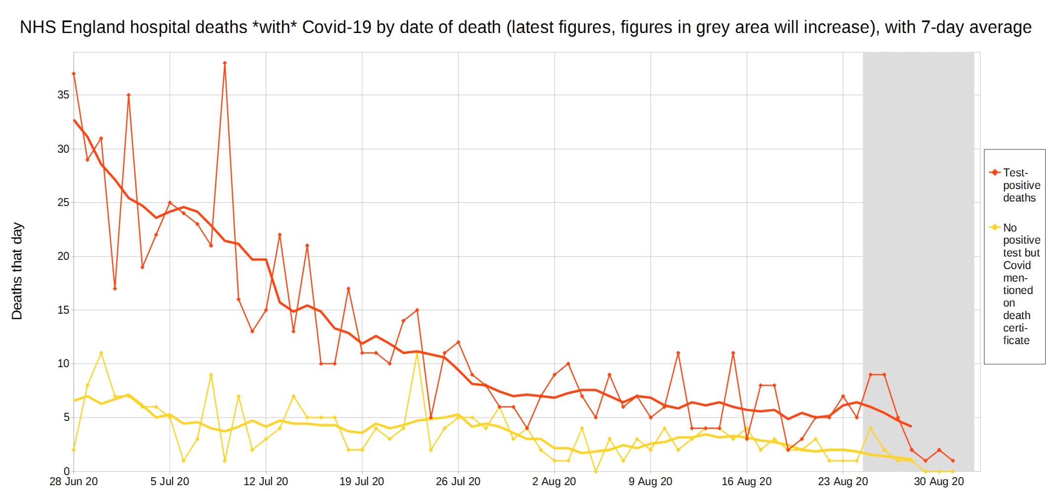
NHS England hospital Covid-19 deaths each day, latest reported figures, with 7-day moving average trendline.
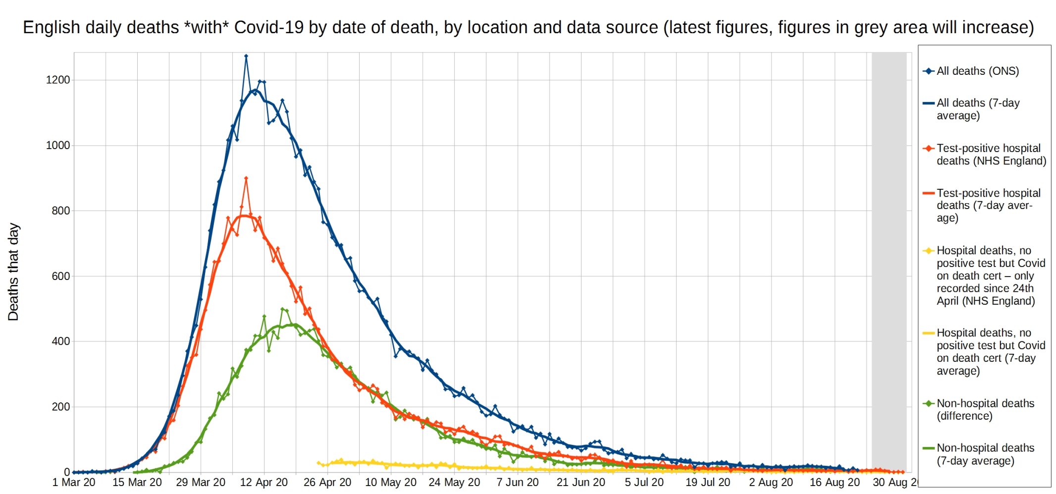
All Covid, hospital Covid, and non-hospital Covid deaths in England each day, with 7-day moving average trendlines. (The blue lines are the ONS’s overall Covid-19 death figures, the reddy-orange lines are NHS England hospital deaths with a positive Covid result, the yellow lines are NHS England hospital deaths reported as Covid on the death certificate, but without a positive test result, and the green lines are the non-hospital Covid deaths, derived by subtracting the orange and yellow numbers from the blue numbers.)
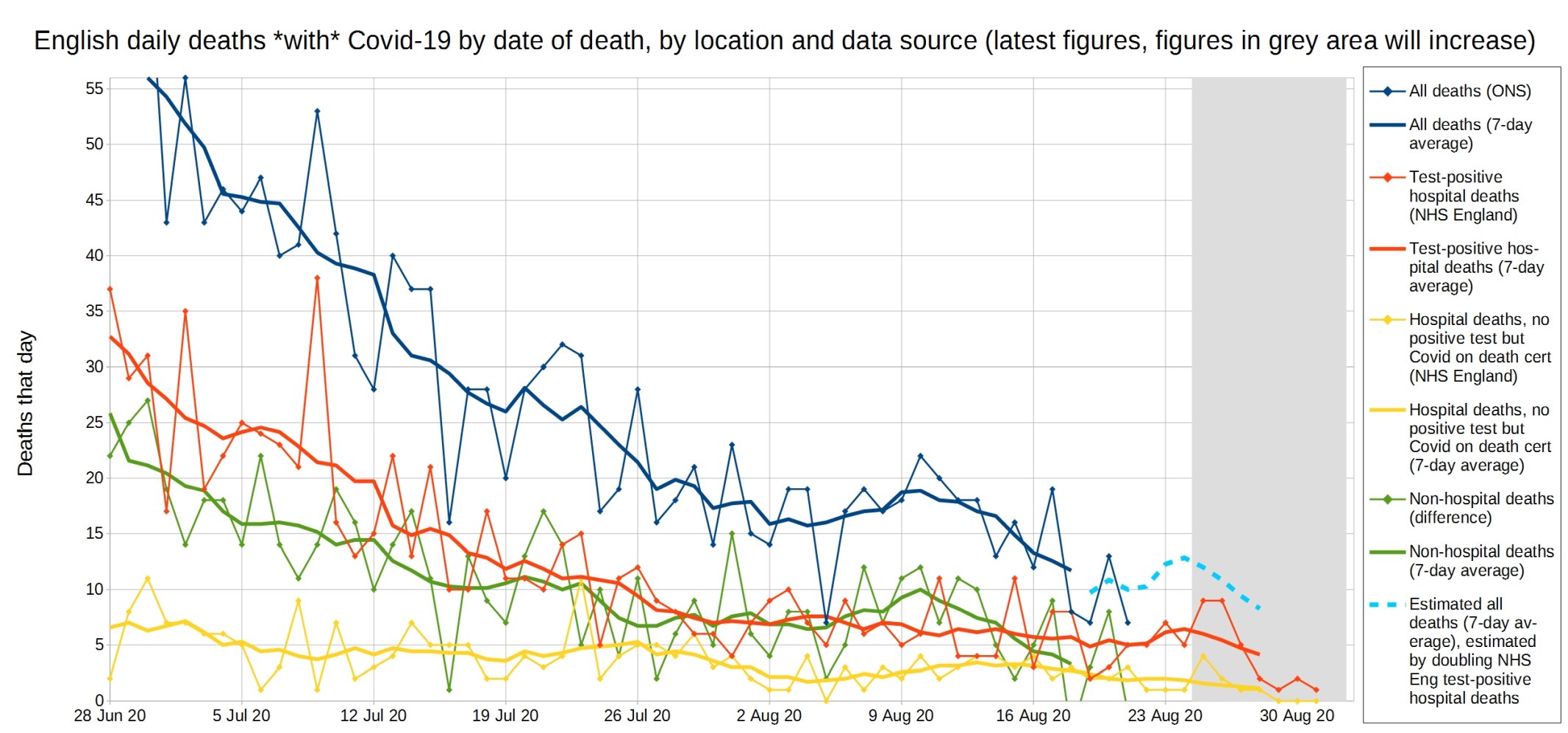
A close-up of this graph, looking at recent weeks.
Christopher writes of this graph: ‘I realised the ONS count as Covid deaths all deaths where Covid is on the death certificate, even if there isn’t a positive test. So I have added two of the NHS England graphs. Otherwise when comparing NHS England and ONS [England] Covid deaths, it looked like non-hospital deaths were more than hospital deaths – as I wasn’t accounting for the hospital deaths with no positive test!’
Update: Please support this website by donating via KoFi, subscribing via SubscribeStar or Patreon, or buying my book (see right-hand sidebar for links). Independent media like Hector Drummond Magazine, and my constantly updated Twitter account, cannot survive without your support.
One thought on “Week 34 graphs from Christopher Bowyer”
Thanks Christopher
Closed NHS imo Also 10 times more dying with Flu than C-19 – where´s the Flu lockdowns etc?
Comments are closed.