I’ve noticed an increase in the misleading use of log graphs. This is a graph where the numbers on the vertical y-axis follow a logarithmic rather than a linear scale. To cut a long story short, the numbers on this axis go up far more rapidly than they do on a normal graph. This is useful in some scenarios, but some people who should know better have started using log graphs where they can be downright deceptive. And some people who don’t know better have fallen for it.
A recent case in point involves Piers Morgan. Last week he retweeted this graph of French hospitalisations.
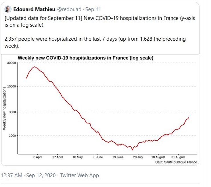
This is a type of log graph, where the four equal-sized divisions on the y-axis represent different amounts of new hospitalisations. The first division goes up to 1000, then the next one to 3000, then to 10,000, then to 30,000. Anyone who doesn’t understand this may glance at the graph, and, assuming it is a normal linear graph, think, “OMG, we’re back up to nearly half what we were in April” (because the red line is almost halfway up the page).
A more careful read of the graph reveals that the current numbers are nearly 3000 a week, whereas the April figures were nearly 30,000 a week. So in fact the current numbers are less than a tenth of April’s. So the graph is very misleading. There is no good reason to present the data in this way on a non-technical forum such as Twitter.
The man behind the graph is Edouard Mathieu, who is a data manager at Our World In Data, so he knows what he is doing with numbers and graphs.
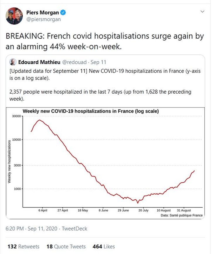
Piers Morgan, you may not be surprised to know, fell for this
I searched around and found the French government’s site where all this data comes from. (Mathieu confirmed in comments that he got his data from the same site.) Here’s the French government’s far less misleading presentation of the same data (hospitalisation graph at the bottom).
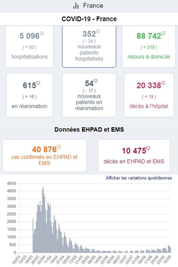
Certainly not as scary, is it?
(In fact even Mathieu’s graph isn’t scary when you consider that France was able to cope with the ‘first wave’, and the death numbers were nothing out-of-the-ordinary for a nasty flu-like virus.)
A couple of other things to note: because Mathieu’s graph presents the numbers as weekly, whereas the French government presents them as daily, he conveniently covered up the fact that the last couple of days in the numbers saw the hospitalisations going down rather than continuing to go up.
Secondly, Morgan shouts about an ‘alarming’ 44% ‘surge’ in numbers. But when the numbers are low it doesn’t take very many extra new patients to give you a 44% increase.
(As it happens the numbers did go up a bit more recently, but it’s still hardly the horrific disaster the media keeps telling us we’re seeing in France.)
4 thoughts on “The misuse of log graphs”
All the way back in 1954, Darrell Huff wrote a book (still available, I think) — “How To Lie With Statistics”. Lots of good ideas for those pushing the Covid-19 Scam.
@Hector
I loathe Log graphs and scales as they are inherently misleading eg dB
Why and where are they appropriate
Log charts do have their place, mostly in assessing growth rates. Here’s one I did towards the end of April looking at what the country data could tell us about the case fatality ratio:
https://datawrapper.dwcdn.net/c8njW/1/
And another that looks at the influence of population density on the rate of infections:
https://datawrapper.dwcdn.net/K3uOD/1/
which shows that high density leads to more than pro-rata increase in cases, somewhat undermining the idea that ethnicity was an important variable (it may be for deaths, but that is a different story about health co-morbidities such as diabetes).
But it is plain that Piers wanted everyone to believe that cases had rebounded to almost half peak values.
The late (I think) John Brignell used to call this “chartmanship”. There’s a good exposition here; https://numberwatch.co.uk/chartmanship.htm
Comments are closed.