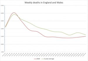
I had a look through the England and Wales weekly death stats for this year so far and previous years. The 2020 figures provided nothing to be worried about. They’re here if you want to look yourself.
I couldn’t find them in line graph form (the Office for National Statistics don’t do that, which is utterly useless of them), so in despair I started to copy them down to convert myself into a graph. But then I found that someone had done it — not overlayed the last few years together like I wanted to, but graphed out this year’s and last year’s figures up until mid-February. It’s rather startling to see it like this (click to enlarge):
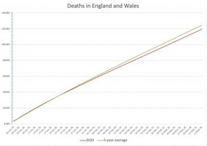
He also did the cumulative deaths. Turns out that we’re 5000 deaths under the average for the last five years (click to enlarge):
This is what they’re telling you is a real-life horror movie.
Of course, people on social media are saying, ‘But this doesn’t include the last few weeks’. But that includes merely a few hundred supposed excess deaths. They won’t trouble the stats much.
Others are saying ‘School yourself in explosive power of exponential growth, which is coming any day now’. Exponential growth is the new hockey stick, usually spouted by people who know very little about maths and statistics and epidemiology, and it’s been coming any day now for quite a while. (A moveable feast, it seems.)
[Graphs made by Alistair Haimes, well done fella]


17 thoughts on “The graphs of World War 3 — they’re not what you expected”
If lots of us are warned off going to hospital the death rate falls.
Will it catch up as we die of whatever was going to take us into hospital? Dunno. Could be. Wouldn’t bet on it.
Thank you for finding this data, Mr. D. Very helpful — but not really surprising. Maybe to compete with the “flattening the curve” meme, we need to talk about the “dying with Covid-19 versus dying from Covid-19” meme.
What is surprising is that surely somewhere at the top of one of the many bureaucracies, there must be someone whose job it is to keep track of these kinds of statistics — and draw the attention of decision-makers in the Cabinet & elsewhere to the absence of any spike in total deaths?
You mean — Going to the hospital accelerates death?
I guess these figures include the people who drop dead in the streets, fall off ladders, die in their sleep, etc in addition to the folk who spend their last days in a hospital.
Thank you, I can’t believe the media has not published this.
At last, a graph that actually has a baseline! Good work.
Yep good work and like Dave Moore says above “a baseline” which is certainly not something any MSM I know are providing.
Also on numbers and the general lack of feel for same by most, I have been getting around lately saying things along the lines of, “Spare a thought for the roughly 90 odd that died in NZ yesterday” to which the reply is generally “what? – what of?”.
To which I reply I dunno, but about 35,000 die a year, so that’s about 90 a day, the road toll is around 300/year, so that probably accounts for one, suicides about twice that, so that’s another two which brings us to three, as for the rest it could be any number of causes.
The usual responce, especially to the 35,000/year, is “that can’t be right”
( have a look here if interested https://www.stats.govt.nz/topics/population)
Looking at the data for the last 5 years, it seems that cumulative English Deaths (All Causes) so far this year are running slightly ahead of 2016 & 2019 and a larger amount behind 2015, 2017, & 2018.
An enthusiast could assert that the last few weeks might be showing a small rise in weekly deaths, but there were larger rises in 2016 & 2018 at about this same time of year.
Bottom line is that so far this year deaths in England have been within the normal expected range. England is still waiting for the predicted exponential increase in total deaths.
Going to the hospital accelerates death?
1. Hospitals are unhealthy places full of sick people, you really don’t want to be there any longer than necessary, especially if you are in a poor condition yourself.
2. but I think what dearieme alludes to is that if I can’t get an appointment to see a GP at the moment because they are all too busy it may be that in a few months it won’t be of much use as my problem may be beyond cure.
The thing is that COVID19 jams up ICU and therefore operating theatre capacity, which means that normal operations are not happening. It looks as if some people are spending 2-3 weeks in ICU. That might well lead to increased deaths somewhere down the line. And some of the lucky blighters who recover seem to have badly impaired breathing capability, which is also likely to show up down the line. In short, it’s a ghastly disease but the long term impacts are possibly as bad or even greater than the current panic. And that is without bringing the economic catastrophe the government seems intent on provoking
Yes, so the answer to that is to treat with Chloroquine and Azithromycin.
That removes the need for ICU in the majority of cases.
Question- do the upper hierarchy need to see a certain level of deaths to justify actions so far and is that the reason UK is slow walking Chloroquine trials.
https://www.thegatewaypundit.com/2020/03/stunning-ny-doctor-vladimir-zelenko-finds-100-success-rate-in-350-patients-using-hydroxychloroquine-with-z-paks-video/
Any comments on the sudden upward Spike in cases, or is that just the result of stupidity last Friday night? My partner and I went to the local and had a quiet evening while, up and down the road, the youtherati were partying like morons.
“overlayed the last few years together like I wanted”
Check your email for a version as desired.
Dear Hector,
I’ve created a graph using the ONS data (I’m happy to send you both the Excel and PDF files) of the respiratory disease deaths for the first 10 weeks of 2020 vs the 5-year (2015 to 2019) average. In terms of cumulative deaths, it seems that as of 2 weeks ago we’re some 3004 respiratory disease deaths short of the previous 5-year average! So 2020 is not even an averagely bad flu season so far.
Data on mortality for 24 European countries: https://www.euromomo.eu/
Thanks, Addolff — very useful data. There is a nice quote, which basically says it all”
“Therefore, although increased mortality may not be immediately observable in the EuroMOMO figures, this does not mean that increased mortality does not occur in some areas or in some age groups, including mortality related to COVID-19.”
Translated into English, this means that most of the people whose deaths are listed as caused by Covid-19 were old & sick, and were close to death even without the virus.
In other news that makes the thinking person wonder what is really going on, mighty Volkswagen has announced that the only place in the world where they are making cars now is — China!
Those are great stats Addolff, thank you. Even in Italy, which we are told is a charnel house right now, the death rate hasn’t reached the same rate as 2016/17 winter. As for the UK, we’re actually lower than normal.
I’m sticking my neck out and saying that when this is all over the death toll in the UK for winter/spring 2019/20 will be less than the obvious blood bath that was 2017/18. Which as we all know has gone down in history as the year the corpses were piled in the streets and crops went unharvested in the fields……..
Comments are closed.