Christopher Bowyer has sent me some more graphs based on the latest NHS England data.
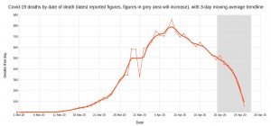
First, Covid-19 deaths in England by date of death, with 3-day moving average trendline (the thinner line). (Click to enlarge.)
Note that numbers in grey area will increase over the next few days.
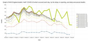
A graph of deaths with Covid-19 in England which occurred each day, by the delay in reporting. Thick line is overall daily announced deaths. (Click to enlarge.)
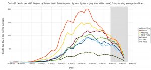
Trendlines (3-day average) for Covid-19 deaths by England NHS region, by date of death. (Click to enlarge.)
Note that the numbers in the grey area will increase over the next few days.
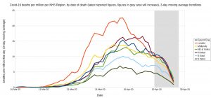
Trendlines (3-day average) for Covid-19 deaths per million by England NHS region, by date of death. (Click to enlarge.)
Again, the numbers in the grey area will increase over the next few days.


4 thoughts on “Updated NHS graphs from Christopher Bowyer”
Can someone look at excess deaths in care homes and at home? I believe a great scandal has occurred with ppl needing medical attention just left to die.
According to the Telegraph, ONS report 40% of deaths now involve Covid.
This could mean a large number of deaths caused by Covid outside hospitals.
Or it could mean that near 40% of the population has contracted the disease, and hence that we are approaching herd immunity.
Or a bit of both.
It would be rather nice to know!
I’ve been following the daily figures as reported at Worldometer (apart from your blog, it’s pretty much the only WuFlu news I have been following), and there are certainly signs that we may have passed peak death rate, although the number of “active” cases is still climbing steadily (but not, crucially, exponentially).
Interesting that the 3-day average for Covid-19 deaths per million by region seems to peak at about the same day irrespective of the rate of rise. Why? Coincidence? Spread of infection ‘balances out’ across the population and peaks at about the same time everywhere – as immunity develops in the ‘national herd’? Shouldn’t the ‘lockdown’ be anticipated to impede spread between regions, meaning the regions should peak more independently according to their own trends?
Comments are closed.