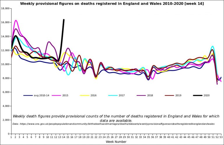
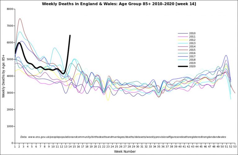
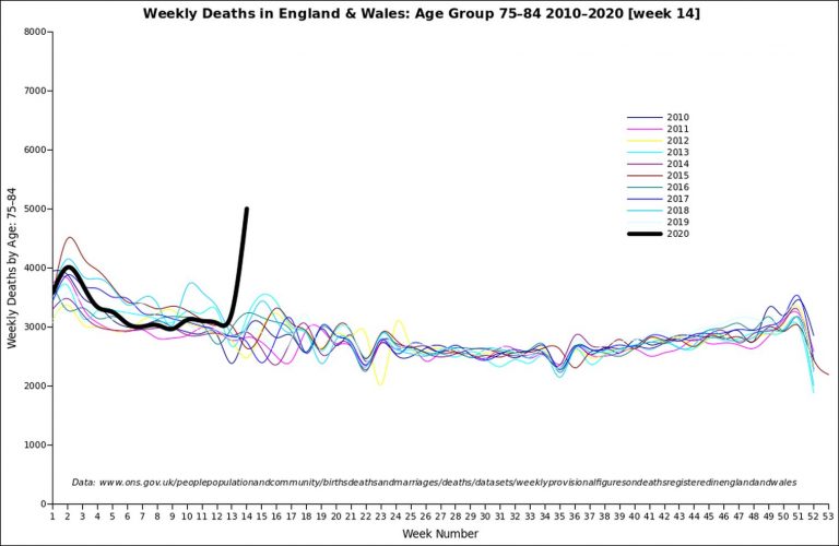
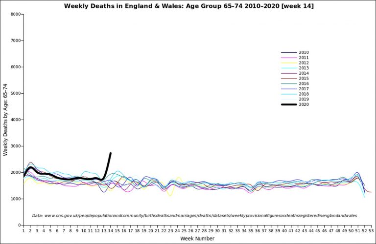
Here are some more graphs for week 14 of 2020, which have been done by a reader of this blog, David Clark (based on the ONS stats). You can really see the recent spike in deaths in these graphs.
These graphs may look scary, but bear in mind that you still have only a small chance of dying from Covid-19, even if you’re elderly. And even if you get it, you’ll most probably recover. For younger people, the risk is virtually zero.
First of all, we have a line graph of the latest ONS all-death figures for England and Wales up to the end of week 14 (April 3), with the past five years and the 2010-14 average in there for comparison. (Click to enlarge).
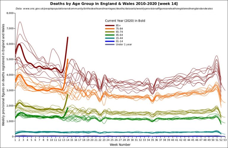
Next we have a line graph of the latest ONS all-death figures for ages 85 and over, for England and Wales, up to the end of week 14 (April 3), with the past ten years in there for comparison. (Click to enlarge).
A line graph of the latest ONS all-death figures for ages 75-84, for England and Wales, up to the end of week 14 (April 3), with the past ten years in there for comparison. (Click to enlarge).
A line graph of the latest ONS all-death figures for ages 65-74, for England and Wales, up to the end of week 14 (April 3), with the past ten years in there for comparison. (Click to enlarge).
A line graph of the latest ONS all-death figures for all ages, for England and Wales, up to the end of week 14 (April 3), with the past ten years for all age groups in there for comparison. You can really see that most of the extra deaths in week 14 are amongst the elderly. There is no rise at all for under 45s. There is a rise in the 45-64 age range, but if you look at the more detailed breakdown in age groups that the ONS now provide, you’ll see that the numbers increase as you go further up that age range. (Click to enlarge).
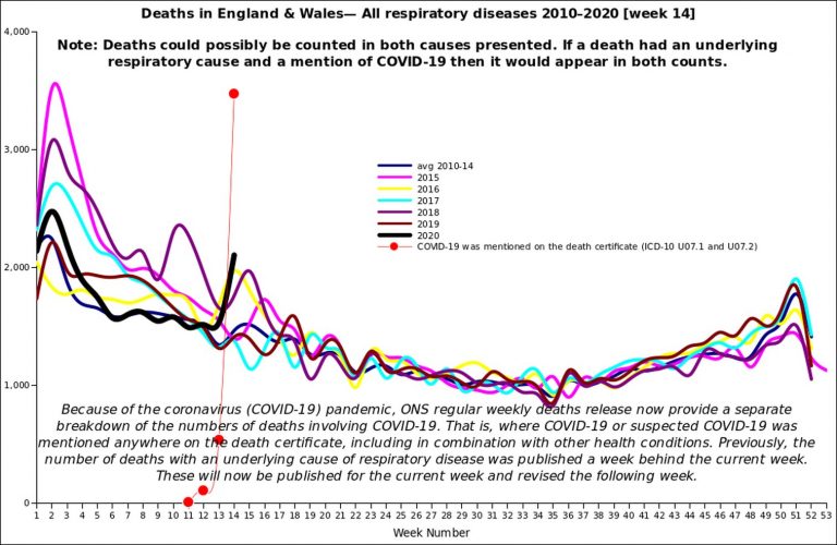
Finally, a line graph of the latest ONS respiratory death figures for England and Wales up to the end of week 14 (April 3), with past years in there for comparison. Note that this rise in respiratory deaths is less than a tenth of the overall rise in deaths in week 14. (Click to enlarge).
The red dots indicate Covid-19-related deaths. Remember that this is an ‘overlapping’ category that includes any death from whatever cause that had Covid-19 mentioned on the death certificate, whether as the main cause or whether the person just had it (or was suspected of having it).
It should be noted that the number of deaths in this Covid-19 category is a lot fewer than the overall rise in deaths for week 14. There were 6082 more deaths in week 14 over the five-year average for week 14, yet there were only 3475 deaths in the Covid-19 category in week 14.
A note from David on age ranges:
The ONS figures are now given with a more detailed set of age ranges. I have kept to the original age ranges in my graphs so as to maintain the comparison with previous years.
Update: Thanks to everyone else who has sent me stuff, it will go up over the next day or two (some of it has already been up on my Twitter page).
29 thoughts on “Week 14 line graphs”
I did notice the complete lack of any of the medias mentioned young male corona deaths in the ONS breakdown, it stated one female between 15 and 19 was the youngest death during March, but the media had given the headlines with a 13, 18 and 19 year oldboys having died of or with coronavirus
Well most on here will know some of this
https://www.spectator.co.uk/article/six-questions-that-neil-ferguson-should-be-asked
Any chance someone could copy the Spectator’s article and send it to me, or copy it to here?
Questions I would ask Neil Ferguson:
Why did you implement your model in undocumented code?
Was the code peer reviewed?
Was the code properly tested, including against a range of inputs and expected results?
If the code was tested can you provide evidence of it?
I was beyond gobsmacked to read that his original code was undocumented. That is sloppy at the best of times, but frightening to think it’s being used to advise government on anything other than Ferguson’s approach to programming.
It was a tale of two interviews on the Today programme this morning. First up on the show was Neil Ferguson, professor of mathematical biology at Imperial College London, who has been instrumental in forming the UK government’s response to the coronavirus crisis, and whose virus modelling led to the current lockdown being put in place.
On the show, the professor received an almost deferential line of questioning from Sarah Smith with his views seemingly taken as near-Gospel as he declared that a ‘significant level’ of social distancing could have to be maintained indefinitely until a vaccine becomes available.
Then came along the Health Secretary, Matt Hancock. As you would expect, he was treated to the traditional Today programme mauling, as his record and pronouncements on testing, the growing virus outbreak in care homes and PPE were scrutinised by Nick Robinson.
While Mr S thinks it’s only right that Hancock faces tough questions, Steerpike can’t help but wonder whether Ferguson should receive similar treatment. After all, his advice is heavily feeding into government policy and therefore ought to face a similar level of scrutiny. What’s more, Ferguson’s scientific work can’t exactly be described as bulletproof.
Given that it’s the trend these days for former spinners, hacks and politicians to suggest questions that the media isn’t currently asking of politicians, Mr S has decided to do his bit for public discourse by penning a few for Ferguson. Below are six questions Steerpike would like to see Neil Ferguson pressed on the next time he embarks on a media round:
Q1.
In 2005, Ferguson said that up to 200 million people could be killed from bird flu. He told the Guardian that ‘around 40 million people died in 1918 Spanish flu outbreak… There are six times more people on the planet now so you could scale it up to around 200 million people probably.’ In the end, only 282 people died worldwide from the disease between 2003 and 2009.
How did he get this forecast so wrong?
Q2.
In 2009, Ferguson and his Imperial team predicted that swine flu had a case fatality rate 0.3 per cent to 1.5 per cent. His most likely estimate was that the mortality rate was 0.4 per cent. A government estimate, based on Ferguson’s advice, said a ‘reasonable worst-case scenario’ was that the disease would lead to 65,000 UK deaths.
In the end swine flu killed 457 people in the UK and had a death rate of just 0.026 per cent in those infected.
Why did the Imperial team overestimate the fatality of the disease? Or to borrow Robinson’s words to Hancock this morning: ‘that prediction wasn’t just nonsense was it? It was dangerous nonsense.’
Q3.
In 2001 the Imperial team produced modelling on foot and mouth disease that suggested that animals in neighbouring farms should be culled, even if there was no evidence of infection. This influenced government policy and led to the total culling of more than six million cattle, sheep and pigs – with a cost to the UK economy estimated at £10 billion.
It has been claimed by experts such as Michael Thrusfield, professor of veterinary epidemiology at Edinburgh University, that Ferguson’s modelling on foot and mouth was ‘severely flawed’ and made a ‘serious error’ by ‘ignoring the species composition of farms,’ and the fact that the disease spread faster between different species.
Does Ferguson acknowledge that his modelling in 2001 was flawed and if so, has he taken steps to avoid future mistakes?
Q4.
In 2002, Ferguson predicted that between 50 and 50,000 people would likely die from exposure to BSE (mad cow disease) in beef. He also predicted that number could rise to 150,000 if there was a sheep epidemic as well. In the UK, there have only been 177 deaths from BSE.
Does Ferguson believe that his ‘worst-case scenario’ in this case was too high? If so, what lessons has he learnt when it comes to his modelling since?
Q5.
Ferguson’s disease modelling for Covid-19 has been criticised by experts such as John Ioannidis, professor in disease prevention at Stanford University, who has said that: ‘The Imperial College study has been done by a highly competent team of modellers. However, some of the major assumptions and estimates that are built in the calculations seem to be substantially inflated.’
Has the Imperial team’s Covid-19 model been subject to outside scrutiny from other experts, and are the team questioning their own assumptions used? What safeguards are in place?
Q6.
On 22 March, Ferguson said that Imperial College London’s model of the Covid-19 disease is based on undocumented, 13-year-old computer code, that was intended to be used for a feared influenza pandemic, rather than a coronavirus.
How many assumptions in the Imperial model are still based on influenza and is there any risk that the modelling is flawed because of these assumptions?
The ITV web site reports on today’s lockdown extension of three weeks. Among the criteria for releasing the suspects, I mean the public, is this one:
“When experts are confident that any adjustments to the current measures would not risk a second peak in infections”
This is unexpected, isn’t it? In Imperial’s (in)famous paper of March 16th they envisaged that a period of lockdown *would* be followed by another peak, requiring another lockdown, another peak, and so on. See figure 4 in their Report 9, “Impact of non-pharmaceutical interventions (NPIs) to reduce COVID-19 mortality and healthcare demand”.
How can the “no second peak” criterion be reconciled with Imperial’s model? Is the government tacitly repudiating it?
And when will the government realise that trade-offs have to be made and the longer that lockdown goes on so the risk of economic collapse increases. The more economic damage there is the more early deaths will be caused in the future, and the less money there will be for the NHS and welfare system.
I forecast this would happen: suicides, domestics, non-CV patients told to stay away…
Hector is too modest:
Delingpod 69, 15 April: Hector Drummond vs Covid-19 Hysteria
https://www.youtube.com/watch?v=ga5IhhVmyR8
Another 3 weeks –by which time Blojo will be back to carry the can–should just about fix the economy’s wagon–with haulage firms in deep trouble and only a small amount of cash handed out by the bureaucracy and piss-taking banks meaning that vast numbers of businesses are in April payroll trouble. If the Tory govt wanted to commit suicide did they really have to take the rest of us with them? And their LD IS over far as I am concerned. Will keep my dist but going out as I see fit. Trouble is– nowhere open to go.
I’m really curious. The year to year death rate seems to be pretty stable except for the oldies from weeks 1-12 and 24-52. Between weeks 12 and 24 however the pattern is all over the shop year to year. Once spotted, you can see this effect in most of the graphs in this post, but it’s most obvious on the lowest couple of plots on the graph split out by age.
Any idea why on earth this is? It’s a definite enough observation I’d expect there to be a cause, but an immediately obvious one doesn’t spring to mind.
No, this “data” is not real.
That is nearly a 50% jump in total All Causes deaths (from 11,141 in week ending 27 March to 16,387 in week ending 3 April), and this in a sizeable country of over 50 Million people. No similar jump from one week to the next has been seen in any other country.
Most probable explanation is that the bureaucratic processes of reporting deaths have been disrupted by the Government’s own lock-down. Reporting of some deaths from prior weeks has likely been delayed and is being misreported here as occurring all in one week. That would imply that the weekly death rate has been running somewhat higher than the 5-year average for the past several weeks — but not dramatically so.
Other possible explanation is that mistakes have crept into the procedures & programs used to tally numbers, and there is some element of double-counting of deaths.
Safe prediction — this 50% one week jump in deaths will be revised in coming weeks.
Second safe prediction — the media will not cover the revisions.
Just looking at the charts my first thought is something looks wrong, I’d be inclined to assume an error and look for that before I started drawing any conclusions from the numbers
Find it hard to believe ONS published these without any explanatory note, if it was a ‘catch-up’ so a correction to the YTD in the week that would not only be easy to document you’d expect it as a note.
Maybe they forgot the leap year and left Feb 29th out and only just remembered to add it back
Likewise Dene – it beggars belief
The ONS weekly figures are by date of report not date of death. When there is a bank holiday and registry offices are closed there is a drop in registrations. There also tends to be a rise the week before and the week after. Easiest seen in week 36 the August bank holiday. In spring there are bank holidays for Easter (a variable date) and two in May. This causes the wave pattern you see.
ONS publish a table comparing the date of registration and date of death, see Covid-19 – E&W comparisons on the sheet you can download from https://www.ons.gov.uk/peoplepopulationandcommunity/birthsdeathsandmarriages/deaths/datasets/weeklyprovisionalfiguresondeathsregisteredinenglandandwales
If anything deaths are being reported more promptly now than in previous week. This may cause a small rise but the reported and actual dates are rising at about the same rate.
That makes sense.
Out of interest, why do they release this information by date of registration, rather than date of death? Surely to register a death the date of the death has to be supplied, and for most purposes the actual date of death is likely to be more useful than knowing when the registry off got round to logging it.
djc, that page is very unclear, but as I read it, on April 3, when the stats were compiled for week 13 (March 21-27), there were 647 Covid-19-related total deaths for the year registered by March 27(see second column). As we had 108 registered by March 20 (end of week 12), that means 539 registrations came in between March 21-27, ie. in week 13. Hence, this is the C-19 death figure used on the ‘Weekly Figures 2020’ page for week 13.
But look at the third column. By April 3 we also knew that in actual fact 1941 people had died by March 27, not 647. That means that 1294 certificates for deaths that occurred before the end of week 13 must have arrived in week 14 (March 28-April 3). Although these were deaths that occurred before week 14 (mostly in week 13, plus a few hundred from earlier weeks by the look of it), they will be included in the week 14 stats, not the week 13 stats, because that’s how the ONS works.
So it looks like to me that almost 1300 deaths actually occurred in week 13 rather than 14, so the week 14 stats are inflated by those.
In fact, we can see from the fourth column, which lists what we know on April 11, that a further 176 deaths in fact occurred by 27 March, and these will go into the week 15 stats, even though they occurred in week 13.
You may say, ‘But a similar thing may be occurring with the week 14 stats, maybe they don’t include a lot of deaths which happened in that week due to forms which won’t arrive until week 15’.
We can see that this is actually true by looking at the fourth column. But first look at the third column. By 3 April there were 4122 total C19 deaths for the year registered by 3 April. But the fourth column tells us that by 11 April we know that there were really 6235 C-19 deaths by 3 April. That means that 2113 certificates for C-19 deaths before April 3 must have come in between April 4-11. These will go in the week 15 stats, but really they are week 14 C-19 deaths. So really week 14 had even more deaths than we thought.
“one female between 15 and 19 was the youngest death during March,”
This was untrue, it was a suicide. Be extremely wary of what the media are claiming as a ‘covid’ death.
The second peak is a direct result of the lockdown, it was the intent in the design. They are moving the narrative…..
Agree.
Just to draw your attention to another oddity in these ONS numbers — although they are described as “Weekly provisional figures on deaths registered in England and Wales”, they seem to be treated as final rather than provisional.
The website has previous weeks reports in addition to the current week. Looking back at weeks 8 through 14, there has not been a single change made to any of the “Total deaths, all ages” for any of the prior weeks.
For example, total deaths for Week 12 (ending 20 March) was listed as 10,645 in the report for Week 12 — and also in the report for Week 13, and again in the report for Week 14. There have been no adjustments for late-arriving reports, or any other problem. And this in the middle of a lock down, with disruption from offices closed, registrars working from home, etc.
While the file “referencetablesweek142020” does make an effort to refer C-19 deaths back to the actual date of death, for total deaths it shows only the date of registration. Bottom line is that the 16,387 total deaths shown for Week 14 probably include deaths which occurred in prior weeks.
Thought it interesting to note on the ONS report, the 91% of March deaths with PEMC’s in all categories the %’s were higher for 70+ age group, than those aged below 70. But in the 9% no PEMC’s the trend was reversed – higher in the under 70s.
Is this an indication that PEMCs are less likely to have been undiagnosed in the U70s, that obesity is the real cause but is not a condition that is recorded, or some other reason?
See here for covid deaths organised by date.
https://www.cebm.net/covid-19/covid-19-death-data-in-england-update-16th-april/
“Trouble is– nowhere open to go”
And that will be a BIG problem when the lockdown is lifted. Where will people like me (assuming I’m still alive) be able to go, and spend some money, in order to help the economy recover? Leisure & Tourism will probably be one of the last activities allowed to restart. The industry is very reliant on summer takings, and even those who have survived will struggle to make up for the losses already suffered. If we get a repeat next year, God only knows what the consequences will be…
Gavin, the main ONS deaths figures for each week are calculated by reference to when the death certificates come in, not when the deaths actually took place. ‘Provisional’ does suggest that it’s the other way around, but it isn’t. So the ‘provisional’ figures are pretty much the final figures.
The trade-off between getting the figure out quickly and being accurate. Not all deaths are registered promptly (within the statutory five days), and some details may require clarification so daily and even weekly reporting by date-of-death would result in several previous weeks being revised. That makes it even harder to make sense of the numbers that keep changing. In normal times it is easier to just keep in mind there is a lag in reporting. The ONS weekly report does now include a table comparing the figures by date of death from the various sources.
Suppose that there is a steady rate of deaths and a constant delay in reporting, there is a balance so both figures over time will look the same. Now suppose the figures are rising, there will be a delay before the reported figures reflect the actual occurrence. And, if the figures are declining there will be a delay in reporting the decline. A similar effect will occur if the delay in reporting changes, speed things up and there will be a bump in reported numbers, slow things down and there will be an apparent drop: this is seen all the time in the case of the bank holiday numbers.
As I noted above, in normal times, for regular users, this does not matter very much, you just keep that reporting lag in mind. It is why these weekly reports are described as provisional. If you want to do serious actuarial or demographic planning you wait several months or more for the definitive account.
Careful scholarship v. the 24/7 news,
Ah, the problem with the code is almost certainly not the code per se. It’s been around a while. The lads aren’t knuckle-dragging eejits. They’ll have tried it out with simple test cases and varied things.
I doubt they’d have subjected it to close-to-exhaustive wide parameter testing. Because – what are the right answers? You wanna test something, you need the right answers to be sure it’s working as desired.
If I were tasked with that sort of thing, I’d do the simple stuff first. Then I’d find some other models with published results, and see if I got the same sort of answers. If I didn’t, I’d chat with the authors to see where the divergence might have come from. I’d try out a wide range of parameters to see if the model blew up (infinities, NaNs, denormalised numbers,… all indicators of non-robust arithmetic). And see if it produce negative incidences of plague, etc I’d expect them to have done something similar, at least..
The real trouble with the model is the parameters given to it. What were they, and why? Do other models provide similar results? And so on.
A key weakness of highly-detailed models (as one assumes this is) is that they’re dependent on correctly tuning all the detail-providing parameters….
@Gavin
Figures are are a mess
https://conservativewoman.co.uk/lies-damn-lies-and-virus-statistics/
Comments are closed.