David Clark has sent me a new graph, again based on the ONS stats (click to enlarge):
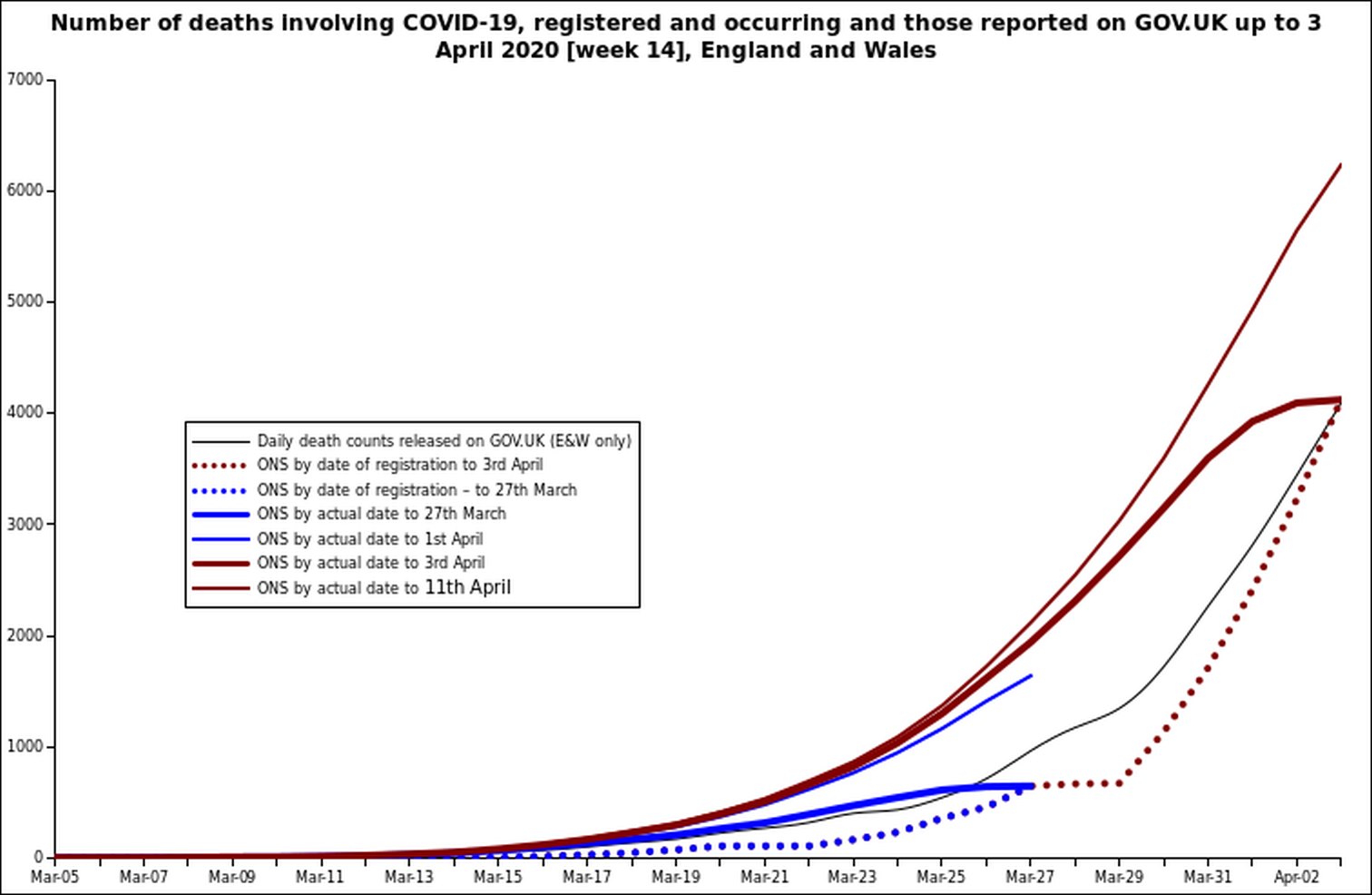
This one is more complicated to decipher. David says:
A quick graph of the reported v date-of numbers, taken from the week 13 and 14 tables.
Dotted line date of registration, broad line actual date of death. At the end of each reporting period (week) the lines meet as they must.
Note how the curved of the actual date flattens as it reaches week-end, This illustrates the problem with insisting on the very latest data: it will always understate the real position and give a misleading impression that it’s all over. (And eventually still be climbing as the actual numbers slow)
The thin line is the ONS ‘preview’ data, what they knew after the official closing date for the week. these will go into the following week.
I think the main point to make is that the slope of the lines is comparable. At the moment the rate of increase is much the same. There isn’t much evidence of a change in the rate of reporting nor of a sudden discontinuity from adding in missing numbers. [flat line on reported Mar-26-7 is weekend when offices closed]
When the death figures start to decline then there will be a corresponding lag in the weekly figures.
9 thoughts on “Graph: number of deaths involving Covid-19, registered, occurring and reported”
Apologies for being a maths philistine and someone who gets confused by statistics, but can someone explain in plain language what this actually means please?
It’s not really about maths at all; just the different types of official figures. The Office of National Statistics (ONS) publishes numbers of deaths for certain periods (weeks, and cumulative up to a given date).
Confusion has arisen from the fact that some counts are for number of deaths for which ONS has actually received paperwork, while others are for the number of deaths reckoned by the dates on which they happened. There are differences, because sometimes the ONS does not receive the papers for several days after the actual deaths.
Latest interview with John Ioannidis (who seems like the most reliable voice in all of this to me)
https://www.youtube.com/watch?v=cwPqmLoZA4s
I have updated this graph with the GOV.UK figures up to 19 Apr, and will add in the ONS weekly figures when released tomorrow.
From the GOV.UK figures now available it looks like the peak COVID-19 numbers seen in the ONS week 14 will persist in weeks 15 and 16.
I will also attempt a better explanation when I have week 15. To be honest the way ONS presents this is rather confusing, particularly the uncharacteristic cumulative counting. I can only assume that as PHE and GOV.UK did it that way they are having to follow that pattern.
Very credible. That’s my the MSM will not cover him at all. The media have gone all in to make this the biggest crisis in human history for a minor virus.
Thanks Tom.
What I meant was I feel that although these graphs originate from official sources, those very sources rely on the readily acknowledged but very imprecise use of “with”, “from” and “of” on death certificates. Quite how this method can ever produce real accuracy of numbers remains a mystery to a bear of little brain, hence my question.
I still feel that the only way any sort of comparative judgement/estimate (call it what you will) can eventually be made will be to take total deaths from a) all causes and b) from all respiratory illness and compare both those figures to past yearly averages.How else is a value judgement to be made of this hysterical time?
I’m really grateful to Hector and others for providing these graphs, because they’re the only way one can begin to make any sense of this madness, but my confusion or lack of understanding remains, as the wording in your second paragraph only confirms.
The ‘with’, ‘from’, ‘of’ remains very confusing — enough to give even Aristotle a headache— and reading the official guidance to doctors on how to classify hasn’t enlightened me much. https://www.gov.uk/government/publications/guidance-notes-for-completing-a-medical-certificate-of-cause-of-death
Looking at the latest (week 15) figures the respiratory deaths look normal relative to previous years, it is the COVID-19 (but not respiratory) category that is behind the all deaths increase. So, it seems Respiratory+COVID-19 applies if COVID-19 came on top of an underlying respiratory condition (in effect this is ‘with’ WuFlu). This makes the other COVID-19 deaths odd as the weekly reports don’t show other causes, so there is no way to tell what other conditions may be involved. We can see an abnormal number of deaths, but it is yet to become clear how many have happened sooner than expected rather than unexpected, nor if by how many weeks, months, years brought forward.
I quite agree, John. Sorry if I missed the point of your post – as I was writing I felt that I wasn’t quite addressing your real concern.
I don’t know the answers.
Quite alright Tom, but thanks anyway!
What we need is someone with a crystal ball, or tea-leaves or summat…..
Comments are closed.