One of my academic readers, who has been doing bar graphs of the ONS data, has sent some more through (also based on ONS stats), and they’re very revealing.
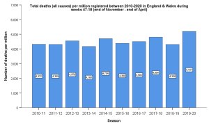
First of all, here’s a graph of of all deaths (per million) in Eng & Wales between December and the start of May for each year 2010-20. The point of including December is that this is the start of the flu season. The point of using ‘deaths per million’ is that it accounts for population increases.

Do you see a once-in-a-century disaster there? 2019-20 is a bit higher than 2017-18, a mere two years ago, but not that much more. As we have previously seen, if we go back twenty years there were higher years (and if we go back to the 1950s we find much higher years).
It doesn’t actually make much difference whether we include December or not, though. Here’s the deaths per million between the start of the year and week 18 for each year between 2010 and 2020.
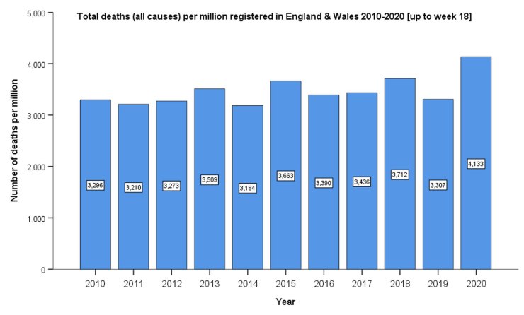
Note that 2020 is currently only 11% higher than 2018.
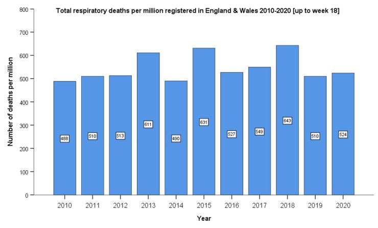
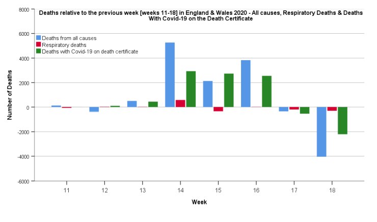
It’s also interesting to note that Covid-19 is generally not killing people via respiratory means. Respiratory deaths are at completely normal levels for the year.
This applies even to more recent weeks — here’s a graph for weeks 11 to 18.
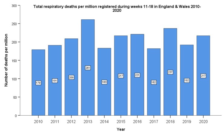
If you look at the weekly respiratory death figures there was a bit of an uptick in weeks 14 to 16 – about 800-900 more respiratory deaths than usual in those weeks – but since then it’s been back to normal, which suggests that Covid-19 peaked in those weeks (and suggesting that many of the high numbers of deaths after that were not Covid).
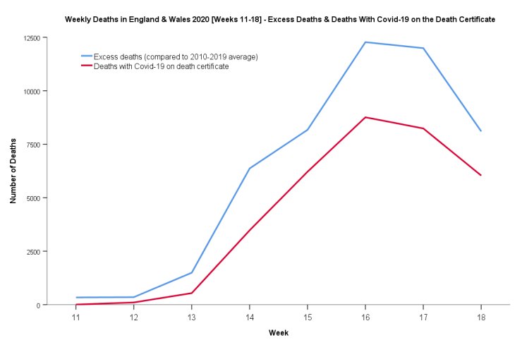
Moving on, let’s look at the excess deaths in 2020. In this graph we can see, for England and Wales, the excess deaths vs Covid-19 deaths in 2020. (Bear in mind that the latter most likely includes a number of non-C19 deaths).
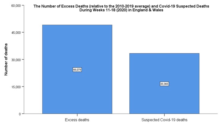
The number of excess non-Covid deaths in 2020 is 15 713.
Here’s a weekly line graph of the excess deaths vs Covid-19 deaths.
Finally, a graph of deaths relative to previous week, including all-cause deaths, respiratory deaths, and Covid-19 deaths (remembering that the ‘with Covid-19 category can include respiratory deaths).
3 thoughts on “Week 18 bar graphs”
Given the number of illegals in the country, who still turn up on the official death stats if/when they die, and the fact their number has been increasing over the last 20 years, the most recent years should be lower relative to the earlier ones. What these death figures may be revealing is the actual size of the UK’s population, rather than its ‘official’ one.
If there were a lot of illegal immigrants in the last 20 years then wouldn’t deaths per million be higher rather than lower than previously (assuming everything else is roughly the same)? Even so, the number of illegals and/or them having an increased risk of death would have to be large to be noticeable in the per capita deaths figures.
If computer modelling didn’t exist, or more accurately if computer generated forecasts could be understood properly by their customers, we would not be here with CV-19 or ‘climate change’ or with most other stupid brainless hyped figments of imagination that our politicians use to change our lives either because they are thick as mince or bent as a farthing or both.
This amalysis joins legions of others giving a lie to this ‘crisis’. But its a drop in the ocean of continuous propoganda repeated daily by the politicians, their pet experts, the money grabbing analysts and the corrupt media.
Over 50% of the public are still scared or lazy or both. Until that changes, nothing else will. And as they have been bought off until at least October nothing is going to change fast, just the eroding of the economy. And some people want that, the extremists on both sides and the very rich who see easy pickings to be had and even more power to be held.
Comments are closed.