Hector Drummond Magazine reader and contributor Christopher Bowyer has done some more Covid-19 test result graphs. Given the urgency of the situation at the moment these are very recent, they are from yesterday’s update at coronavirus.data.gov.uk. (All graphs can be clicked to enlarge.)
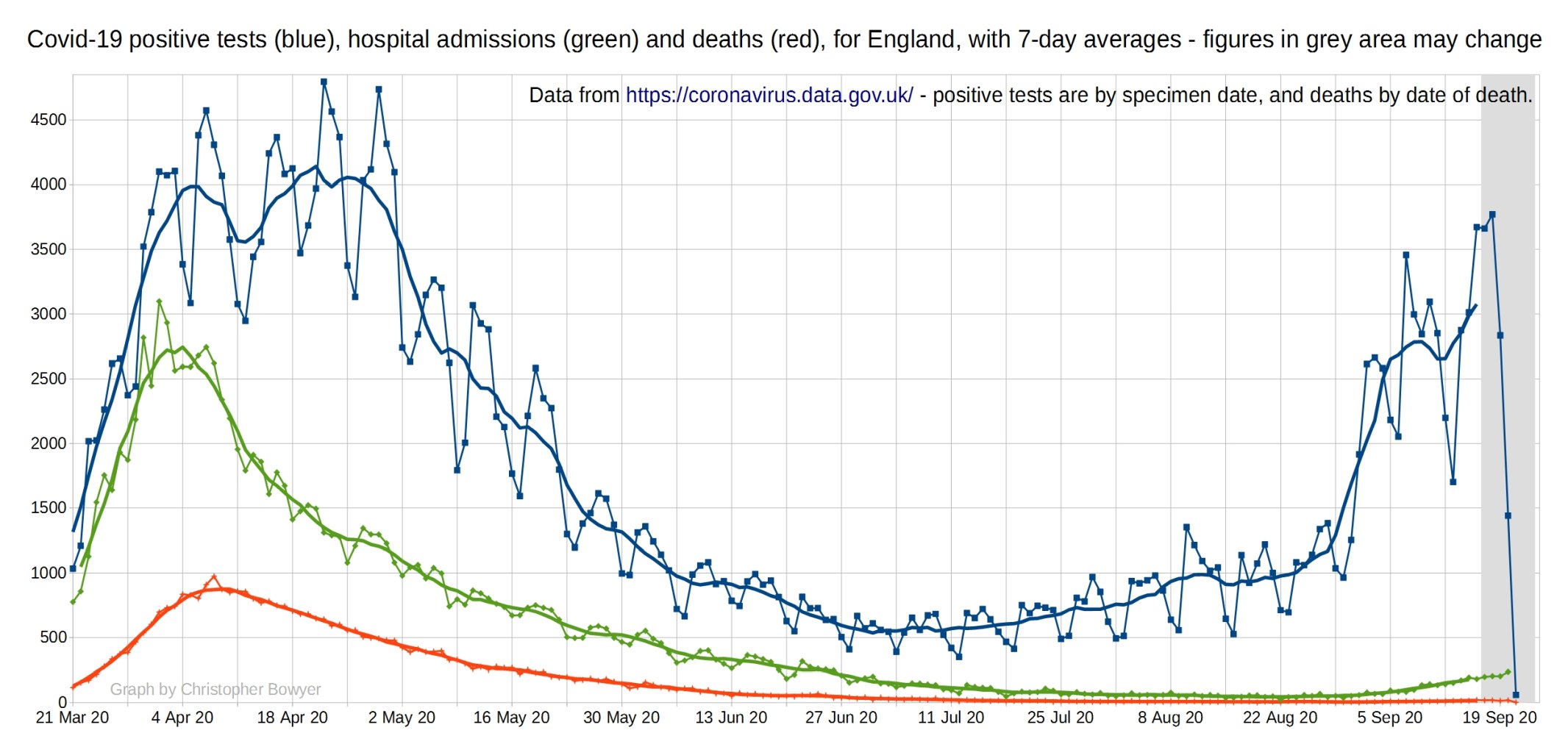
The first one looks at Covid-19 positive tests (blue), Covid hospital admissions (green), and Covid deaths (red) for England. You can see that there’s been a slight increase in hospital admissions over September, as expected given the time of year, but it’s hardly a public health disaster in the making. The number of deaths is still very small.
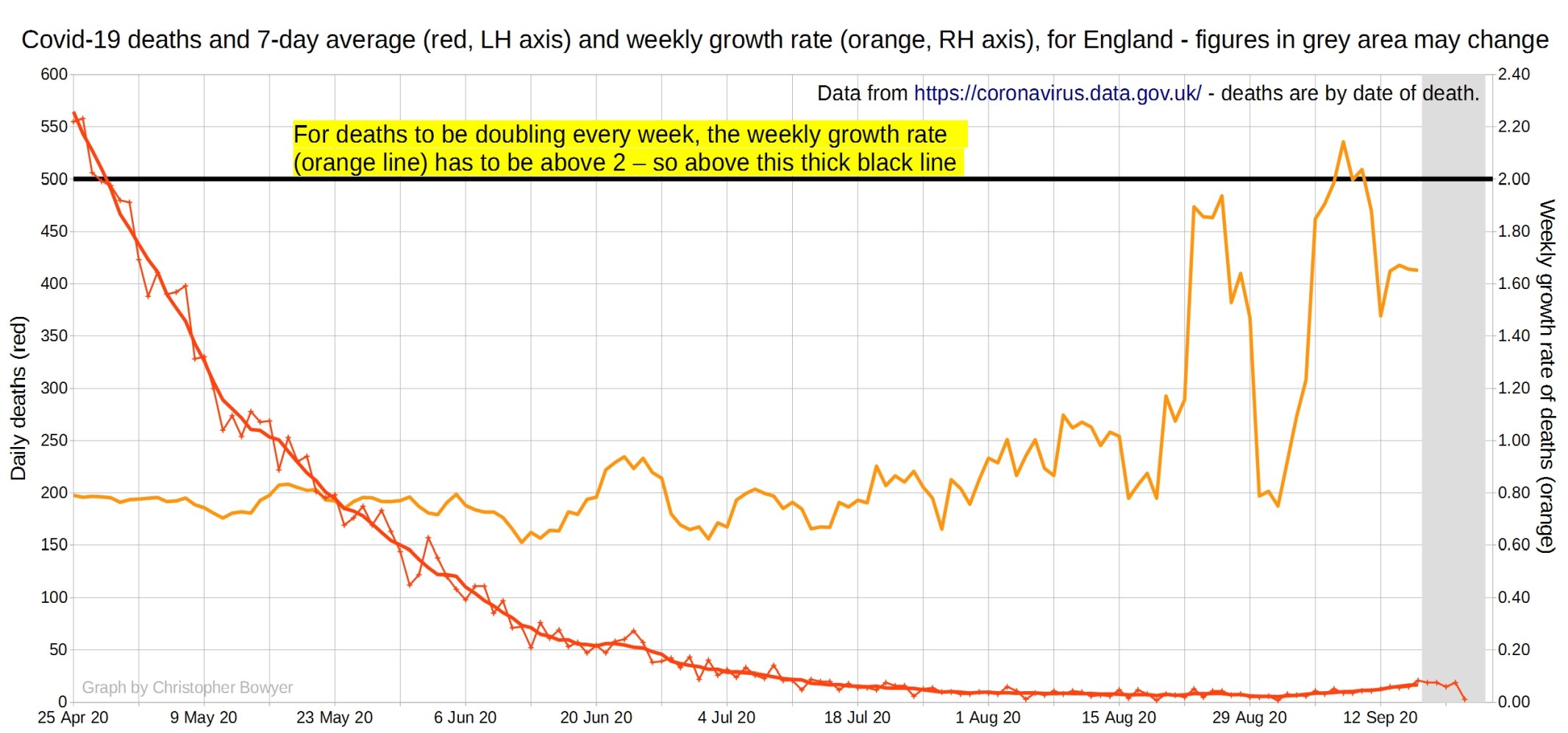
Here’s a graph showing UK Covid deaths and their growth rate. Bear in mind that with such low numbers it takes very little to cause a doubling of deaths. And before you start screaming ‘Muh exponential growth’, remember that exponential growth is not at all inevitable, can stop at any time, and usually does not carry on for very long in the real world.
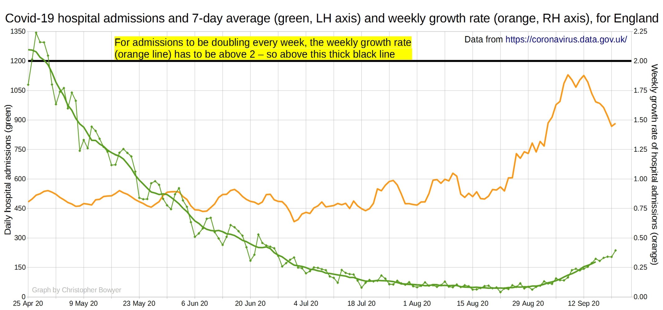
Here’s a graph showing UK Covid-19 hospital admissions and their rate of growth. Same points as above apply.
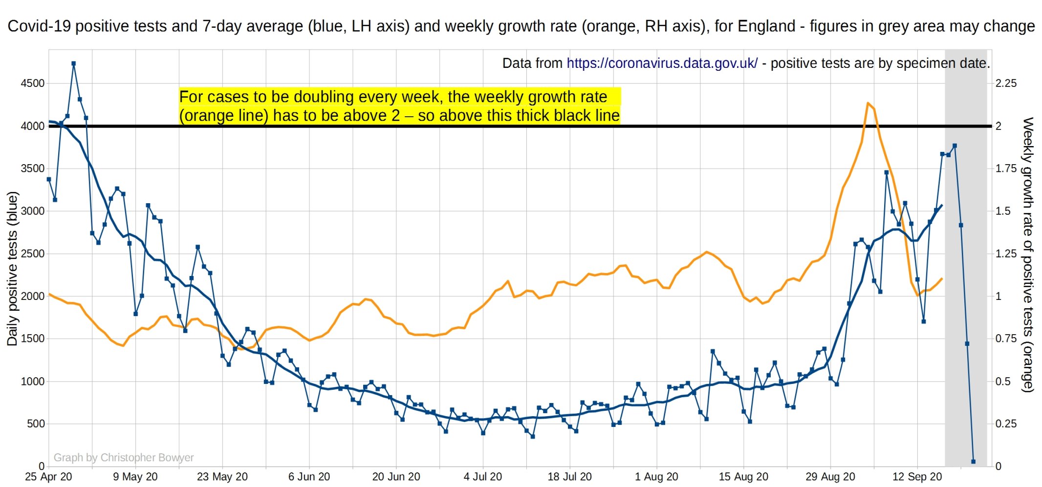
Here’s a graph showing UK positive cases and their rate of growth. Bear in mind that a lot of this is down to increased testing, and that most of it is occurring in younger people to whom Covid-19 presents virtually no threat.
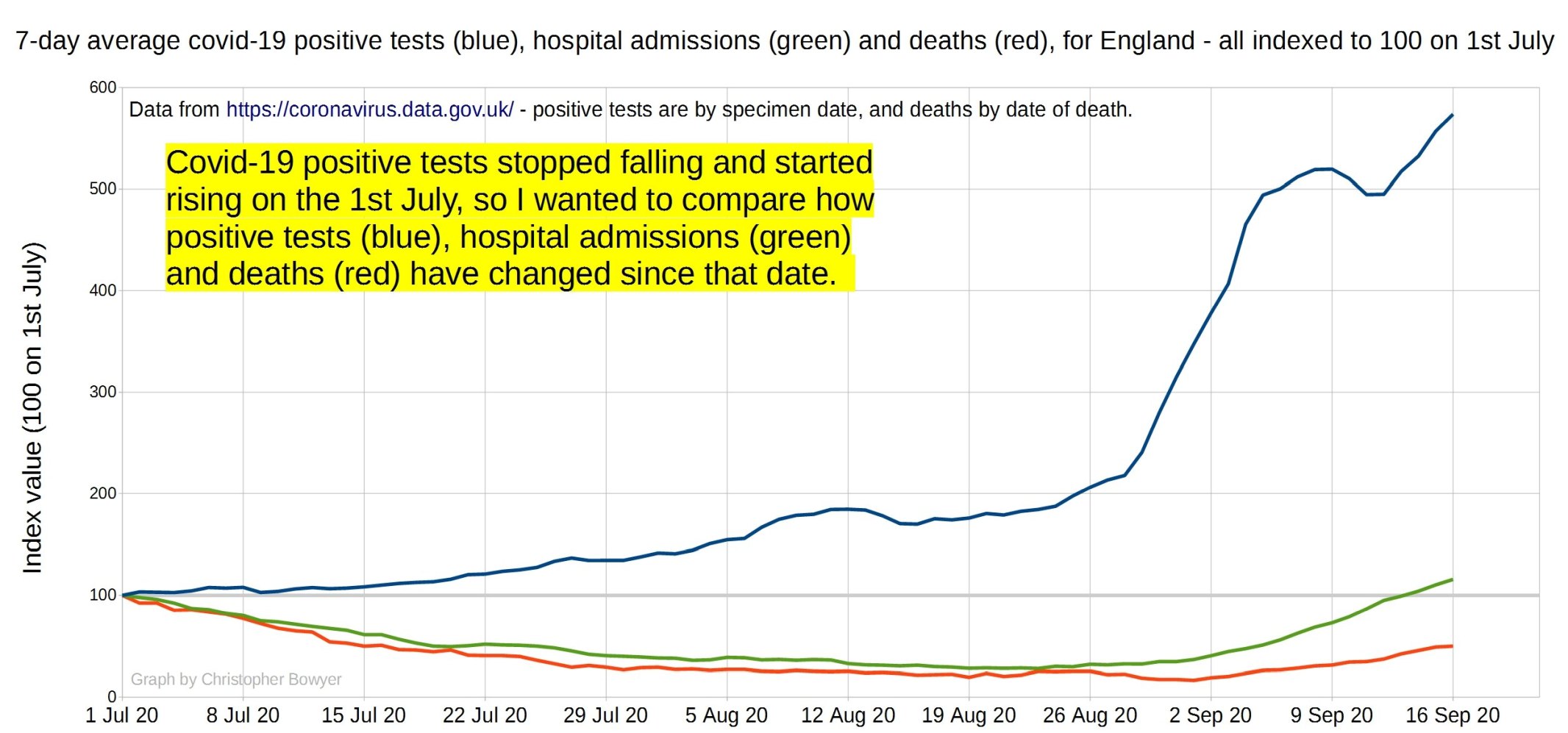
And here’s a graph of all positive tests, admissions and deaths, all indexed to 100 on 1st July (which is when positive tests started increasing again).
7 thoughts on “Positive tests, admissions and deaths graphs from Christopher Bowyer (23 September)”
Graph 2 really shows how the death rate hasn´t increased at all, despite the positive tests having increased constantly since the end of June
No surprise as the “positive’ results are, every day, a lower percentage than ONS 2.7% and PHE 2% False Positive rate – >90% of Positive are False
PCR tests are not diagnostic as they report fragments, not active infection
We know that the rate of testing is increasing (exponentially?). We know that most of the people with positive tests are not real medical cases, i.e. they are not sick people with signs & symptoms of the disease. We know that the percentage of tests delivering a positive result is uncomfortably close to the typical rate of False Positives in a well-run testing procedure.
Probably one of the most important data streams at this point in time (second only to actual deaths) is the percentage of tests returning a positive result. If that is increasing, then we have a problem. Otherwise, we don’t.
Something I haven’t heard anyone mention is this: with lots of testing being done, and having been done over the past month, and with Covid hospital admissions including people who tested positive within 28 days, isn’t it going to be the case that some people dying of all causes are going to have a positive result on their recent record? Or do the statistics account for this? I don’t know if they’re still being as loose with how they classify deaths with Covid.
Matt. The NHS stats will be showing any death with a positive test as a ‘COVID’ death or if COVID was mentioned on death certificate.
The ONS mortality stats will show a COVID death if it is mentioned on the death certificate, even if that was not the ‘underlying cause’.
http://djclark.co.uk/download/NHS-England-ONS.pdf
djc, that’s what I thought. Which makes me think that when increased testing is happening then a lot of those positives are going to be among the people who will dye of natural causes within the same month. It seems inevitable but I don’t know how statistically likely. I’d love to know what Hector Drummond thinks about the subject.
Thanks for an informative site. I would like to see a graph of the number of true positive test results divided by the number of tests, over time. This would help dislodge the feeling that the “number of cases” are increasing, or at least put it into perspective. My guess is that such a graph stands a better chance of correlating with hospital admissions than just the absolute number.
@Peter
Mostly covered here:
Also
John Redwood raises some important questions
HTH
Comments are closed.