Here are some new Covid-19 graphs from Christopher Bowyer. ONS data here. NHS England data here. (The ONS data is up to the end of week 42, 16 Oct. The NHS data is generally more recent, see each graph for the date.)
All graphs can be clicked to enlarge.
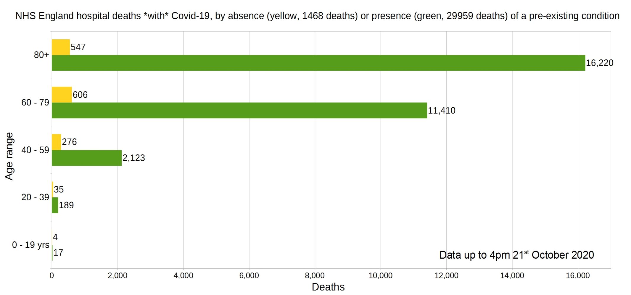
England deaths with Covid-19 by absence (yellow) or presence (green) of a pre-existing condition. Data from NHS England.
Percentage of deaths with Covid-19 by pre-existing condition. (95% have one or more P.E.C.) NHS England data.
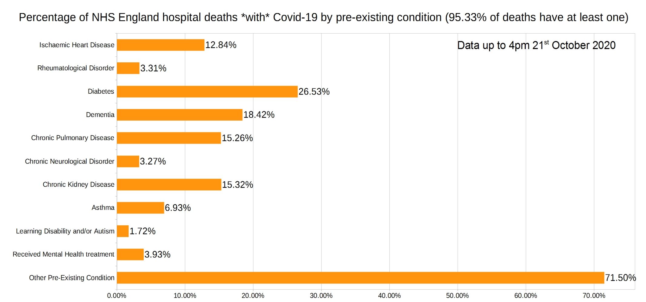
Note that the most common pre-existing conditions are diabetes, followed by dementia, chronic pulmonary disease, and chronic kidney disease.
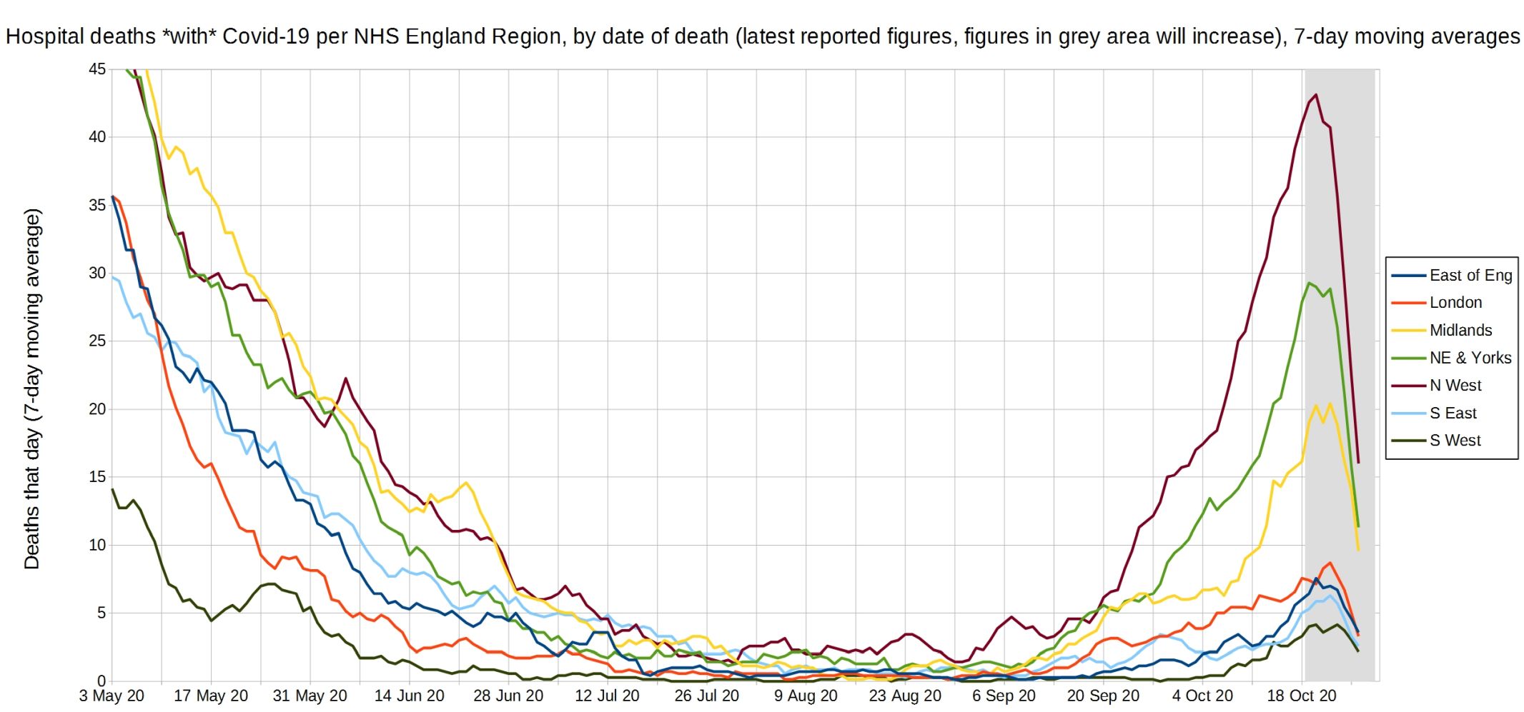
Trendlines (7-day average) for Covid-19 deaths by England NHS region, by date of death. (Note that the numbers in the grey area may increase over the next few days.) NHS England data.
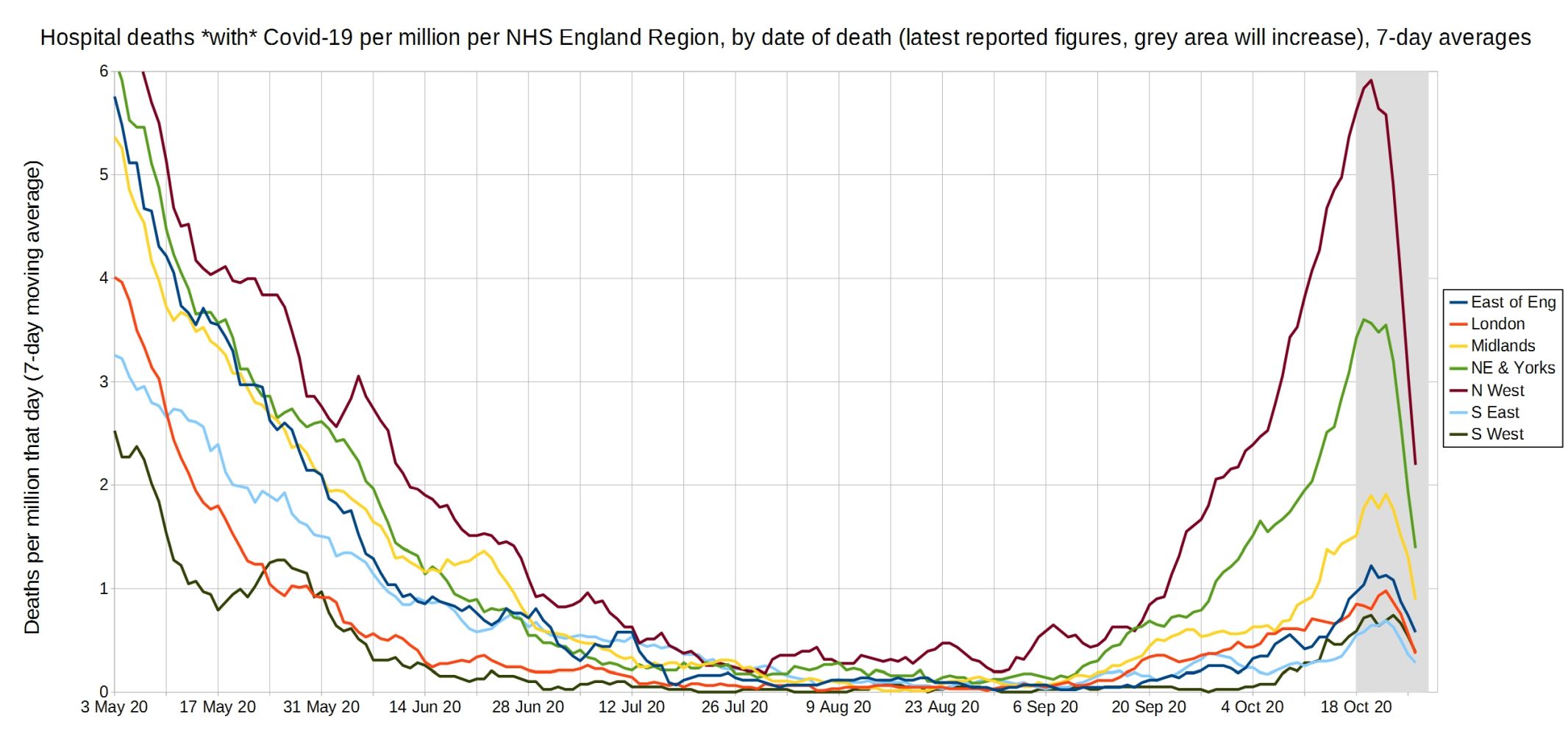
Trendlines (7-day average) for Covid-19 deaths per million by England NHS region, by date of death. (Note that the numbers in the grey area may increase over the next few days.) NHS England data.
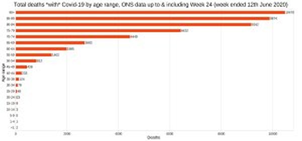
England and Wales total deaths with Covid-19, by detailed age range. ONS data.

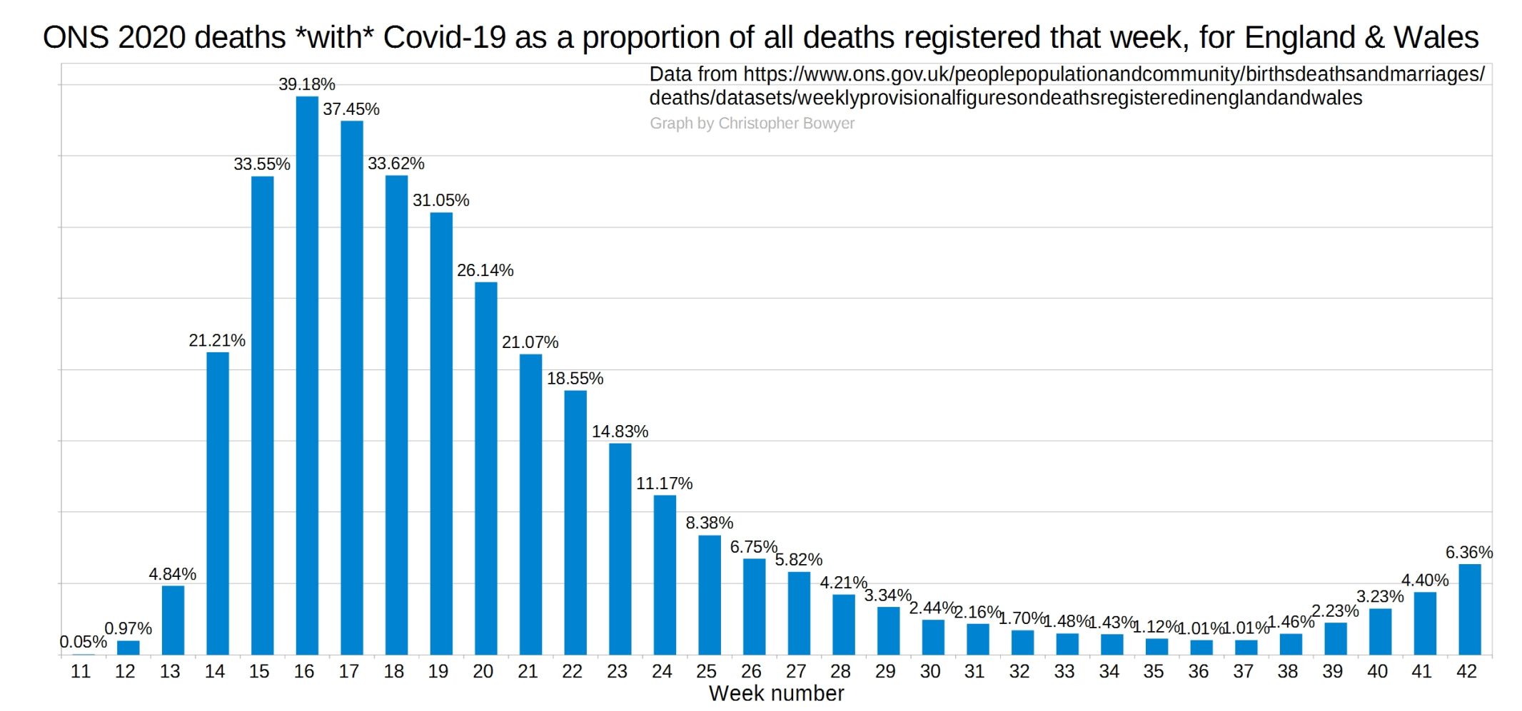
ONS England and Wales Covid-19 deaths as a proportion of all deaths registered that week.
ONS England and Wales weekly all-cause deaths compared with the five-year average.
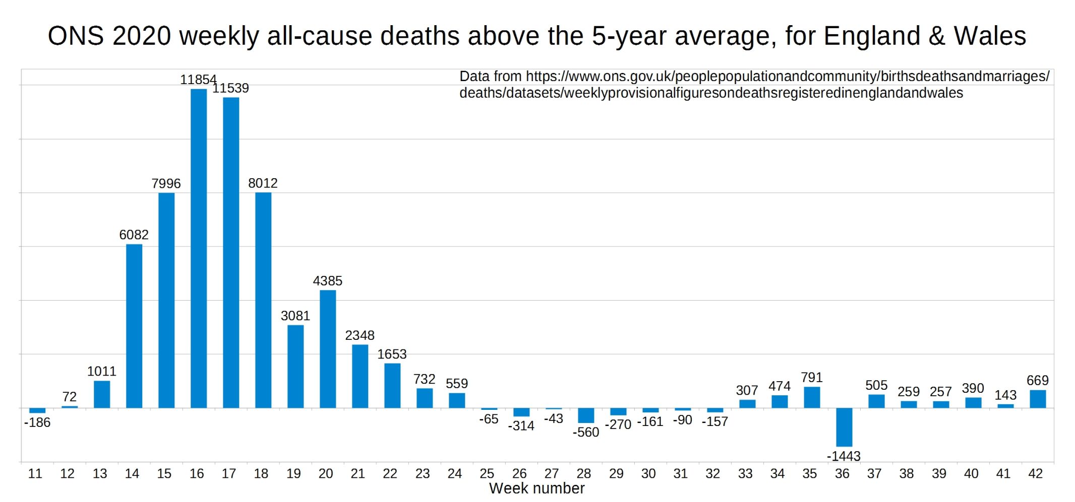
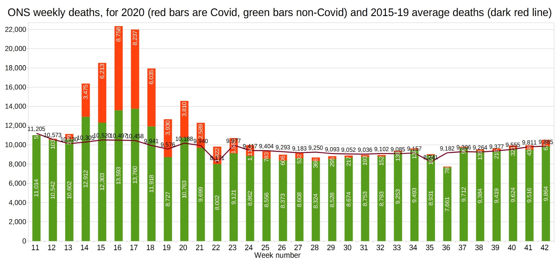
ONS all-cause deaths for 2020 vs 2015-19 average.
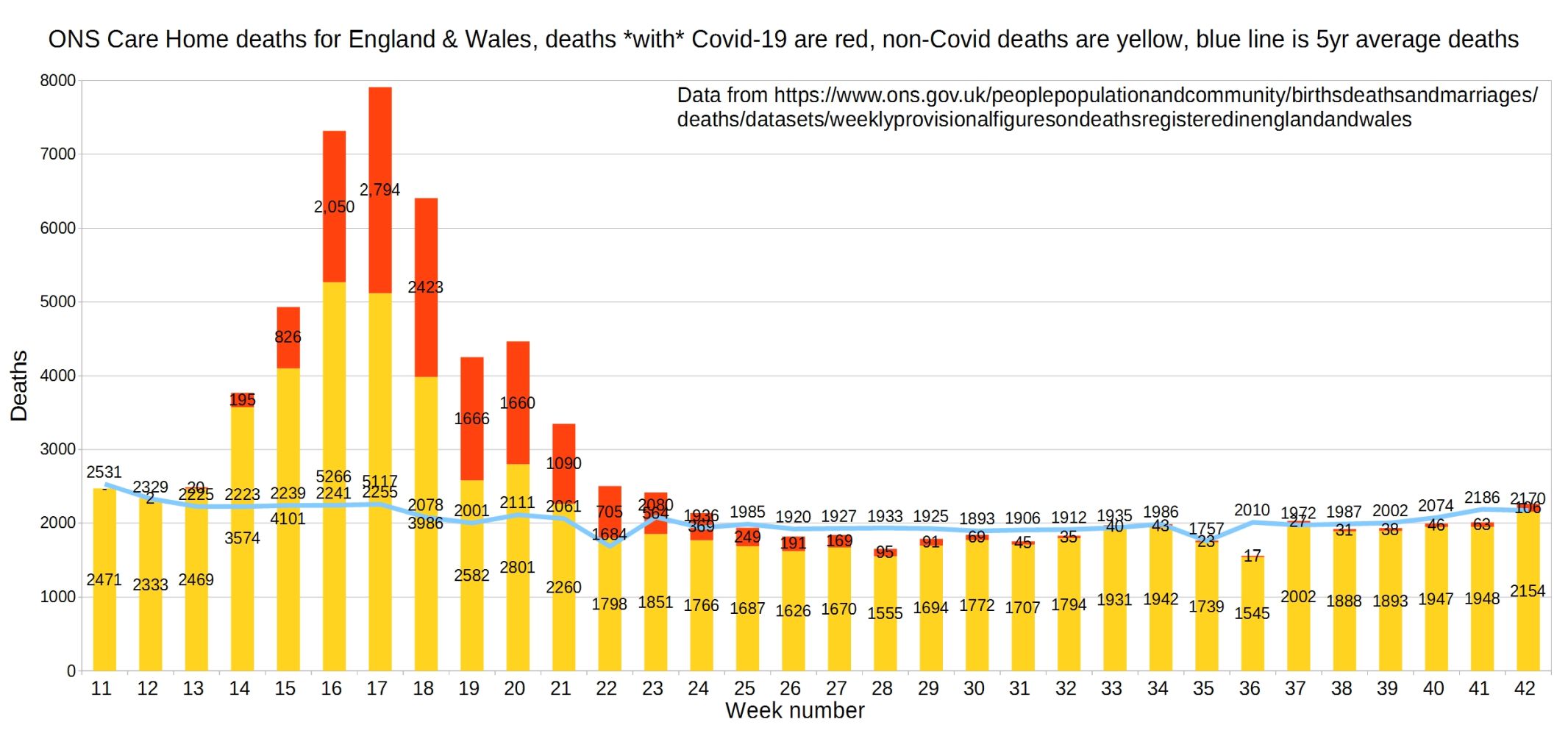
England and Wales weekly Covid and non-Covid care home deaths. ONS data.
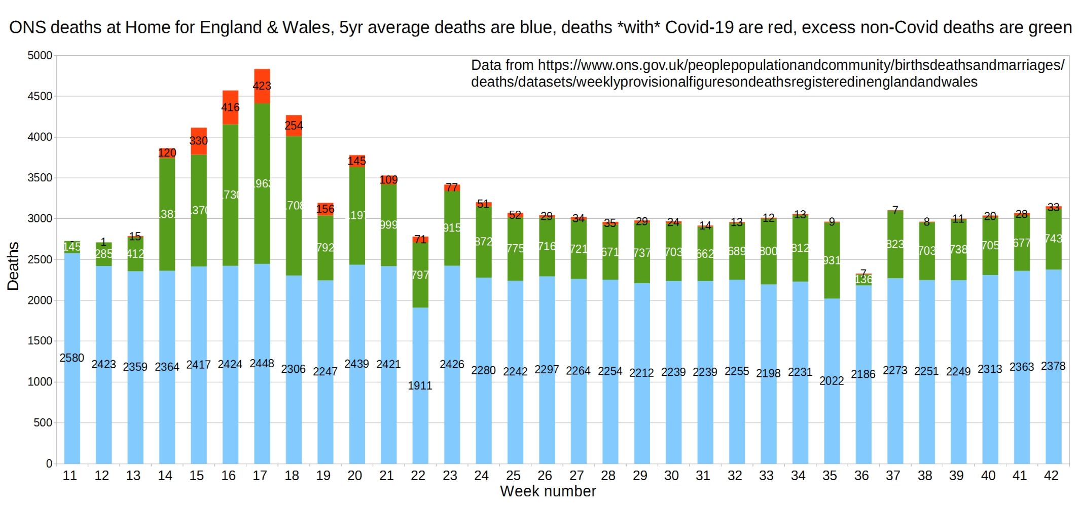
England and Wales weekly Covid and non-Covid deaths at home. ONS data.
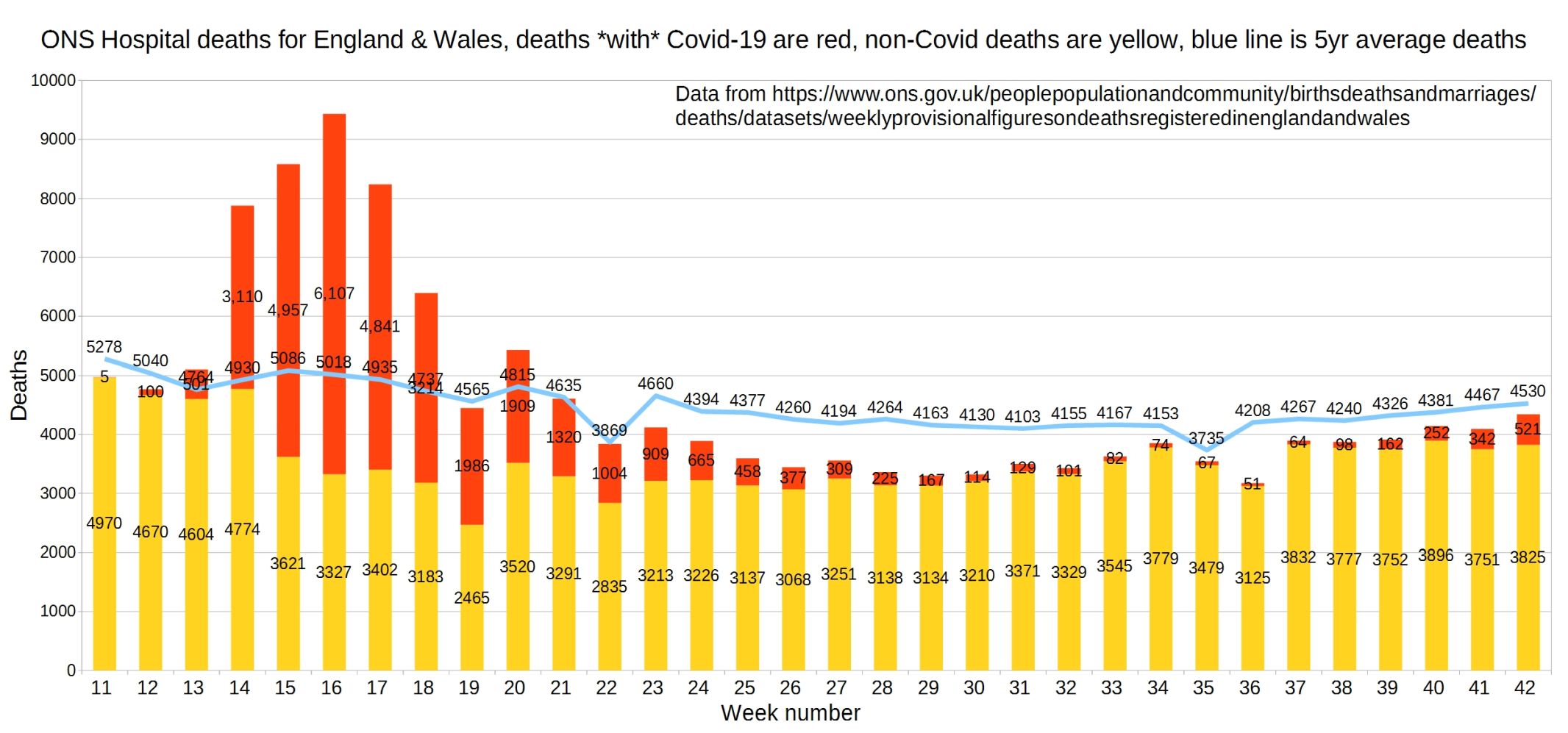
Hospital deaths for England and Wales. ONS data.
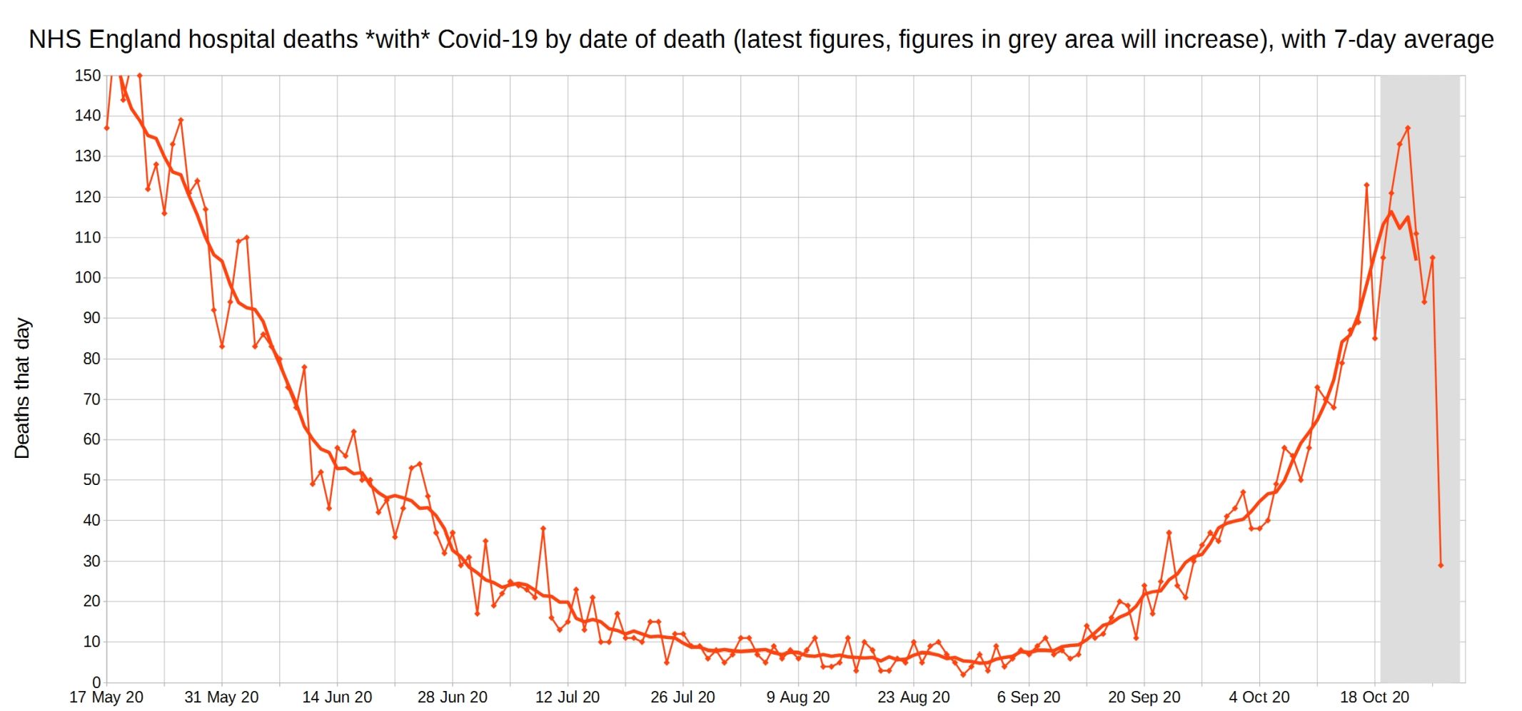
NHS England hospital Covid-19 deaths each day, latest reported figures, with 7-day moving average trendline.
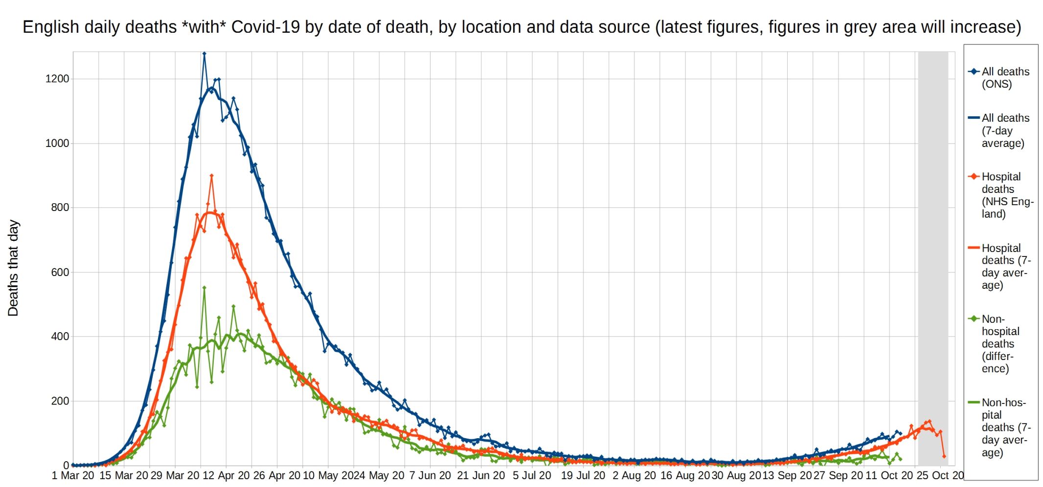
All Covid, hospital Covid, and non-hospital Covid deaths in England each day, with 7-day moving average trendlines.
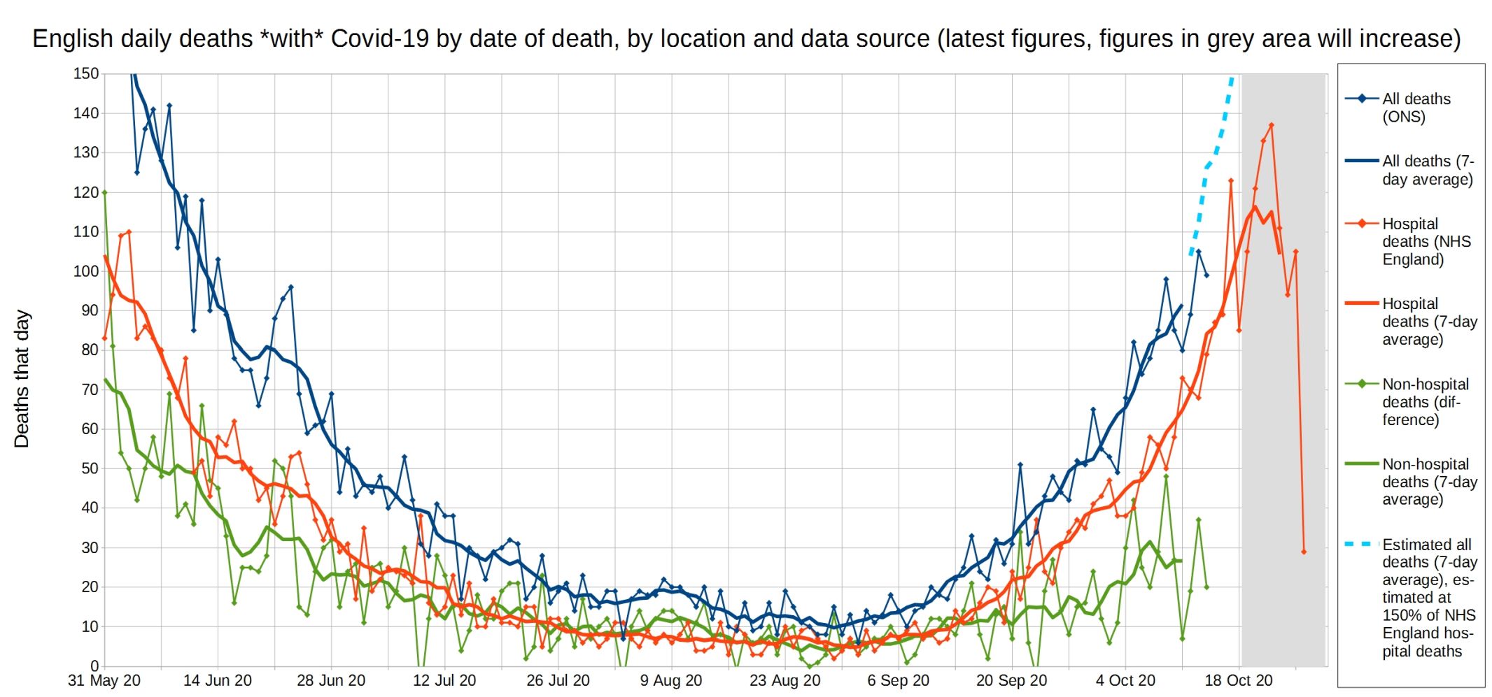
A close-up of this graph, looking at recent weeks.
‘With Covid’ deaths (yellow) compared to flu and pneumonia deaths (blue), with the red line the five-year average for flu/pneumonia.

Update: Please support this website by donating via KoFi, subscribing via SubscribeStar or Patreon, or buying my book (see right-hand sidebar for links). Independent media like Hector Drummond Magazine, and my constantly updated Twitter and Parler accounts, cannot survive without your support.
3 thoughts on “Week 42 graphs from Christopher Bowyer”
Thanks Christopher, excellent as always. I especially like the last chart showing normal flu deaths to covid; really helps put it into perspective.
Excellent as usual. Excess deaths without covid at home exceed all causes excess deaths. So at the point the govt is going to call a lockdown because of covid, the existing problems of getting health care for other diseases exceeds the covid problem. This fact should not be lost at a future enquiry.
And of course the last graph puts it all in perspective.
Hi Christopher,
I just compared your week 42 (21/10) and week 39 (30/9) numbers for hospital deaths. This shows 1,418 extra deaths. This analysis showed that just 31 of 1,418 deaths concerned people that were aged under 80 and died without a pre-existing condition present. That is 2.2% of all deaths. I did wonder how this might have tracked since the start of your analysis. Possible tracking down due to improved treatment.
Comments are closed.