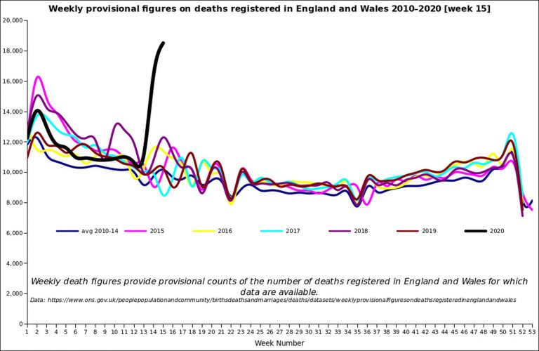
A line graph of the latest ONS all-death figures for England and Wales up to the end of week 15 (April 10), with the past five years and the 2010-14 average in there for comparison. (Click to enlarge.)
(It may look scary, but remember that your risk of dying from C19 is still very small.)
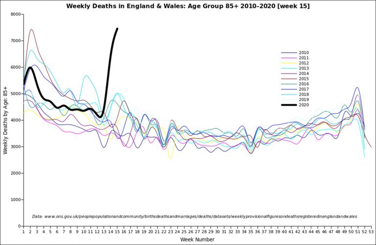
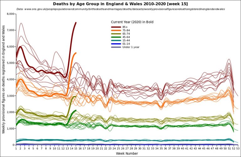
A line graph of the latest ONS all-death figures for ages 85 and over, for England and Wales, up to the end of week 15 (April 10), with the past ten years in there for comparison. (Click to enlarge.)
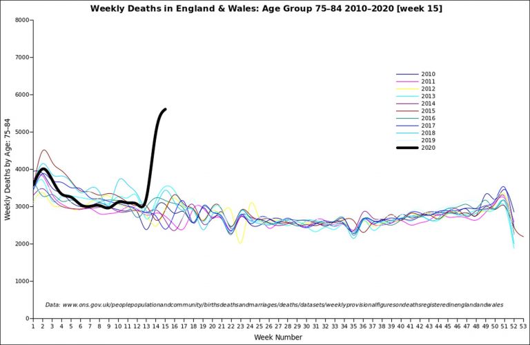
A line graph of the latest ONS all-death figures for ages 75-84, for England and Wales, up to the end of week 15 (April 10), with the past ten years in there for comparison. (Click to enlarge.)
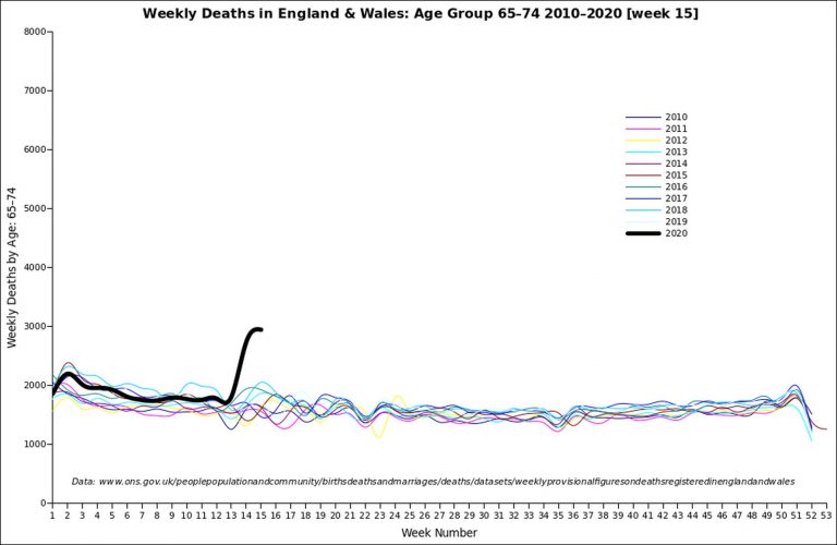
A line graph of the latest ONS all-death figures for ages 65-74, for England and Wales, up to the end of week 15 (April 10), with the past ten years in there for comparison. (Click to enlarge.)
A line graph of the latest ONS all-death figures for all ages, for England and Wales, up to the end of week 15 (April 10), with the past ten years in there for comparison. (Click to enlarge.)
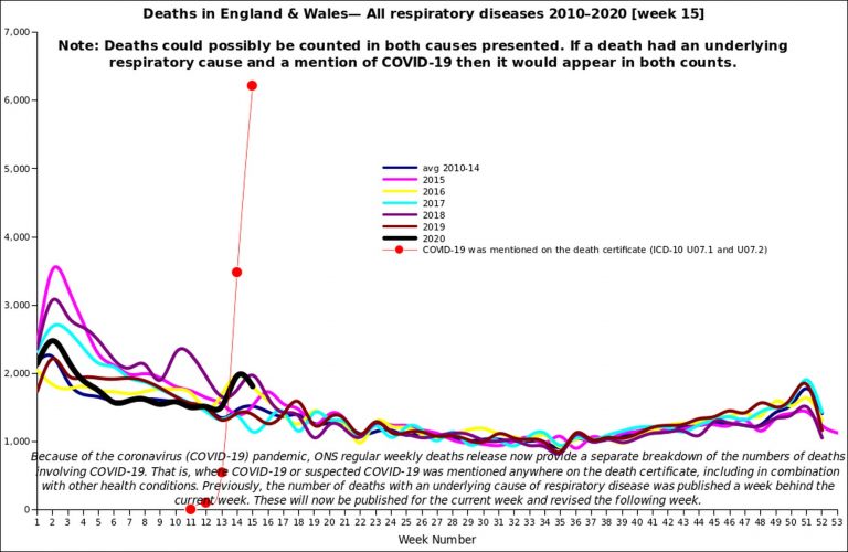
A line graph of respiratory deaths for Eng & Wales up to the end of week 15 (April 10), with past years in there for comparison. (Click to enlarge.)
Basically, respiratory deaths are in the normal range. But bear in mind that Covid-19 is killing many people in other ways.
Note: Graphs done by blog reader David Clark, who does this sort of thing for a living. All stats are from the ONS.
23 thoughts on “Week 15 ONS line graphs”
So what you’re saying is that overall deaths have shot up, and the older you are the more they have shot up, but respiratory deaths are nothing out of the ordinary. So older people are dying in droves but not particularly because of respiratory problems.
Yes, although that may be an artefact of the way the Covid-19 deaths are being reported.
“But bear in mind that Covid-19 is killing many people in other ways.”
Is it at all understood how Covid-19 can kill someone? From what I can see, it seem hazy.
It’s mostly elderly people nearing the end of life, and people with other serious medical issues. Covid weakens them and that finishes them off. Flu is similar.
On the first graph, the week 52 for 2015 (purple line) does not match the week 1 line for 2016. Ditto for 2016/2017, etc.
There seems to be a data mismatch.
So were all the people clamoring for you to “wait a couple of weeks” vindicated, as it were? Have the recent data caused you to change your position on the government’s policies in part or in whole?
That is a striking jump in all-cause death and something feels…off about it.
I also predicted a rise in deaths over late March to mid April as we came to the peak, and then a falling off as the warmer weather comes in. If this really was the once-in-a-century mass killing pandemic that its being portrayed as then we would have seen far more deaths than we have.
But I don’t think the lockdown is worth it even if we’d had 100 000 more deaths. I need to write a blog post about this.
Map for Wales:
https://datawrapper.dwcdn.net/7Lbsv/1/
Less singing in the valleys…
Another map with relevance for lockdown decisions looks at how long ago local cases peaked, where that can be reasonably identified. There are still a few where the peak date remains uncertain, but they are also mainly areas with low case rates.
https://datawrapper.dwcdn.net/eFD6C/1/
@Hector
Para 1 +1 Global Pandemic? Deaths (176,786) and infected (2,520,522 cases) are orders of magnitude below a Global Pandemic
Para 2 +1 UK Shutdown cost is running at £2.4bn/per day or ~£30 Million per With CV-19 premature death and GDP cost/death increasing daily
Maybe it’s time to put Col Tim Collins in charge, he’s not scared of some deaths causing negative press coverage unlike our spineless politicians who refuse to lead and hide behind Medics whose prime objective is saving lives
Replacing Med advisors with Undertakers another thought
Gov Today (again): Isolation needed for rest of 2020. Must wait for a vaccine or people might die.
Was world shut/isolating before MMR, Whooping Cough, Chickenpox, Flu…. vaccines?
As I was at Prep school in 196/70s and caught all but mumps; holidayed in IoM, London, Tunisia, Austria, Switzerland: world Not shut
Is world shut/isolating from:
TB: 1.5 million people died from TB in 2018
HIV: In 2018, 770,000 people died of AIDS-related illnesses. This number has reduced since the peak of 1.7 million in 2004 and 1.4 million in 2010
Message for Govs: Everybody Dies
Nice graphs but why replicate what you can see on Euro Momo?
Also the comparison is not with deaths in these weeks its with excess deaths during influenza seasons which are mid winter. EuroMomo all ages excess deaths graph clearly shows the CV-19 excess is almost exactly the same as the 2018 influenza excess death graph in amplitude, duration and shape.
The govt also needs to model non-CV early deaths that will result from lockdown and the economic damage. Surely they can’t be blind to the need for trade-offs, especially as we accept tens of thousands dying from flu during a bad flu season. Only some failures of major businesses will wake them up from denial about the effects of lockdown.
Each year is a line drawn separately from week 1 to week 52/53. The line starts at the value for week 1, it ends at the value for week 52/53.
JW, if you spent some more time here you’d see that I have regular posts on the Euromomo graphs, and posts on excess winter deaths.
Euromomo graphs have the advantage that they do go back far enough to show previous winters. On the other hand, they insist on adding predicted numbers in for up to a week, which aren’t real numbers.
Understood. That would be best as saying that Covid-19 is causing an increase in mortality in the vulnerable population.
The way the media report the numbers of deaths paints it as a sythe that is cutting down tens of thousands. That, to me, is highly misleading. It is also part of the reason those who seem most fearful are mostly younger and at almost zero risk from Covid-19.
Is it really beyond wit for the ONS to provide death statistics by when the death actually happens, as opposed to when it is reported? There seems to be a lot of weekend and holiday artefact in the numbers.
As I understand it, all deaths have to be registered, there is some legal time limit for it, and it’s likely that the overhwhelming majority of deaths do indeed get registered within the legal time limit.
So, apart from the fact that you can’t breathlessly report this week’s registered deaths but have to wait for legal time limit + 1 day, it can’t be that hard, can it?
Yep. I warned of putting too much store by the early figures which represented a period when there were very few reported cases at all, but these figures barely show a doubling of total deaths. Which – don’t get me wrong – is terrible, but, as you say, it’s not a once-in-a-century megaplague.
One thing I’d like to know… although the Deaths by Age Group chart makes the increase in with age look very clean, proportionally, it actually appears quite similar for everyone over 45: somewhere between 150 and 200%. And there is an uptick in the 15-44 group; I wonder what that line would look like scaled up.
Obviously you’re less likely to die the younger you are, but as the chart itself shows, that’s always the case. Since we’re dealing with a new threat above the baseline, the (or, at least, one) question should be whether it presents the same increase in danger for all ages or not. I’m prepared to believe that it doesn’t, but it’s far from clear on the chart.
Some uptick in 15-44 age group, but there’s a good chance some or most of that is caused by the lockdown.
“I wonder what that line would look like scaled up.”
Here you are:
http://djclark.co.uk/download/ONS-EW-WeeklyDeaths-under74.pdf
I don’t see an uptick of any significance in 15–44.
Are you confusing 15-44 with 45-64? The colours do look similar and the lines for under 1 year and 1–14 are so low they both crawl along the baseline. (under 1 is always higher than 1-14, infant mortality hasn’t gone away.)
The legal time limit is 5 days (not working days) so in principle most deaths should be registered within a week.
The ONS do have an article about how quickly deaths are registered:
https://www.ons.gov.uk/peoplepopulationandcommunity/birthsdeathsandmarriages/deaths/articles/impactofregistrationdelaysonmortalitystatisticsinenglandandwales/2018
If you want to know when it actually happened then you need to wait for all the data to come in ie the quarterly or annual reports. The problem with reporting daily when it takes at least a week for the reports to come in is that the last few days in each report will show incomplete and there for in present circumstances misleading number. Too often people demand to know ‘right now’ but, no matter how pointedly it is stressed that these numbers are incomplete and will change, they will still complain when the revised numbers are issued that they were given the wrong information.
@Sam Duncan
In UK large % of <60 deaths with CV-19 are brown or black, same in USA. Have a look at NHS Staff deaths
USA White House has reacted and told hispanic, brown & black to be aware and take extra precautions
UK Gov: hiding behind sofa in fear of "You're racist". Meanwhile Left, BBC, C4:
C4 News at it again on race "Urgent inquiry needed on why disproportionate and unacceptable high number of BME dying from CV-19"
https://youtu.be/meiMiWfvaeg?t=198
FYI: Reports/Research in February said non-white/yellow were much more at risk of death from SARS-CV19
That’s my point – the end of a week 52/53 line for one year should match the start of the line for week 1 of the following year. They don’t.
Comments are closed.