This is an article by Andrew Carey, addicted gambler and unemployed tree feller.
When the virus that was to be named Covid-19 erupted in Wuhan I noted that the city had a Metro system. When this virus arrived in the UK, London hardest at first, I thought the Underground system must be a factor in its rapid spread with its crowded trains, surfaces that get touched and generally sharing of the same air.
Then I wondered: the London Underground doesn’t penetrate south of the River Thames very far. That’s mainly, although not exclusively, the territory of overground trains. So it should be easy to find a link between Underground travel and the CV-19 virus being shared.
But before I go on I should mention US physicist and Nobel Laureate Richard Feynman. I’ve long admired and enjoyed the his books. In his down-to-earth autobiographies he praised the guy who did many boring experiments on learning in rats only to learn nothing about rats apart from all the environmental cues you have to eliminate and things you have to control for before you can do an experiment on rat intelligence. He also said that you should declare your expectations from any experiment before you do it.
So let me declare a bias. I hate the London Underground. It’s hot, dull and claustrophobic, and when I commuted on it twenty five years ago never saw it as a liberating force that allows people to cooperate more quickly than the alternatives and thus make more wealth so people are more free to do with their lives what they wish.
Anyway, I looked a little further into the matter.
For the data on stations which are part of the Underground which are actually underground, as in being part of the tunnelled network, this source was used:
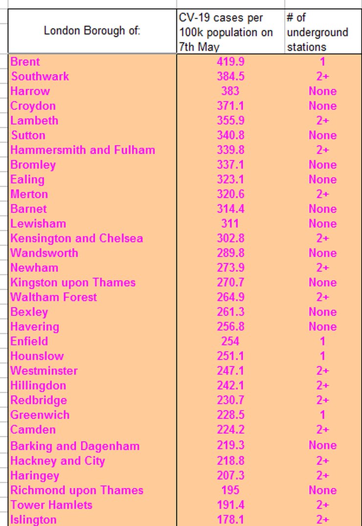
The data on local authorities cases per 100k of population is generally available on the BBC, Sky news and other sources. I broke the data down into Local Authorities that had none, one and two or more underground stations which are actually below ground and produced this table:

There may be an error in there. And any data may only be a proxy for what actually goes on – if you commute from Camden to Westminster you may pass through two underground stations. If you’re travelling from Harrow to Central London for work you likely have one egress or entry which is actually underground on each leg of your trip.
That said, the results are not what I expected, as there appears to be no positive correlation between travelling underground and the local authorities worst affected.
There was an excellent piece by Jonathan Kay on Quillette which mentioned that no transport hubs were the locations of super spreader events.
So we have some evidence that the London Underground can go back to business as usual as long as the passengers treat each other with respect. Sure, there will be transmissions of this virus that occurs on the network, but it is not a high-risk environment for transmission of this beastly thing.

13 thoughts on “Andrew Carey: Covid and the underground”
I wonder what the correlation would be if you compared covid cases to the numbers commuting by tube for each borough? The population per borough is not a straight proxy for the number of tube users…
Good analysis. Interesting to add that Tokyo is renowned for packed trains – overground and underground, and yet their societal Covid transmission is much much lower. The obvious observable difference is that they all wear masks.
I am sure, when this all is said and done, that we will all agree that the use of face masks is an extremely effective way of reducing transmission.
“Cases” is such a poor measure — as much a function of testing as of infection. And since the Diamond Princess data tells us that 80% of infections produce only minor or unnoticeable symptoms, even widespread testing may not be particularly informative. Deaths are the only meaningful data in an asserted “pandemic”.
Another factor is the now-established-beyond-any-doubt real-world observation that C-19 deaths are concentrated in the aged & infirm — who do not seem to be heavy users of mass transit systems. Further, the potential for infection from travelling on the Tube (for the unfortunate 1 person in 5 who lacks natural immunity) comes from proximity to other passengers inside the train — not from whether the train is above ground or in a tunnel.
If the data were available, it would be interesting to see if individuals who possess season tickets/monthly passes on a system like the London Underground had an age-adjusted higher probability of dying from/with C-19.
Another observable difference is that of obesity.
Some not very scientific thoughts on why the underground, or transport in general, doesn’t appear to be the super spreader you’d expect from what we’ve been told about the virus:
People generally don’t talk to each other. See the excellent work done by (Jonathan Kay at Quillette on super spreading events that has now been taken up by academics). Its also unlikely they’ll be facing the same person for more than 15 minutes.
They tend to be mostly looking down at their phones so not breathing on/at each other.
Its possible to go through the whole system without touching anything. When I was working in London and had to use the tube I made a big effort not to touch anything unless I really had to eg grabbing a handle when the train rocked unexpectedly.
The big one is bus drivers and they are in the firing line as people get on and touch their cards right in front of the driver. Human instinct as well as checking to make sure they pay the fare means the drivers will be facing passengers.
An update on the infection rates in Enlgand:
https://datawrapper.dwcdn.net/YIgji/2/
Much of Devon is now free of new cases for over a week. Everywhere is (way) below the German lockdown standard of 500 new cases per million population per week.
A tour around the Worldometers data in map form: firstly, the money shot – deaths per million population:
https://datawrapper.dwcdn.net/95LCA/1/
Of course, lots of caveats about the quality of the data everywhere, but the general picture is very clear. This is a disease that kills in the West. Not to say that infections aren’t also rising a little elsewhere – so here’s a peek at case rates per million population:
https://datawrapper.dwcdn.net/eLGW6/1/
Now here’s where it starts to get more interesting: we can look at the implied case fatality rate:
https://datawrapper.dwcdn.net/eLGW6/1/
It’s interesting to note some of the detail. There are countries with very low case fatality rates – which may be a reflection of the true picture where they have also tested extensively and thus found many mild and asymptomatic cases. Or in some cases, it reflects that they are simply early in the epidemic process, and worse is to follow. Equally, the higher implied rates suggest that testing has been inadequate to find the cases that are out there. So let’s look at testing:
https://datawrapper.dwcdn.net/FCVW7/1/
The first thing that is evident is there has been very little testing in places where the virus has yet to get much of a grip – i.e. Africa. It’s also evident that the richer countries afford more testing – though Venezuela is an interesting exception, either due to forged reporting or a generous donation of tests (that probably don’t work too well) from the Chinese – still they don’t seem to have had many deaths. Of course, very low testing rates may simply mask the existence of the epidemic, but eventually deaths will tell a tale. It’s interesting to note that since South Korea managed to more or less suppress the virus, their testing has apparently fallen way behind – but that is simply because their vigorous trace and quarantine policy means they only need to test small numbers of people around the sporadic outbreaks that do occur, while the rest of Korea gets on with life.
Again we can combine data to see the implied positive test percentages:
https://datawrapper.dwcdn.net/uWHpi/1/
Low testing rates show up very clearly here – they are associated with only testing people in serious condition. Countries with very high test rates begin to have enough data for making more serious estimates of case fatality ratios and other statistics such as looking at possible herd immunity, and getting better data on virus transmission.
I’m not looking to draw too many conclusions at this stage. All the data are of dubious quality, and it’s plainly still epidemic much in progress, so we have little idea whether it will rip through Africa for instance. But for anyone wanting to know where to look for better data, or cases that merit further study, it is I hope a useful guide. It might inform a policy on international travel and any restrictions that might be needed around that, for example. Doubtless the erudite readership will note some other facets worth highlighting.
Long time since I got on a bus, but I seem to remember they had perspex screen between diver and passenger (to stop attacks/robbery rather than disease.)
*The first thing that is evident is there has been very little testing in places where the virus has yet to get much of a grip – i.e. Africa. *
That kind of thing in Africa where it’s done at all would be undertaken by UN / NGO agencies. There’s no public realm in Africa as it’s understood in West. The institutional arrangements and concomitant infrastructure doesn’t exist.
IDAU, your third link is the same as the second, was this supposed to be different link?
Here’s the correct link:
https://datawrapper.dwcdn.net/rXHCA/1/
Balham, Tooting Bec and Tooting Broadway are all in proper tunnels and all are in Wandsworth which you have labelled as having 0 underground stations.
To properly conduct this kind of analysis there are all kinds of other factors that need to be controlled for: Age, % BAME, Distance travelled, frequency, level of overcrowding per station/line etc. Have you ever commuted on SE Region overground trains? Packed in like sardines in hot sweaty carriages. It has already been mentioned that confirmed “cases” is a poor indicator – mainly hospital workers and in-patients were tested. Were they recorded by home address? There are probably 50x the number reported (see: https://covid.joinzoe.com/) at least 50% asymptomatic. So not sure it really tells us much. My own view is that the great majority of Londoners have been exposed to Covid – largely because of the high density of public transport, bars, restaurants, theatres, cinemas, clubs, events, foreign travel and tourists. London was hit very early and very hard.
Comments are closed.