More Covid-19 graphs from Christopher Bowyer. ONS data here (up to week 26, week ending 26 June). NHS England data here. Other Covid data here.
All graphs can be clicked to enlarge.
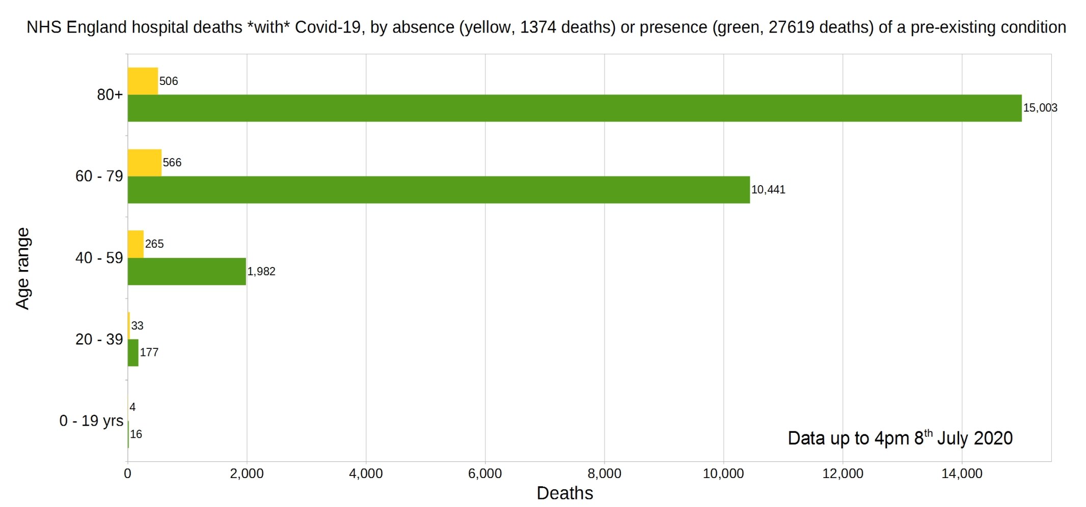
England deaths with Covid-19 by absence (yellow) or presence (green) of a pre-existing condition. Data from NHS England.
Percentage of deaths with Covid-19 by pre-existing condition. (95.26% have one or more P.E.C.) NHS England data.
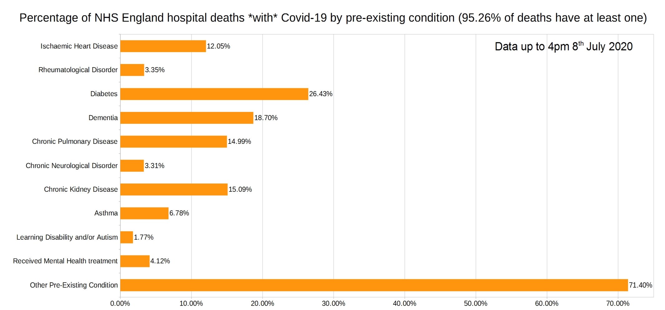
Note that the most common pre-existing conditions are diabetes, followed by dementia, chronic pulmonary disease, and chronic kidney disease.
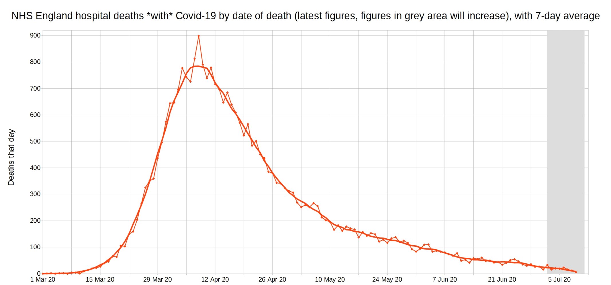
Covid-19 hospital deaths in England by date of death, with 7-day moving average trendline (the thicker line). (Note that numbers in grey area may increase over the next few days.) NHS England data.
Note that Christopher has changed this graph to now feature 7-day instead of 3-day averages, to help cope with the ‘lumpiness’ that results from having so few deaths.
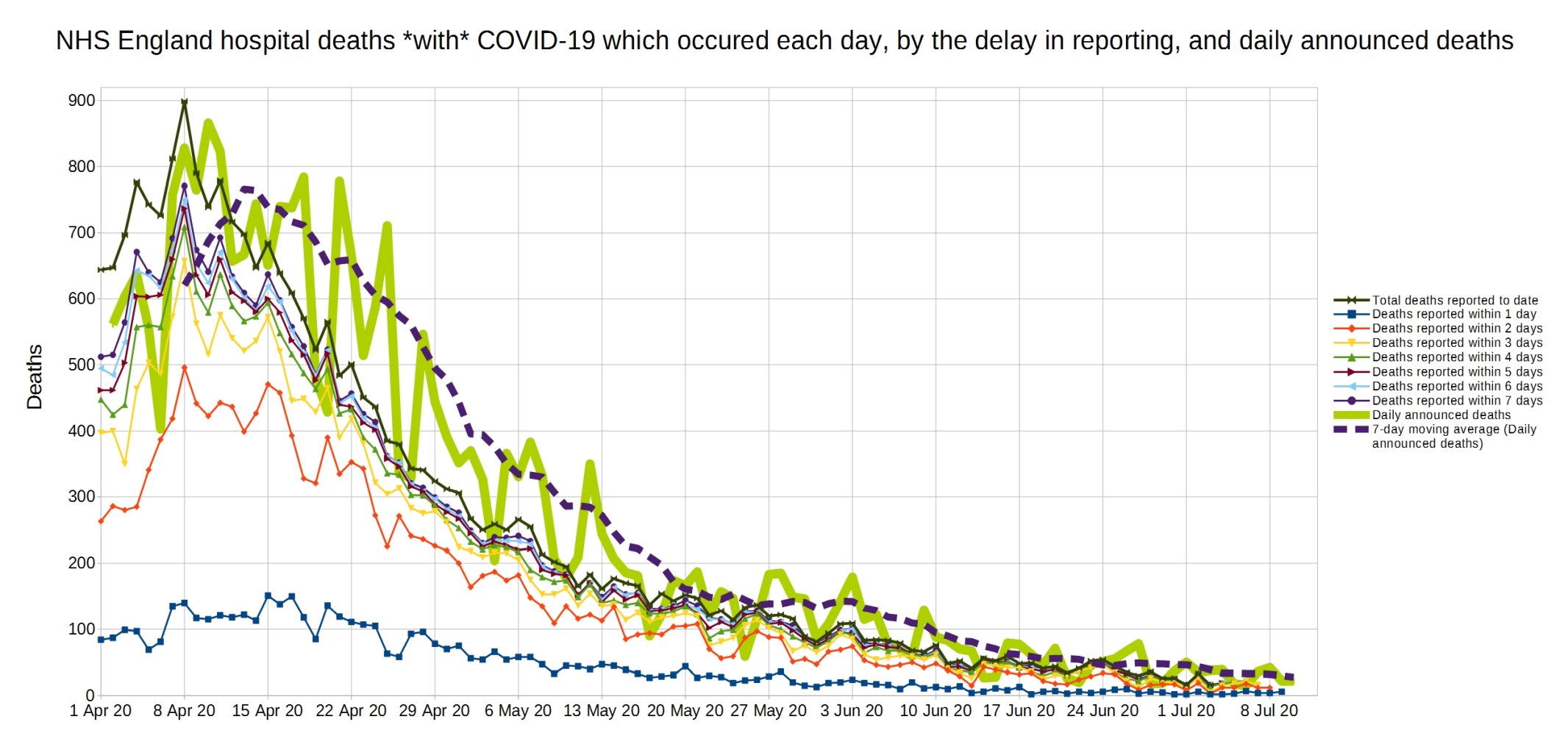
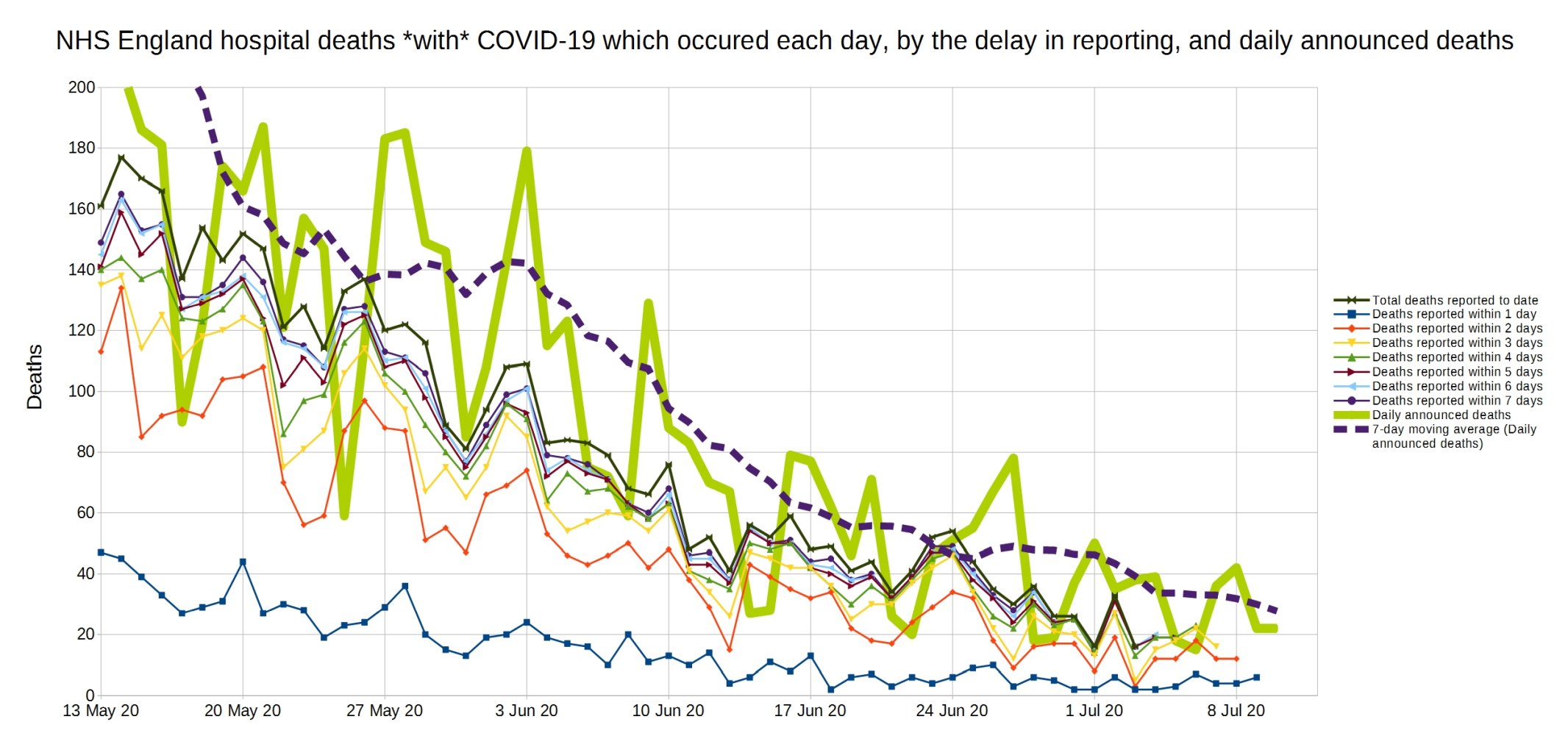
A graph of deaths with Covid-19 in England which occurred each day, by the delay in reporting. Thick line is overall daily announced deaths. NHS England data.
Same again, but a close-up on the last month.
Trendlines (7-day average) for Covid-19 deaths by England NHS region, by date of death. (Note that the numbers in the grey area may increase over the next few days.) NHS England data.
Note that Christopher has changed this graph to now feature 7-day instead of 3-day averages, to help cope with the ‘lumpiness’ that results from having so few deaths.
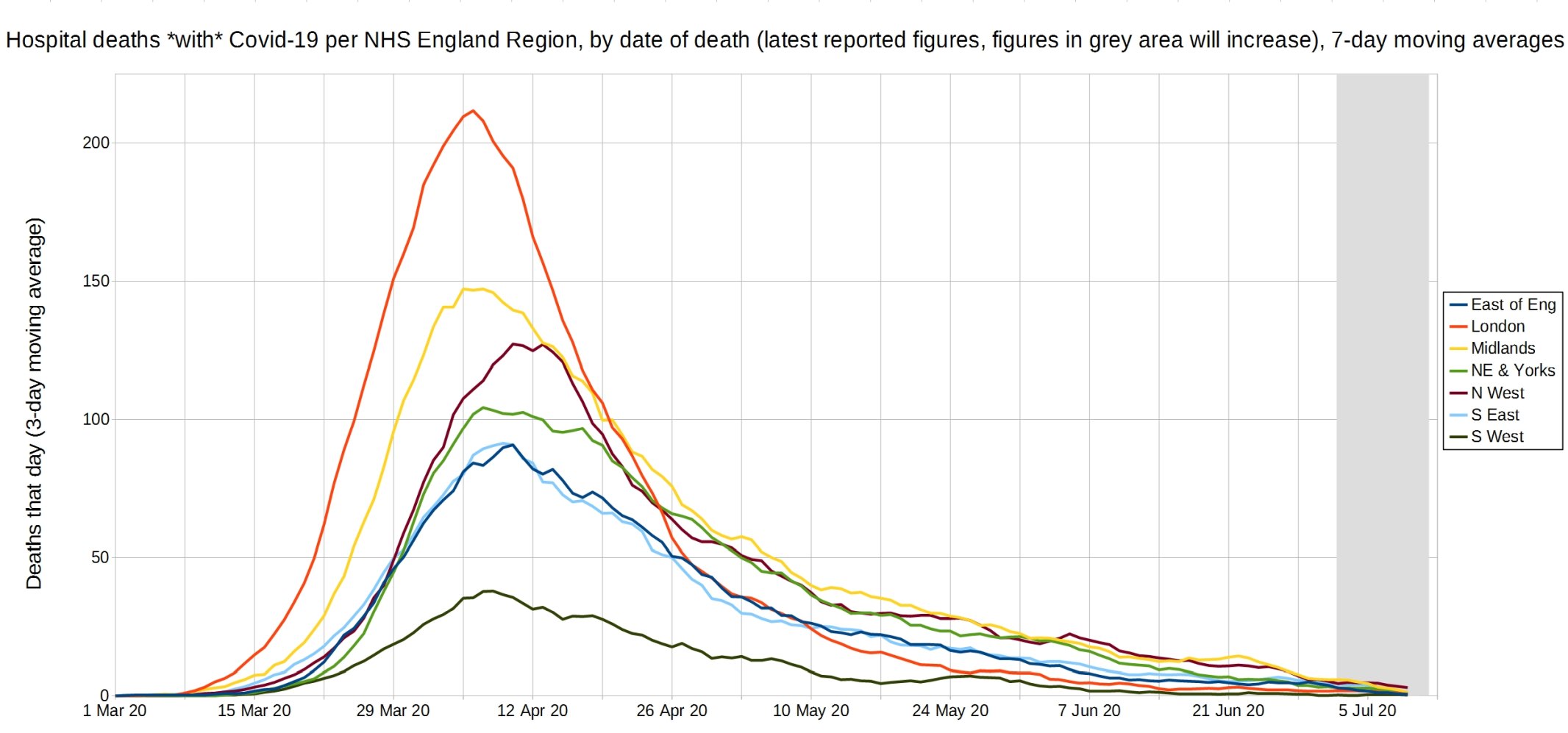
An enlarged version of this graph.

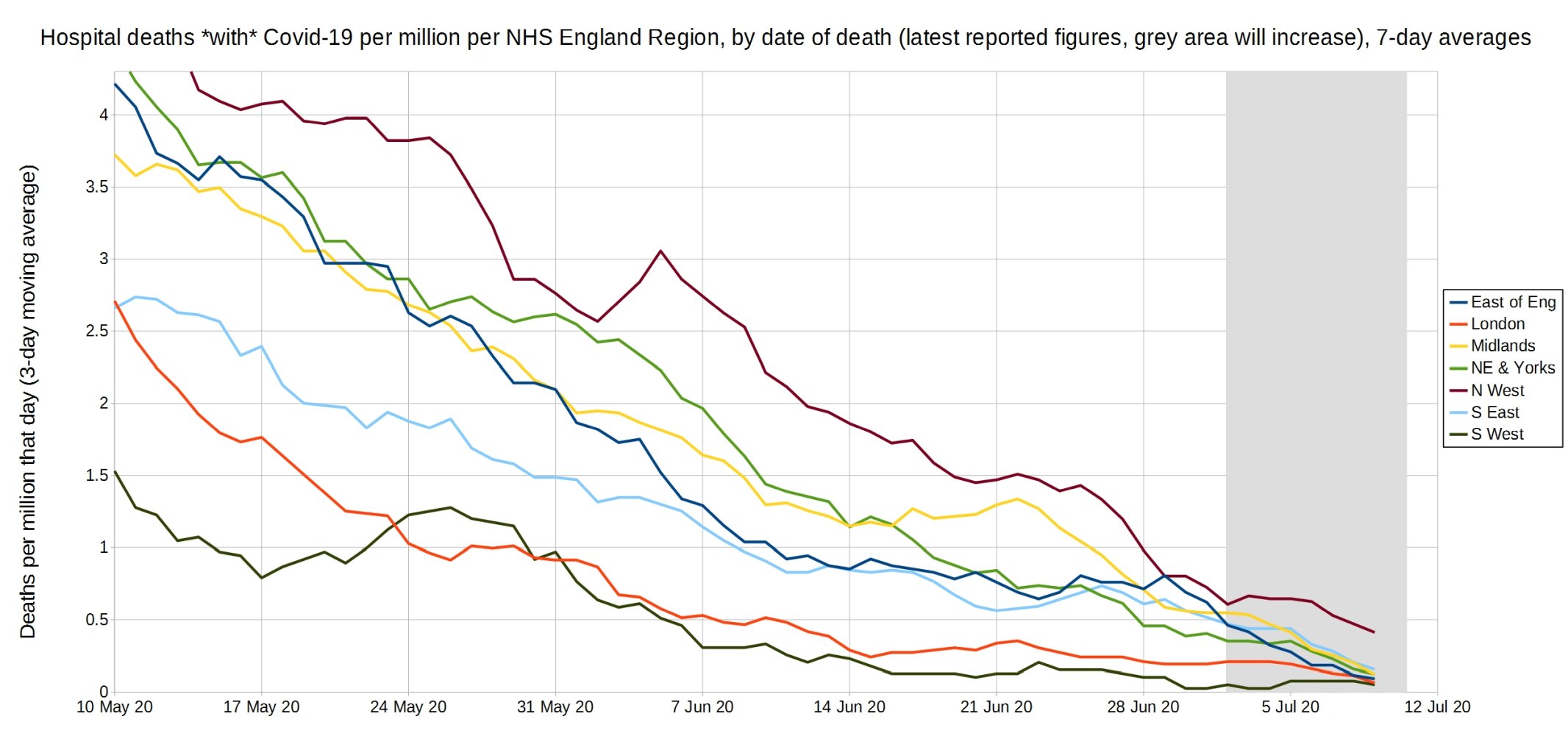
Trendlines (7-day average) for Covid-19 deaths per million by England NHS region, by date of death. (Note that the numbers in the grey area may increase over the next few days.) NHS England data.
Note that Christopher has changed this graph to now feature 7-day instead of 3-day averages, to help cope with the ‘lumpiness’ that results from having so few deaths.
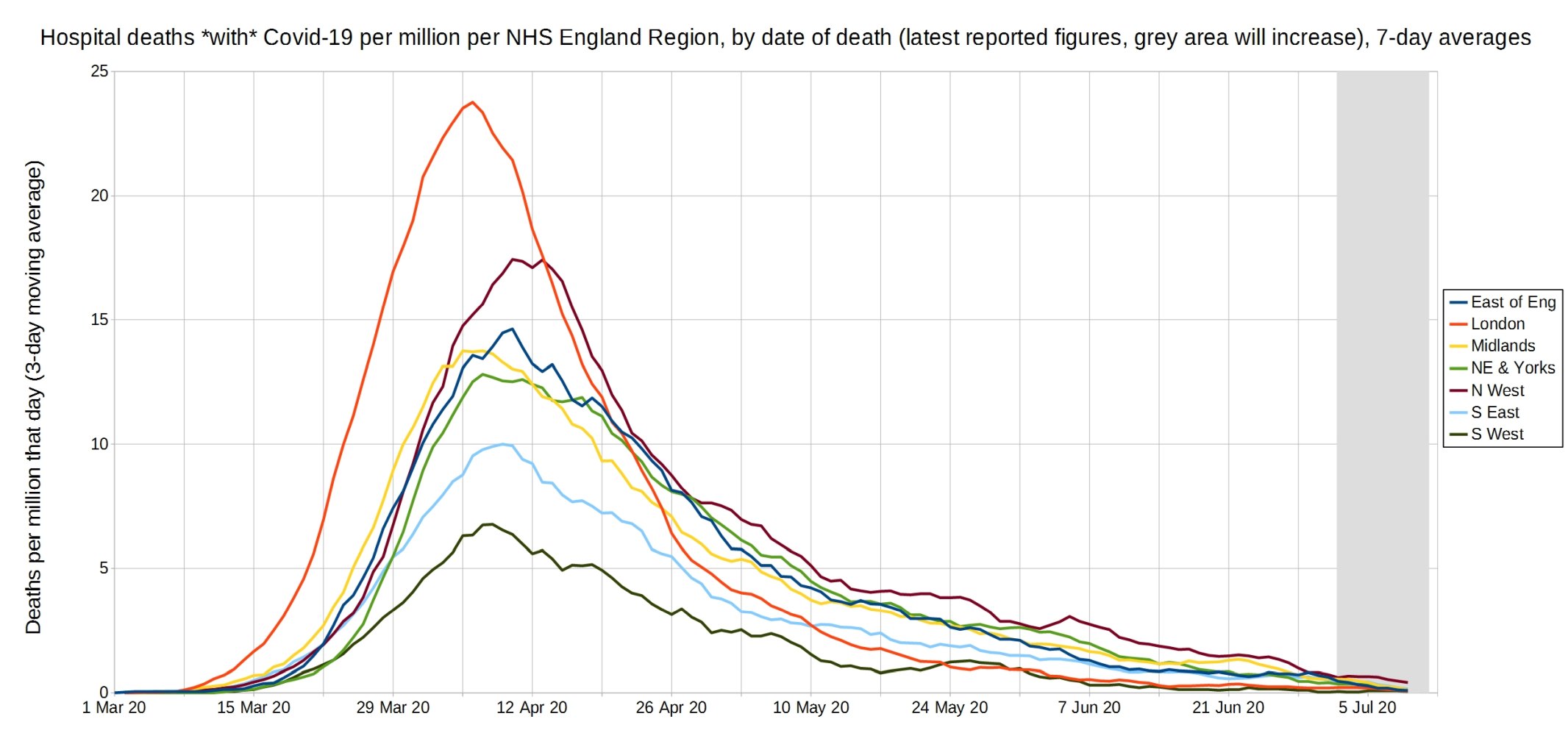
An enlarged version of this graph.
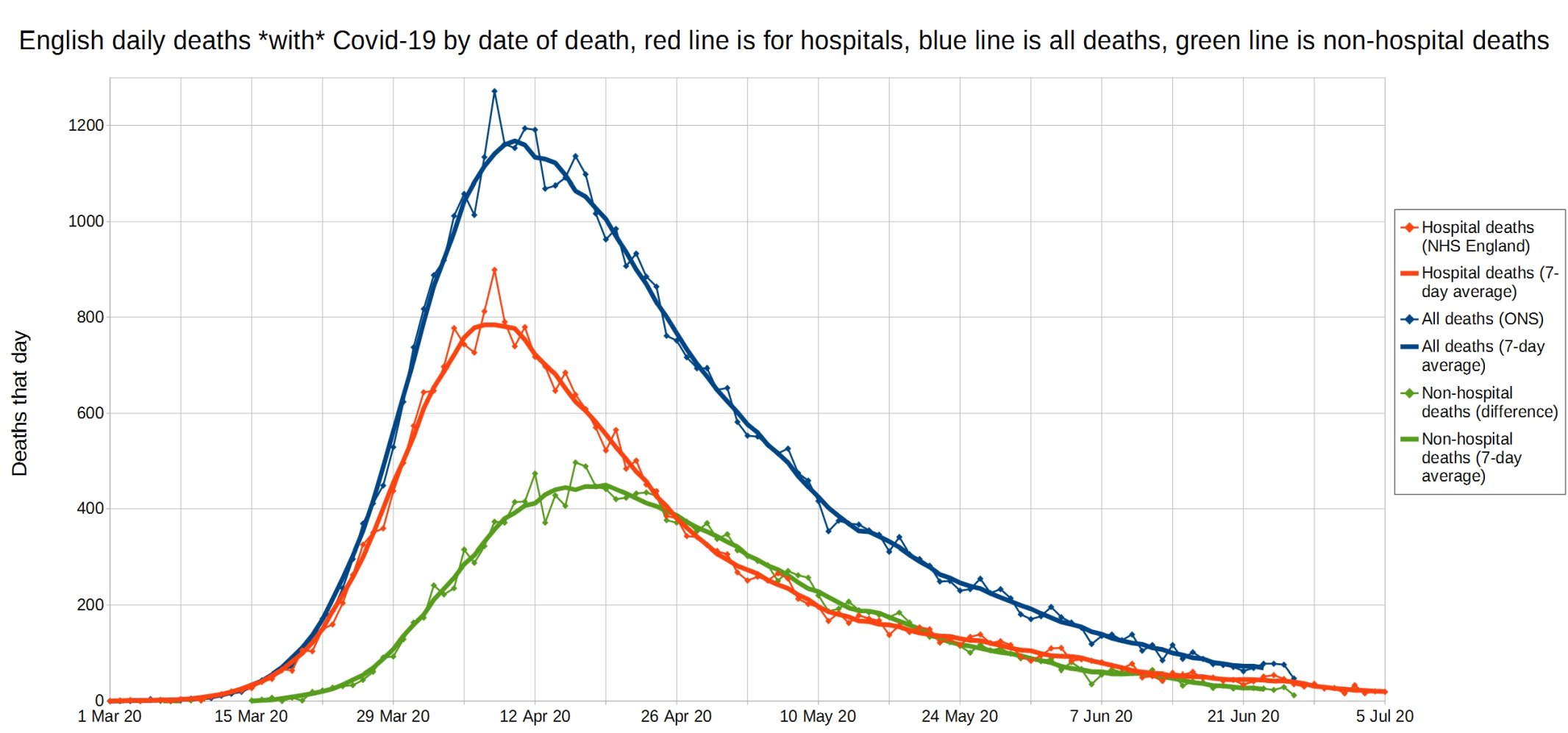
English daily deaths with Covid-19 by date of death. Blue line is all Covid deaths, red line is hospital Covid deaths, and green line is non-hospital Covid deaths. NHS England data.
Note that Christopher has changed this graph to now feature 7-day instead of 3-day averages, to help cope with the ‘lumpiness’ that results from having so few deaths.
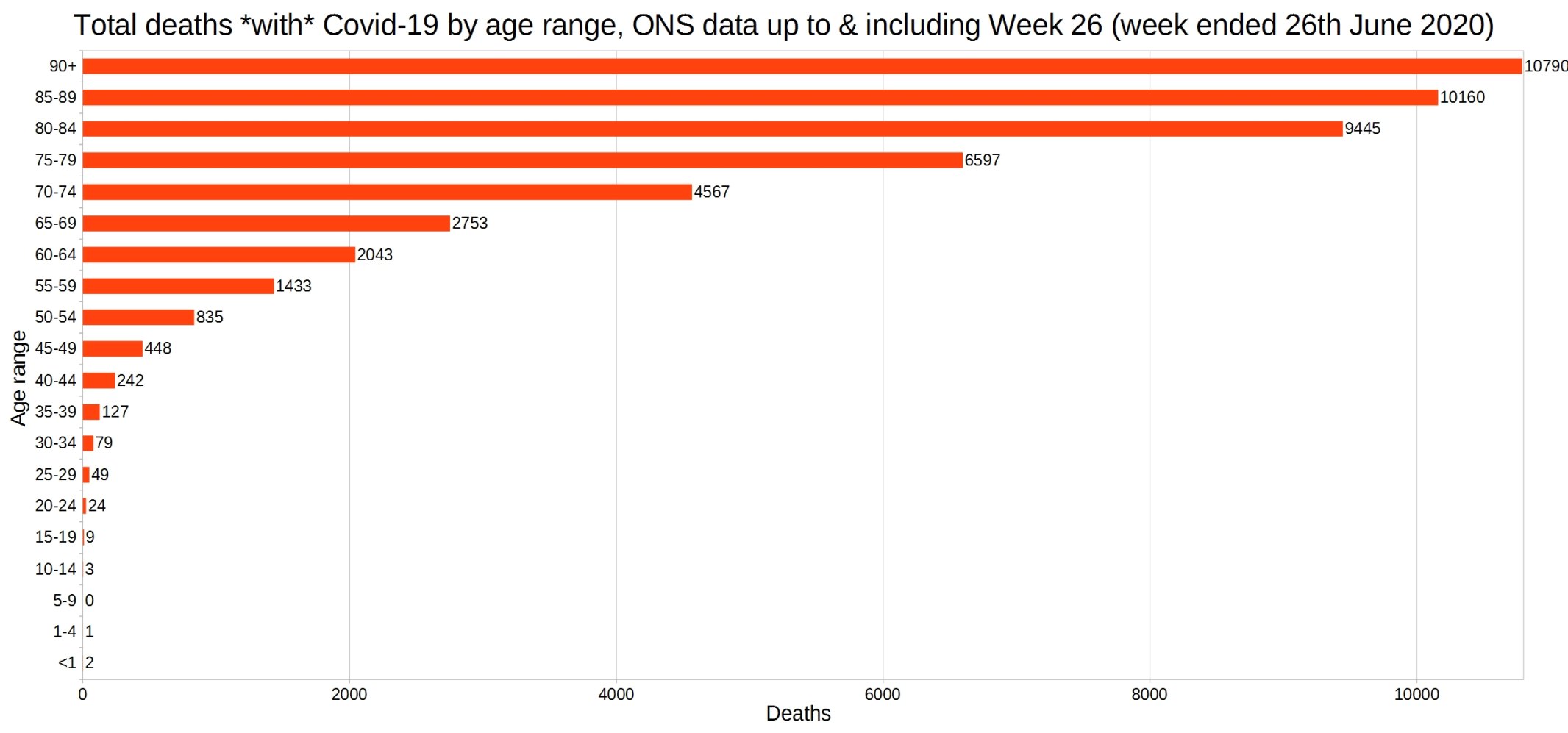
England and Wales total deaths with COVID-19, by detailed age range. ONS week 26 data.
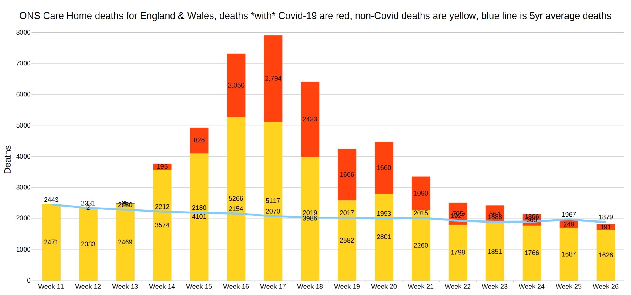
England and Wales weekly Covid and non-Covid care home deaths. ONS week 26 data.
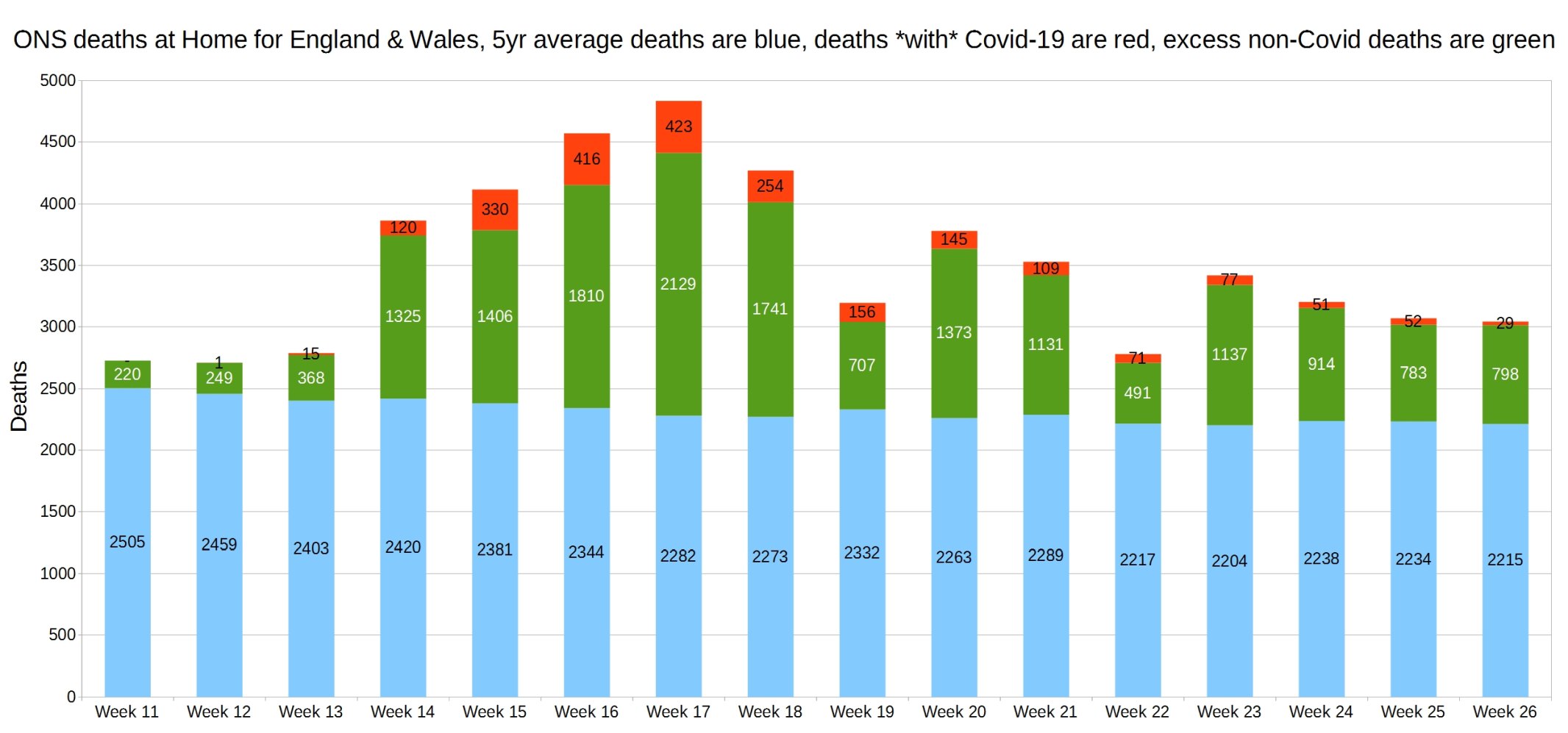
England and Wales weekly Covid and non-Covid deaths at home. ONS week 26 data.
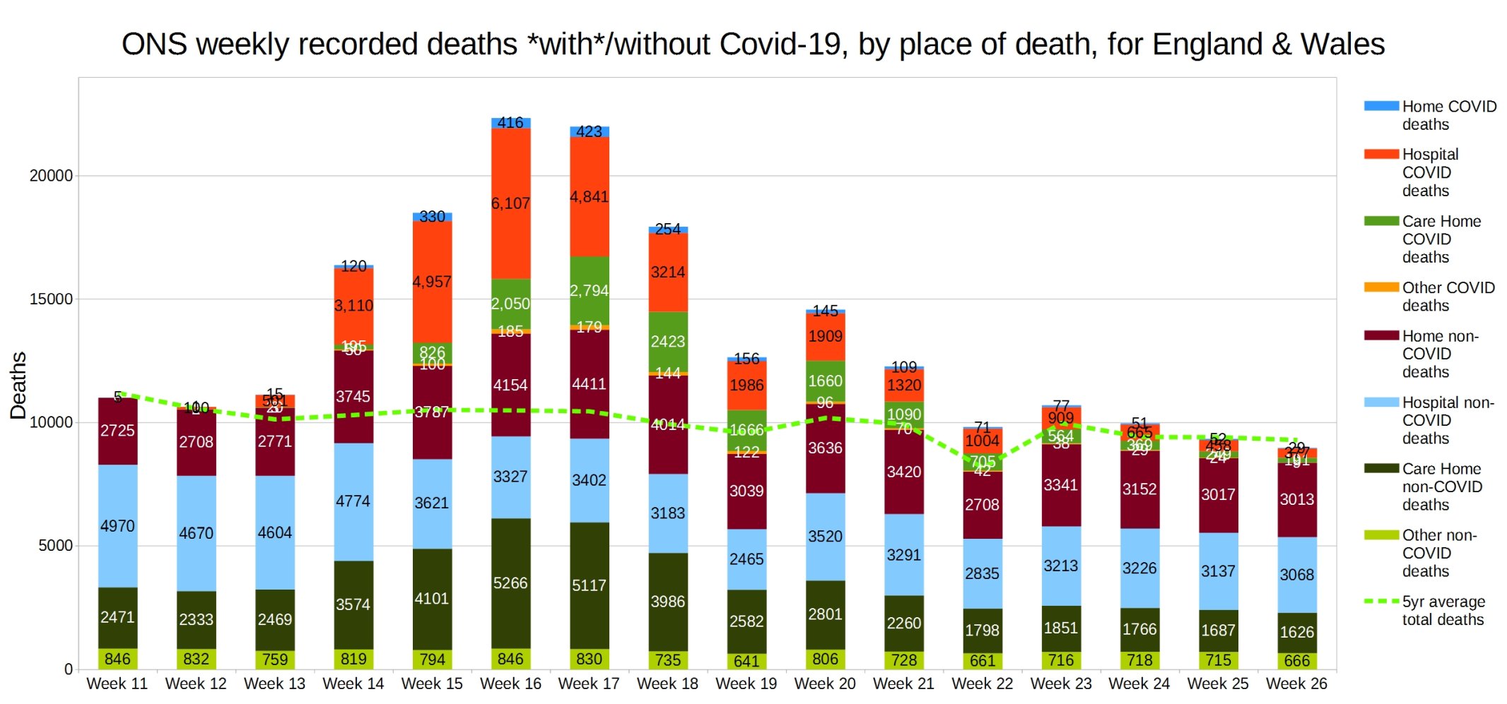
England and Wales weekly Covid and non-Covid deaths by place of death. ONS week 26 data.
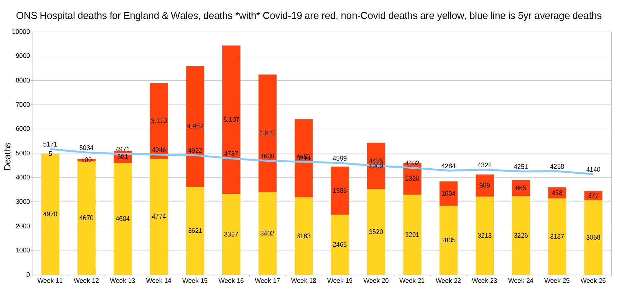
Hospital deaths for England and Wales. ONS week 26 data.
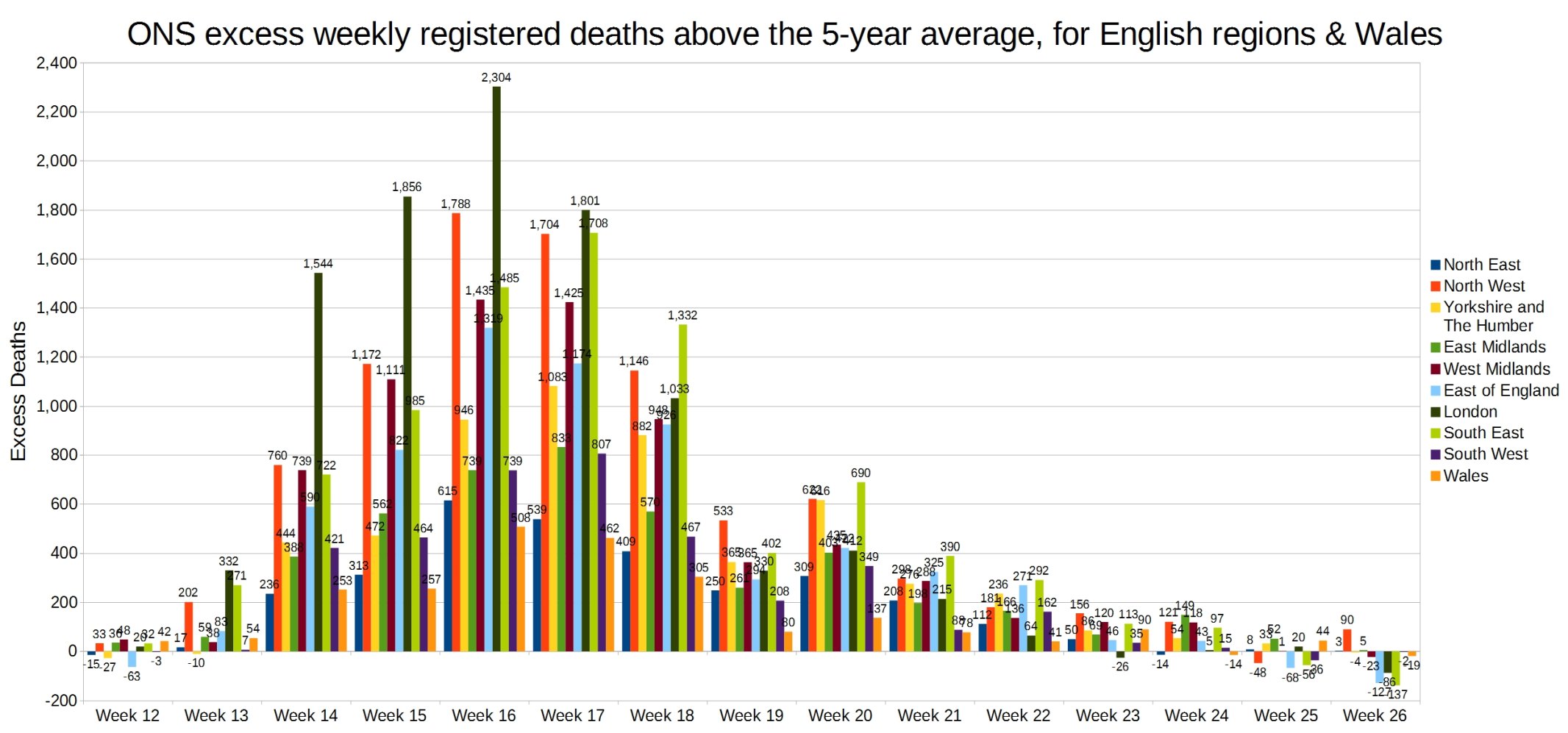
Weekly excess deaths above the 5-year average, for English regions and Wales. ONS week 26 data.
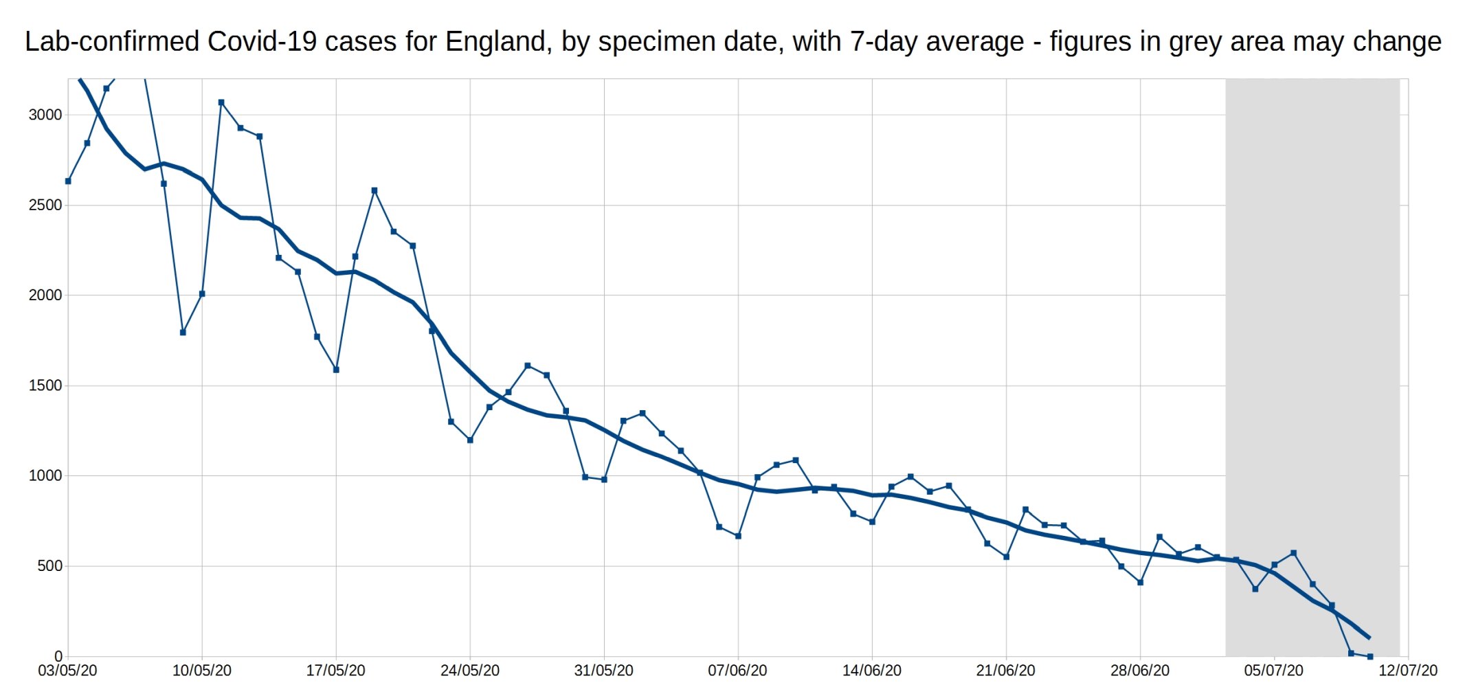
A graph of daily Covid-19 positive tests (by specimen date), for England, with a 7-day average trendline (the thick line). The data shown in the grey area may increase, as it takes a few days for all the test results to come in, especially over weekends.
Note: The coronavirus.data.gov.uk website now shows all the Pillar 1 and Pillar 2 tests, with no way of separating them, so these numbers are a bit different from those last week due to this change.

An enlarged version of this graph:
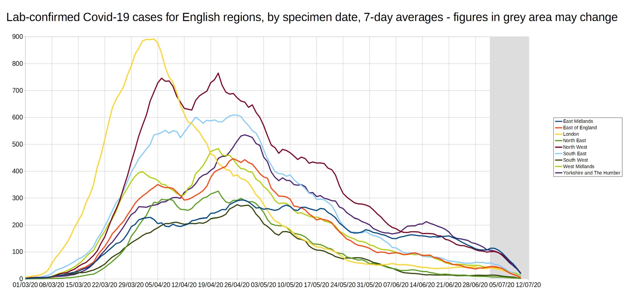
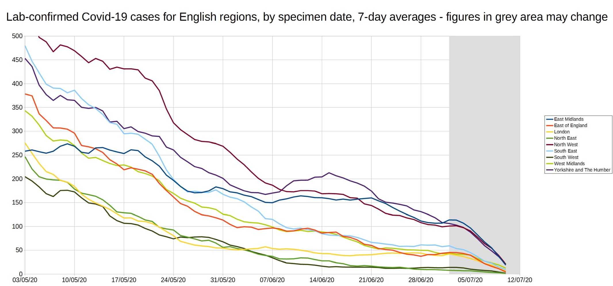
Graph of the 7-day average positive tests (by specimen date) for each of the English regions. Daily test data removed, as it made the graph too complicated. As before, the data shown in the grey area may increase.
Note: The coronavirus.data.gov.uk website now shows all the Pillar 1 and Pillar 2 tests, with no way of separating them, so these numbers are a bit different from those last week due to this change.
An enlarged version of this graph:
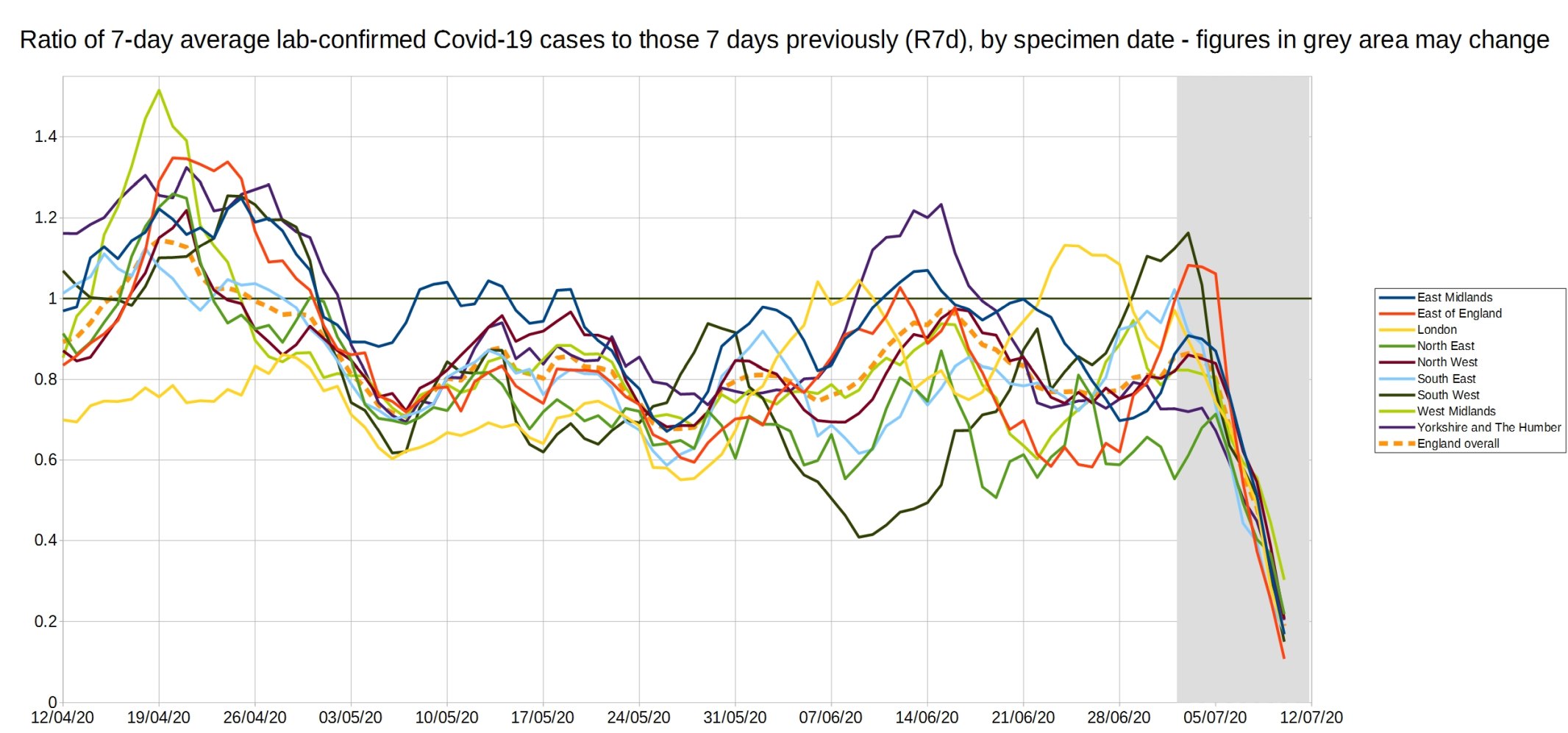
Graph of the ‘R7d ratio’, the ratio between each day’s 7-day average positive tests, and the 7-day average from 7 days previously.
Like the R0 number, this ratio is above 1 when case numbers are increasing, and below 1 when case numbers are decreasing.
Note: The coronavirus.data.gov.uk website now shows all the Pillar 1 and Pillar 2 tests, with no way of separating them, so these numbers are a bit different from those last week due to this change.
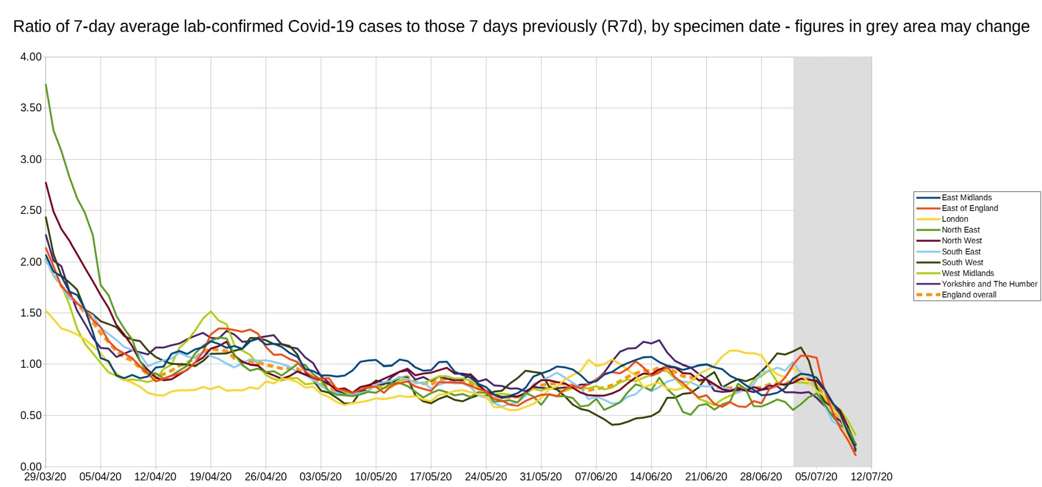
An enlarged version of the R7d ratio.
Graph of the R14d ratio, the ratio between each day’s 14-day average positive tests, and the 14-day average from 14 days previously.
Note: The coronavirus.data.gov.uk website now shows all the Pillar 1 and Pillar 2 tests, with no way of separating them, so these numbers are a bit different from those last week due to this change.

16 thoughts on “Week 26 graphs from Christopher Bowyer”
Wandered off to the pub yesterday afternoon for a quiet pint and a read. A near-neighbour in his seventies was in his garden as I passed; we exchanged pleasantries, as you do, and he asked if I’m well. “Yes thanks”, said I, “and you?” “Oh, yes, just fine. Bit worried about this virus, though. I’d love to get out for a pint but I’ve read that 70% of all those over 70 who catch this will die”. (I’m approaching this particular age barrier at a distressing rate).
The facepalm moment passed. I asked if he was sure that’s what he’d read – oh yes. Authoritative source, too, but couldn’t quite remember where….. I urged him to go find some ONS stats and stop reading anything about viruses that wasn’t either this blog, or from the ONS, and to consider that – as we aren’t having to shovel dead seventy-year-olds off the street – the figure he’s got may not be the entire story.
I’d always thought my neighbour was probably a fairly sensible, level-headed, sort but perhaps the experience shows that the hysterical headline seeking and clickbait stuff is still out there in quantity, and determined not to let this drama die.
The point of the comment? A thank you to the people who are tracking the stats and presenting them here so lucidly. Like a beacon on a dark night.
An interesting insight into the misperceptions that have been generated – and the susceptibility to them – about a 7-fold exaggeration even based on the dodgy ‘case’ denominator.
The masks are bad for you – up to 5000ppm CO2 has been detected under a ‘standard’ mask, which is breathed in again by the wearer. This is much higher than the government’s own recommendations for more than 30 minutes exposure – appalling if the mask is worn all day, especially as there’s no logical reason to do so.
The Gov.uk site has useful information:
https://www.gov.uk/government/publications/face-coverings-when-to-wear-one-and-how-to-make-your-own
Under section 5. Exemptions, it states,
“to avoid harm or injury, or the risk of harm or injury, to yourself or others”.
I believe the dangerous CO2 concentration which occurs under a mask is very obviously covered(!) by this clause, which should be the basis for a legal challenge.
Great charts as normal thanks!
@formertory: He does seem like a sensible old boy from the sound of your conversation.
@Ed P: I think there’s a lot of rubbish flying around about masks. There’s definitely some bad stuff they can cause that is being ignored or laughed away as nothing to worry about; bacteria build up, actual effectiveness against viruses (they are used in surgery to protect from bacteria, hair and other larger things from falling into patients), waste, improper handling etc.
But the oxygen thing is a difficult one to bring up as tests done with surgical masks, N95 and regular, don’t really show any increase in CO2 or decrease in O2 consumption, and they are worn for long periods by health care workers and other professions. However fabric masks that members of the public are being encouraged to wear may well suffer from this problem. They are just so varied in style, material and use that it is impossible to say. I know I read a study from 100 years ago (based around the pandemic of the period) about fabric masks needing so many layers to be effective that they impaired breathing, but material science has moved way on since then. Even then it’s still food for thought over the mandatory mask orders being thrown around, and how effective they actually are (several countries that issued such orders show no distinctive dip in infections).
Yes, Covid 19 seems to be a disease which wipes out the old, sick and vulnerable, relatively quickly. Total sympathies with those who have suffered or lost loved ones. Unmistakable fact is that the curve has flattened. Look at the Swedes. Simply put another way. The old, sick, or vulnerable person, can only die once.
Second wave? Maybe? If your one of the vulnerable group, happy, unhappy? If you’re younger, fit, and healthy, welcome to a future of higher tax, debt servicing.
What number exactly do the ONS give for excess deaths for 2017-18 winter?
https://www.independent.co.uk/news/health/flu-vaccine-deaths-nhs-ineffective-crisis-bad-weather-illness-2017-a8660496.html
Here’s a couple of good paragraphs from the Z-man blog.
There are now two camps of people. One camp consumes every event and metabolizes it into fuel for their ideological war. As soon as the virus became news their chief concern was in how to turn it into another weapon in their social war to control society. As soon as the hated Trump declared his side on the virus issue, the Left immediately embraced a set of positions on the virus. Every left-wing and adjacent governor blew up his state to spite Trump.
The second camp are the people who realize that the new issue is becoming politicized and they form up an opposition to the Left. In the case of the virus, they started as curious or maybe mildly skeptical. These were the people who said it was just going to be a very bad flu most likely, but we needed more information. Now they are the people who say the face muffler is the six pointed star of totalitarianism. For them, the facts of the virus no longer matter anymore.
Hi Formertory
Up to the 4th July this year, ONS figures for All Cause Excess Deaths is 54,705 (greater than the 5yr average)
41,527 of the deceased are aged 75 and over which equals 75.9% of the total excess deaths .
There are however, 5,200,000 individuals in this age group thus the excess deaths for those aged 75 + is less than 1%.
Excess deaths for those younger than 75 are 13,364 out of a population of 60,000,000. So little risk to your neighbour on visiting their local.
@dearieme
Pardon? The facts of the virus are all that matters, not Gov & MSM fear mongering. I reject face nappies as there is no conclusive evidence they prevent catching or spreading C-19 which is almost gone. Where’s all the BLM riots C-19 deaths?
Even WHO were against them until Gov’ts applied pressure
A revelation from of all places, the BBC – story seems to have been binned – H/T Peter Hitchens
Policy based evidence making inflicted on public again
– Deborah Cohen BBC Newsnight
– Coronavirus: Why have masks become such a battleground? – BBC Newsnight
– “WHO changed their advise due to Gov’ts/political pressure” – Seen To Be Doing Something
– https://youtu.be/Bw51IudGNb8?t=262
Should people be fined £100 for refusing to wear a face mask in shops? – 62% say No
Peter Hitchens: If I refuse to wear a face mask, people suggest I’m “guilty of murder”
https://www.youtube.com/watch?v=JhV6g00GoNs
Leftie Janet Street-Porter: Masks were useless, now they’re compulsory – why WHO & Gov change?
https://www.dailymail.co.uk/femail/article-8523099/
Informative:
https://app.spectator.co.uk/2020/07/15/the-mask-slips/content.html
If these muzzles work, if they keep out the virus and stop the spread of the transmission, then why are mask wearers worried? If they’re protected, they have nothing to fear, right?
Johnson has spent the last month talking about kick-starting the economy, so why he has come up with a hare-brained decision to effectively make people more scared?
Pcar: “Johnson has spent the last month talking about kick-starting the economy, so why he has come up with a hare-brained decision to effectively make people more scared?”
Because Johnson is out of his depth like the rest of them.
@Dene
I’ve given up on Boris, all bluster, and no strength – no Churchillian leadership. Now, doubt he’ll deliver anything but BRINO. Disappointed Cummings has turned out to be either ignored or has submitted to establishment.
Steve Hilton, now at Fox News, should be brought back
Look forward to seeing these graphs each week. Any chance of adding a couple?
1. Excess deaths showing all areas (hospitals, care homes and in the community)
2. Excess deaths by age group*
* I heard yesterday that the excess deaths below the age of 50 are within the 5-year average.
There was a nice little stat for Sweden out today – that deaths in the last 24 months were just under the deaths in the previous 24 months.
So I thought ‘what about England and Wales?’ and went to https://www.ons.gov.uk/peoplepopulationandcommunity/birthsdeathsandmarriages/deaths/datasets/weeklyprovisionalfiguresondeathsregisteredinenglandandwales and manually calculated deaths in the 52 weeks to 10/7/20 ( total 1107748 ) to deaths in the previous 52 weeks back to 15/7/16 ( total 1086700 ). Drat, I thought. It might be due to lock down, PHE, the overall health system, that we’re one of only 2 EU countries that doesn’t tax obesity for practical purpose, the level of overcrowded housing due to culture and CPREitis, or some other factors. But we’re down by 21000 ish on this metric.
Just wanted to say a quick thank you to you guys for producing these graphs every week. Much appreciated, thank you.
Drat, completely messed my comment – missed a week out and said 52 when I meant 104.
Done it again for deaths in the 104 weeks ending 17/7/20 – 1,107,444
Previous 104 weeks – 1,077,089. Difference 30,355 or 2.8%. That’s bad.
Comments are closed.