
This is an article by Daniel Curtis.
The following chart was built with data from a csv file downloaded from Our World in Data (downloaded on 11 Aug 2020 at 08:49). The vertical axis (logged, for clarity) shows the daily test positive rate for the UK, where ‘test positive rate’ is defined as the percentage of new_tests showing new_cases, as derived from their respective columns in the csv file (i.e. 100 x new_cases/new_tests). The horizontal axis shows the date.
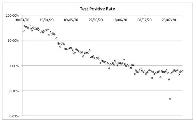
The test positives will be the sum of both true and false positives. If the ratio of false positives to number of tests is assumed to be constant then the overall test positive rate will level off at a constant minimum when the ratio of true positives to number of tests reaches its baseline. This will be when true positives either (a) reach zero, or (b) persist at a small yet stubborn constant rate. The results from any further testing might be expected to be randomly distributed around this point.
From the chart it appears that the test positive rate levelled off in such a way from 30 June. The rate from that point to the latest date (30 Jun to 8 Aug) – excluding an apparent outlier (0.05% on 29 Jul) – has a mean of 0.553% and SD of 0.096%. The distribution of residuals around this mean is not significantly different from normal (Kolmogorov-Smirnov test statistic (D) = 0.168, p = 0.198).
On this basis, the data suggest the prevalence of Covid in the UK reached a minimum on 30 June and has remained constant since.
Existing surveillance measures report on absolute numbers of test positives. Given that prevalence has been shown to be constant since 30 June, these numbers will have varied only as a function of daily number of tests taken. They will not have indicated any change in prevalence. Future monitoring should look for diversion from the baseline test positive rate rather than absolute numbers of test positives.
14 thoughts on “Daniel Curtis: Brief Analysis of UK Covid test positive rates”
A major variable is the number of tests being given each day — and the basis for selecting the people tested.
It is not obvious what are the original sources for the data in the linked file. Taking the data as valid, it shows a great variation in the number of daily tests given:
31 Mar – 11,896
30 Jun – 97,367
15 Aug – 174,914
When the number of tests increases by more than an order of magnitude, it suggests that the population being tested is moving from a susceptible sub-group to a more representative sample of the UK population as a whole.
It may be that the real prevalence of Covid-19 in the general UK population has all along been about 6 people in 1,000, and the apparent decline from the initial ~200 per 1,000 people has mainly been due to broader testing. Of course, this interpretation would imply that Covid-19 has been endemic in the UK population for a long time (perhaps as one of the many Influenza-Like Illnesses which the US CDC tracks). The only new thing was the test specifically for Covid-19 — well, that and the massively successful Operation Fear to justify the damaging Lock Downs.
You have a snowballs chance in hell in explaining that to a politician. I think the entire cabinet are numerically illiterate, and I have no doubt we will be seeing panic lockdown measures continuously based on flawed understanding of what is quite simple mathematical concepts.
But great analysis nonetheless.
I would be happier if I had yet seen any confident and convincing proof that there is actually such a virus as SARS-COV-2.
“You have a snowballs chance in hell in explaining that to a politician. I think the entire cabinet are numerically illiterate…”
Quite so, John. Does it make anyone stop and think: why does our wonderful, ideal, perfect political system result in our being governed by some of the stupidest and worst educated people in our society?
Contrast this, if you will:
“The Chinese Government Is Dominated by Scientists and Engineers”
https://gineersnow.com/leadership/chinese-government-dominated-scientists-engineers
I’d like to know what the specificity of the PCR really test is, and so the false positive rate. Prof. Carl Heneghan wrote an article about this in The Spectator in July, and I recall that he cast doubt on 99.9% (I may be wrong). 99.9% means a false positive rate of 0.1%.
Put another way: Daniel showed above that the ratio of positives to UK tests has levelled off to a mean of 0.55%. How does that compare to the false positive rate for “Pillar 2” PCR tests, and so what’s the true prevalence of Covid-19?
makes sense
if you look at the daily new cases here
https://www.worldometers.info/coronavirus/country/uk/
it has a typical seasonal profile and false positives from 30 June onwards (<100 cases for each 100,000 tests)
deaths had pretty much hit zero by then (apart from a few people hit by buses that had previously tested +ve)
looks like a typical seasonal infection
I think separating out the data for pillar 1 & pillar 2 data would be even more illuminating.
Brilliant chart.
In looking for data on PCR specificity I found this video showing proceedings of the Independent Corona Committee in Germany (English subtitles). Pretty damming of the PCR test.
https://vimeo.com/443416775
Excellent piece of analysis – and which crucially fits pretty well with the other key data gleaned from ICU occupancy and deaths in hospital.
The manufactured narrative and policy around this infection is like a runaway train with a madman at the controls. It sticks to its course whatever the sane rationale for putting on the brakes.
MRG, the specificity of the tests the ONS uses in its Coronavirus Survey Pilot is 99.96%, not a penny more, not a penny less. They used to say that they flexed it to test the effect of this assumption, but I noticed in their Methods document that it doesn’t actually change in their two scenarios. They changed the wording at my request and it now says they use the same specificity in both scenarios.
I do not see how they can be confident of their current estimate of around 0.05% incidence when flexing the assumed specificity from e.g. 99.95% to 99.97% could make a big difference to it.
Even without any real knowledge of statistics, given that we know that (i) the PCR test produces false positives, (ii) it produces true positives but of people who were infected but no longer are, and (iii) that deaths are being counted as Covid simply because of a positive tests, we can say with certainty that actual deaths from Covid are now around zero. That has been the case since at least the end of July. The ONS data on all-cause mortality bears that out, with total deaths below average for eight weeks now.
Just a further thought.
Has anyone anyone located any reasonable sure data about the *true* infection rate of Covid? – i.e. the prevalence of real infection and illness that is a reasonable estimate that excludes the tracking of questionable strands of RNA by the PCR test.
I’ve tried various ways of extracting a population figure, but have always run up against the inherent flaws in the data that we all know about.
The ‘Infection Survey Pilot’, gives a figure of 1 in 1,900 currently – but, of course this relies on PCR testing, and suffers the same suspicion of most official sources – particularly after the method of calculation changed, bringing the ration down from about 1 in 3000.
The real figure is useful in that it can be translated into a easily understood starting point for an image of risk for when you give mask-wearing people a picture such as
: “Do you realize how many people would have to walk through that door and lick your face before you came into close contact with a Corona virus?”
You can then talk about the multipliers required for you to actually catch an infection – including, of course, the pretty high odds of your own immunity.
Any ideas?
Why is France rate over 2% and rising?
Rick: there’s something recent on false positives here:
https://lockdownsceptics.org/false-positives/
by a “Professor of Genetics”.
0.17%, and Pillar 1 data quoted
Comments are closed.