
New Covid-19 graphs from Christopher Bowyer. ONS data here. NHS England data here. (The ONS data is up to the end of week 36, 4 Sep. The NHS data is generally more recent, see each graph for the date.)
All graphs can be clicked to enlarge.
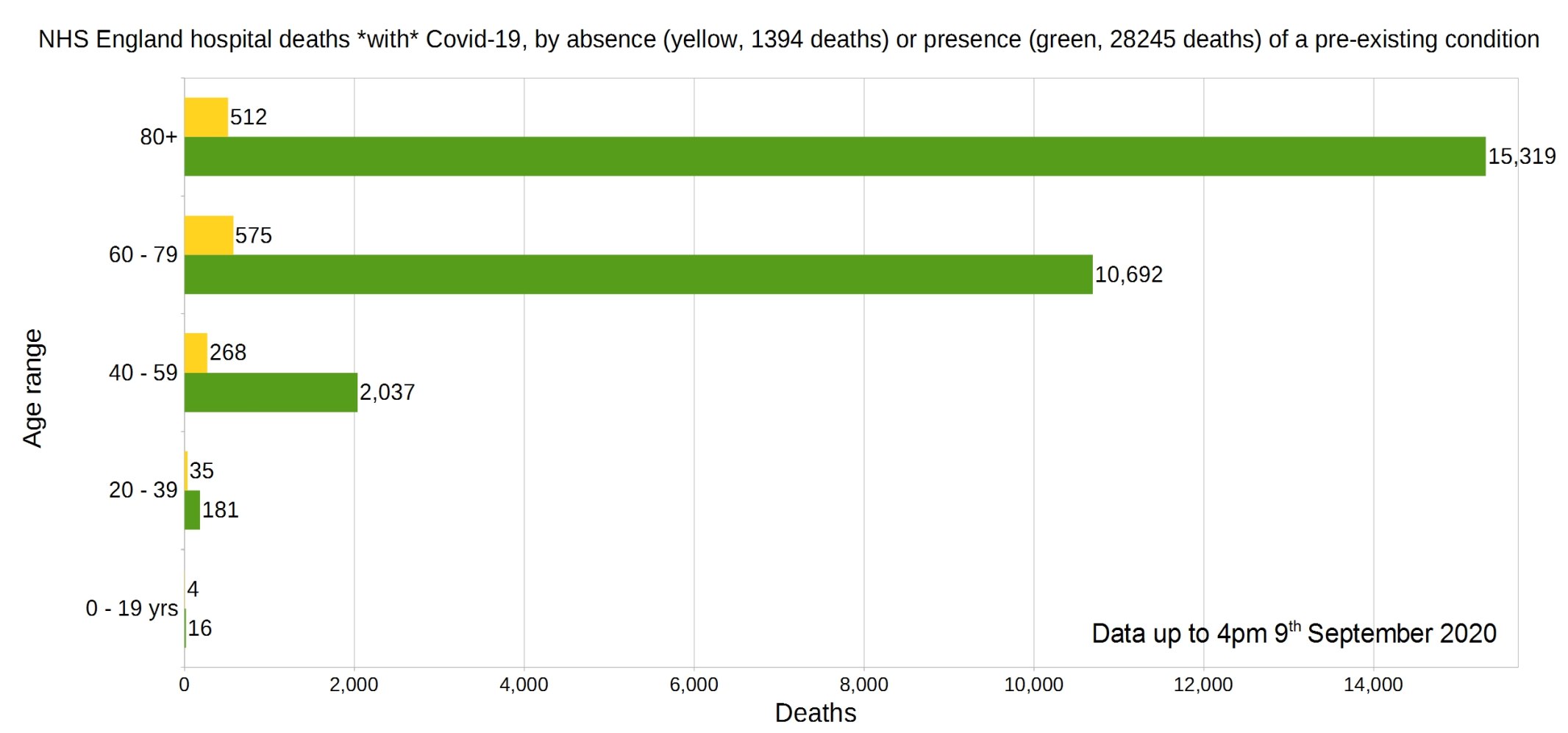
England deaths with Covid-19 by absence (yellow) or presence (green) of a pre-existing condition. Data from NHS England.
Percentage of deaths with Covid-19 by pre-existing condition. (95% have one or more P.E.C.) NHS England data.
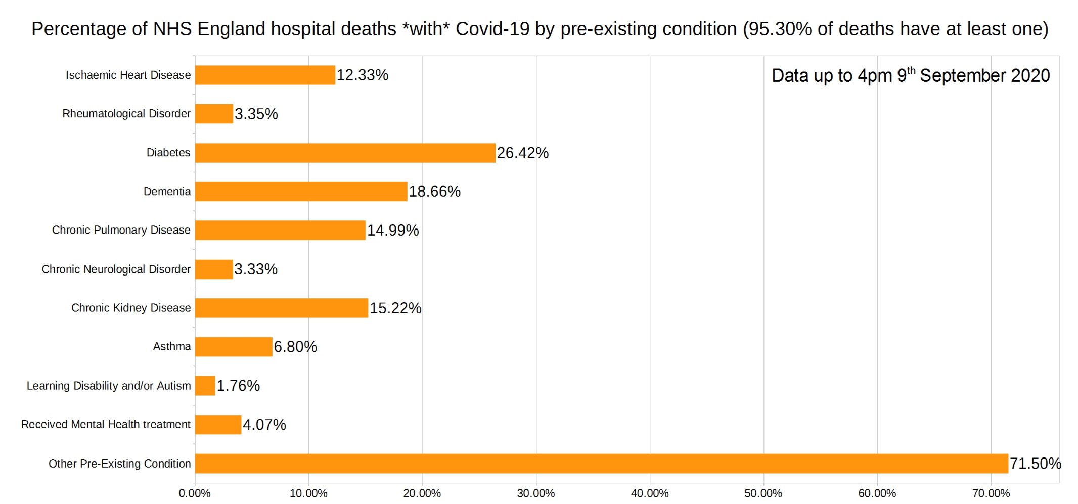
Note that the most common pre-existing conditions are diabetes, followed by dementia, chronic pulmonary disease, and chronic kidney disease.
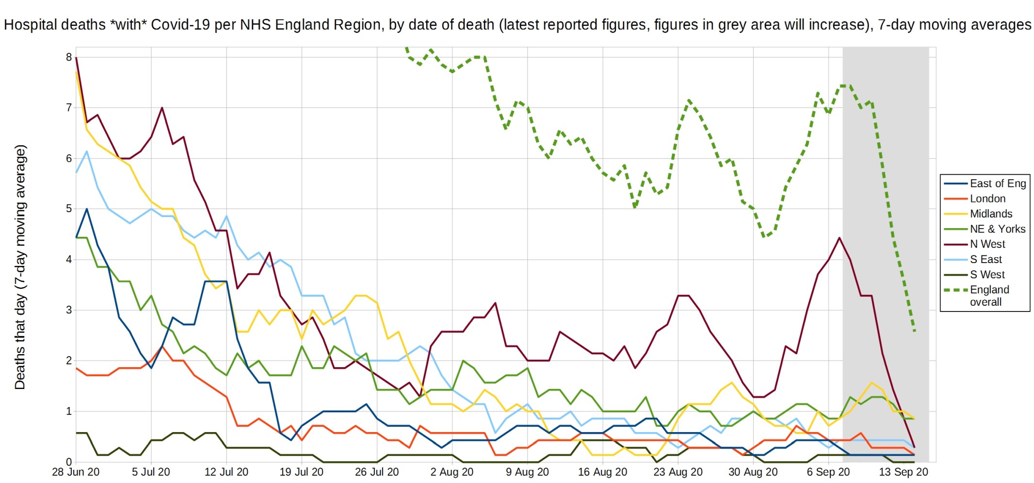
Trendlines (7-day average) for Covid-19 deaths by England NHS region, by date of death. (Note that the numbers in the grey area may increase over the next few days.) NHS England data.
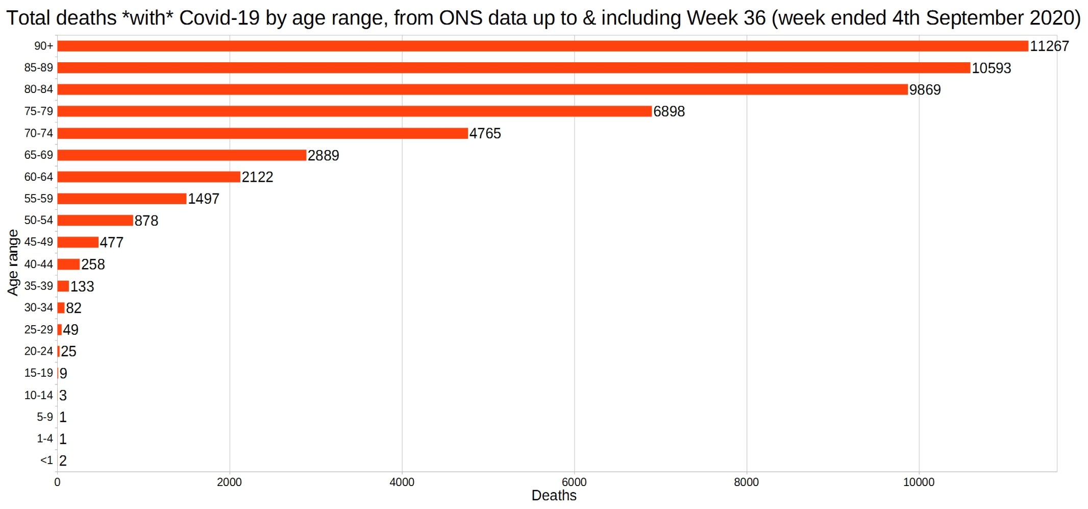
England and Wales total deaths with Covid-19, by detailed age range. ONS data.
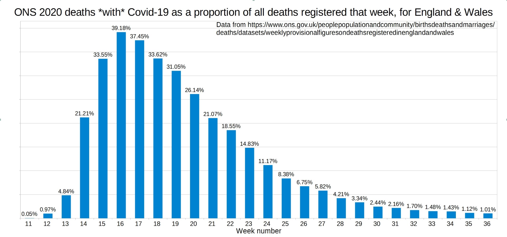
ONS England and Wales Covid-19 deaths as a proportion of all deaths registered that week.
ONS England and Wales weekly all-cause deaths compared with the five-year average.
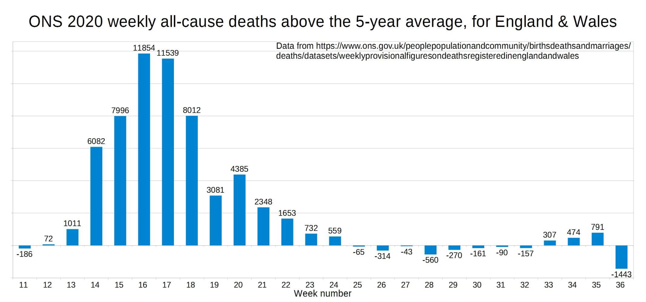
Christopher writes:
As can be seen from the two graphs above, the difference between the weekly 2020 deaths and the 2015-19 average deaths has been a bit odd over the past four weeks. To try & make sense of this, I have done a third graph showing the total weekly deaths for 2020 and the 2015-19 average, which is shown below, along with more of an explanation.
ONS all-cause deaths for 2020 vs 2015-19 average.

Christopher writes of this graph:
As can be seen from this graph, the 2020 and 2015-19 average deaths were pretty steady from week 26 to week 32, 2020 deaths in the range 8600-9200, and 2015-19 average deaths in the 9000-9300 range.
For weeks 33 and 34, the 2015-19 average deaths continued as before (9085 then 9157), but the 2020 deaths rose to 9392 then 9631. I believe this was chiefly down to the heatwave which preceded those weeks, rather than lack of NHS care causing problems yet. It certainly wasn’t due to covid-1984, as the proportion of deaths each week with covid-1984 has fallen for the past 20 weeks!
This is especially as for week 35 the 2020 deaths are 9032, back down in the usual range. However the 2015-19 average deaths in week 35 are only 8241, as this week usually contains the August bank holiday (which delays registrations), but doesn’t in 2020 as it was on 31st August. So week 35 has the 2020 excess deaths rocketing up to 791, when in fact the 2020 deaths have fallen to the usual level – it’s just that from the bank holiday the average 2015-19 deaths have fallen even more!
And in week 36, the 2015-19 average deaths are back to their usual level (9182), but the 2020 deaths have fallen to 7739 from the 2020 August bank holiday occuring a week later than usual. This is is why week 36 has 1443 less deaths than the 2015-19 average, more than cancelling out the 791 excess deaths in week 35!
England and Wales weekly Covid and non-Covid care home deaths. ONS data.

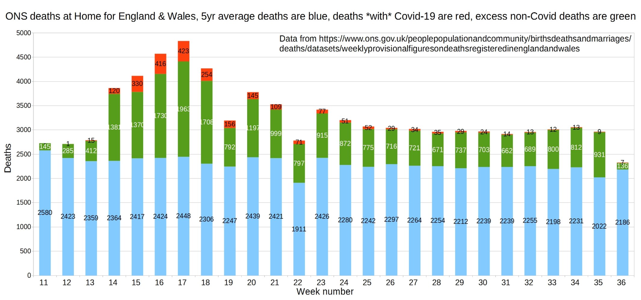
England and Wales weekly Covid and non-Covid deaths at home. ONS data.
Hospital deaths for England and Wales. ONS data.

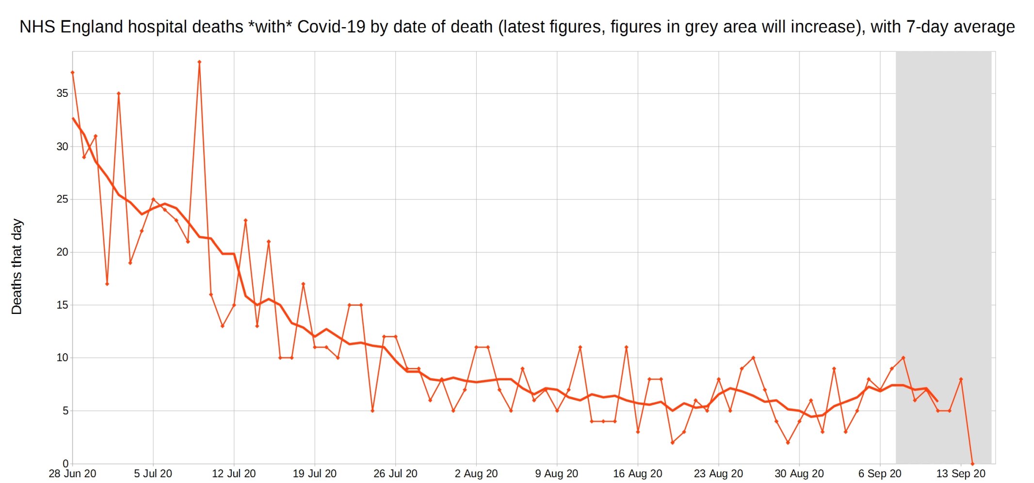
NHS England hospital Covid-19 deaths each day, latest reported figures, with 7-day moving average trendline.
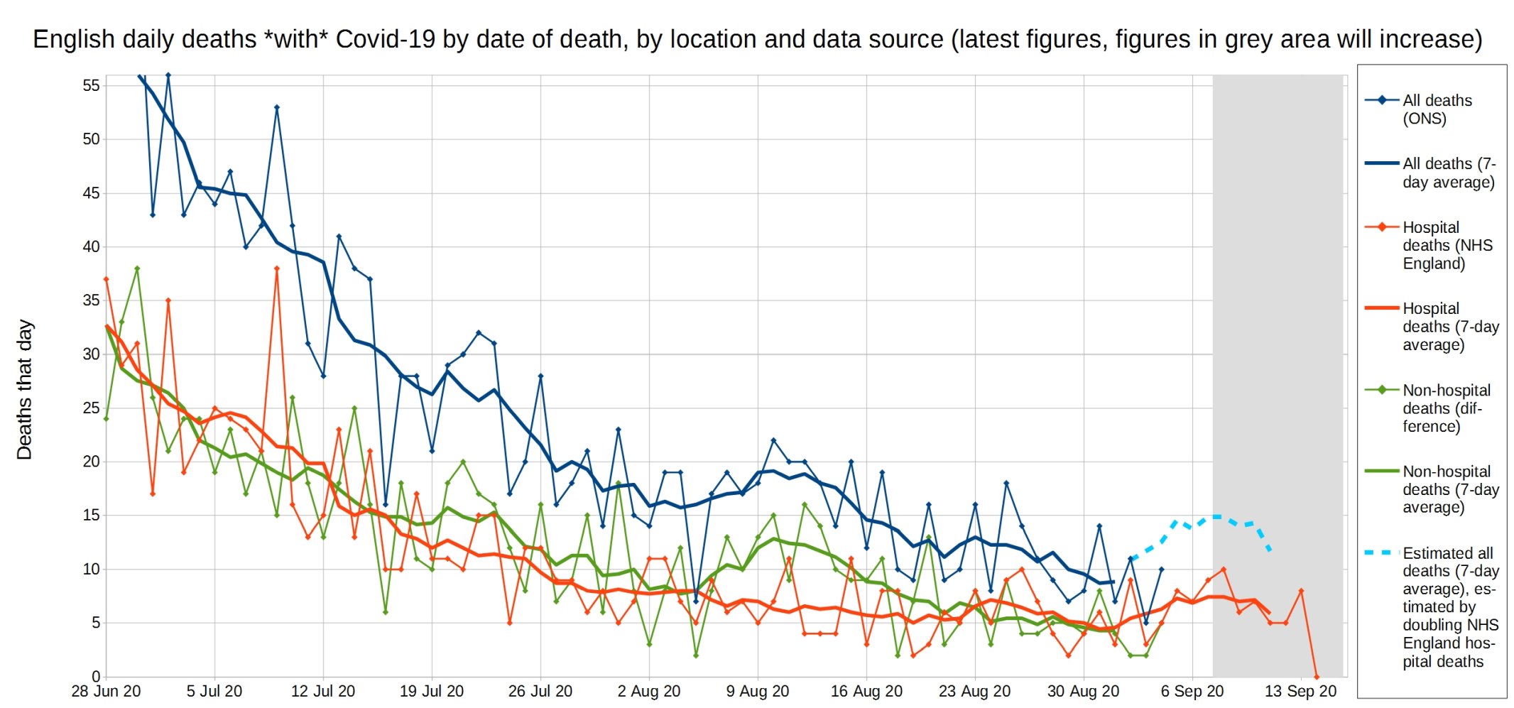
All Covid, hospital Covid, and non-hospital Covid deaths in England each day, with 7-day moving average trendlines.

A close-up of this graph, looking at recent weeks.
Update: Please support this website by donating via KoFi, subscribing via SubscribeStar or Patreon, or buying my book (see right-hand sidebar for links). Independent media like Hector Drummond Magazine, and my constantly updated Twitter and Parler accounts, cannot survive without your support.
6 thoughts on “Week 36 graphs, from Christopher Bowyer”
Thanks Christopher and Hector! I understand that all cause excess mortality is the key metric that fair-minded people will use to judge the seriousness of COVID-19. But across which time period? 2019? March 2019 to March 2020? Or another time period?
I guess we all knew this was happening
https://www.dailymail.co.uk/news/article-8750139/Scientists-claim-UK-covid-19-victims-July-August-died-causes.html
30% of covid deaths in recent months were actually other causes. Makes it even more difficult to make sense of the numbers. I think we also need better clarity on the normal deaths baseline. Can’t have different versions with inadequately explained differences. Perhaps ONS might comment o n both issues.
But across which time period?
a. On a calendar year basis, mortality in week 12 2020 was 2% below the ten-year average, by week 22 (the peak) it was 24% above the ten-year average, it is now down to 16%.
b. Given the seasonal pattern, comparing years starting mid july would be better (eg week 27 2019 – week26 2020. Mortality 4% above average in week 50 of 2019, was 1% below average in week 13 of 2020, rose to 11% by week 21, and was at week 26 10% above average.
PS. on a year starting week 27 2020 basis mortality now (week 36 of 2020 is 1% below average.
Following on from @IDAU
MoS Good today:
Given more falsification uncovered in Scotland on this, PHE doing same
Professor Carl Heneghan
“irrational, unscientific use of language” is what has contributed hugely to Fear
eg using Cases, not infections; From, not With; Novel, not Different/new
Yes, and why Boris ever listened to him remains a mystery
More
Professor Carl Heneghan vs MPs Government has left people terrified of coronavirus, top Oxford scientist warns MPs
Comments are closed.