New Covid-19 graphs from Christopher Bowyer. ONS data here. NHS England data here. (The ONS data is up to the end of week 37, 11 Sep. The NHS data is generally more recent, see each graph for the date.)
All graphs can be clicked to enlarge.
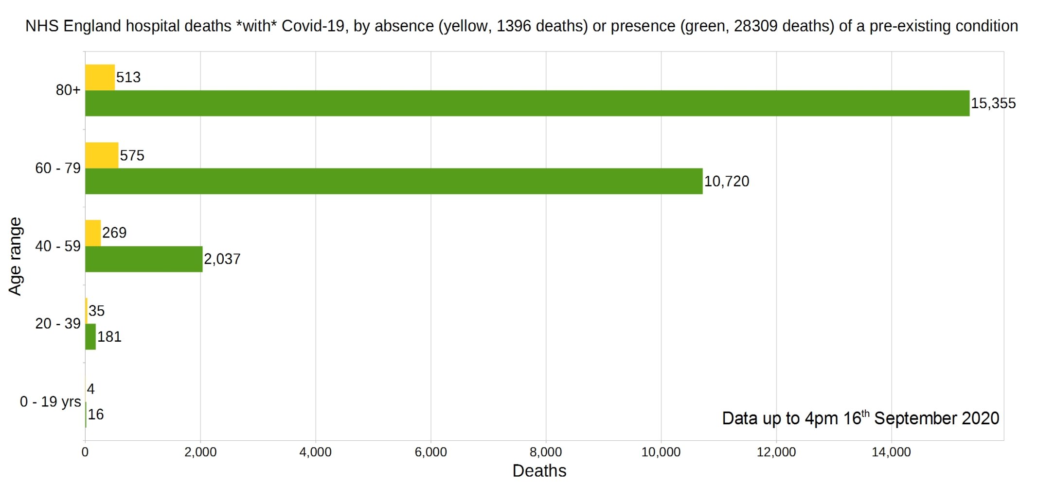
England deaths with Covid-19 by absence (yellow) or presence (green) of a pre-existing condition. Data from NHS England.
Percentage of deaths with Covid-19 by pre-existing condition. (95% have one or more P.E.C.) NHS England data.
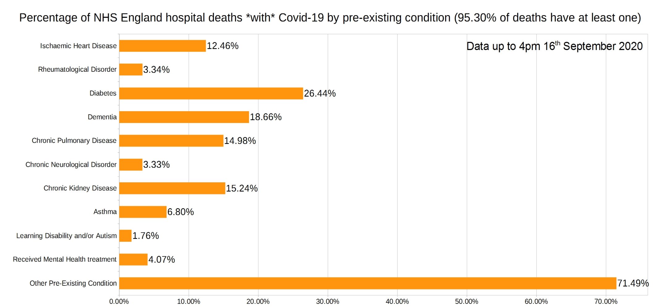
Note that the most common pre-existing conditions are diabetes, followed by dementia, chronic pulmonary disease, and chronic kidney disease.
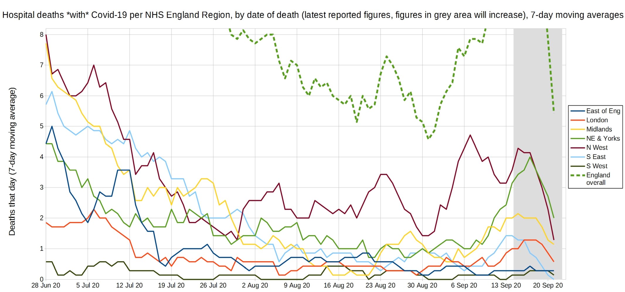
Trendlines (7-day average) for Covid-19 deaths by England NHS region, by date of death. (Note that the numbers in the grey area may increase over the next few days.) NHS England data.
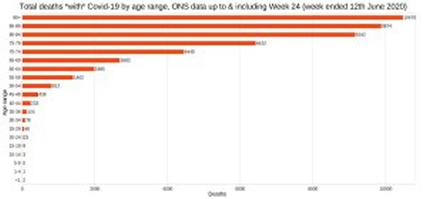
England and Wales total deaths with Covid-19, by detailed age range. ONS data.

ONS England and Wales Covid-19 deaths as a proportion of all deaths registered that week.

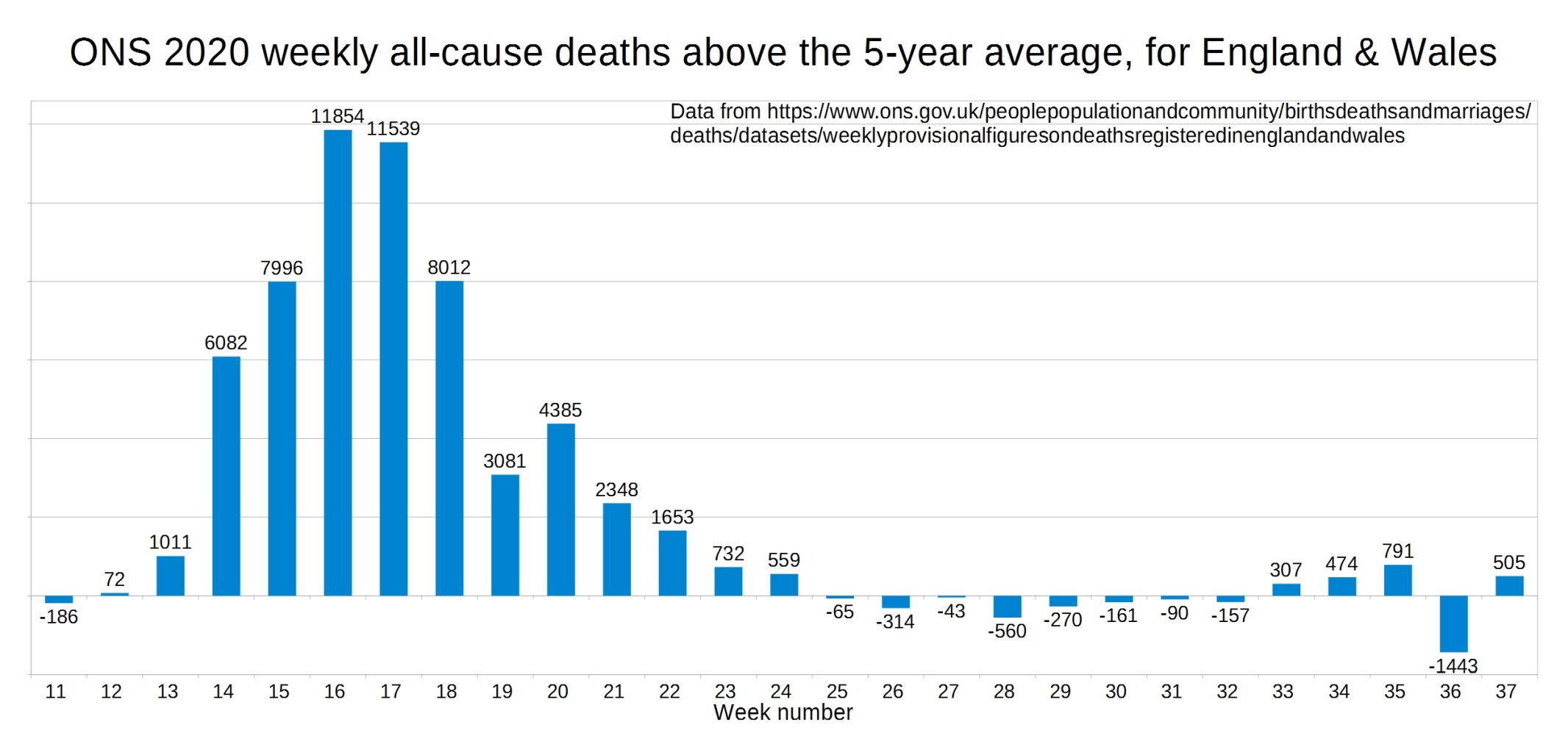
ONS England and Wales weekly all-cause deaths compared with the five-year average.
ONS all-cause deaths for 2020 vs 2015-19 average.

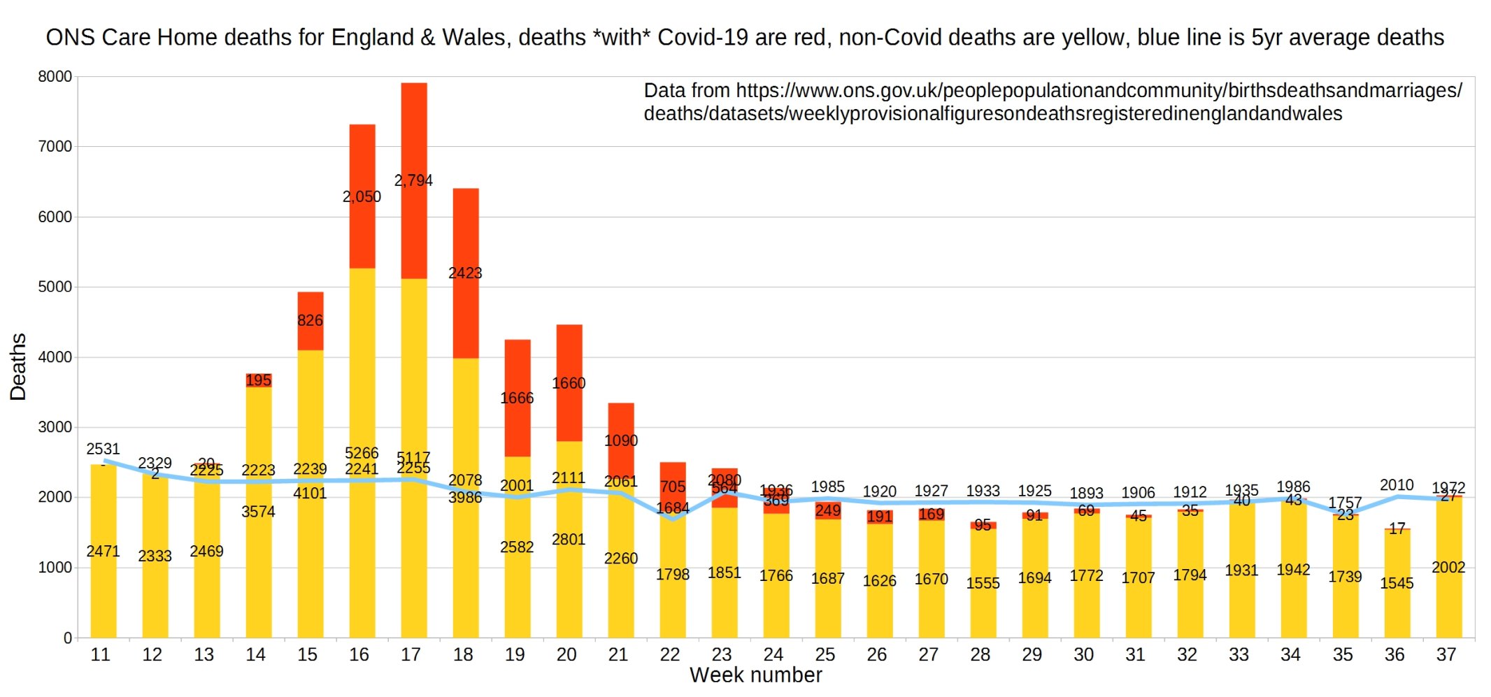
England and Wales weekly Covid and non-Covid care home deaths. ONS data.
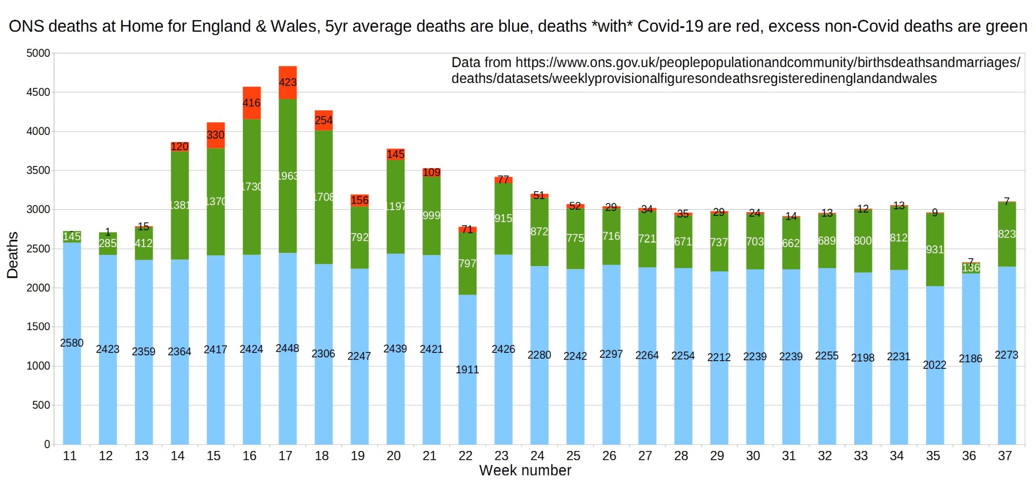
England and Wales weekly Covid and non-Covid deaths at home. ONS data.
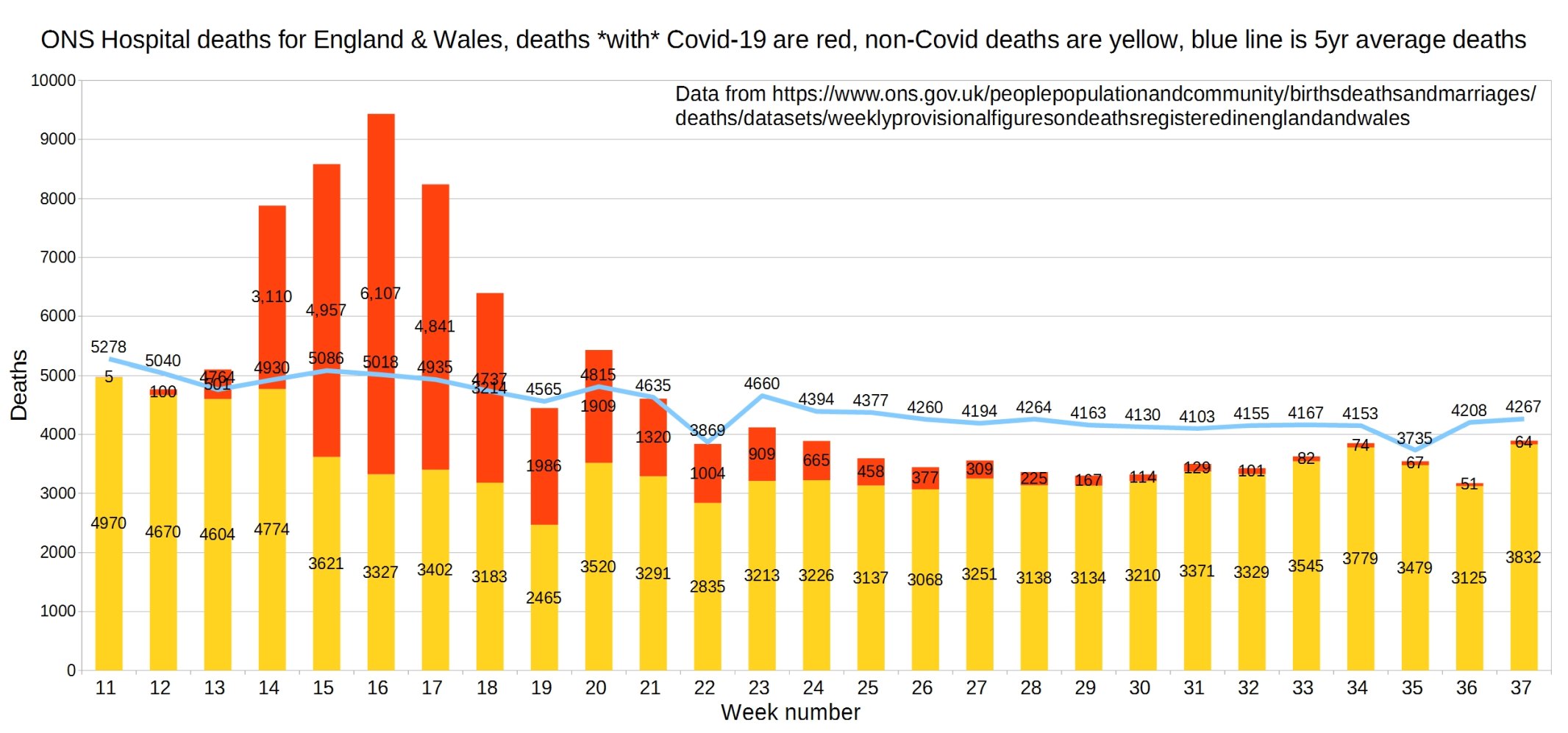
Hospital deaths for England and Wales. ONS data.
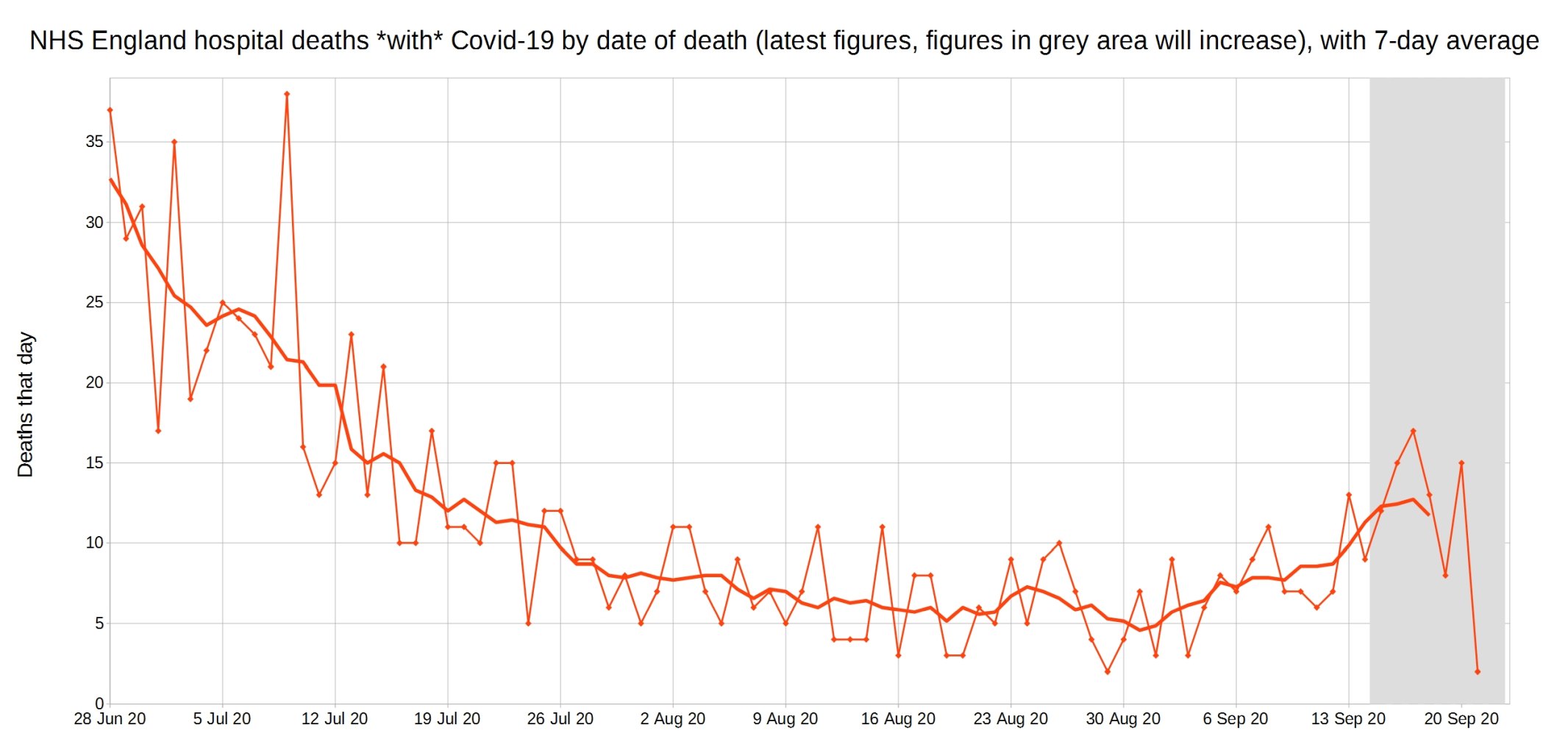
NHS England hospital Covid-19 deaths each day, latest reported figures, with 7-day moving average trendline.
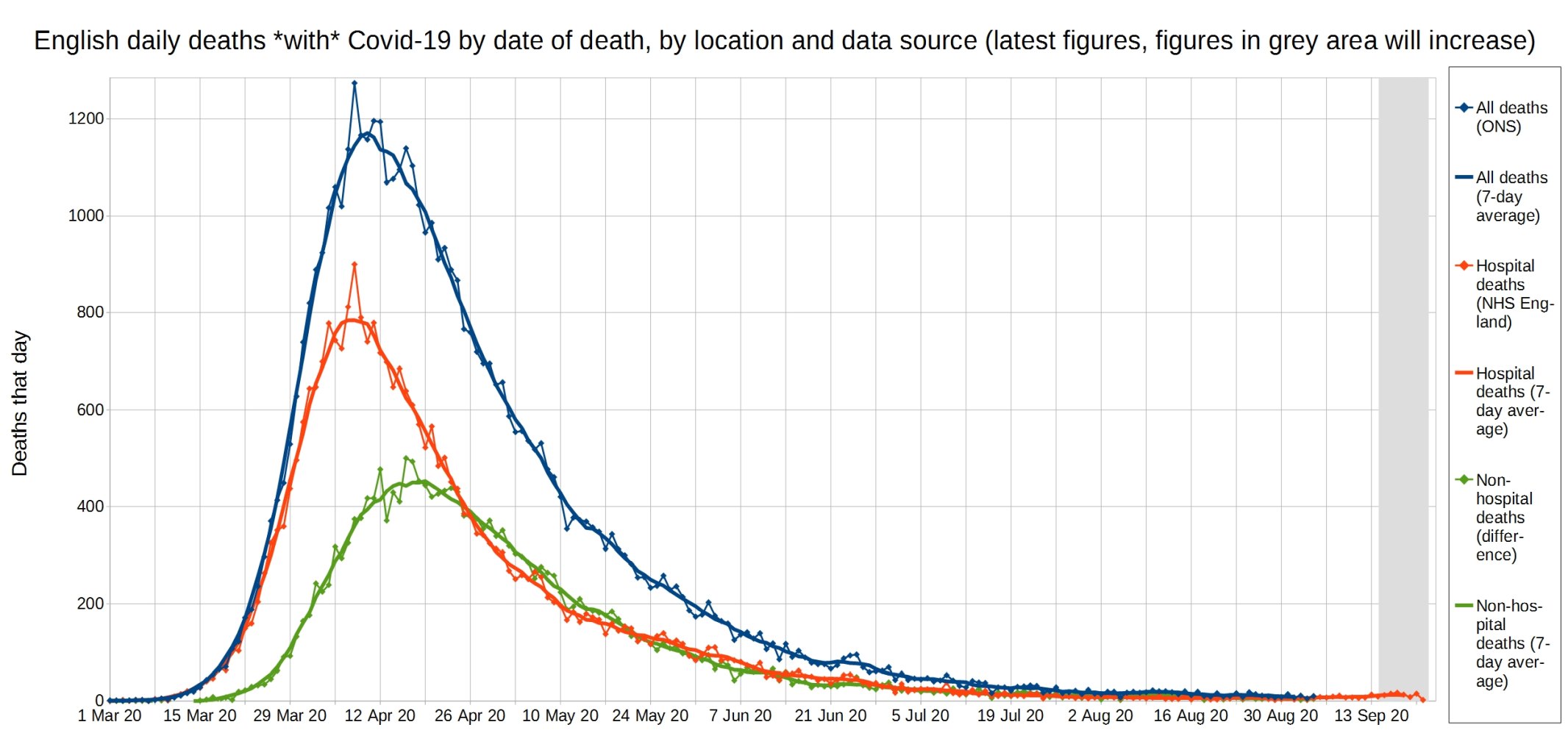
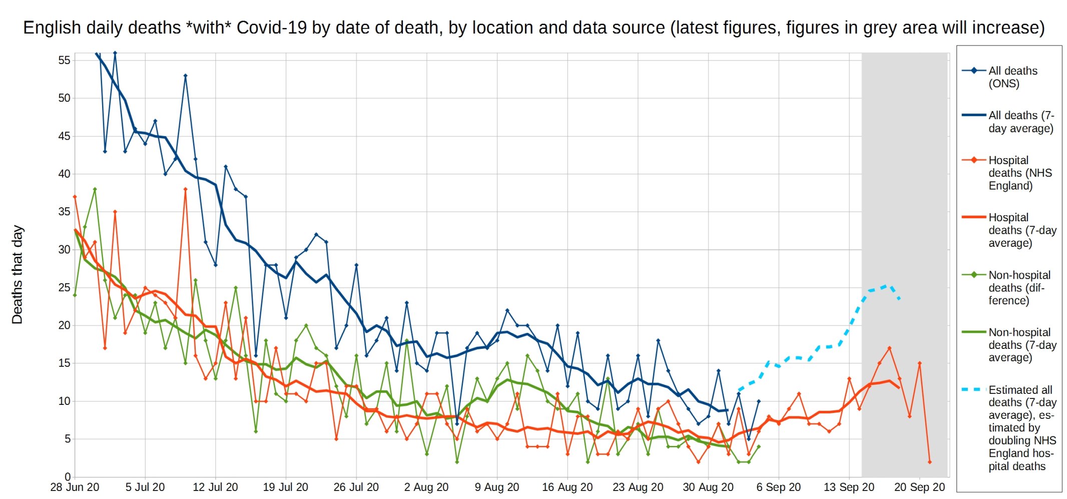
All Covid, hospital Covid, and non-hospital Covid deaths in England each day, with 7-day moving average trendlines.
A close-up of this graph, looking at recent weeks.
Update: Please support this website by donating via KoFi, subscribing via SubscribeStar or Patreon, or buying my book (see right-hand sidebar for links). Independent media like Hector Drummond Magazine, and my constantly updated Twitter and Parler accounts, cannot survive without your support.
4 thoughts on “Week 37 graphs, from Christopher Bowyer”
Thanks
If they are Real Positives and no immunity, where are the deaths?
https://twitter.com/UKCovid19Stats/status/1309586495205003265
In the last month near 33% increase in positive test infection. Those, people confirmed rose from 329,000 to today’s 423,000. Total death from Covid up 1%, rose from 41,500 to today’s 41,936. So all in all, this suggest to me that there are a few possibilities for this:
1. Treatments have vastly improved, where mortality is less of and endpoint.
2. The disease predominantly wipes out the old sick and vulnerable. Many of whom had early infection or susceptibility and unfortunately had succumbed.
3. People have gotten a whole lot healthier from lock downs.
4. The Old, sick and vulnerable have been better protected from infection.
My thoughts are more along the lines that the old, sick, and vulnerable, will succumb relatively early. Morbidity will increase though, at a much reduced rate, as evident in the numbers. Mortality, may decrease, as those already near death, had already died.
As I yet again witnessed the other day in conversation with elderly friends. They are both what would be termed higher risk, elderly with preexisting conditions. Their take on the whole matter is, money is not an issue, life is more important. Suffering of the younger generation is of no concern what so ever. Themselves born in the 40’s and 50’s, never had been forced to go to war, amassed huge capital gain wealth, swung in the 70’s, now enjoyed phenomenal medical advancements. Yes, these are the people who have the least life to lose. Now they want youth to give up their futures for their selfish belief that they will live forever. They hope a vaccine will soon be available which will cure old age.
From those graphs / Official Data, it looks like what is normal actually is happening. Gompertz’s curve has played out – sharp rise to peak, then languid falling away at reducing rate to approach (near) zero. The beginning of an uptick will only be the start of Winter’s natural mortality. Then there’s the removal of “undergrowth” – bushfire terminology – for survivors of a milder ‘flu season by this year’s conflagration as well as the ‘normal’ number of ailing aged that Wuhan flu targets. In short, the 2020 – 2021 winter figures will tell you how many *really* were the excess COVID – caused deaths. Sane Minority is on the Money…
Rest assured, when the Coming Catastrophe (2021) falls short of this one, 2020, politicians everywhere will credit themselves with courageous leadership in imposing lock-downs.
And Centralising / stealing Power.
Well said James, though you suggest some disdain to your suggestion the politicians will spin credit of their actions. Oh please just let them delude themselves. Let politicians everywhere credit themselves with courageous leadership in imposing lock-downs.
Now, those grown up’s in the room, know better.
Expect a spike in other cause morbidity, as the flow on effect of missed diagnosis, treatment delays, fear, depression, mental illness, bankruptcy, and unemployment, take hold.
Though, this may not hit home to our media, politicians, and medical heroes, until it’s them or their loved ones who suffer from the consequence.
Comments are closed.