Hector Drummond Magazine reader and contributor Christopher Bowyer has done some more Covid-19 test result graphs based on the data at https://coronavirus.data.gov.uk/. The data was downloaded yesterday, 6 October, so it’s very up-to-date. (All graphs can be clicked to enlarge.)
First, a health warning. The positive test data comes from PHE/NHS Track and Trace, and you’ll have seen very recently that their competence is questionable (to put it diplomatically). So take it with a grain of salt.
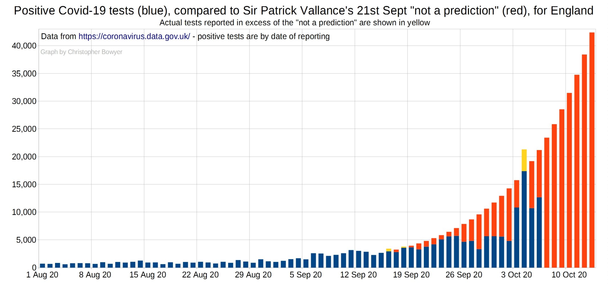
First up, a comparison of the current positive test situation with that ‘predicted’ by Vallance and Whitty on September 21 – this version is adjusted to apply to England only to match the charts below (which are England only).
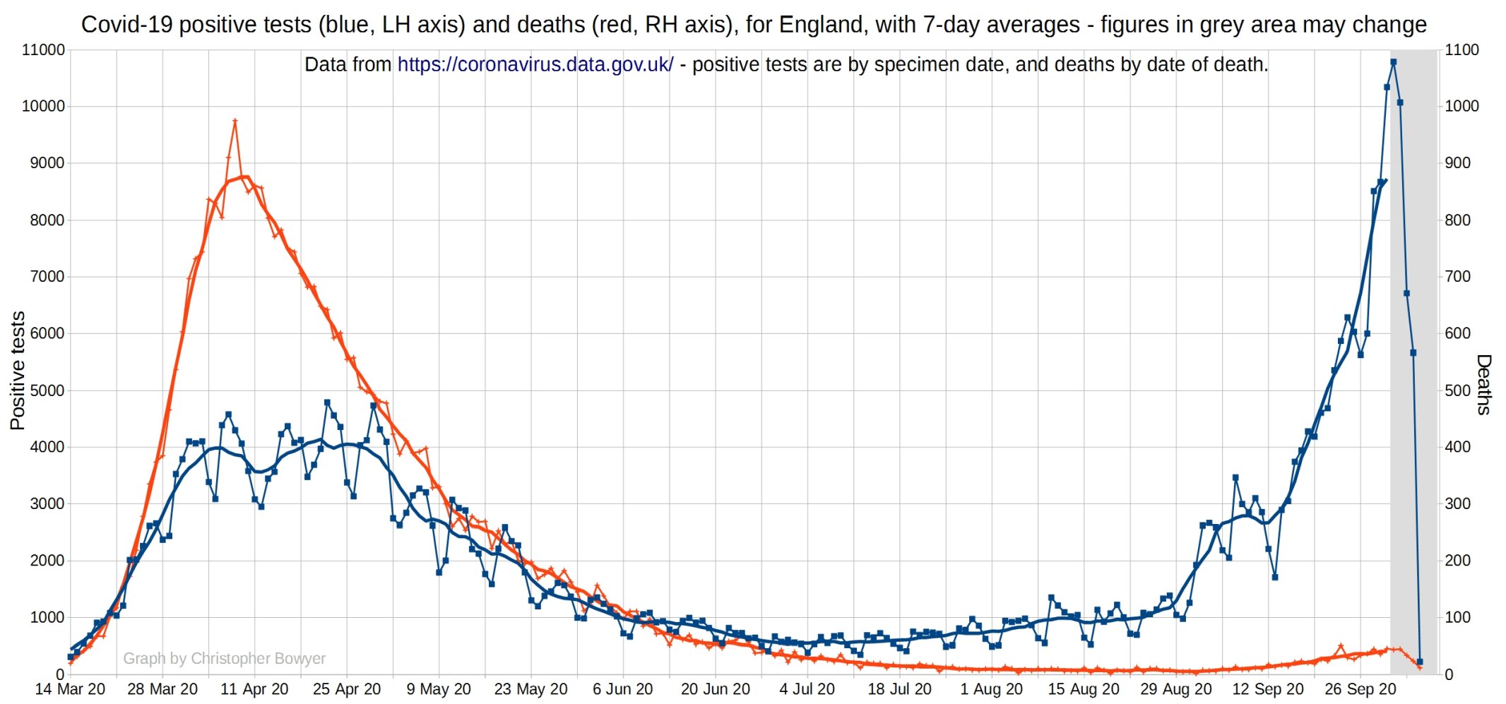
The following graph looks at SARS-CoV-2 positive tests (blue), Covid hospital admissions (green), and Covid deaths (red) for England. You can see that there’s been a slight increase in hospital admissions over September, as expected given the time of year, but it’s hardly a public health disaster in the making. They’re also not rising exponentially, but are fairly flat. The number of deaths is still very small, and and has also been pretty flat recently.

English SARS-CoV-2 positive tests (blue) and Covid-19 deaths (red). This graph uses a different scale than the last graph for deaths so you get a closer look at them. You can see that there has been an increase in deaths recently, but only very a slight one, so clearly the large increase in positive tests over August and September has not been matched by anything like that with deaths.
Hospital admissions per 1000 positive tests, England. Still nothing to worry about there. Why didn’t Witless and Unballanced present this sort of data?

A couple of new graphs now – Christopher says “to look at things other than positive tests – after the spreadsheet fiasco, the positive test data is at best questionable”.
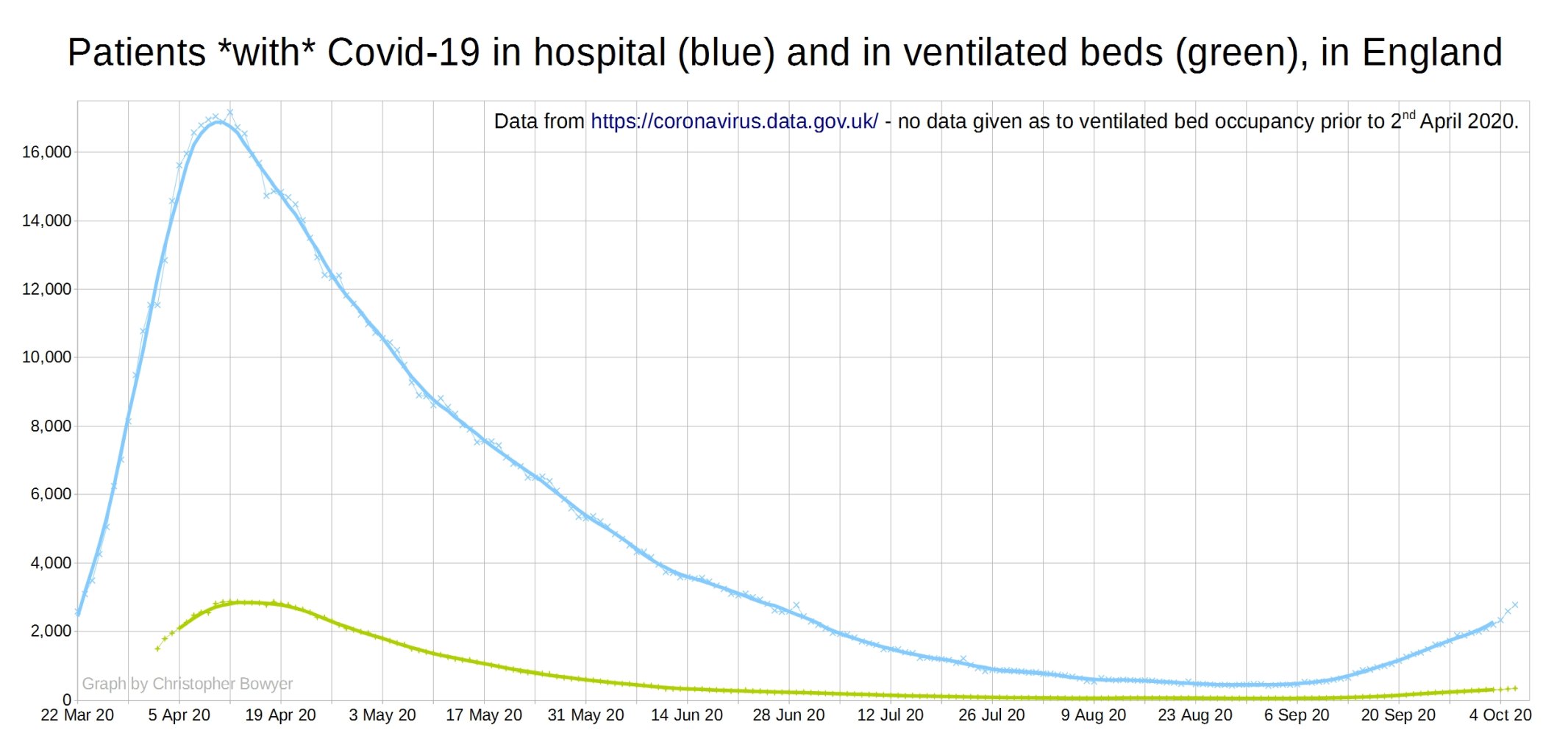
The first new graph
shows the patients with covid in hospital and in ventilated beds – I don’t know if this means they’re on a ventilator, or in ICU – it’s just what the data is called on https://coronavirus.data.gov.uk/healthcare?areaType=nation&areaName=England
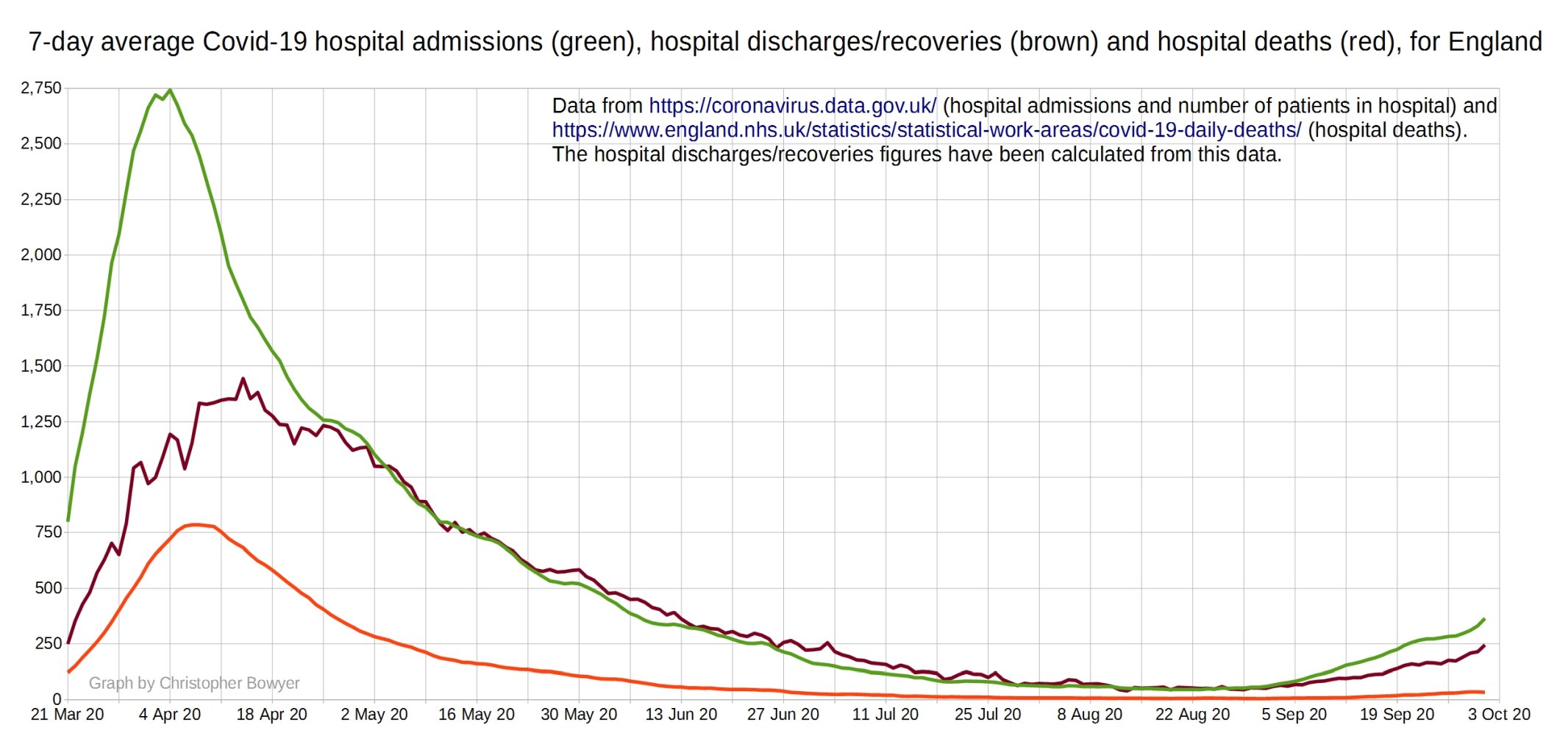
The second new graph is of Covid hospital admissions, Covid hospital discharges (recoveries) and Covid hospital deaths. Christopher says:
I was able to calculate the hospital discharges myself from the patients in hospital data and admissions data on the coronavirus.data.gov.uk website, and the NHS England hospital deaths data.
It’s not perfect, the discharges figure jumps around a fair bit from day to day – hence I’ve only plotted the 7-day averages on the graph, to smooth this out a bit.
But as I often see people saying why doesn’t the government publish the recoveries figures, this might be the next best thing. Especially as on every single day I have data for, the average discharges figure has always been above the average deaths figure – if you go into hospital with Covid you’re much more likely to recover than die!
4 thoughts on “Positive tests, admissions and deaths graphs from Christopher Bowyer (6 October)”
Underlying any analysis is the long-standing uncertainty about what a ‘Covid’ admission/hospitalisation/death actually means.
It’s the old one about the difference between deaths ‘with’ and ‘of’ Covid – but, because of the ramifications of what we now know about the flaws inherent in PCR testing, the whole area of definition of a ‘Covid’ patient becomes highly questionable.
In simple terms – we simply don’t know what the numbers show, in any context.
It’s an unholy mess.
Thanks for this analysis. I agree with Rick Hayward, the data is a mess and I would add that it appears to be constructed to generate and support head lines rather than allow informed decision making and risk management.
New Good Article on Positive PCR Tests
In some ways he makes it more complicated by being more accurate. I will stick with X% of tests will be FPs and if total “cases” lower than X% of tested, vast majority are FPs imprisoned for 14 days when innocent – thoughts?
Comments are closed.