Christopher Bowyer has done a couple of new and very interesting graphs (each can be clicked to enlarge).
Both graphs are scatter graphs of ONS weekly Covid deaths vs excess deaths, for all English regions (London, Mids, NW, East, SW, NE & Yorks, SE) and Wales. The first graph covers the ‘first wave’ (weeks 12-24 of 2020), and the other covers the so-called ‘second wave’ (week 37 onwards).
In each graph the vertical axis is for excess deaths, and the horizontal axis is for Covid deaths. For each week in each region a point was added where the excess deaths meets the Covid deaths.
If there’s a strong correlation between the two things then most of the points should cluster around a diagonal line that goes from bottom left to top right (because regions with low excess deaths and low covid deaths with be at the bottom left, and high excess deaths and high Covid deaths will be at top right, and medium excess and Covid deaths in the middle).
In the first graph below, the one for March, you can see that there is such a line.
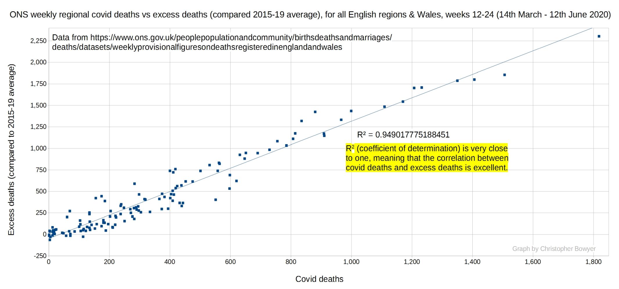
We can measure the correlation between excess and Covid deaths with what’s called R2 (R squared), the ‘coefficient of determination’, which is just a measure of how much one figure predicts the other. The closer this number is to 1 the higher the correlation. In this case R2 is 0.949, which means that there is a very high correlation between excess deaths and Covid.
Compare this with the graph for September onwards where deaths above (or below) the five-year average are plotted against Covid deaths for each region and week.
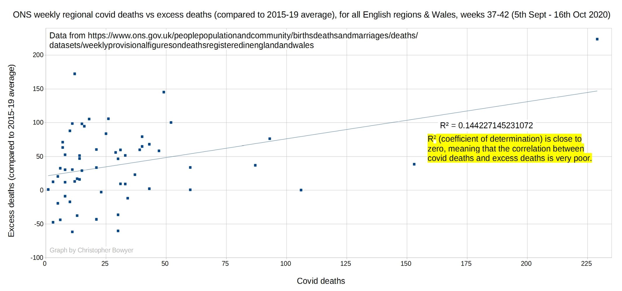
You can see that the points don’t cluster around a bottom left-to-top right diagonal. They’re all over the place. The R squared for this graph is 0.14, which means there’s not much correlation between the two. We can conclude that Covid is not currently a driver of excess deaths.
Thanks to Christopher for doing these graphs and making them available here.
Update: There is another point of interest in these graphs. It might be wondered whether the high correlation between excess and Covid deaths in March to mid-June means that there were no non-Covid ‘lockdown’ deaths.
I don’t think we can say that, though. An R2 of nearly one doesn’t mean that excess and Covid deaths numbers are the same (or even roughly the same). It just means that excess deaths and Covid deaths vary together in a roughly proportional way. But if you have a close look at the points and their numbers, the majority show that excess deaths were well higher than Covid deaths; often there’s a range of 100 to 500 more of the former than the latter. The opposite is the case with some of points that are lower down on the left-hand side.
So while I expect some of these “excess excess” deaths were caused by undiagnosed Covid, it certainly hasn’t been shown by this graph that all were (and most likely many of the official Covid deaths weren’t Covid anyway, but that’s another story).
Update 2: Prof Jonathan Jones pointed out (on Twitter) that you have to allow for the different scales involved, as the first graph has much larger values than the second. So Christopher has done a new graph where only the values under 250 for the spring period were used. This is the result.

So a much lower correlation than before, but still quite a bit higher than the 0.144 for autumn.
Update 3: Please support this website by donating via KoFi, subscribing via SubscribeStar or Patreon, or buying my book (see right-hand sidebar for links). Independent media like Hector Drummond Magazine, and my constantly updated Twitter account, cannot survive without your support.
6 thoughts on “The correlation between weekly excess deaths and Covid deaths by region, then and now (Christopher Bowyer graphs)”
Another point to note is the massive Order of Magnitude change in scale between March-June versus Sep-Oct. The first graph runs up to over 2,000 deaths per week — the second to only about 200. If one plotted the Sep-Oct data on the first graph, they would mostly congregate in the bottom left corner — and likely would have little impact on the r-squared value.
Covid-19 was not a pandemic in the Spring. With ascribed deaths dropping by a factor of 10 since then, it certainly is not a pandemic now.
Correlation is not the same as causation. In the spring the extreme concentration of resources on what turned out to be a relatively ordinary seasonal issie diverted resources which led to more excess deaths that had nothing directly to do with the virus. There is a strong correlation and causation between idiotic, brainless behaviour of ‘man’ and excess deaths, about to be repeated right now.
There’s an erroneous “vertical” that you might like to delete. Then you can delete this.
Deleted the ‘vertical’ that shouldn’t have been there, thanks.
This is terrible analysis, even after update 2.
Of course when there are more weekly Covid deaths, the correlation with weekly excess deaths will be greater. As Covid deaths grow, excess deaths becomes more dependent on them.
Comments are closed.