Hector Drummond Magazine reader and contributor Christopher Bowyer has done some more Covid-19 test result graphs based on the data at https://coronavirus.data.gov.uk/ and NHS England. (All graphs can be clicked to enlarge.)
Be aware that the positive test data comes from PHE/NHS Track and Trace, and the reliability of that data is questionable, so take it with a grain of salt.
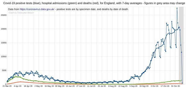
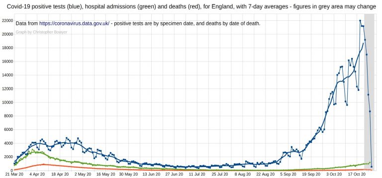
English Covid-19 positive tests, hospital admissions and deaths.
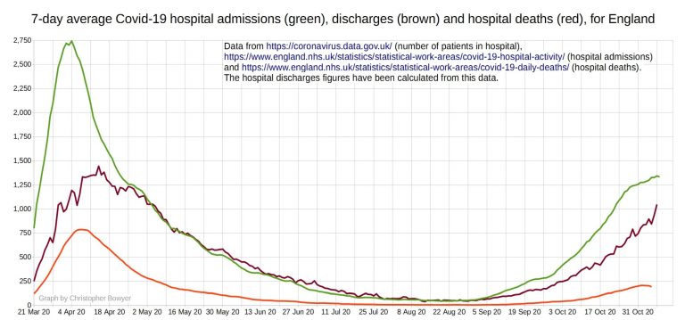
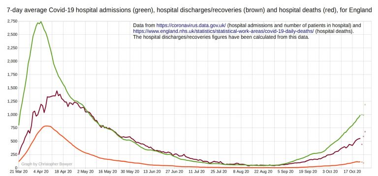
Covid-19 hospital admissions, discharges and deaths for England
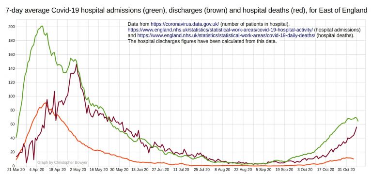
Covid-19 positive tests, hospital admissions and deaths for East of England.
Covid-19 positive tests, hospital admissions and deaths for London.
Covid-19 positive tests, hospital admissions and deaths for the Midlands.
Covid-19 positive tests, hospital admissions and deaths for north-east England and Yorkshire.
Covid-19 positive tests, hospital admissions and deaths for north-west England.
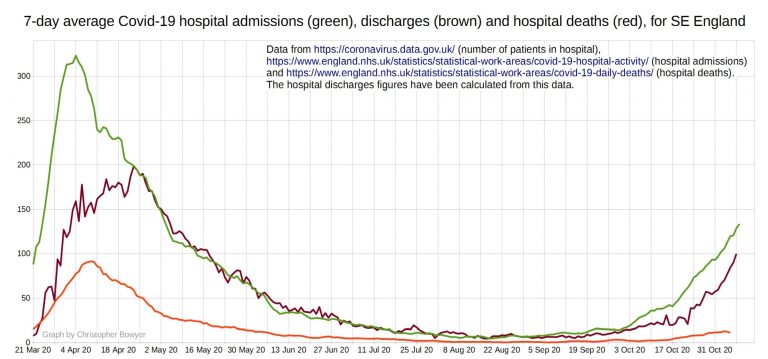
Covid-19 positive tests, hospital admissions and deaths for south-east England.
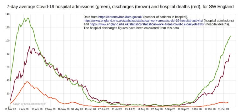
Covid-19 positive tests, hospital admissions and deaths for south-west England.
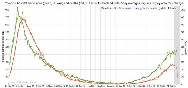
English Covid-19 hospital admissions and deaths, using two y-axes.
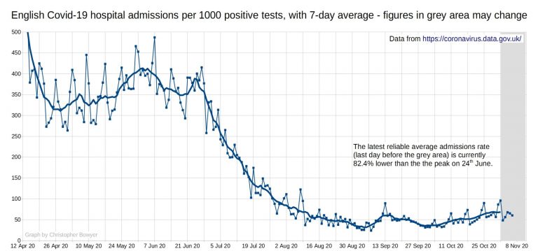
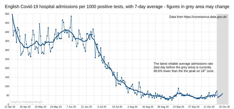
English Covid-19 hospital admissions per 1000 positive tests.
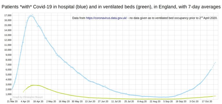
English Covid-19 hospital beds occupancy.
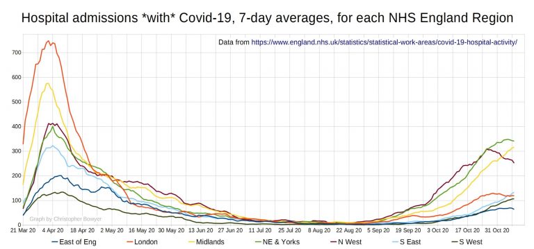
Regional Covid-19 hospital admissions.
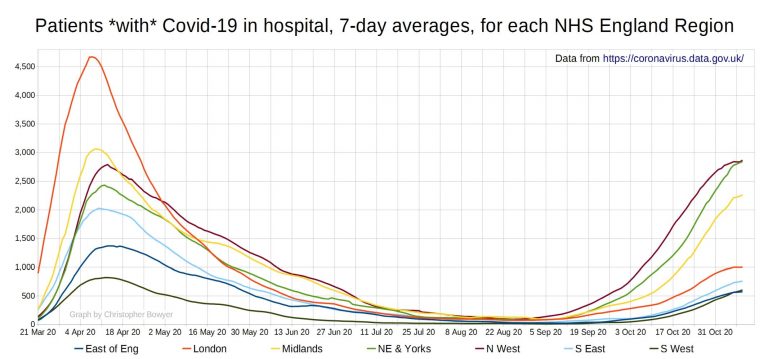
Regional Covid-19 hospital occupancy
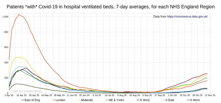
Regional Covid-19 hospital ventilated bed occupancy
First up, a graph looks at SARS-CoV-2 positive tests (blue), Covid hospital admissions (green), and Covid deaths (red) for England.
Hospital admissions per 1000 positive tests, England. 86% lower than the peak in June.
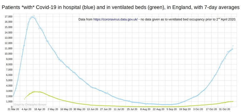
Patients with Covid in hospital and in ventilated beds in England.
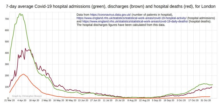
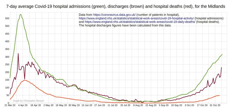
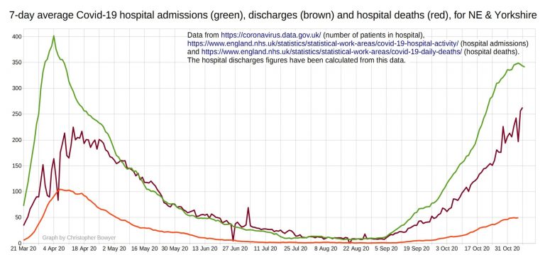
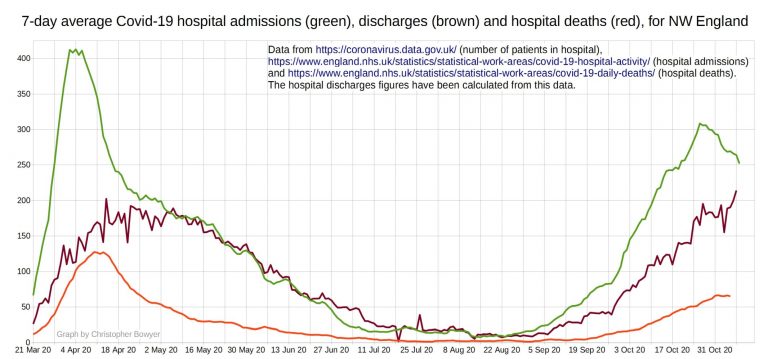
Covid hospital admissions, Covid hospital discharges (recoveries), and Covid hospital deaths. Hospital admissions have increased since September, but so have discharges. Deaths still pretty low. Remember that at this time of year it is completely normal for hospitals to start filling up with elderly patients who have respiratory viruses, some of them die. It’s also totally normal for hospitals to be overwhelmed by December, and it’s likely to happen again this year regardless of what happens with Covid.
Some people are making a fuss about hospital admissions now getting up towards half the spring peak, but you can see from this graph that the hospital case fatality rate is completely different than in spring. Back then the peak (in early April) was around 2750 hospital admissions a day and around 760 deaths, which meant just over a quarter of the patients were dying, whereas now we have (27 Oct) 1190 admissions and 147 deaths, which is 12%.
You can also see that the rate of growth of admissions and deaths is much lower now than in Spring, despite there being less lockdown restrictions now.
Also bear in mind that the dubiousness of the test data means that it is very likely that a fair proportion of the people in hospital ‘with Covid’ don’t really have it (more so than in spring due to the recent degradation of the testing system). This also means that some of the Covid deaths will not really be Covid deaths; in addition, we still have (as we had in the spring) doctors who are determined to put down Covid on the death certificate as a contributory cause even if there was little evidence that the deceased had it.
Update: I have a lot of submitted material to go through and I am working my way through it, plus my own pieces I’m trying to write. Please support this website by donating via KoFi, subscribing via SubscribeStar or Patreon, or buying my book (see right-hand sidebar for links). Independent media like Hector Drummond Magazine, and my constantly updated Twitter account, cannot survive without your support.
Also, please please please add the word ‘Submission’ to any article or material you send me, I get so much e-mail that without that your email may get buried and lost. (If you’re just sending me a passing comment or a link of interest then you don’t need to add that.)
2 thoughts on “Positive tests, admissions and deaths graphs from Christopher Bowyer (10 November)”
Excellent graphs as always.
Its still abundantly clear that without the ‘meeja’ telling us that we have an epidemic, we would not know.
@Jim W
As Mike Yeadon said last week: Stop testing, Scare over
As for BBC etc – Give all stats
“Today’s Deaths
Cancer xxx
Heart xxx
Stroke xxx
Flu xxx
Pneumonia xxx
blah
blah
Covid-19
blah…”
Comments are closed.