Here are some new Covid-19 graphs from Christopher Bowyer. These graphs use data from NHS England data, which can be found here. (One of the graphs also uses ONS data, and that can be found here.)
All graphs can be clicked to enlarge.
England deaths with Covid-19 by absence (yellow) or presence (green) of a pre-existing condition. Data from NHS England.

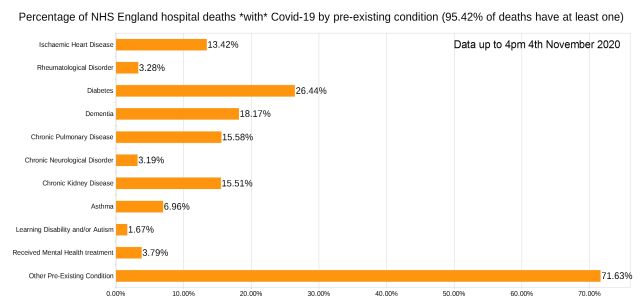
Percentage of deaths with Covid-19 by pre-existing condition. (95% have one or more P.E.C.) NHS England data.
Note that the most common pre-existing conditions are diabetes, followed by dementia, chronic pulmonary disease, and chronic kidney disease.
Trendlines (7-day average) for Covid-19 deaths by England NHS region, by date of death. (Note that the numbers in the grey area may increase over the next few days.) NHS England data.

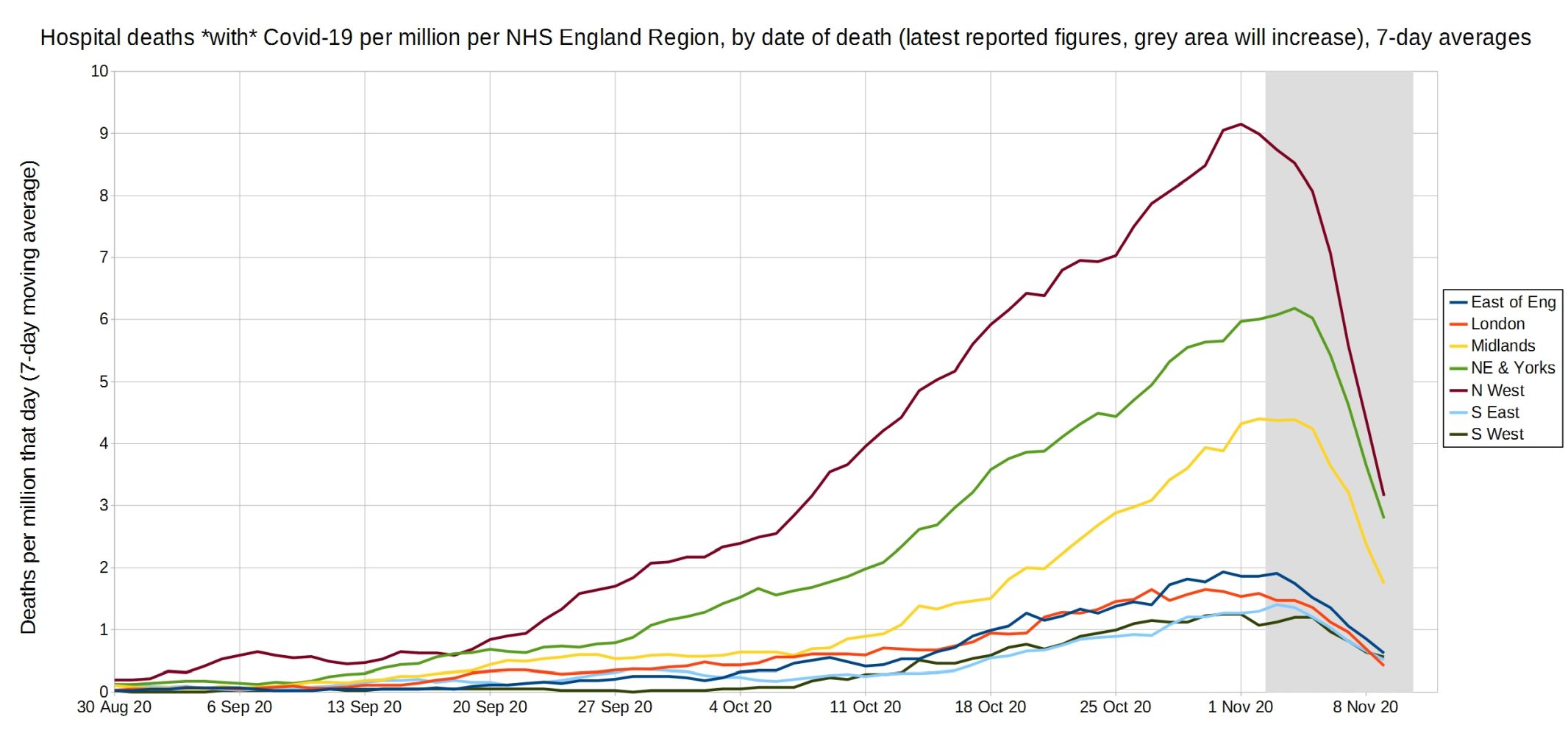
Trendlines (7-day average) for Covid-19 deaths per million by England NHS region, by date of death. (Note that the numbers in the grey area may increase over the next few days.) NHS England data.
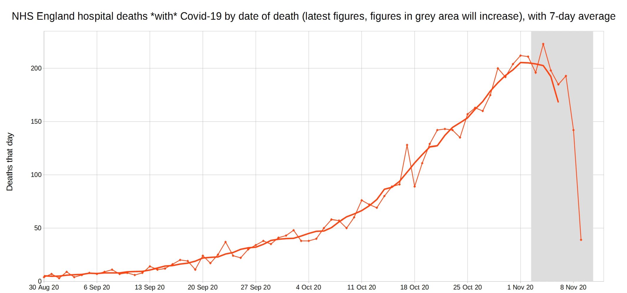
NHS England hospital Covid-19 deaths each day, latest reported figures, with 7-day moving average trendline.
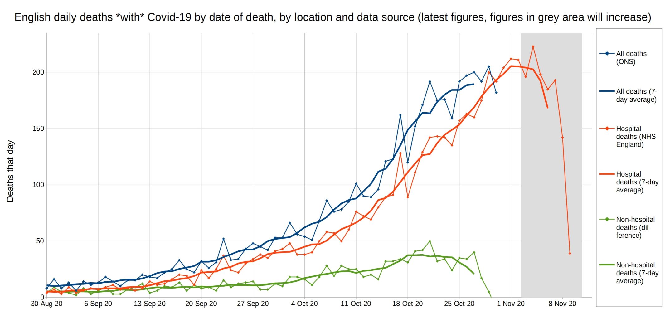
All Covid, hospital Covid, and non-hospital Covid deaths in England each day, with 7-day moving average trendlines.

All (ONS) and hospital (NHS) English deaths with C19 each day, latest reported figures, with 7-day moving average trendlines.
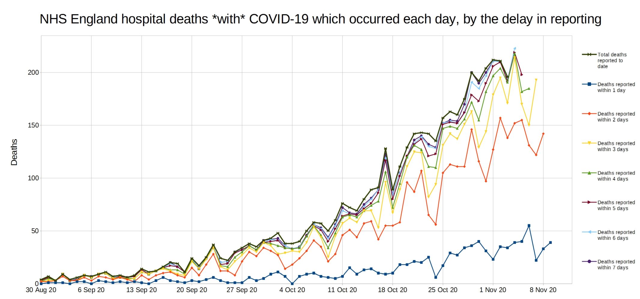
NHS England deaths with Covid-19 each day, by delay in reporting.