Why would you give any money to a charity in 2020? They've all gone woke, and now spend their money on clipboard-wielding harridans who go around searching cupboards looking for non-compliant coffee mugs. Support me instead by sending a bit of money my way via
Patreon, or
SubscribeStar, or buy me a coffee via
Ko-Fi.

8 thoughts on “Sunday’s NHS Covid-19 graphs”
Following exactly the same bell shape as all virus.
So what will Bojo’s excuse be for continuation of lockdown after VE day?
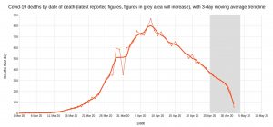
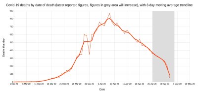
Eyeballing the first graph (England hospital deaths by date of death), we’re seeing a remarkably smooth linear decline from the peak, with a gradient of about 100 fewer daily deaths every 5 days.
Since we’re already down to about 300 on 30th April, if the linear decline were to continue, we’d see deaths hit zero around 15th May.
This won’t happen, of course: the linear decline will soon start tapering off into a longer tail, if it hasn’t already. Nevertheless, I reckon deaths will have fallen to a very low level already by the end of May.
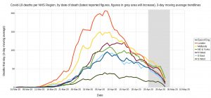
Nice charts Christopher. We do indeed appear to be following the same trajectory as other nations with a high infection/ mortality rate.
I caught a bit of the Sir David King alternative scientific committee on Sky News (I was not able to find it on YouTube) and it was heartening to hear the possibility of significant heard immunity having already been achieved being discussed. While this was only speculation, at least it was honest speculation, and also recognised the possibility that a big proportion of the population is not even susceptible to the virus. The numbers quoted were that IF we have achieved 30% of the population with antibodies, and 50% of the population are not susceptible, we will have likely achieved a situation where there is a high degree of immunity in society. Hopefully this committee will provide an alternative dialogue about the potential societal and economic steps we should be taking
Coronavirus latest: UK deaths rise by 288 – the smallest daily increase since March – Telegraph
@Andy
Sir David King’s ‘Independent Sage’
https://www.youtube.com/watch?v=azR2tW6tgYY
I’m not sure whether you’ve covered this elsewhere but, in the first graph (NHS-England deaths) the disturbance between 28 March and 1 April interests me. Death certificate guidance was changed on 31 March. Figures added on 2, 3, 4 April contributed disproportionately to 29 and 30 March, in comparison with both 28 March and 31 March. So a couple of questions:
1) Could the huge dip on 31 March be anything other than a cock up in allocating deaths to days?
2) Are we really looking at two distinct graphs; the first up to March 28, showing a conservative count of confirmed Covid-19, and the second, from 1 April onward, showing the inflated ‘untested’ Covid-19?
I see that NHS-E did eventually get round to updating their webpage to show ‘mentioned on death certificate’ alongside ‘tested positive’, but this didn’t happen until some time between 23 and 28 April.
I’ve done some curve fitting on the same data, could be down to early March levels (<10/day) by 20th May. (NB these are NHS England numbers, the ONS numbers will be higher and lag by a week or two)
many thanks for this; you are a lone voice of sanity.
Comments are closed.