The latest Euromomo graphs clearly show that excess deaths have peaked and are now declining everywhere in Europe. For the countries that had excess deaths, that is. A lot of countries have had nothing at all.
First of all, here’ s a graph of Europe as a whole (at least, all the participating countries). Week 17 2020 is at the end of the right-hand side (click to enlarge):
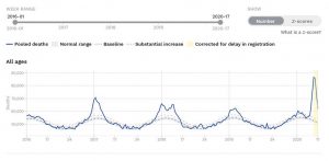
That graph uses numbers rather than z-scores. Note that although the peak was higher than winter 2016-17 and winter 2017-18, it was much narrower, so there would not have been that much more of a death toll overall than in those winters.
Individual country graphs
The individual country graphs are also very revealing. For one thing, many countries were completely unhit. Also, everywhere that was hit is now showing a decreasing death rate. I’ve got four snips of country graphs to show you. First up we have Austria, Belgium, Denmark, Estonia, Finland and France (click to enlarge).
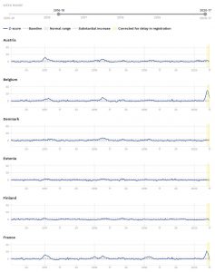
These graphs use z-scores, which means they’re standardised to the norm for each country, so you can directly compare each country. So, Austria, Denmark, Estonia and Finland were completely flat for this winter and spring, not even any of the excess deaths you usually get every second or third winter. (Note that the standard for each country’s z-score is set to the norm you get around the most stable parts of spring and autumn, so excess winter deaths will show up.) Only Belgium and France had some excess deaths, but France is back to normal, and Belgium is almost back to normal.
Next graph is Germany (two graphs), Greece, Hungary, Ireland, and Italy (click to enlarge):
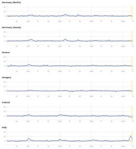
Only Italy shows any excess deaths, and it’s almost back to normal. Everywhere else has been as flat as a tack for the whole of winter and spring.
Third graph has Luxemberg, Malta, Netherlands, Norway, Portugal, and Spain (click to enlarge):

Only the Netherlands and Spain had anything out of the ordinary, and they’re now both back to normal (the Netherlands is in fact way under normal).
Finally, Sweden, Switzerland, England, Northern Ireland, Scotland and Wales (click to enlarge):

Sweden doing much better than England
The amazing news here is that Sweden, with partial restrictions but no full lockdown, has only had a mild rise in deaths, and nothing out of the ordinary. Same for Switzerland, NI, Scotland and Wales. The biggest outlier is England, which has seen a large deviation from the norm on these z-score scales. Also, it looks like England’s peak has now passed, but it is plateauing much more than other countries and not coming down quickly. This is possibly because England is seeing extra deaths caused by the lockdown and the aggressive and insane ‘Stay At Home’ campaign, and the creepy NHS worship.
Has lockdown prevented deaths?
These graphs seem to show that the lockdown in the UK has not prevented any deaths. Lockdown proponents will say that the death toll would have been even greater without it, but these graphs show that this is very unlikely, because there was no country that was much worse hit than England. Also, Sweden, which had no lockdown, has done much better than England. Also, the NHS is nowhere near full. So it’s hard to see any reason (outside computer models from interested parties) to think that England’s figures would have been vastly higher if we had followed Sweden (and please don’t just say ‘But more Swedes live alone’). Would we really have been even more than twice as bad as Italy? (It’s possible that Italy’s figures will creep up, as possibly their death stats system is slower than ours, but I think my point will still stand.)
Delay-adjusted scores
One objection that might be made to my claims here about these Euromomo graphs is that we need to be careful about the last week on the graphs, the ‘yellow zone’, ie. the yellow shading at the end. Most of the declines are in this yellow zone. But the yellow zone is an indication of where Euromomo doesn’t have the official figures yet. Euromomo says of the yellow zone figures that they are based on an algorithm which uses previous years’ data to predict what the figure for next week will be. But, our objector might say, what use is that going to be to us in this unprecedented situation?
However, I have been watching Euromomo’s ‘delay-adjusted’ figures for over a month now, and it seems to me that they are getting advanced notice of what figures are in the pipeline from the relevant statistical agencies. Bear in mind that the latest week that us being graphed here, week 17 (17-24 April), is 10-17 days behind now, so the statistical agencies will have a pretty good idea of what that week is looking like.
(I did e-mail Euromomo to ask about this a while ago but they haven’t replied.)
For instance, a few weeks ago the delay-adjusted figures for England massively spiked out of nowhere, and that could not have been from some algorithm that purely analysed previous year’s figures. It can only have come from the ONS telling them of the big spike. And it turned out that that big spike was right, because the ONS confirmed it a few days later. So I do take the declining numbers in the yellow zone seriously. After all, all the real-time data we’ve been hearing about recently indicates that Covid-19 deaths have been declining all over Europe in the last few weeks (including the UK, judging by the recent NHS figures), and while that data isn’t as reliable as ONS-type data, it still gives a picture of the overall trend.
My conclusions are that Covid-19 is over in Europe (for now, at least), the lockdown was completely unnecessary, and it probably killed people who would have lived had we not got so hysterical.
27 thoughts on “Euromomo graphs show that Covid is finished in Europe, and that the lockdown didn’t help the UK”
As someone on the ground maybe I can help explain the excess UK non covid deaths. Many elderly frail patients living in residential homes have a revolving door existence with the local DGH . If they have a significant water infection or minor stroke in they go to the local hospital for immediate treatment often because the residential home has not got the staff to nurse them. This has not happened during covid time . I suspect they have just quietly passed away in the residential home .
Coronavirus latest: UK deaths rise by 288 – the smallest daily increase since March – Telegraph
One suspects that the sainted NHS is actually the reason that the UK’s death rate is stubbornly higher than in the rest of Europe. How exactly will the NHS worshippers manage to explain that their healthcare model has produced (possibly) the worst outcome of every European nation? Worse even one suspects than the Great Satan itself, the US healthcare system.
But I’m sure they’ll manage to square the circle somehow. Blame it on the Tories I expect. But one would think that deep down it might be causing the NHS worshippers a few dark nights of the soul – if Donald Trump and the massed ranks of the evil neo-liberal baby eating b*stard US private healthcare system can out-perform the Angels of the NHS, perhaps, just perhaps the NHS isn’t the ‘Wonder of the World’ after all?
Excess deaths in care homes are predominantly due to Covid-19. Do you have numbers for non-Covid excess deaths in care homes that you can share? I am also on the ground, I can confirm that people in care homes or receiving care at home continue to be admitted to hospital for the kinds of illness you mention.
Let’s assume that nobody in a care home is being admitted to hospital when they fall ill because hospitals don’t want to admit them during the pandemic. This, I think, is what you are suggesting. Are you also suggesting that this accounts for the increased deaths in care homes?
Increased deaths are mainly due to Covid-19. The National Care Forum (NCF) estimates that there were 7,300 deaths due to Covid-19 among care home residents in the five weeks to April 13th. That includes deaths in care homes and deaths among care home residents admitted to hospital (note: care home residents are in fact continuing to be admitted to hospital).
How many care home residents would normally be admitted to hospital over a five week period? Government figures show that there were 192,000 admissions to hospital from care homes in England over the whole of 2016. Scaling this up we can say that there were approximately 228,000 hospital admissions across the UK in 2016. Around 12% of the people admitted to hospital from care homes died in hospital in 2016. This suggests that around 2,360 people admitted to hospital from a care home died in hospital in any five week period in 2016.
It may well be that care home residents with non-COVID related illnesses have died because they were not given the acute care that they would have received in normal times. I haven’t seen any numbers for that – perhaps you could supply them? Those deaths should be added to the excess deaths from Covid-19. Whatever the number is for non-Covid excess deaths, it will be lower than the theoretical 2,360 that I have just calculated. This is because residents in care homes have continued to be admitted to hospital for serious illness, If you have information on the extent of the drop in hospital admissions for illnesses such as stroke or serious water infections I would be interested to receive it.
deStatis has daily total mortality data for the whole of Germany up to 5th April here:
https://www.destatis.de/EN/Themes/Society-Environment/Population/Deaths-Life-Expectancy/mortality.html
No sign of a blip.
Try looking at this chart (the exact numbers reveal as you mouse over)
https://datawrapper.dwcdn.net/0KlJb/1/
Although we have a late starting breakout of virus deaths in care homes compared with the main peak, it is surely clear that there are plenty of excess non-virus deaths in care homes, since these have doubled compared with the steady level of care home deaths pre epidemic. We’ll get a further week of update at the latest on Wednesday.
Thank you. Yes I can see that I was mistaken about the level of non-Covid excess deaths. An FT article suggests that there were 5,000 excess deaths in care homes in the week to April 17th. NCF’s analysis suggests that weekly care home deaths from Covid-19 in mid-April was 2,500 so clearly there is a significant amount of non-Covid excess deaths. While a certain level of admissions to hospital from care homes has been maintained, it seems clear that lower admissions are contributing to excess deaths. Your comments and Peter Thompson’s are absolutely correct.
https://www.ft.com/content/0ed8ea34-ebc5-4425-b86a-7a29447de57b
Mondays and Tuesdays are always low because they are the figures from Saturday and Sunday. Regional coroners don’t work weekends.
It has always puzzled me that whenever I raise doubts about the efficacy of ‘our’ NHS, the response from worshippers is a shudder accompanied by ‘b b b but America!’.
As Hector and team have so admirably demonstrated, there are many alternative healthcare systems available in other countries with better outcomes, and (thanks, Gordon!) equivalent or even lower costs.
It is great to see some people being prepared to ask for clarification and then when they have reviewed the evidence change their minds and admit as much. This is all most people are asking of the GOV’s who entered lockdowns on very flimsy evidence (if any). Test the hypothesis and re test it, no just the symptoms of the disease. If it was wrong admit adjust and re test the new approach in light of new information.
This is to confuse treatment of the disease (there is no effective treatment and our ITU outcomes are as good or better than anywhere) with causes of spread of disease, demographics, government mitigation policies, social care policy etc. It is unlikely (in my opinion) that NHS treatment/management will be shown up as contributing to mortality compared with other countries. With the benefit of hindsight many social effects will be shown to contribute to spread and thus mortality. Some of these will have been in government control. Hindsight is a wonderful thing. The bipartisan and “blame culture” state of our politics will make it difficult for the government to admit mistakes.
While a certain level of admissions to hospital from care homes has been maintained…
What has also been maintained is the return from hospital to care home once the patient has been treated. This has been a major vector of COVID-19 into care homes.
If you have symptoms, go home and wait for them to get bad enough for us to admit you. That is the NHS way, and it misses the opportunity taken elsewhere to treat aggressively and early. Other places are changing in the light of events. I refer of course to the EVMS covid protocol, which you can google of you haven’t seen it. The regime is nothing like what the NHS seems to be doing. (Apologies if it is reacting better now, but what it publishes on its websites doesn’t give much encouragement.) There are places with better outcomes than what the NHS manages. Whether this will be investigated fairly afterwards I don’t know. I predict that ‘lessons will be learned’.
*the aggressive and insane ‘Stay At Home’ campaign*
Ordering people to stay at home indiscriminately because of a respiratory virus is indeed insane. How is confining young people supposed to prolong the lives of the elderly or otherwise vulnerable? One thing keeping people indoors is guaranteed to accomplish though is to deprive them of what is essential to immune system health as the primary source of Vitamin D, namely sunlight. Yet it’s public health orthodoxy!
Which points to a still greater insanity: allowing your public discourse to be controlled by hostile foreign interests. Yet no one questions that anymore than a concomitant insanity: that people who’ve dwelt here for centuries should have no more right of abode than new arrivals from thousands of miles away with no prior connection to this place whatever.
Not only that, people face political persecution for not embracing their impending minority status which is not even mentionable in public life even though it’s guaranteed on current trends well before end of the century, and is already a fait accompli in London and Birmingham. Even as the scapegoating of natives intensifies with the numbers, with anti-European race activists given a platform throughout the mass media.
The ‘free speech’ or ‘right wing’ media nomenklatura reinforce the official orthodoxy by providing ‘balance’. But the only real balance to an Ash or Afua would be a European equivalent. Which is what their prominence as much as their ‘right wing’ opponent is designed to exclude. It’s a classic example of the middle-ground fallacy, that between two opposing viewpoints the truth must lie somewhere in between, patented by the BBC but now the norm throughout the media. The middle-ground between Ash or Afua and Toby or James being the guaranteed minority status of the latters’ grandchildren if not their children.
Any deviation from the sacrosanct principle that European-settled lands alone should be available for settlement to all peoples regardless of origin is thereby banished from public discourse as “racist”, while the celebration of other identities openly hostile to Europeans is reaffirmed in every public sphere. The idea that Europeans should be entitled to their own homelands same as everyone else can’t even be aired.
Economic liberals or ‘libertarians’ like IEA defend mass migration as beneficial to “the economy”. Economics is from Greek for housekeeping. It’s akin to renting out a spare room to generate more revenue: your bank balance might improve, you just no longer have a home of your own. Hence Powell, a proponent of economic liberalism came to side with the socialists, economics being otiose absent of a home.
We’re supposed to oppose “socialism” because economic power begets political power, concentrated economic power spelling political despotism. There’s a scene in Hector’s novel where the academics are arguing over the death toll of socialism. But “socialism” is only an idealisation of political power. Suppose thousands die from Bill Gates’ global vaccine. That’s no more attributable to “capitalism” than the massacre of the kulaks is to “socialism”. Bill Gates’ or Lenin’s desire for political domination wasn’t implanted in them by “capitalism” / “socialism”.
Blaming “socialism” for mass murder is like blaming the internet for “hate” or the internal combustion engine for “road rage”. GK Chesterton regarded Socialism and Capitalism, in so far as they concentrate economic and therefore political power, as forces conspiring against the ordinary man. In other words, he understood those terms as representing forms of power inimical to the common good understood as the dignity and liberty of the greater mass of men.
Any concentration of power is to be opposed because if power corrupts, unaccountable power corrupts “exponentially”. Whether it’s in the guise of “socialism” (state capitalism) or “capitalism” (crony capitalism) is to that extent immaterial. He opposed capitalism on the same grounds of economic liberty with which it’s typically defended against socialism. The difference between Chesterton and some economic liberals, apart from his Christian faith and attachment to family and nation as primary forms of social and political loyalty, is that he recognised capitalism as crony capitalism, i.e. what actually happens as distinct from a utopian ideal: that free market capitalism was practically a contradiction in terms.
Chesterton’s ideal was for every man to be a “capitalist” in so far as that meant being a self-reliant property owner. Perhaps that’s no less utopian. But at least it doesn’t falsify existing conditions. I’d only add that the accusatory clamour we call “the left” can also be understood as “capitalists” except their currency is resentment. Traditionally that meant economic resentment but with demographic change now encompasses cultural and racial resentment, “racism” displacing “capitalism” as animating principle. Which also explains why Leave was a ‘left wing’ cause in 1975 yet a ‘right wing’ one in 2016.
“If you have symptoms, go home and wait for them to get bad enough for us to admit you. That is the NHS way,”
It is always the NHS way, want a GP appointment… wait, delay, too late, go to A&E.
Brilliant attack on rule of scientists from GK Chesterton in his chapter on HG Wells in ‘Heretics”. Also remarkable for its grace and for never impugning the person of Wells, which is characteristic of Chesterton however vehement his denunciation of a man’s ideas:
https://www.gutenberg.org/files/470/470-h/470-h.htm#chap05
Do “government mitigation policies” include instructions or advice on how to fill in death certificates correctly?
“With, of, from”
There are two proven methods for rationing scarce resources:. The oldest method is the price mechanism, much loved by A-level economics students. The other is the “queuing mechanism”, much loved by degree level humanities students. The queuing mechanism is inefficient, and is always open to abuse.
Or, as soon as the first elderly patient had a hospital visit and returned, all the patients in that residential home succumbed to the Covid that was brought back from the hospital….
“…It is unlikely (in my opinion) that NHS treatment/management will be shown up as contributing to mortality compared with other countries…”
The NHS is a big bureaucracy. Amongst other things, it will issue treatment protocols. If, as a junior doctor, you follow those protocols and your patient dies, that is just too bad. If you deviate from those protocols and your patient dies, you may be looking at a malpractice suit and being struck off. So you stick rigidly to them.
Now, we need to consider how rapidly the NHS can develop new protocols for a new disease. I suspect that we will find that it is very slow, and our treatment may be worse than other countries because of this central bureaucracy…
“Chesterton’s ideal was for every man to be a “capitalist” in so far as that meant being a self-reliant property owner. ”
Chesterton’s battle-cry was: “Four acres and a cow!”. He was an agrarian romantic. What his system would have failed at was the technical developments, driven by capitalism, which have transformed our lives so much for the better…
“instructions or advice on how to fill in death certificates correctly”
must get those forms filled in correctly:
https://www.gov.uk/government/publications/guidance-notes-for-completing-a-medical-certificate-of-cause-of-death
Yes Dodgy that’s why I put ‘utopian’ in the next sentence. But even if Chesterton’s ideal of self-sufficiency symbolised by 4 acres and a cow is utopian, as I believe it to be, that doesn’t invalidate his critique of capitalism / socialism as inimical to that property-owning ideal. The virtue of utopian systems is supposed to be in bringing to light existing imperfections, their vice in fuelling fanatical schemes of improvement. But self-sufficiency is intrinsically virtuous, and as such a noble ideal whether or not universally attainable. If some aren’t able to fend for themselves for whatever reason that’s not a justification for denying people at least the opportunity to be independent.
If technological advances or material wealth translated into ‘better’, then the Belgravian billionaires should have been models of contentment instead of crackheads. Arguably affluence is “worse” in that better healthcare means lower infant mortality exerting dysgenic pressure leading to survival of deleterious traits, ie a more sickly, less able, lower iq population. Of course that might be ‘better’ for some individuals but it’s hardly better for the survival of the group, assuming group survival to be ‘better’. My own ideal is austerity, certainly for other people, which has at least the merit of not being utopian.
“It is unlikely (in my opinion) that NHS treatment/management will be shown up as contributing to mortality compared with other countries. ”
I think that the NHS decision to clear its decks of all the bed blocking elderly and shove them back to care homes has resulted in a lot of the extra deaths the UK is now seeing, both of CV (because they sent infected people back to care homes and spread it) and non-CV (because care homes are not set up to care for people who should be in hospital). Its instructive that in New York Governor Cuomo did exactly the same thing, and guess what, they’re experiencing a far higher death rate than other parts of the US.
“This is possibly because England is seeing extra deaths caused by the lockdown”. But some other countries have had stricter and longer lockdowns than the UK. Why have these countries not seen the same extra deaths ?
the data seems to be flashing and swirling around like snow flakes in a snowstorm Tony; a paper published Nov 19 looked at flu deaths in Italy up from 2013/14 to 2016/17; so it took them over 2 yrs to tidy it all up; that is careful study
PS there were 25,000 ILI deaths (influenza-like illness) in the winter 2016/17 and perhaps 20,000 or less this year.
Re: E Hagger thread…
Yes, very refreshing. It’s too easy for any of us to take a view and refute evidence – I’m as guilty as anyone.
We should all aim to see truth even if it doesn’t fit our own preconceptions.
Comments are closed.