This is an article by Christopher Bowyer, who has produced many graphs for HD Magazine.
Having produced graphs of the NHS England Covid-19 deaths statistics for the past month or so, I thought I would have a go at analysing the https://coronavirus.data.gov.uk lab-confirmed Covid-19 cases data.
Before I go any further, please bear in mind that the number of positive cases depends on the number of tests done each day (which has increased over time), and whether only hospital patients are being tested or anyone who feels unwell. So just because the England Covid-19 positive tests peak on the 7th April, it doesn’t mean that was the peak of the epidemic.
Now onto the graphs.
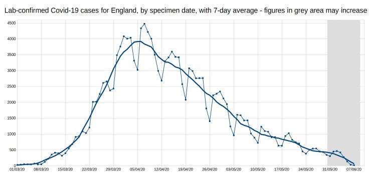
Firstly, here is the graph of daily Covid-19 positive tests (by specimen date), for England, with a 7-day average trendline (the thick line). The data shown in the grey area may increase, as it takes a few days for all the test results to come in, especially over weekends.
(Bigger versions of all graphs available at end of article.)
From this, it can be seen that the daily Covid-19 cases have been falling steadily since early April, although the rate of decrease has slowed since early May. It is also apparent when the weekends/bank holidays are!
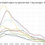
The next graph is similar, but shows the 7-day average positive tests (by specimen date) for each of the English regions. I had to remove the daily tests data, as it made the graph too complicated. As before, the data shown in the grey area may increase.
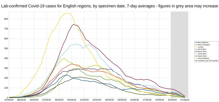
The difference in the shape of the region curves, are quite striking, with London and the North West rising rapidly to a peak and then declining, while the other regions rise more slowly, plateau and then gradually decline. Unfortunately I don’t know how much of this is to do with how much testing was done in each region, and how much is down to the outbreaks following different patterns.
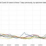
Finally, I have attempted to work out a more-understandable alternative to the near-mythical R0 number, by calculating for each region, the ratio between each day’s 7-day average positive tests, and the 7-day average from 7 days before. As an example, for the South-West (where I live), on 20th May the 7-day average positive tests was 31, and on 13th May (7 days previously) the 7-day average was 35.8 – so the ratio is 31/35.8=0.86.
Like the R0 number, this ratio (which I will call R7d) is above 1 when case numbers are increasing, and below 1 when case numbers are decreasing.
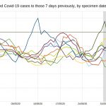
Below are two graphs of this R7d ratio for all English regions, firstly an overview from 29th March onwards, and then a close-up of the R7d ratio from 12th April onwards, when it is in the range between zero and 1.2, to show the fluctuations more clearly. As on the previous graphs, the data in the grey areas may increase.
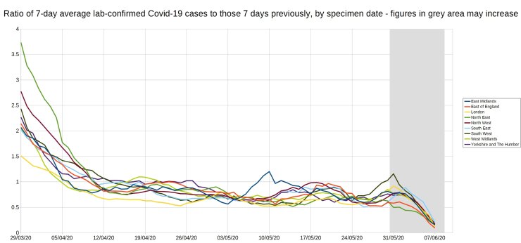
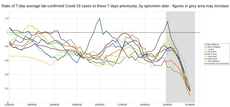
From these graphs (especially the second), it can be seen that since the beginning of May, only two regions have had a R7d ratio over 1 – the East Midlands got up to 1.2 on 10th May, and the South-West reached 1.16 on 31st May. In both cases the R7d ratio was above 1 for only a few days, both peaks were on a Sunday, and both peaks also came 7 days after a trough (0.57 on 3rd of May for EM, and 0.63 on 24th May for SW).
Looking at the 7-day average positive test values for the Sundays, as shown in the table below, gives more information on how the R7d ratio value got above 1.
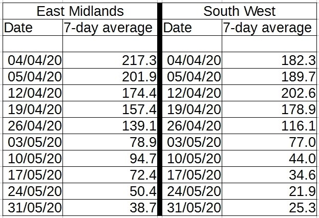
For the East Midlands, the 7-day average fell sharply from 139.1 on 26th April to 78.9 on 3rd May, and then rose to 94.7 on 10th May. The 10th May value is still 32% less than that on the 26th April, though, and in subsequent weeks the 7-day average has resumed its fall, reaching 38.7 on 31st May.
For the South West, the pattern is incomplete, but similar – a sharp fall from 34.6 on 17th May to 21.9 on 24th May, followed by a small rise to 25.3 on 31st May. This is only an average of 3.4 extra people a day testing positive than the previous week, and the 31st May figures are still 27% lower than those from 17th May, so nothing to get worried over, it appears to be just a blip as it was for the East Midlands. Naturally though the government are currently considering tightening the lockdown in the South West 🙁
I hope you have found this article interesting, please let me know any suggestions you have in the comments.
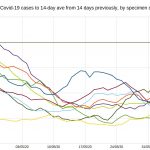
Update: After submitting this article to Hector, I got thinking about the R7d ratio, and how it is over-sensitive to weekly fluctuations. So I thought I would also calculate the R14d ratio, this is the ratio between each day’s 14-day average positive tests, and the 14-day average from 14 days previously.
Below is the graph of the R14d ratio, for all English regions.
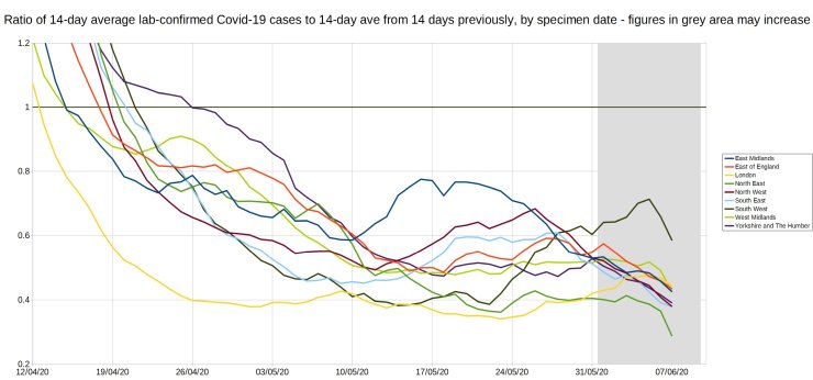
From the graph, it can be seen that the R14d ratio has been below 1 since 26th April, and even the peaks for East Midlands & South West on the R7d graph are still below 0.8 on this R14d graph. By comparing average positive tests with the average from 14 days previously, instead of with the previous week’s average, the R14d ratio gives a much better long-term picture of the course of the epidemic than the R7d ratio does.
Bigger versions of the graphs (click to view, click outside graph to get back):
12 thoughts on “Christopher Bowyer: Lab-confirmed Covid case data graphs, 12 June 2020”
Absolutely great graphs ! That’s the first time I have seen a description of anything that might allow getting your head around anything like an R factor. Couple of observations :
1) Even accounting for the fact that there was less testing earlier, it is clear that R was below 1 from mid April onwards. So Dominic Raab (who as standing in as PM at the time) should have released the lockdown when he made his 3 week review statements on April 16th. The NHS was NOT overwhelmed and R was below 1. Quite simply we were tricked into remaining locked up.
2) Looking at the areas under the curves, what you see is ‘squashed sombreros’. For London, the SE and the NW the epidemic is over. For the others infection rates will rise again – although no need to fear anything. It’s just that there are infections that need still to happen.
Do you know how the false positives found in Taunton have been treated? These happened around the end of May.
“Nearly 150 Somerset patients may have been wrongly told they had caught COVID-19, a hospital trust has admitted.
Nearly 80 patients at Musgrove Park Hospital in Taunton may have been incorrectly told they had coronavirus when they did not.
And a further 69 people are being contacted ‘as a precaution’ who may also have been given false-positive results.
The Somerset NHS Foundation Trust expressed its “heartfelt apologies” to those affected by this error but initially it did not reveal the scale of the problem yesterday (Wednesday, June 10).
In an updated statement Dr Daniel Meron, Chief Medical Officer for Somerset NHS Foundation Trust, said 78 patients who tested positive for COVID-19 after their swabs were analysed on the fast track machine between May 27-June 4 were told they may have been “incorrectly diagnosed”.”
https://www.somersetlive.co.uk/news/somerset-news/musgrove-park-taunton-coronavirus-error-4214659
All very good work – but any such analysis is a tower built on sand.
How do we know how many “cases” of Covid-19 there are?
1. Some people deliver themselves up to the tender mercies of the NHS because they have “symptoms of Covid-19”. Most of those symptoms can be caused by other diseases, or even by factors other than infection. (Coughing, sneezing and runny nose, for example, can be caused by allergies such as hay fever; or by the common cold; or boring old flu).
2. The RT-PCR test is hopelessly inadequate. It was explicitly not intended as a diagnostic technique at all. All it does is to turn RNA into DNA and then force the DNA to divide and multiply – just as it does in cell division – over and over. Ten doublings increase the quantity by a factor of about 1,000, and so on; 40 doublings increase it by about 1 trillion times. Somewhere about 37-38 doublings, testers check the amount of DNA resulting and, if it is above a given threshold, pronounce “positive”. This is hopelessly error-prone. Some people have been known to test positive, then negative, then positive again. It’s almost as if the test outcome was random.
3. The “antibody test” is supposed to show if someone has had Covid-19, developed immunity to it, and is now recovered. Except that these results, too, tend to come and go. Someone who tested positive for antibodies may subsequently test negative. Moreover, how can one test for antibodies to a virus without having an absolutely certain way of identifying the virus itself? (Which we don’t have).
All in all, the situation is what Sir Humphrey Appleby of “Yes, Minister” fame would describe as “a perfect pig’s breakfast”. There is doubt about everything, including whether there even is such a virus as “SARS-COV-2” which causes the observed epidemic.
Such a situation is terrible for everyone, except politicians and dodgy businessmen – who love to fish in troubled waters.
In agreement with Tom Welsh here. In the US the PCR tests are notoriously inaccurate, even the FDA stated that 14 of the 19 test kits being used would be recalled. In short they are crap.
We also know, in the US at least, there is tremendous financial and political pressure to label every and anything as a “covid case.” None of these figures can be trusted.
And really, what is “a case?” Have the viral particles been purified? I’ve not seen one example of this being done worldwide. Anyone?
The important figure would be how many hospitalizations due to the ever elusive “covid”- and even that figure couldn’t be trusted as hospitals here get federal money for each “covid case” and thusly are labeling all manner of hospitalizations as “covid cases.”
My earlier comment must have gone in to the spam filter as it had a link in, so I’ll post again.
Did the South West numbers take in to account the recent false positives in Taunton? From SomersetLive:
“Nearly 150 Somerset patients may have been wrongly told they had caught COVID-19, a hospital trust has admitted.
Nearly 80 patients at Musgrove Park Hospital in Taunton may have been incorrectly told they had coronavirus when they did not.
And a further 69 people are being contacted ‘as a precaution’ who may also have been given false-positive results.
The Somerset NHS Foundation Trust expressed its “heartfelt apologies” to those affected by this error but initially it did not reveal the scale of the problem yesterday (Wednesday, June 10).
In an updated statement Dr Daniel Meron, Chief Medical Officer for Somerset NHS Foundation Trust, said 78 patients who tested positive for COVID-19 after their swabs were analysed on the fast track machine between May 27-June 4 were told they may have been “incorrectly diagnosed”.”
BiND, I found your earlier comment in the spam bin and have re-instated it, sorry about that (using links is normally okay).
@Christopher
Thank you. Striking difference between North West (lots) vs North East (few), any ideas why?
Some analysis of NI and also Scotland regions and cases, deaths etc would be useful
Cheers
According to coronavirus.data.gov.uk
Total cases in Somerset = 789 so with incorrect tests those are at least 10% out. Which might explain why the Somerset rate of 141 cases per 100,000 population is a bit higher than elsewhere in SW. (Dorset 97.5, Devon 103.9)
The testing regime started to change towards the end of April. Prior to that, tests were largely directed at those who were symptomatic plus selected NHS staff. After, testing became more widespread, and thus more likely to find new cases. I think that’s partly why the rate of decline on the 14 day measure slows in May.
Testing on a consistent basis (or at least maintaining a constant basis for temporal comparison) is essential to drawing much in the way of consistent conclusions.
Pcar:
Data for Northern Ireland are presented in a form that makes it difficult to extract data to analyse other than the ways the provide it
https://www.nisra.gov.uk/statistics/ni-summary-statistics/coronavirus-covid-19-statistics
There’s actually a lot of data and analysis, but you must literally transcribe it if you want to use it yourself. Copy/paste is not possible, and download not offered. But data points on charts are revealed on mouseover.
@Idau
Thanks 🙁 Maybe an FoI for raw data?
Re: Q on NE vs NW
A: North East is as name suggests
North West is > twice the size & pop and on map looks like it should be two regions:
– North West
– Lancashire and The Mersey
https://about-britain.com/maps/regional-britain.jpg
Pcar, North West includes both Liverpool and, most notably, Greater Manchester.
North East is much less-densely populated with a different demographic.
Comments are closed.