
More Covid-19 graphs from Christopher Bowyer. ONS data here (up to week 25, week ending 19 June). NHS England data here. (NHS data is more recent, see dates on graphs).
All graphs can be clicked to enlarge.
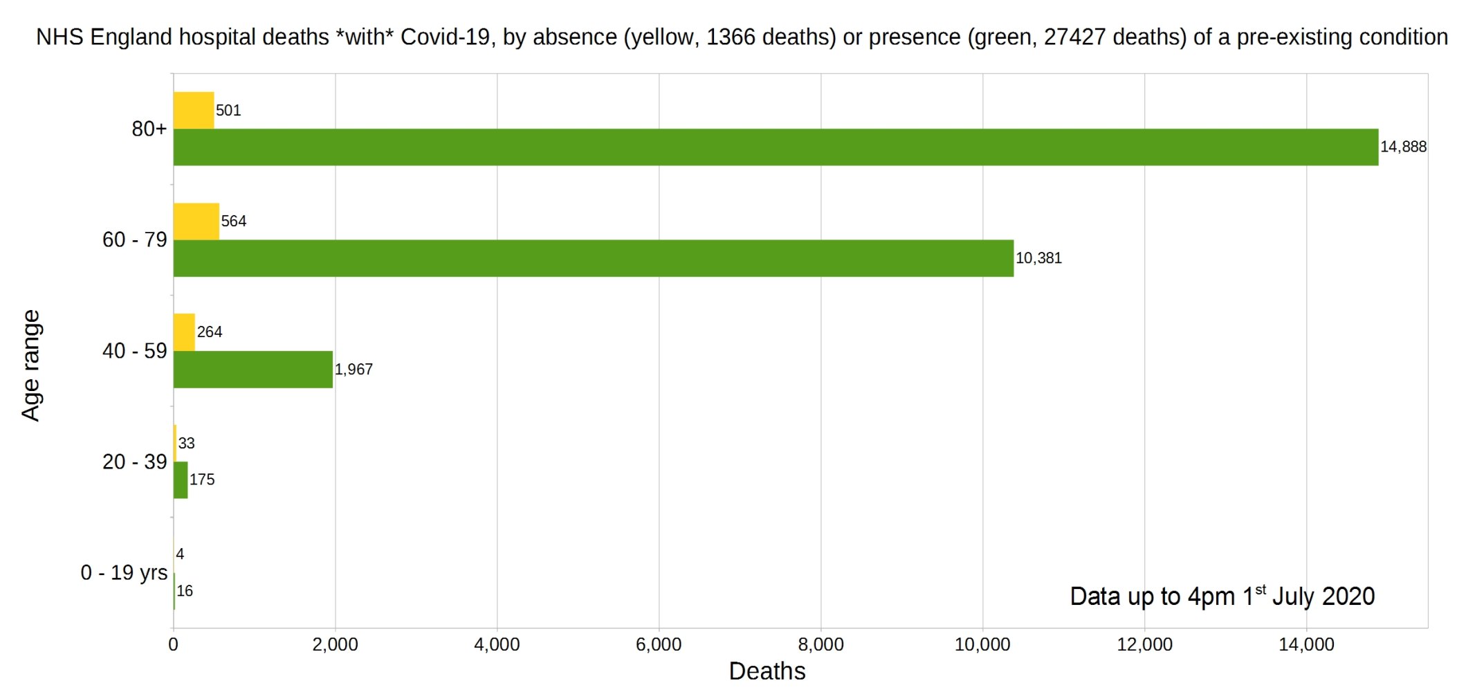
England deaths with Covid-19 by absence (yellow) or presence (green) of a pre-existing condition. Data from NHS England.
Percentage of deaths with Covid-19 by pre-existing condition. (95.26% have one or more P.E.C.) NHS England data.

Note that the most common pre-existing conditions are diabetes, followed by dementia, chronic pulmonary disease, and chronic kidney disease.
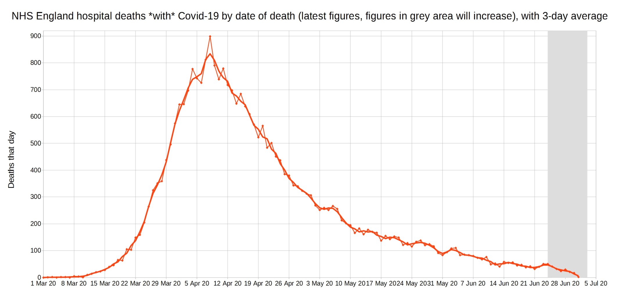
Covid-19 hospital deaths in England by date of death, with 3-day moving average trendline (the thicker line). (Note that numbers in grey area may increase over the next few days.) NHS England data.
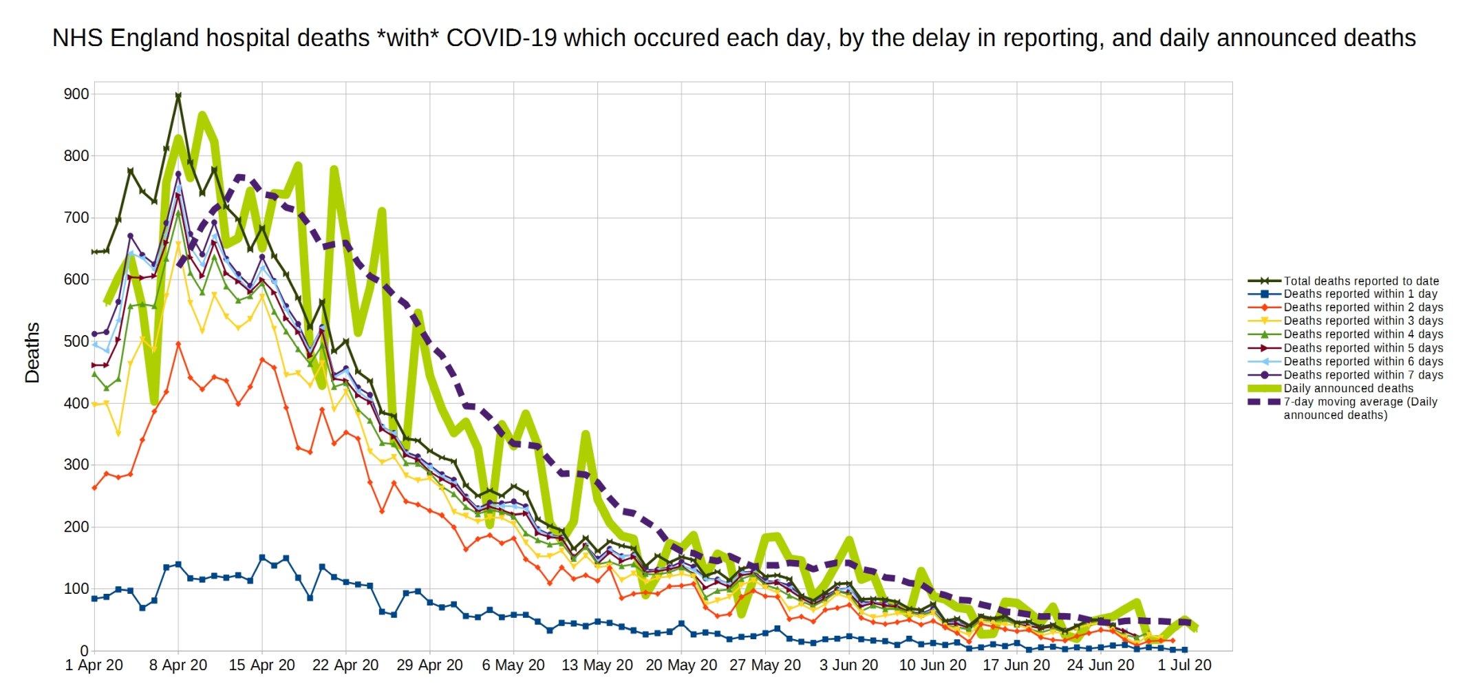
A graph of deaths with Covid-19 in England which occurred each day, by the delay in reporting. Thick line is overall daily announced deaths. NHS England data.
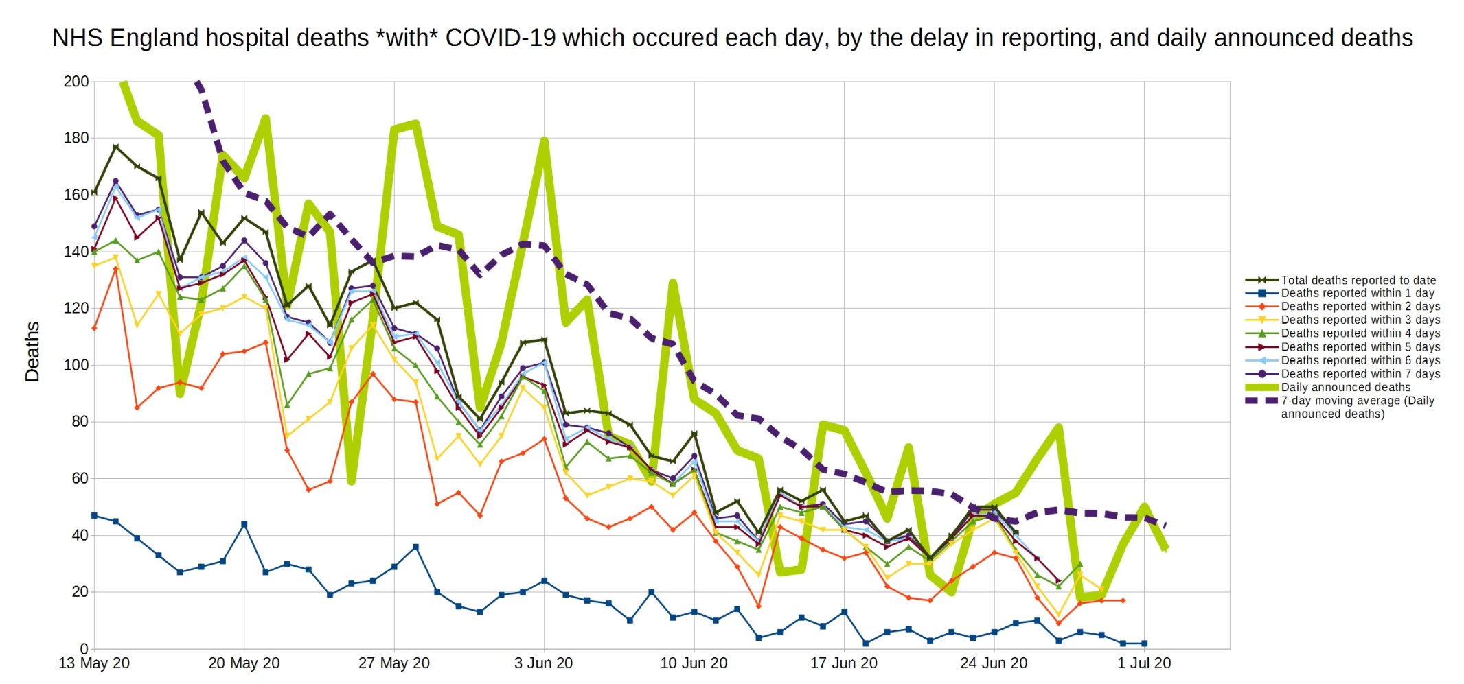
Same again, but a close-up on the last month.
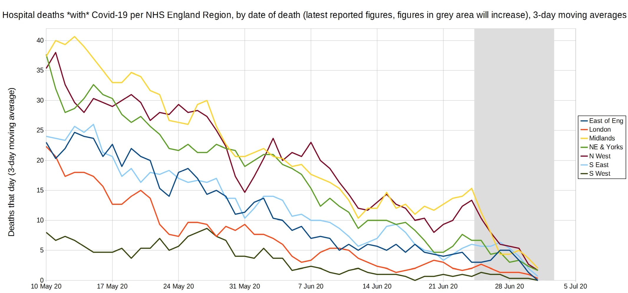
Trendlines (3-day average) for Covid-19 deaths by England NHS region, by date of death. (Note that the numbers in the grey area may increase over the next few days.) NHS England data.
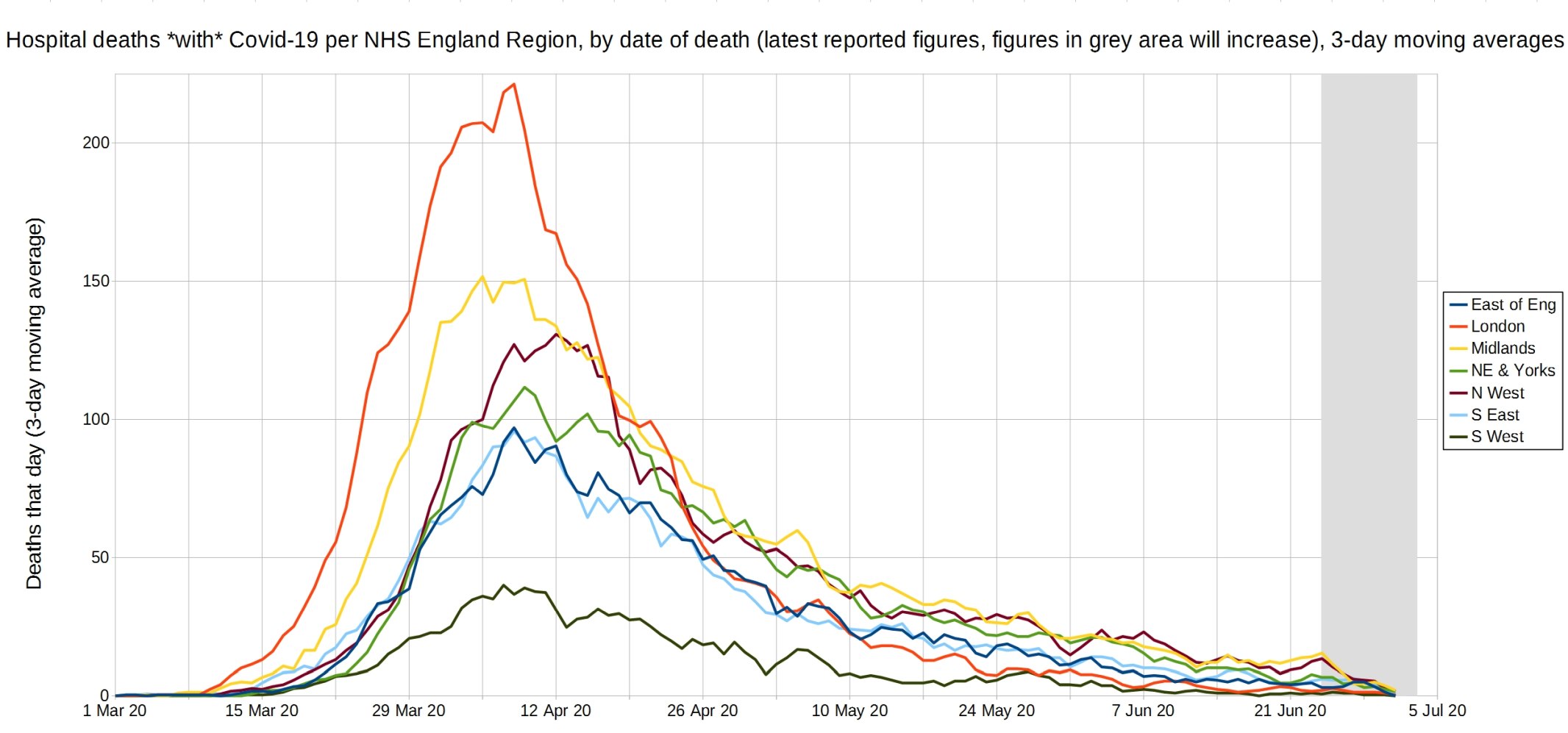
An enlarged version of this graph.
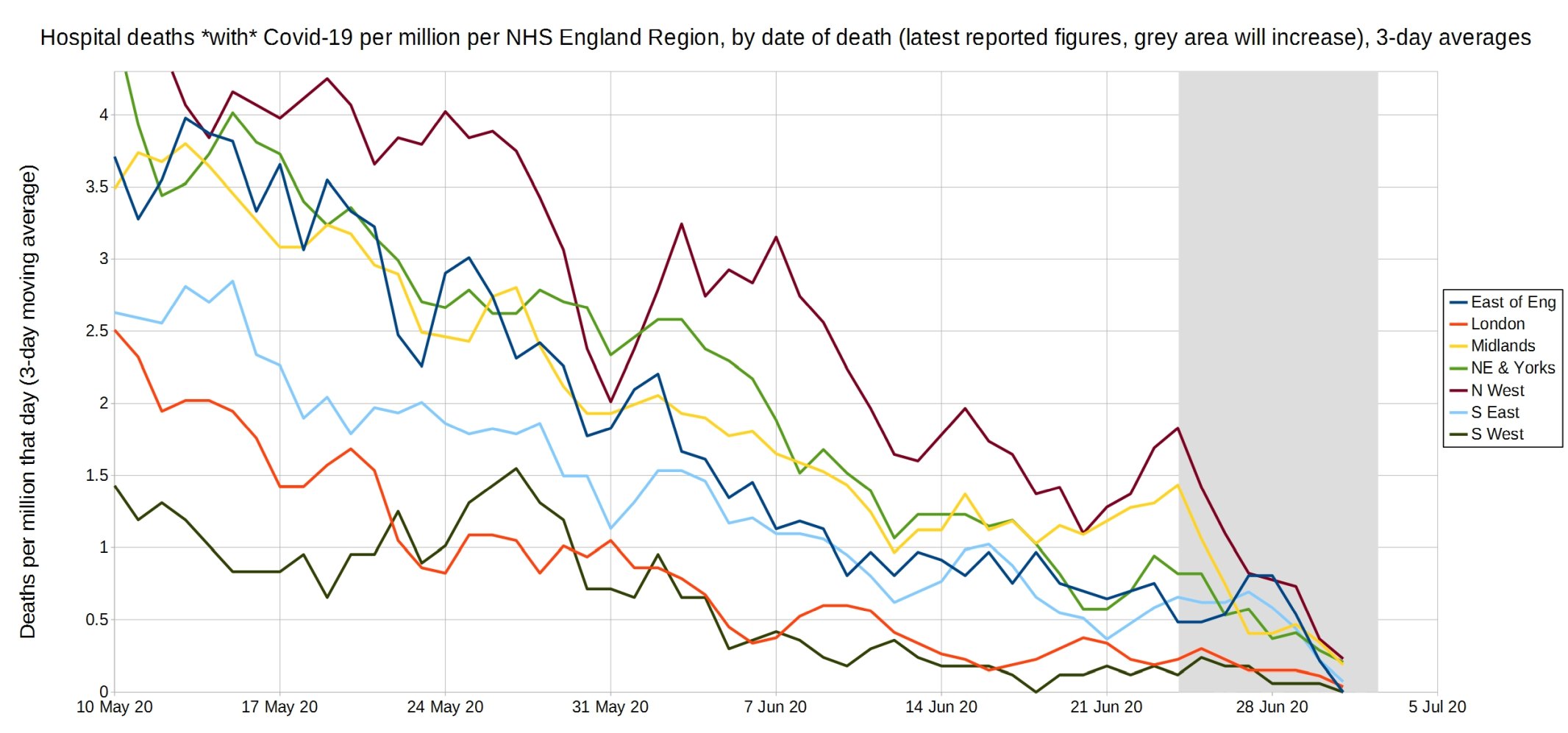
Trendlines (3-day average) for Covid-19 deaths per million by England NHS region, by date of death. (Note that the numbers in the grey area may increase over the next few days.) NHS England data.

An enlarged version of this graph.
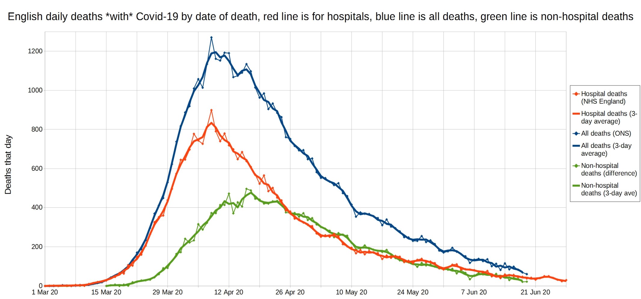
English daily deaths with Covid-19 by date of death. Blue line is all Covid deaths, red line is hospital Covid deaths, and green line is non-hospital Covid deaths. NHS England data.
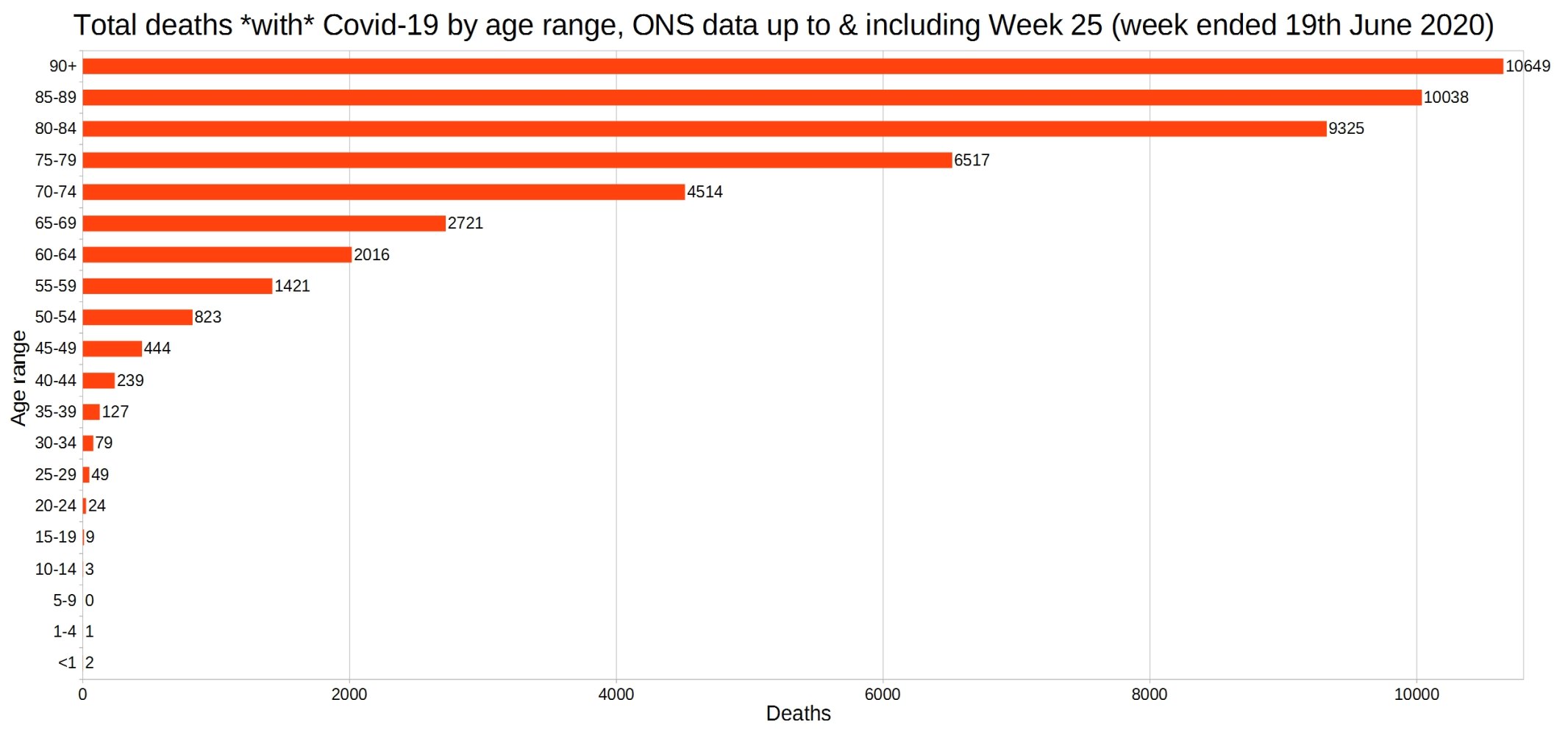
England and Wales total deaths with COVID-19, by detailed age range. ONS week 25 data.
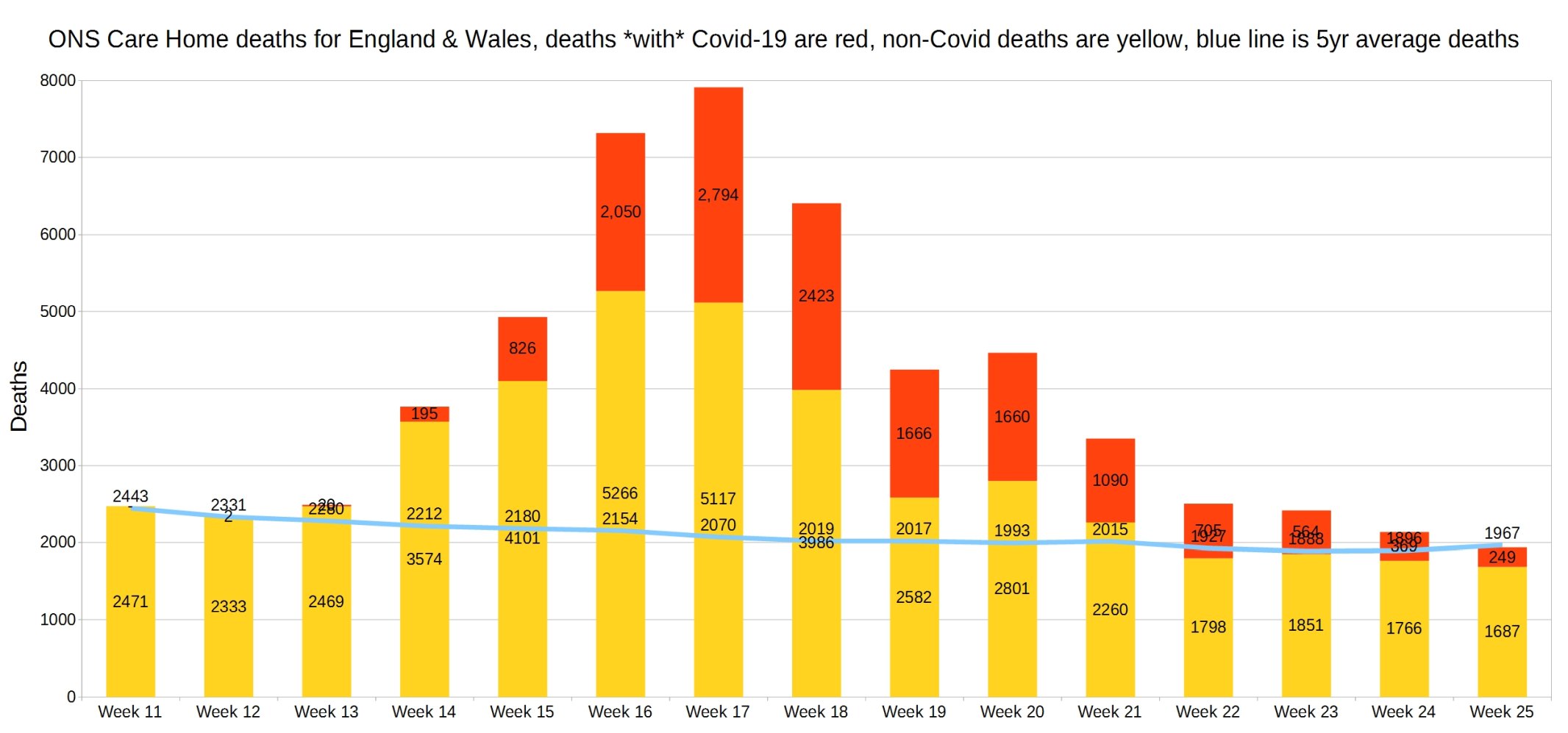
England and Wales weekly Covid and non-Covid care home deaths. ONS week 25 data.
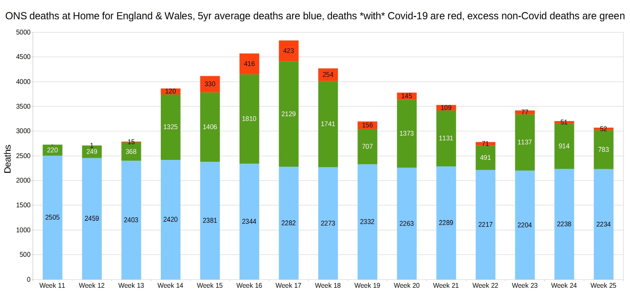
England and Wales weekly Covid and non-Covid deaths at home. ONS week 25 data.
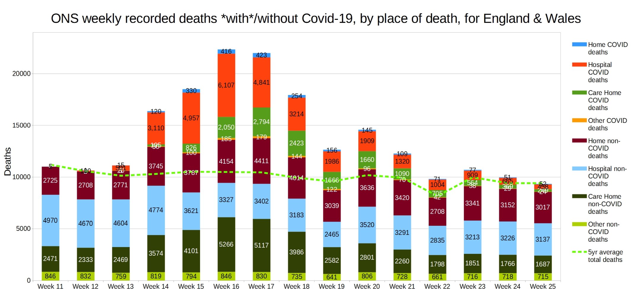
England and Wales weekly Covid and non-Covid deaths by place of death. ONS week 25 data.
Hospital deaths for England and Wales. ONS week 25 data.

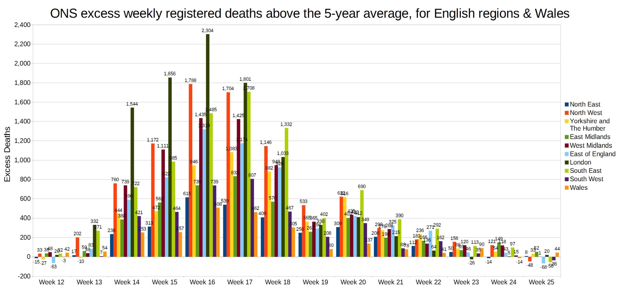
Weekly excess deaths above the 5-year average, for English regions and Wales. ONS week 25 data.
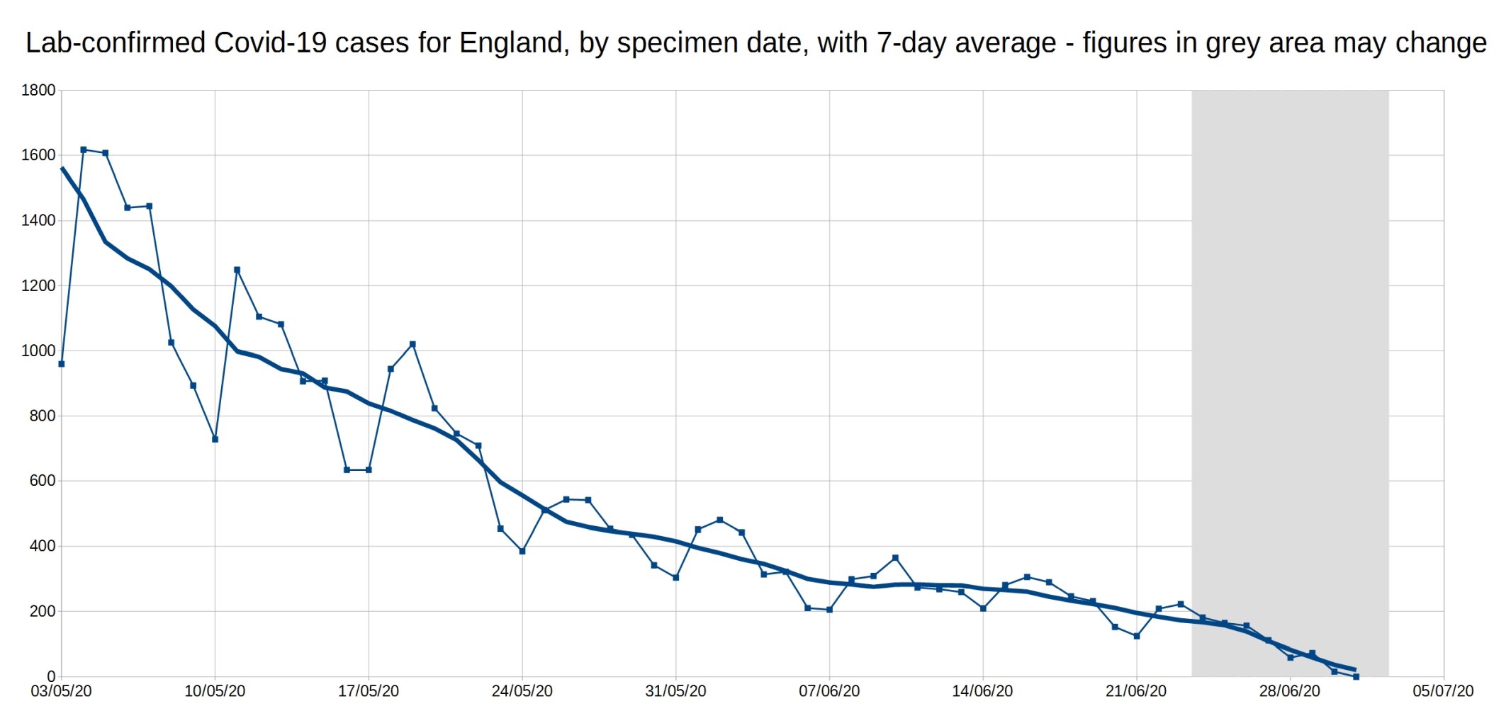
A graph of daily Covid-19 positive tests (by specimen date), for England, with a 7-day average trendline (the thick line). The data shown in the grey area may increase, as it takes a few days for all the test results to come in, especially over weekends.
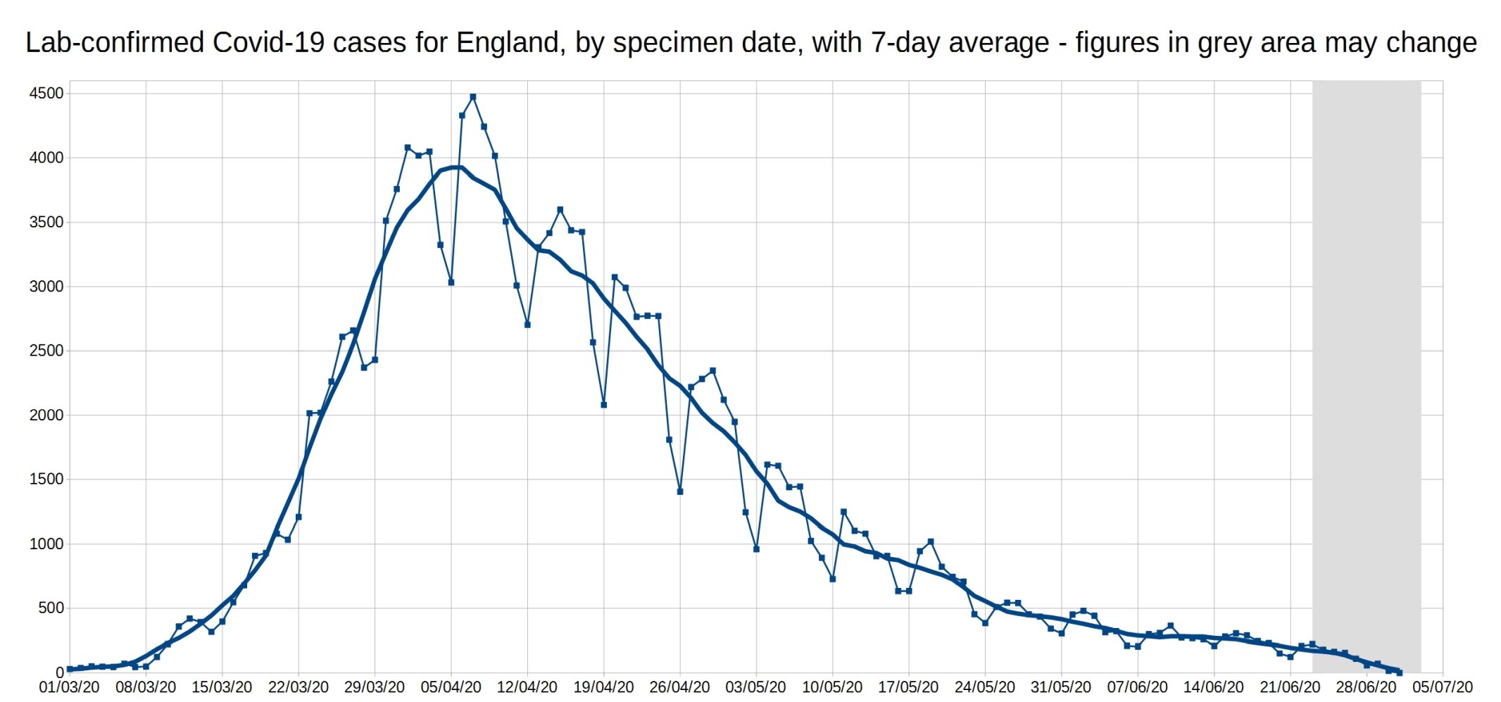
An enlarged version of this graph:
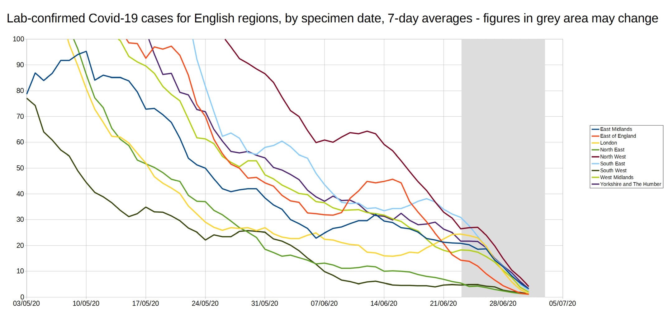
Graph of the 7-day average positive tests (by specimen date) for each of the English regions. Daily test data removed, as it made the graph too complicated. As before, the data shown in the grey area may increase.
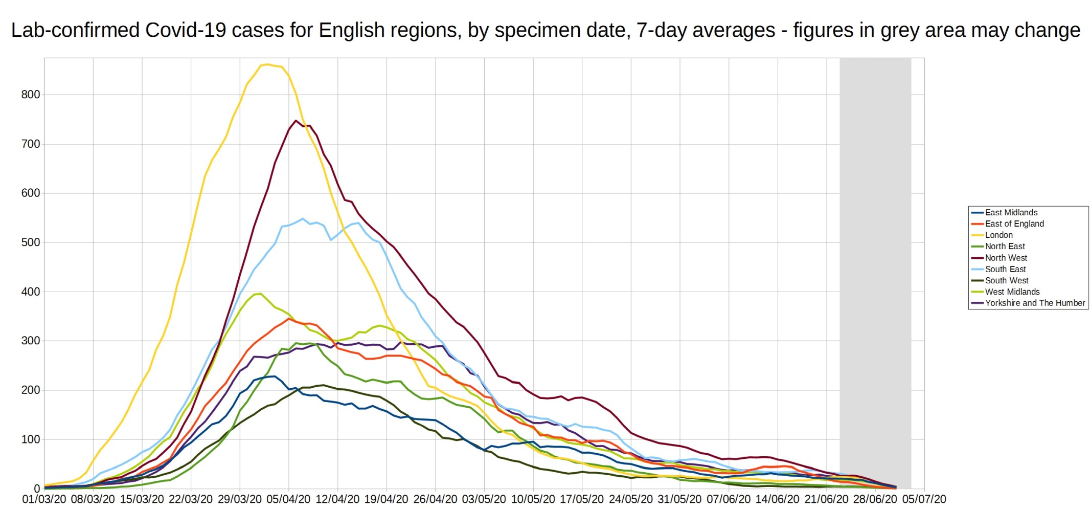
An enlarged version of this graph:
Graph of the ‘R7d ratio’, the ratio between each day’s 7-day average positive tests, and the 7-day average from 7 days previously.
Like the R0 number, this ratio is above 1 when case numbers are increasing, and below 1 when case numbers are decreasing.
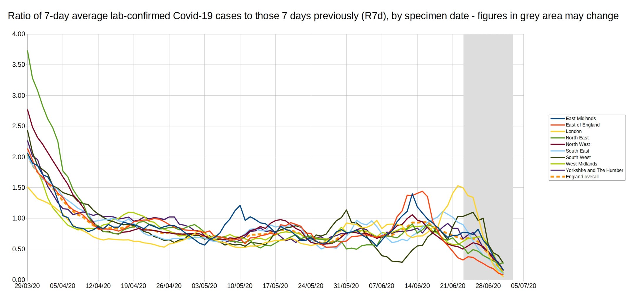
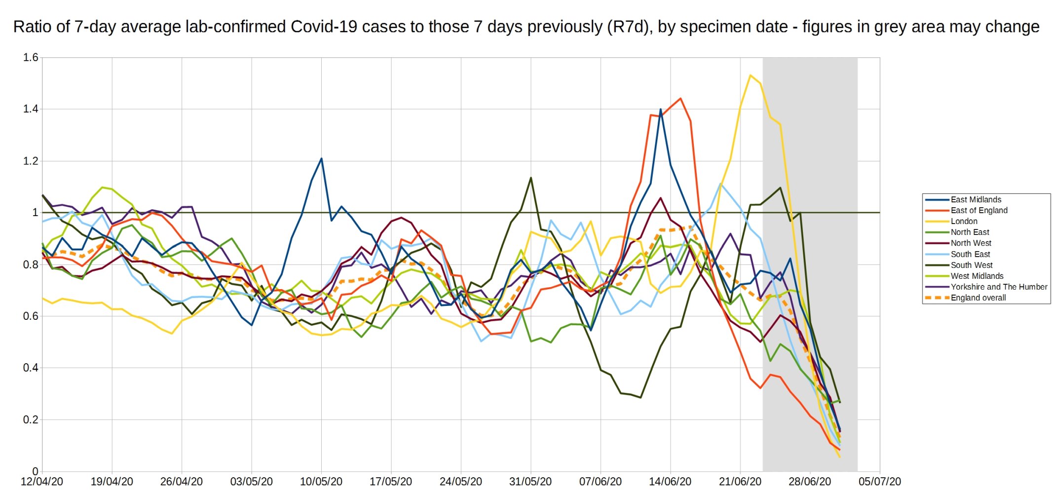
An enlarged version of the R7d ratio.
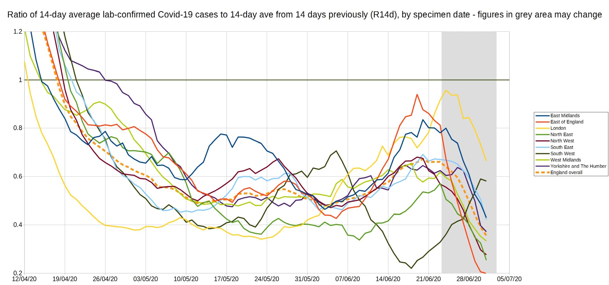
Graph of the R14d ratio, the ratio between each day’s 14-day average positive tests, and the 14-day average from 14 days previously.
8 thoughts on “Week 25 graphs from Christopher Bowyer”
Christopher, thank you
Any delved deeper into this anomaly?
Here is Coronavirus – the map movie – now with added frame for w/e 7th July. Open in adjacent tabs of your browser, and flip between them to see how the epidemic progressed since the beginning of May. Charts are of weekly infection rates at week intervals: the date is the end date of the week. The list is in date order. Add an “h” to the front of each to generate urls
ttps://datawrapper.dwcdn.net/gx1II/1/
ttps://datawrapper.dwcdn.net/jsIvq/2/
ttps://datawrapper.dwcdn.net/LCbA5/1/
ttps://datawrapper.dwcdn.net/iL0yx/1/
ttps://datawrapper.dwcdn.net/ztVPL/1/
ttps://datawrapper.dwcdn.net/2uelL/1/
ttps://datawrapper.dwcdn.net/K94t6/1/
ttps://datawrapper.dwcdn.net/buGhn/1/
ttps://datawrapper.dwcdn.net/S5Dmw/1/
ttps://datawrapper.dwcdn.net/aTTV5/1/
Not sure what you are picking up for lab test results. AFAICS they are now only publishing the sum of Pillar 1 and Pillar 2, at least in any detail. So I get England totals that look like this:
https://datawrapper.dwcdn.net/d307t/2/
So I was looking for any data on the ONS relating to those who had last years brand new cell based flu vaccine and those who died?
Does anyone have detailed figures for USA testing such as:
– Who is being tested
– What percentage are negative for C-19
– What percentage are asymptomatic
– What percentage are hospitalised
Comments are closed.