Hector Drummond Magazine reader and contributor Christopher Bowyer has done some more Covid-19 test result graphs based on the data at https://coronavirus.data.gov.uk/. (All graphs can be clicked to enlarge.)
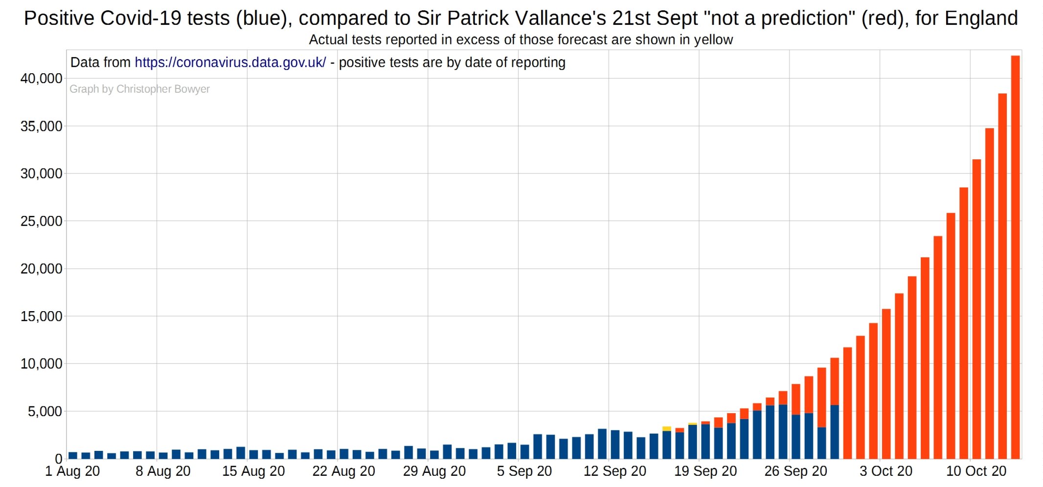
First let’s remind ourselves of the ridiculous graph presented by Vallance and Whitty on September 21 – this version is adjusted to apply to England only to match the charts below (which are England only).
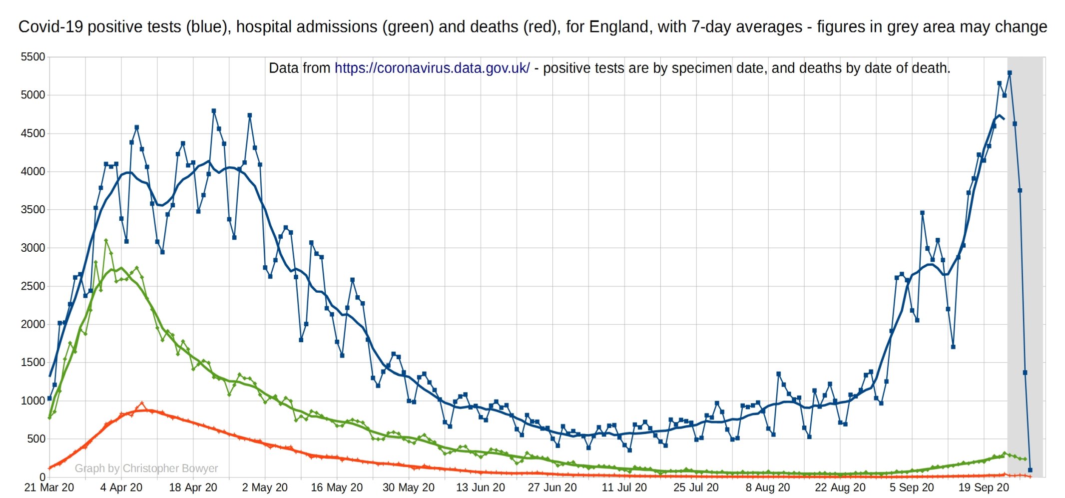
The following graph looks at SARS-CoV-2 positive tests (blue), Covid hospital admissions (green), and Covid deaths (red) for England. You can see that there’s been a slight increase in hospital admissions over September, as expected given the time of year, but it’s hardly a public health disaster in the making. They’re also not rising exponentially, but are fairly flat. The number of deaths is still very small, and and has also been pretty flat recently.
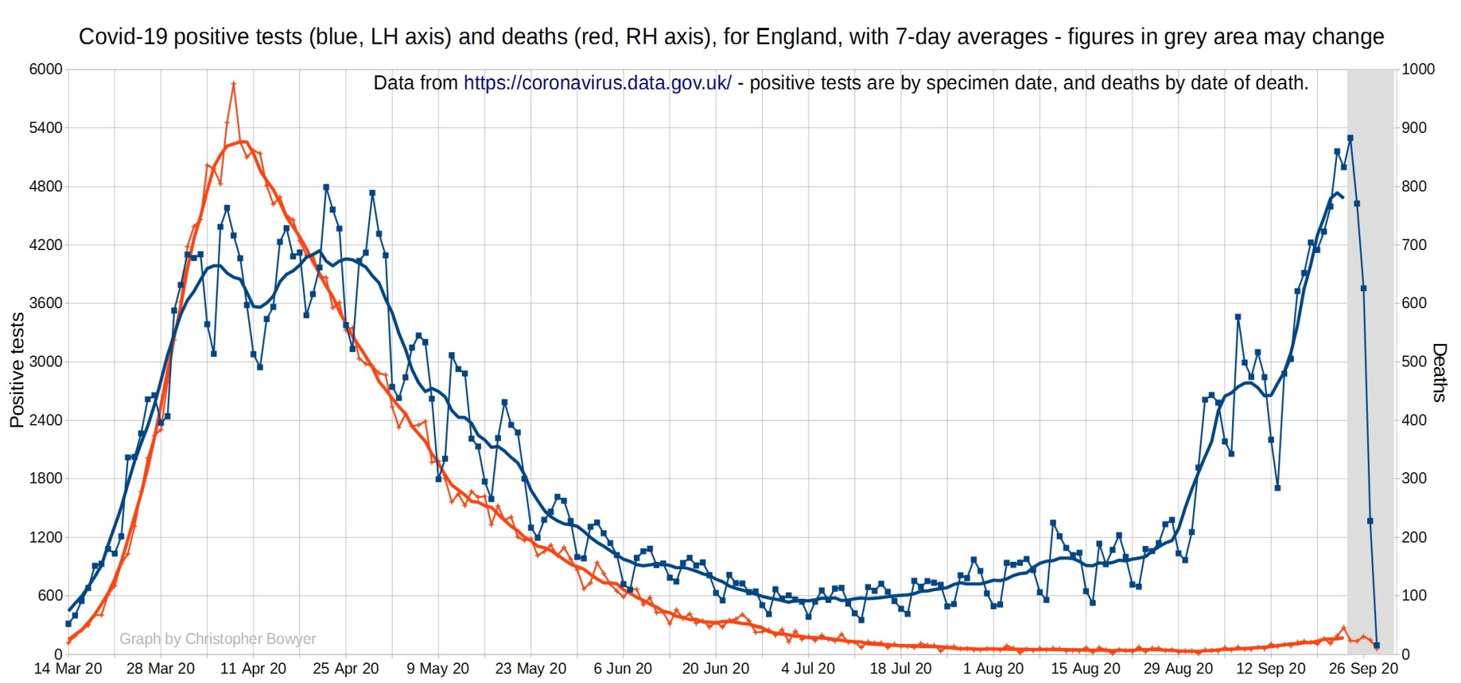
English SARS-CoV-2 positive tests (blue) and Covid-19 deaths (red). This graph uses a different scale than the last graph for deaths so you get a closer look at them. You can see that there has been an increase in deaths recently, but only very a slight one, so clearly the large increase in positive tests over August and September has not been matched by anything like that with deaths.
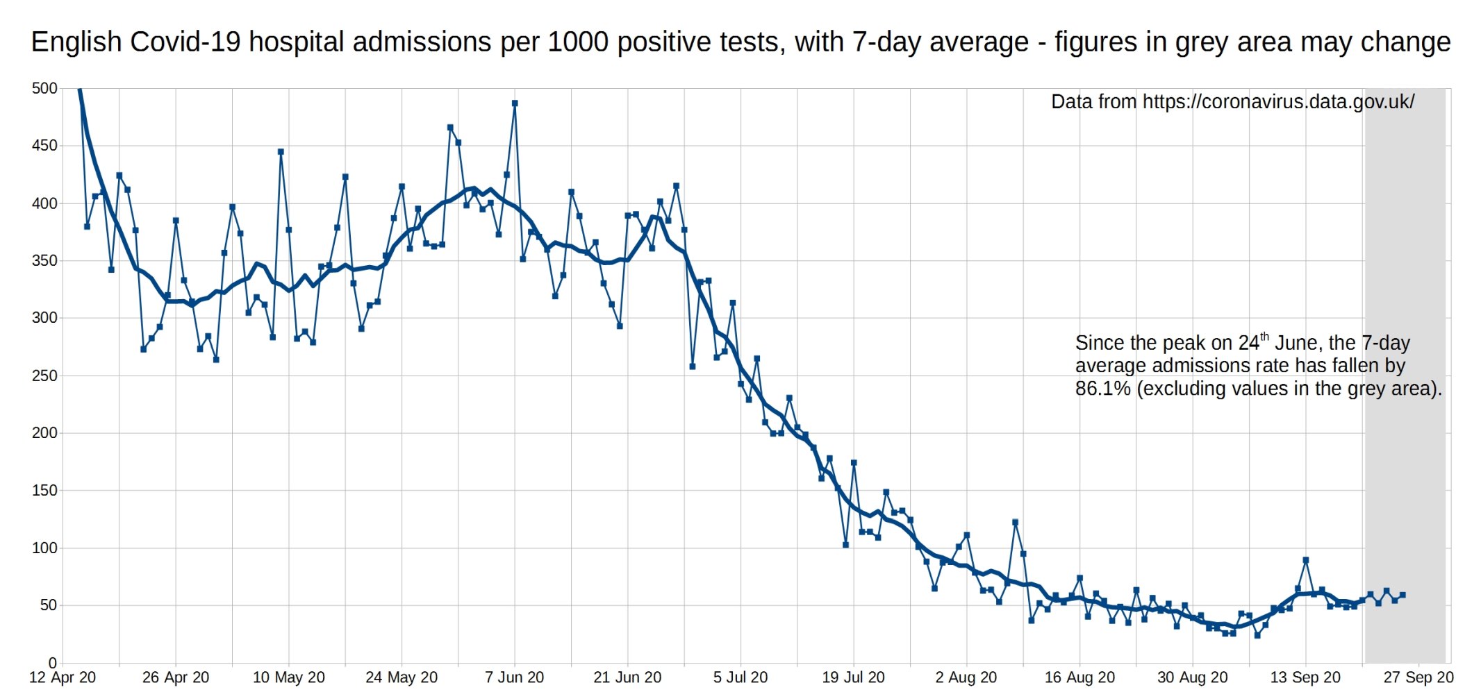
Hospital admissions per 1000 positive tests, England. A slight increase over September (from a very low level).
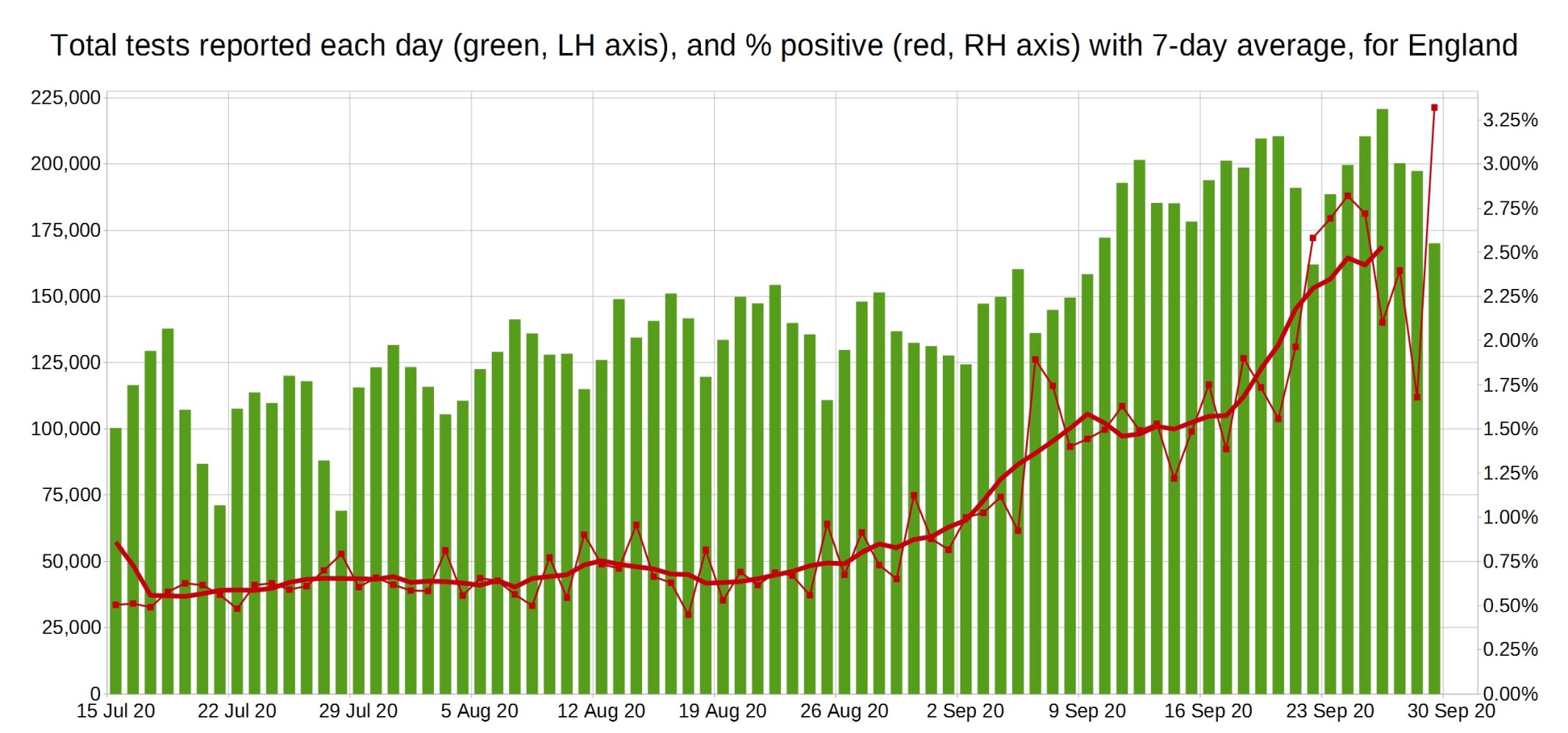
Total SARS-CoV-2 tests done each day and the percentage of positive tests (England). You can see the the percentage of positive tests has gone up a bit since September (from miniscule to tiny), but this is of no consequence as most of these extra positives are asymptomatic. As we saw in the second graph, hospitalisations have only increased a bit (from near zero), and deaths are still very small.
3 thoughts on “Positive tests, admissions and deaths graphs from Christopher Bowyer (29 September)”
Could you do a graph of the comparison between the relative hospitalisations/deaths of Covid and influenza of the last few months?
Is there any data available on asymptomatic positive results, or on positive % by pillar or test lab? This seems like important information to be able to fully understand what is happening where.
That last graph is interesting — or puzzling, depending on one’s perspective.
Context — we know from the low number of hospitalizations & deaths that Covid-19 is certainly not a pandemic, not even an epidemic. In very round numbers, back in mid-July about 100,000 people were being tested daily in England and about 7 in 1,000 were testing positive. By late September, the number of people being tested daily had approximately doubled to around 200,000 while the number testing positive had more than tripled to about 25 per 1,000.
We know that very few of the people tested (especially now) are actually true medical cases, with signs & symptoms of the disease. Thus, as the number of people tested with no signs & symptoms of disease increases, one might expect that the percentage with a positive test would decrease — the opposite of the reported observation. Why are we seeing this apparent anomaly?
One hypothesis is that the great expansion in testing has pressed less well-trained people and less competent labs into service, resulting in an increase in False Positives.
A second hypothesis is that the number of people who have been exposed to the virus and have defeated it naturally (generally without even realizing they had been infected) has been growing. In this case, the growing percentage of positive tests would be real — and would be a good hopeful sign that the disease is now on its way out, naturally.
Comments are closed.