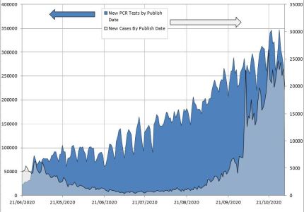
Reader Laurence Hodge has sent through (in response to a request made in comments) some graphs looking at SARS-CoV-2 tests done versus positive results. Of course we have to take the positive result numbers with a pinch of salt, but it’s still interesting to see what the relationship is. Here’s the first graph (all graphs can be clicked to enlarge).
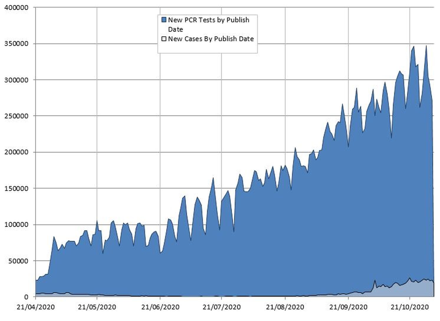
Here’s the same data, but with an extra axis on the right-hand side just for the positives so we can zoom in on them more closely.
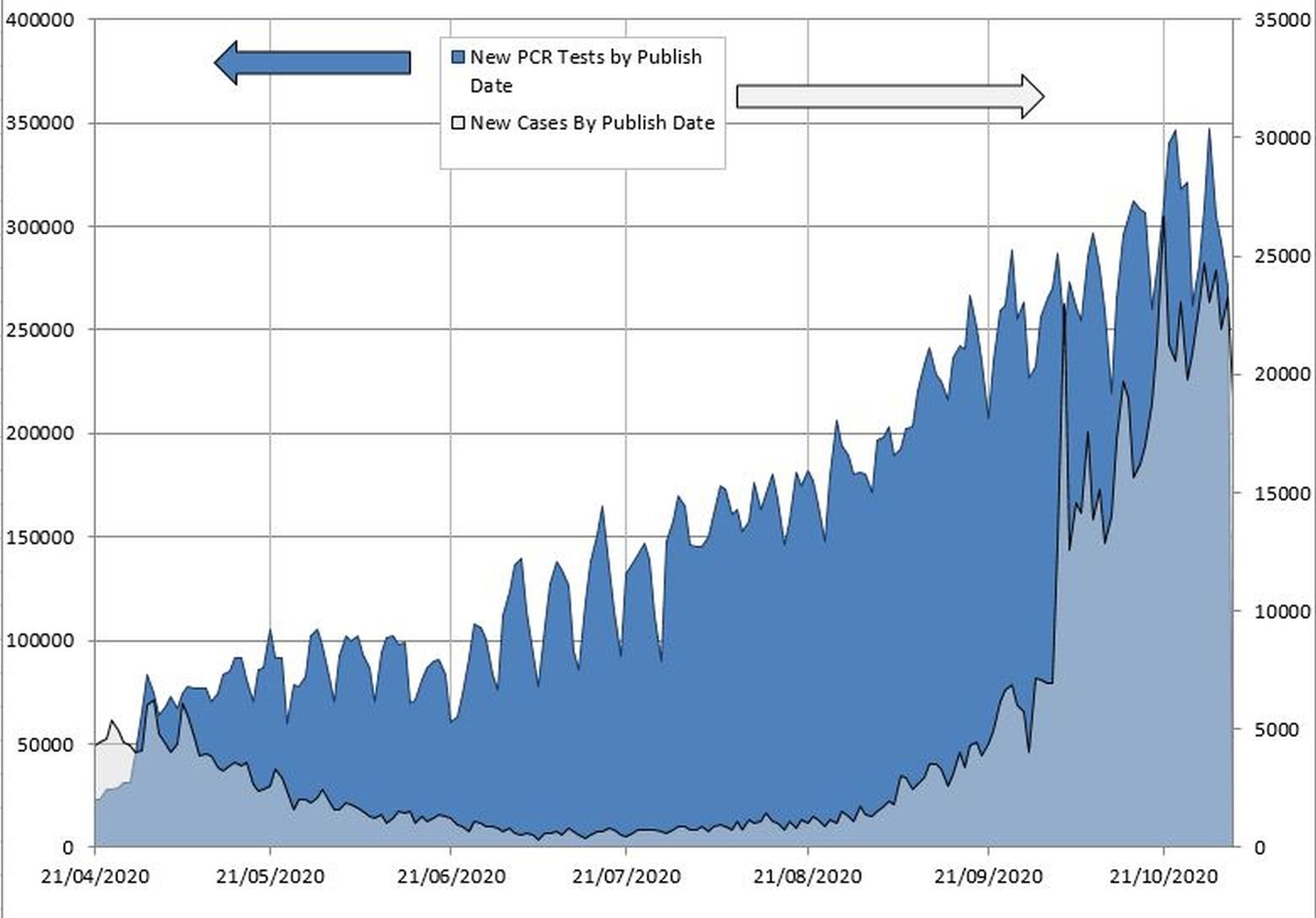
And here’s a graph of the positives compared to the false positives, assuming a false positive rate of 0.8%, which is about what Matt Hancock thought it was (although I suspect the false positive rate has increased recently due to rising amounts of SARS2 and labs doing more tests than they can properly handle, resulting in contamination).
Update: Donations and book sales have been drying up recently, so I would appreciate it if you can send a donation my way (however small) via KoFi, or subscribing via SubscribeStar or Patreon, or buying my book (see right-hand sidebar for links). But I don’t blame anyone for holding onto their money right now!
7 thoughts on “Laurence Hodge graphs for tests vs positives”
Matt Hancock never said the the % of tests which would return a false positive was around 0.8%. When he spoke it was clear he was talking about the % of positive tests which were false positives was around 0.8%. No scientist would explain it this way, and Hancock’s misuse has been jumped on by many lockdown hawks wanting something to jump on and ride. You need to get off.
The data from many places from the ONS prevalence surveys to New Zealand (which once went several thousand tests without a positive) indicates that 0.8% is not the number to be using.
Re last graph. No idea where the incidence of 3% has come from. Latest ONS data ( the source for this %) in October is 0.7% for urban and just under 0.5% for rural. Taking the 0.7% and the 0.8% FPR gives False Positive percentage for Pillar 2 PCR tests of approx 40%. This 40% gives a ‘green line’ end point of 9,000 on the last graph.
Re Andrew Carey. There has been no EQA done of the use of PCR on this scale ( Pillar 2). The 0.8% is the lowest point of a range of values of EQAs produced for PCR tests worldwide for previous virus over 20 years. The range is 0.8%-4%. Hancock just doesn’t know what he is talking about. The fact that an EQA hasn’t been done is significant. It should have been , but clearly its been decided that its likely to show a number way in excess of 0.8%. The argument that 0.8% is above the 0.1% or so of the ONS survey FPR in the summer is not valid. The ONS testing procedure on very small numbers relatively over weeks is conducted in very strict laboratory conditions in Oxford, just one lab. Clearly this is nothing like the Pillar 2 process of literally 1000,000 or more daily tested , transported in cardboard containers to different labs using newly ‘trained’ testers on RNA strands, multiplied up to 40x, using human intervention not robotics, and various sized test tubes with cross contamination not only likely but more or less guaranteed.
Recently I found again a document that had gone into hiding about PCR testing, which draws attention to the importance of interpreting cycle numbers into conclusions about the tests.
https://assets.publishing.service.gov.uk/government/uploads/system/uploads/attachment_data/file/926410/Understanding_Cycle_Threshold__Ct__in_SARS-CoV-2_RT-PCR_.pdf
Figure 3 on page 7 is particularly interesting, as it posits a lifecycle of viral detection levels over the course of an infection. Without comment, it suggests that an undetectable infection may occur a week before the first detectable quantities of virus are present. This would seem to be very much an outlier, given the extreme sensitivity of testing, and the rate at which the virus replicates naturally: most infections will start with a larger virus quantum from a contact. There are two periods when the level of virus is on the lower fringes of detection: a short period as it is starting to replicate rapidly after infection, typically about a week or less before symptom, followed by the week of maximum virus and maximum onward transmission risk, and then a gradual decline over the course of the next three weeks until levels once again return to marginal levels that are still detectable for weeks afterwards at high cycle numbers of amplification in the test.
This implies that positive tests at high cycle numbers of the asymptomatic are in fact more likely to be picking up people who have already had the virus and have recovered from any illness, but still have small quantities of detectable proteins in their systems. So instead of presaging an increasing rate of infection from people who are about to become much more infectious, it is actually recording a previous infection that has waned, and for which it might be more appropriate to test for antibodies as confirmation. Because this phase lasts for many weeks, it far outweighs the small probability of a test being conducted at the point shortly after first infection.
This is also why mass testing as proposed for Liverpool is likely to produce some highly misleading figures, probably added to by a test that has a higher false positive rate in exchange for faster operation.
It should be obvious that we need to improve the reporting of PCR testing in order to understand what is happening. Marginal tests should be followed by retests to distinguish new infections from old, and to reduce the incidence of false positives among the asymptomatic, many more of whom will be picked up by blitz testing in areas where there have been outbreaks.
Previously, we had a fairly well defined Pillar 1 where testing was largely confined to the symptomatic. We are no longer allowed to see separate test results for Pillar 1, which has increasingly been used for general asymptomatic screening of NHS staff, which will again contaminate its usefulness as a purer indicator of those who are ill and infectious.
Trying to estimate some average numbers off the charts, it looks like in late July, about 125,000 tests yielded 1,000 “cases” — about 0.8%. In late October, 310,000 tests yielded 22,000 “cases” — about 7.1%. Almost an order of magnitude increase in positive results. Does that pass the smell test?
Given all the questions about the accuracy of testing, and about how many of the reported positives are actual genuine medical cases (i.e., sick people with signs & symptoms), it seems better to concentrate on reported morbidity (while recognizing that establishing cause of death can be subjective). With ONS saying that Covid-19 was the 19th most common cause of death in September, and all we now know about the At Risk population, the case for continued Lock Downs of the working age population looks rather tenuous. Certainly, China’s rulers seem to think so!
>Matt Hancock never said the the % of tests which would return a false positive was around 0.8%. When he spoke it was clear he was talking about the % of positive tests which were false positives was around 0.8%.
Hancock was asked what the false positive rate was. He repeated the figure the scientists had told him. What was clear was that he didn’t understand what FPR meant. It wasn’t that he was talking about something else, he was giving the false positive rate (choosing a figure at the lower end of the normally accepted rate), but misunderstanding it. (Note that the government has not presented any evidence to show that the percentage of positives that are false is 0.8%.)
>The data from many places from the ONS prevalence surveys to New Zealand (which once went several thousand tests without a positive) indicates that 0.8% is not the number to be using.
As I explained in my NZ post from a few weeks ago, you can’t compare the two countries very easily. Firstly, there is obviously not much Covid in NZ now, so there is very little scope for contamination in their testing system. Secondly, they are doing vastly less testing per head of population than the UK, so that also reduces the chance of contamination (the UK’s testing systems are in terrible shape, as I have also blogged about). Thirdly, NZ considers any positive cases detected with a high number of cycles to be an old infection.
The false positive rate is not set in stone. It will vary according to circumstances, and the given the circumstances in the UK it is likely to be much higher than in NZ, and much higher than 0.8% in the UK now.
However, I am certainly not denying (and I don’t think Laurence is either) that SARS2 isn’t around in number in the UK. I think it is.
Thanks for this, I believe that I was one of those asking to see the comparison.
Comments are closed.