
Here are some new Covid-19 graphs from Christopher Bowyer. These graphs are based on ONS week 44 data (week ending 30 Oct 2020).
All graphs can be clicked to enlarge.
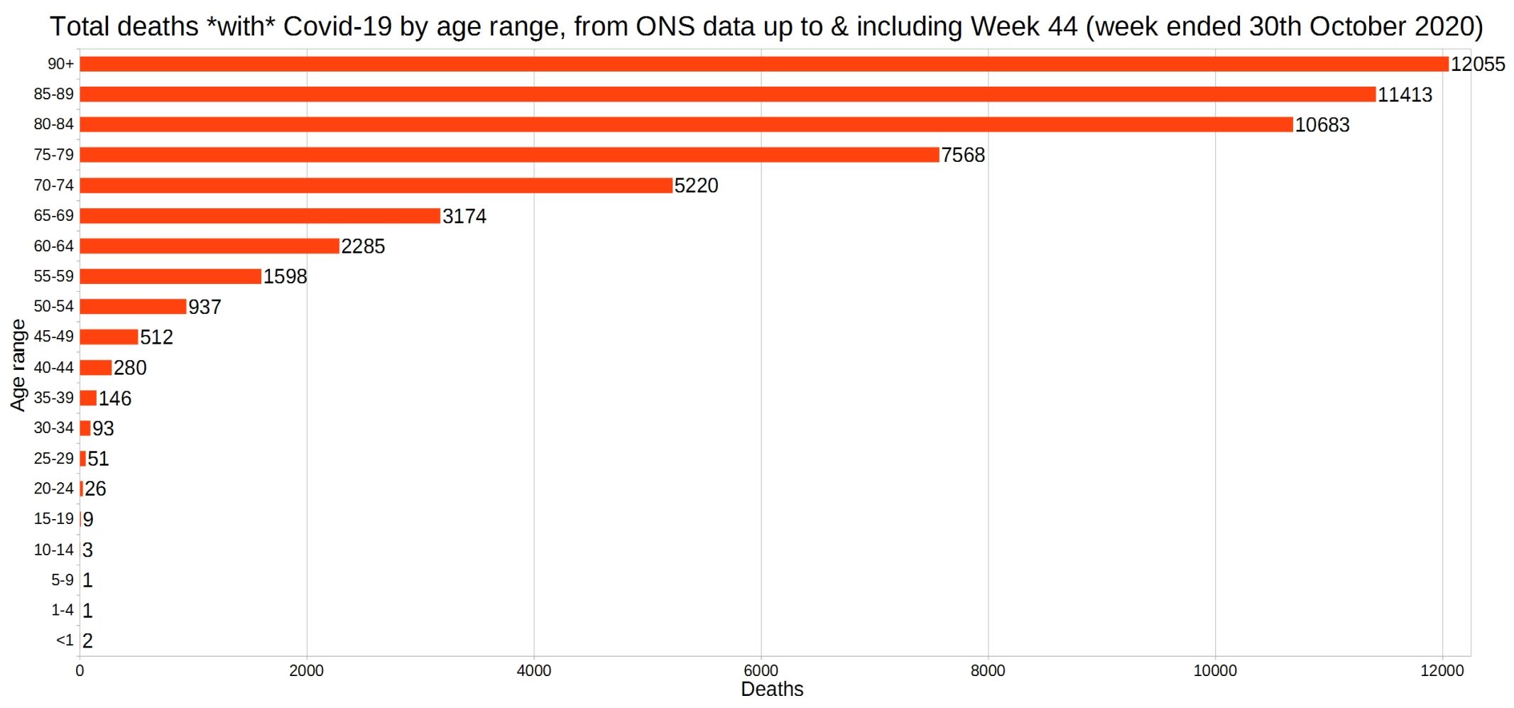
England and Wales total deaths with Covid-19, by detailed age range.
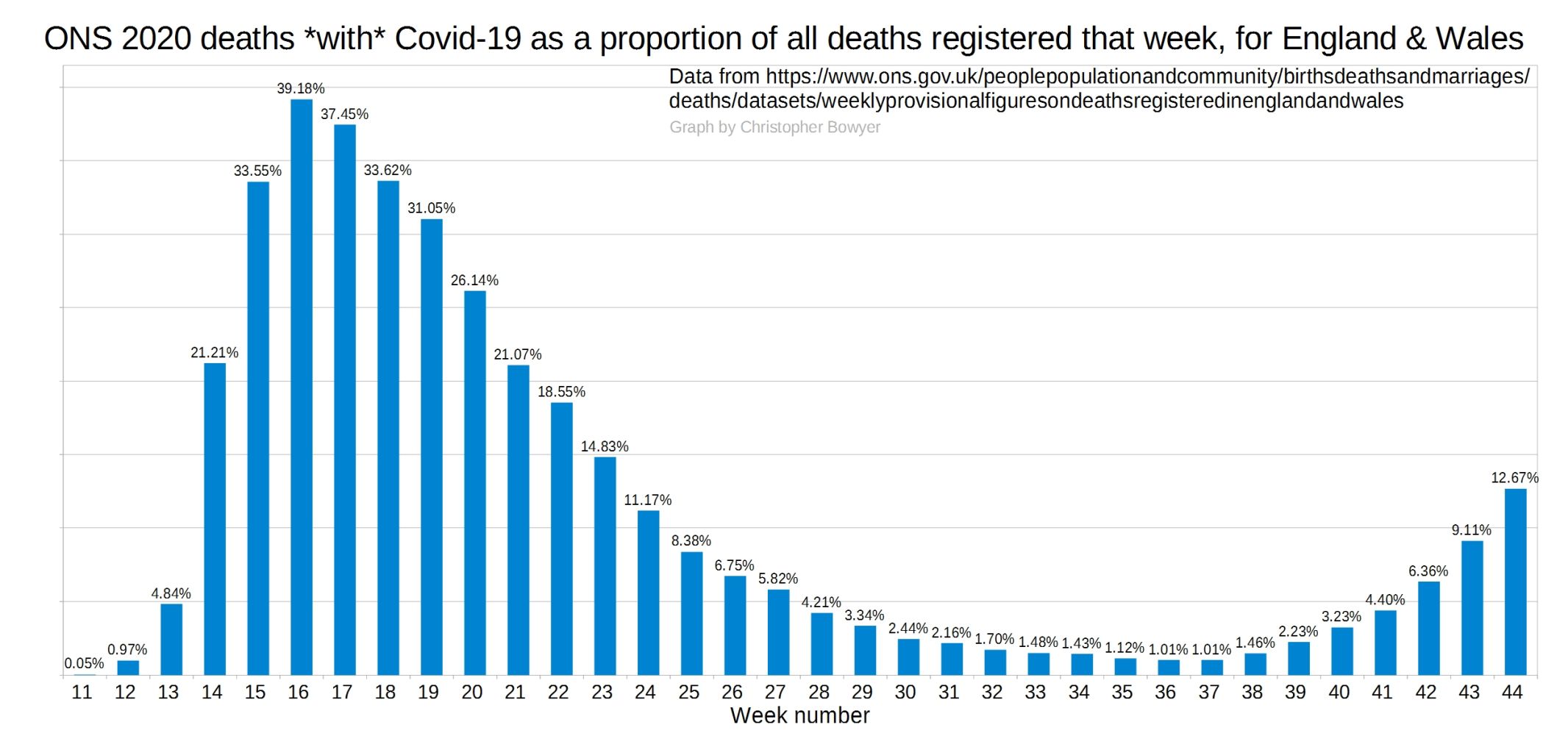
ONS England and Wales Covid-19 deaths as a proportion of all deaths registered that week.
England and Wales weekly all-cause deaths compared with the five-year average.
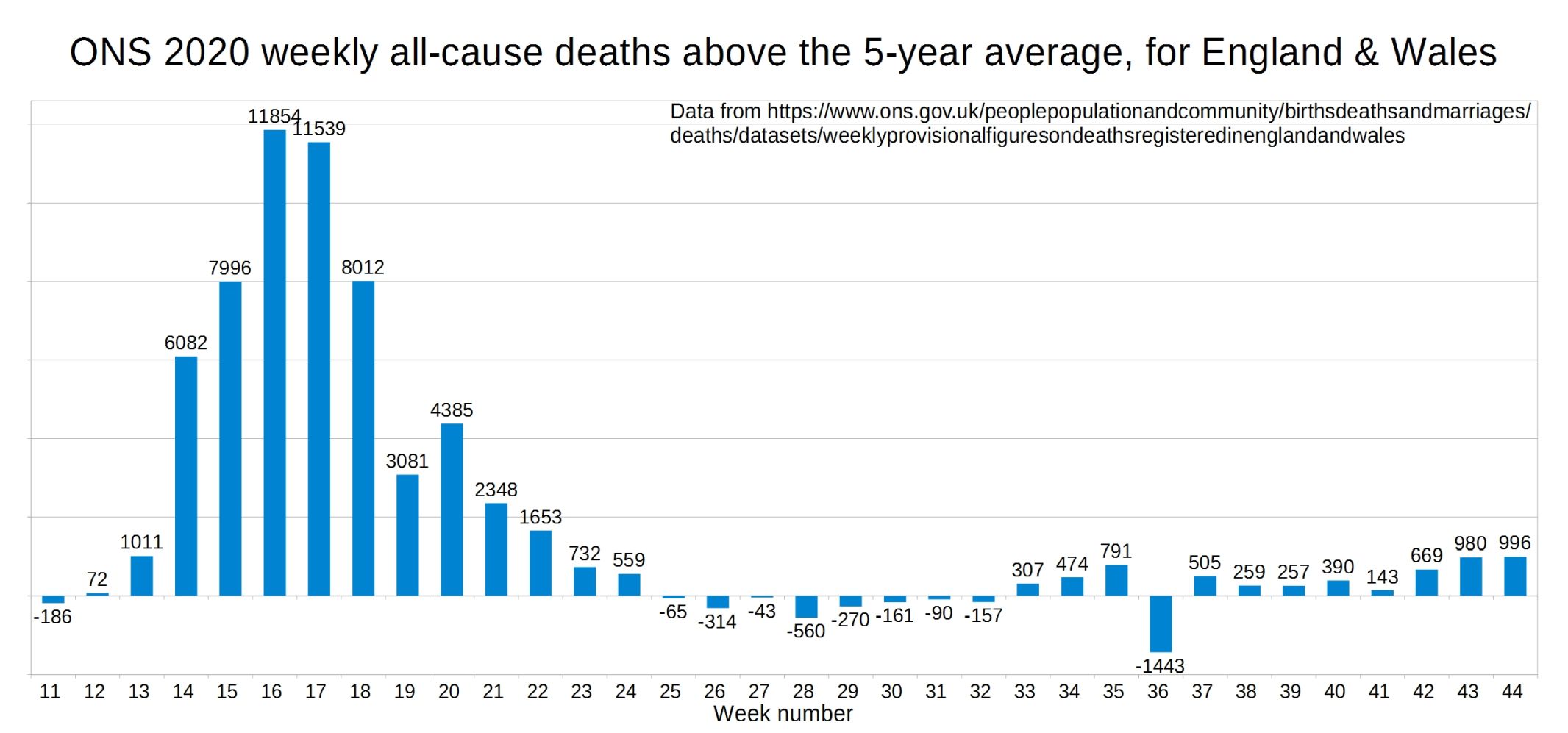
England and Wales all-cause deaths for 2020 vs 2015-19 average.

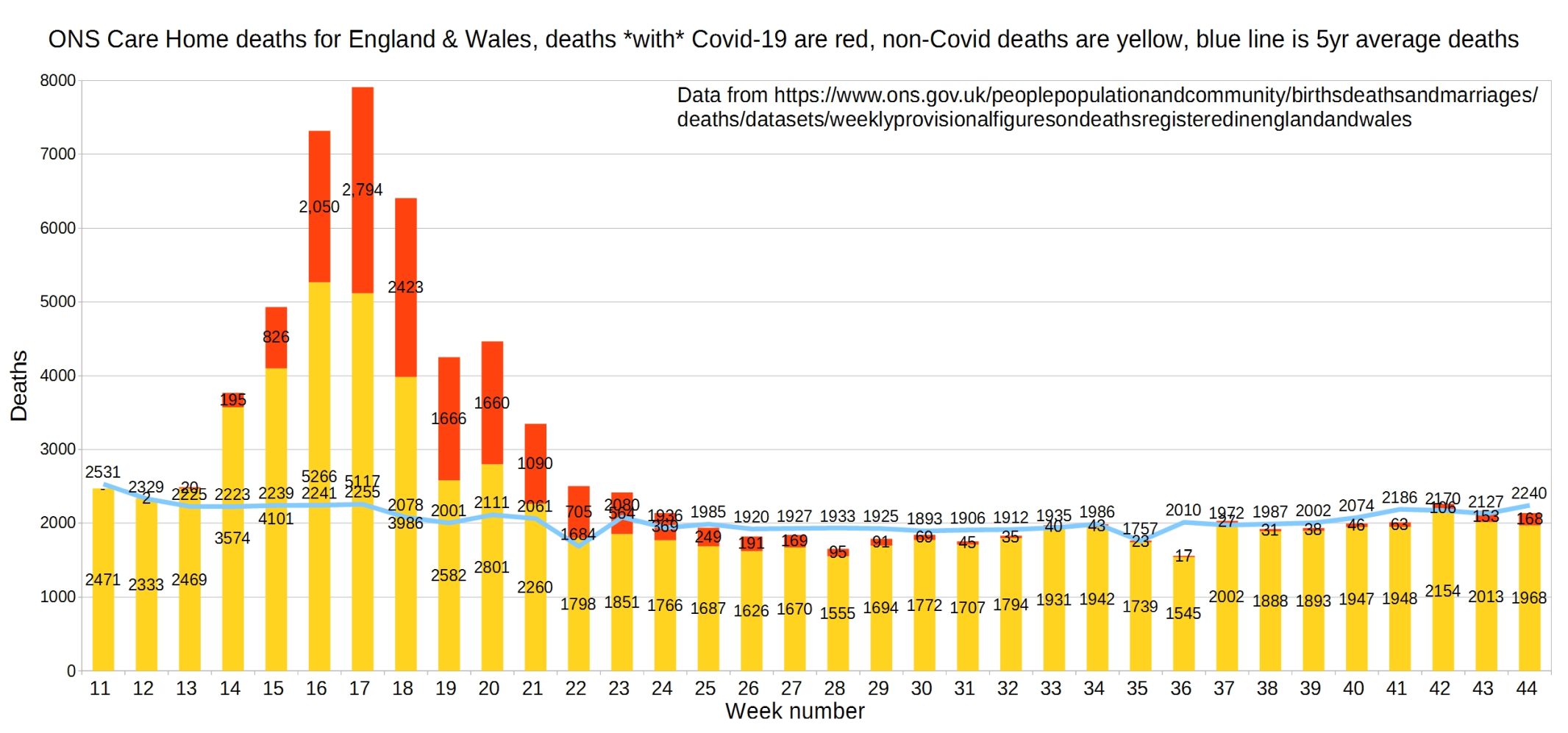
England and Wales weekly Covid and non-Covid care home deaths.
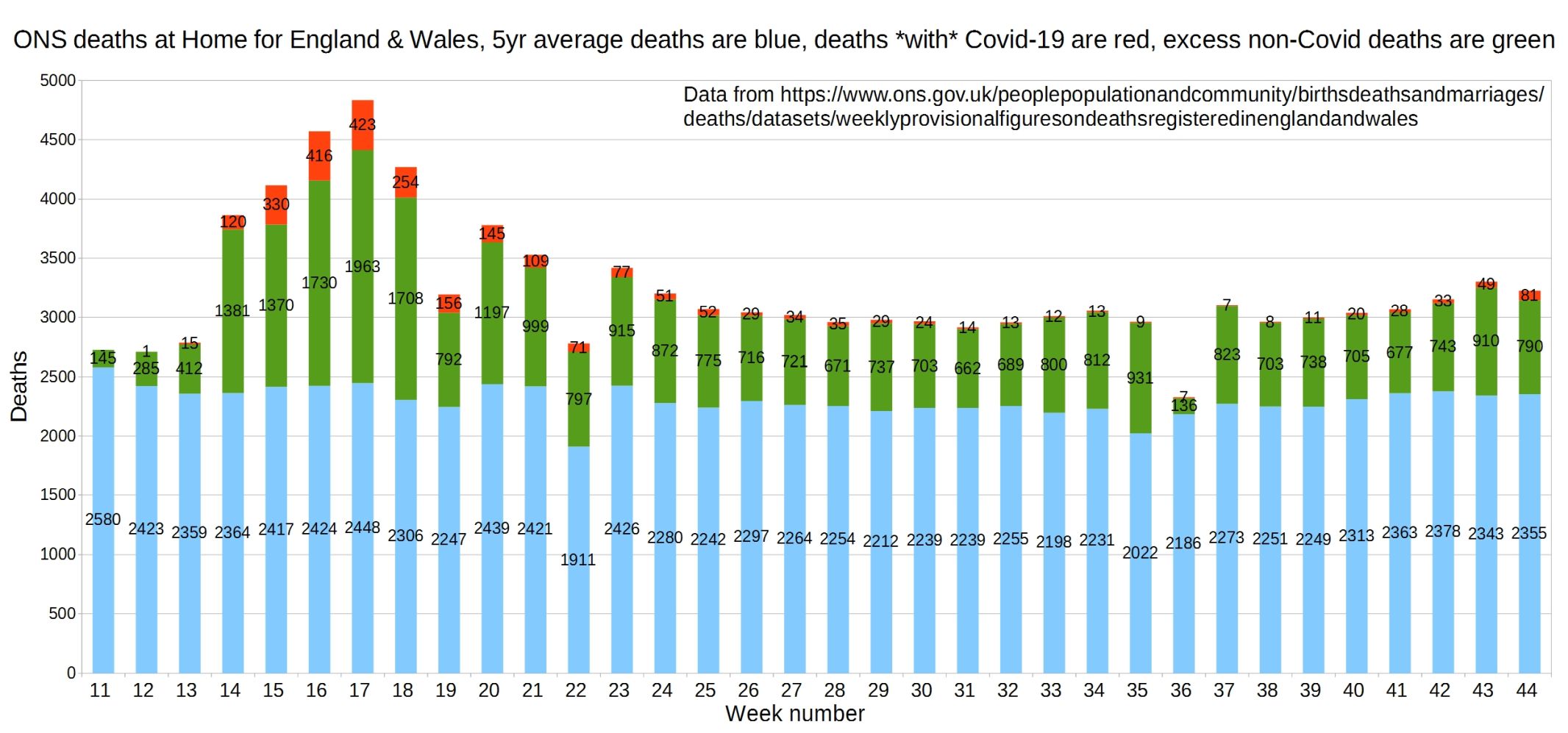
England and Wales weekly Covid and non-Covid deaths at home.
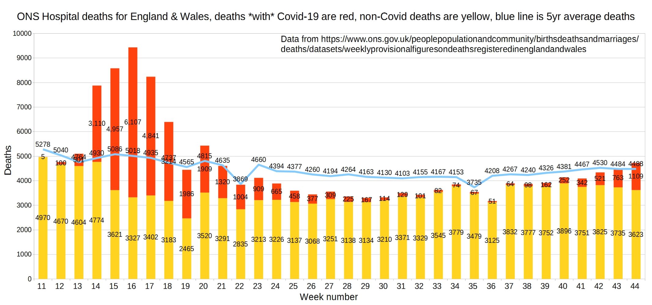
Hospital deaths for England and Wales (ONS data, not NHS England data).
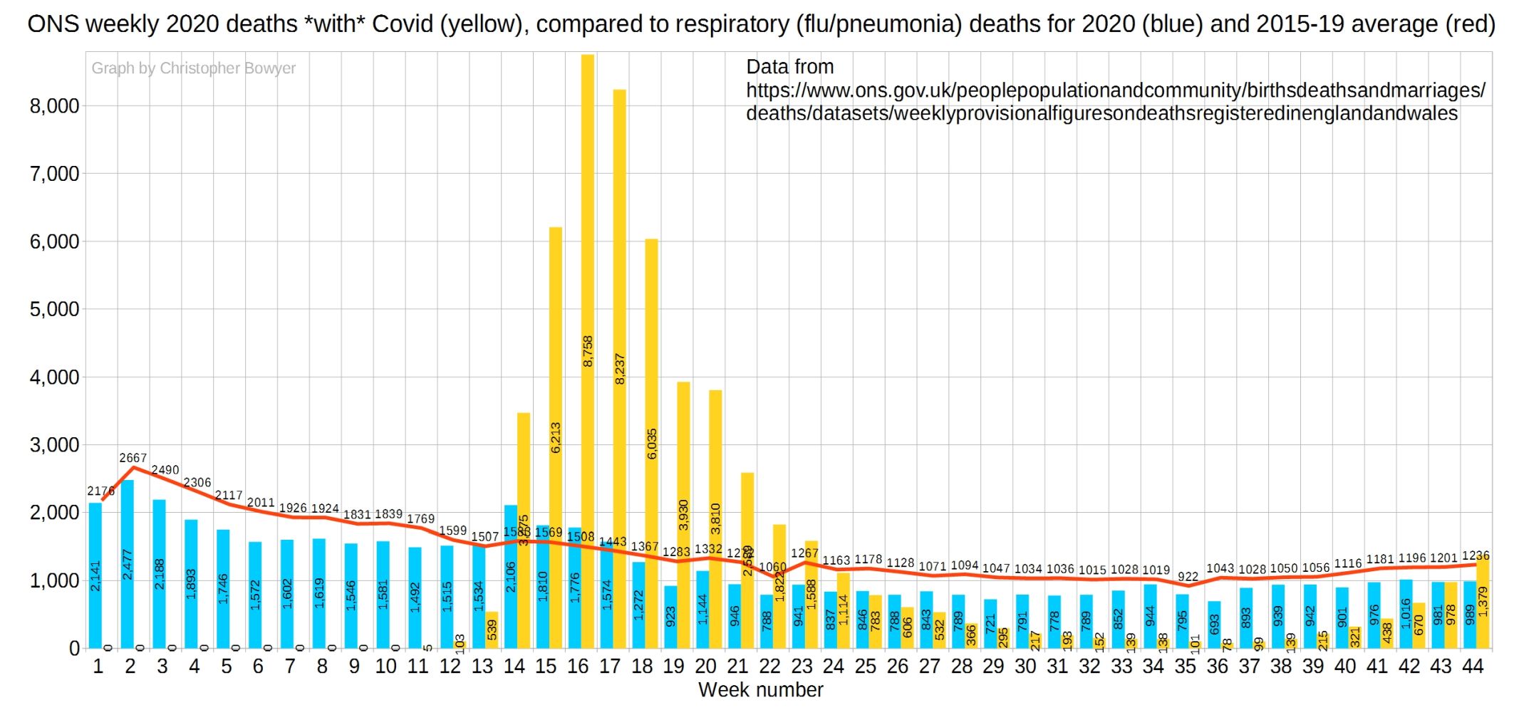
‘With Covid’ deaths (yellow) compared to flu and pneumonia deaths (blue), with the red line the five-year average for flu/pneumonia.
2 thoughts on “Week 44 ONS graphs from Christopher Bowyer”
Excellent as always. Particular take from wk 44, excess deaths all causes 996, excess deaths at home from non-covid 790. Some epidemic!
Christopher are you finding a new home for these graphs?
I wonder when the MSM will make the connection that the “ peak” occurred at the same time the uncritisisable NHS closed its doors.
It’s funny how when the hospitals are giving no treatment and GP close that more people die.
The govs own report in April said if they REDUCE non essential surgery by 75% ( not 100% as actually happened) then 185000 people would be expected to die.
Page 4
https://assets.publishing.service.gov.uk/government/uploads/system/uploads/attachment_data/file/892030/S0120_Initial_estimates_of_Excess_Deaths_from_COVID-19.pdf
Comments are closed.