Euromomo has updated deaths stats out. They give the impression that they go up to the end of week 13 (March 27), although in fact for a lot of countries the stats only go for half the week, and the rest of the week is a prediction (more on this below). It looks like we can now see some Covid-19 deaths there, but there’s still no sign of a horror movie.
Here’s your headlines: Italy, Spain, Switzerland and Belgium all have definite recent upturns. But none of them massive. All within normal range. Italy is the worst, but it’s on about the same par as the winter of 2016-17. You know, the winter when we had that other World War 3 and we had to shut down the whole world… no, hang on, nobody even noticed that.
As the graphs may have changed by the time you read this post here’s a snip of some of the countries. It’s the last bit of the graph on the right-hand side that has the most recent figures (click to enlarge):

(For those who didn’t read my last post on the euromomo figures, these graphs don’t present the ‘absolute’ numbers, but the ‘z-scores’, which are the deviations from what is normal for this country.)
France is up a bit, but everywhere else (apart from England, which we’ll talk about in a minute) is flat, or even down. That includes Wales, Scotland, NI, Germany, and most importantly … Sweden. Yes, Sweden is stubbornly showing no signs of impending doom despite their refusal to have a lockdown.
Here’s a snip of some more of them (click to enlarge):

We can also see that the deaths are once again very predominantly occurring in the elderly. If you click on the age range figures — see the top of the country z-scores page — this is very clear. We can also see that in the pooled European data page, which is divided up into age groups — again it’s the last bit of the graph on the right that has the recent weeks’ figures (click to enlarge):
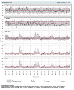
This again tells us that this is a nasty-but-fairly-normal winter virus, and not a general once-in-a-century mass killer.
There’s one more thing to talk about, and that is the ‘delay-adjusted’ blue lines on the z-score by country page. The green lines represent the actual death figures that have come in so far (in z-score format), whereas the blue lines represent the ‘delay-adjusted figures’. The latest figures won’t be complete because some death certificates take time to do, and so the certificates for some recent deaths won’t have come in yet. Euromomo therefore make predictions about what the ultimate figures will be for recent weeks based on the data they have from previous years that tell them how these things normally go. At least, that seems to be the general idea from what they say on their methods page (which isn’t the clearest).
However, I don’t get what is happening with England’s delay-adjusted data. The green line goes to the middle of week 13, and is well below normal. Then there’s a blue delay-adjusted line spiking upwards for the rest of the week. I don’t see how they get that from past data. Which makes me wonder whether they are actually basing that spike on what they’ve been told is in the pipeline by the British stats people. So we need to take some care on declaring that this graph shows that the British death rates have gone up recently. It doesn’t show that the official figures have gone up, although they may well do so in a few days (we’ll have a better idea of that anyway on Tuesday when the latest batch of ONS stats comes out). Italy’s upturn, however, is real, although as I said, it’s not that big.
23 thoughts on “Latest Euromomo stats: Covid-19 visible in some countries, but no disaster, Sweden fine.”
If we weren’t behaving with such appalling consequences this would be a comedy. We are destroying our society to no purpose.
Thank you for the excellent work.
Given the insane way that supposed coro deaths are being counted the numbers are likely a huge miscount. How many flu/pneumo/TB/cold deaths are being put down as coro?
Thanks for the sanity check! Great work!
Why is the media loaded with innane blow hards? Every statistician I know is bemused by this madness. Far more will die from economic hardship this is obvious. Is that the plan?
Australia, 17 Aug 2019: Deadly flu season has researchers racing to find out why this year has been ‘exceptional’
https://www.abc.net.au/news/2019-08-18/influenza-spike-may-be-climate-related/11406980
It should be born in mind that the measures being taken to delay the spread of Covid will have the same effect on any infectious disease. So that would limit overall mortality.
Sweden and Portugal however can’t be accounted for that way.
Interesting that it was already ‘an exceptional year’ for influenza before Covid 19 broke. And 217,000 infections with the ‘regular’ flu but they shut down pubs and clubs when they reached 1800 cases of Covid 19: https://www.theguardian.com/australia-news/datablog/ng-interactive/2020/apr/06/coronavirus-cases-in-australia-map-curve-confirmed-numbers-stats-how-many-covid-19-nsw-by-postcode-maps-victoria-live-data-qld-sa-wa-tas-nt-act-latest-statistics
Why the difference in actions between regular flu and Covid?
At least they haven’t gone full mental panic mode and shut their whole bloody economy down.
Italy’s upturn, however, is real, although as I said, it’s not that big.
But is it not that big because of the lockdown? That’s the territory we’re moving into now – not being able to know whether COVID-19 is a massive killer in itself.
We have Sweden to watch but they’re showing signs of caving in.
There’s also Belarus (which is doing absolutely nothing). The official figures are worth less than China’s but they won’t be able to hide it if millions die.
I have posted this elsewhere today, but perhaps worth saying here re your ” I don’t get what is happening with England’s delay-adjusted data. The green line goes to the middle of week 13, and is well below normal”
I expect there will be an uptick in the ONS figures in week thirteen, but even if the all-deaths figure kicks up by a couple of thousand it will still be no more than a bad flu year. Week 13 is something of an anomaly in that if you look at the highest weekly figure in the period 2010—19 that week is quite low. A statistical quirk, probably caused by the date of Easter and hence the drop in registrations in bank-holiday weeks.
The ONS weekly provisional figures do not show causes other than Respiratory diseases. Analysing death certificates and getting the classification right cannot be done accurately and in a hurry. Showing Respiratory Disease is an exception, justified because *every winter* it is that cause that pushes up the death rate.
I do wonder how reliable these figures are anyway. Ipswich Hosital failed to get 14 deaths counted at all forsoetime. I wonder if the same is happening elsewhere?
https://www.itv.com/news/anglia/2020-04-03/fourteen-coronavirus-deaths-at-ipswich-hospital-were-not-reported-due-to-an-administrative-error/
I’ve also read somewhere that old people who die in German care homes aren’t counted because they’re not in hospital.
And some absolute nonsense that in Scotland a person couldn’t be included in the CV19 count until after their relatives had given consent.
I have no idea whether this lot are reliable, but they have an interesting hypothesis (to save too much reading – the CV19 virus was out and about before the Military Games in China in October 2019 or so, and folk took it home with them, using CDC ‘flu-like’ medical visit data as a basis)
https://uncoverdc.com/2020/04/05/could-cdc-data-prove-covid-19-infections-in-november-2019/
Undeterred, Prof.Ferguson bravely ploughs on regardless and is now dispensing advice on a possible exit strategy from this crisis. In Hancock and Ferguson we trust.
The interview doing the rounds of Dr Jay Bhattacharya Prof. Medicine at Stanford Uni is well worth a watch.
If you have not watched this video – linked in a number of articles and comments – it is well worth a view.
https://www.youtube.com/watch?v=lGC5sGdz4kg
The take away thing from this longish video is when Prof. Wittkowski points out that the Imperial Modellers based their social distancing (SD) and lockdown advice on the success of it in China and S. Korea. BUT he shows that in both cases they were past the peak before SD was introduced. So had herd immunity before SD. He also thinks that because they locked down before full herd immunity had been established, is why they have new cases when they relaxed. This view seems closer to the Oxford teams view and those advising the Swedish government.
Why not? They did a good job of hiding millions of deaths under the Soviet regime*, and Belarus has changed even less than Russia since then.
*: or at least persuading the western establishment to not talk about them. Which is the same thing.
As I was saying:
“Spikes or dips may in part reflect bottlenecks in the reporting system, rather than real changes in the trend.”
“Many hospitals will not report deaths that happened over the weekend until the middle of the following week.”
“the daily figures included deaths that may have happened up to two weeks ago.”
“The Office for National Statistics examined registrations and found deaths in the community not included in the daily hospital deaths figures. ”
https://www.bbc.co.uk/news/health-52167016
It’s a different world now, BiG. Not even China can stop the signal. There won’t be millions of deaths, of course. Just lots of oldies. This will upset people but they’ll move on.
@Scott
This?
Questioning Conventional Wisdom in the COVID-19 Crisis, with Dr. Jay Bhattacharya
https://www.youtube.com/watch?v=-UO3Wd5urg0
https://www.sciencealert.com/the-us-has-reportedly-begun-blood-tests-to-hunt-down-immunity-to-coronavirus
Not just respiratory disorders. A friend of mine was hospitalised with a urinary infection and diarrhoear, subsequently tested positive for covid and I was told that “covid sufferers are showing a range of other symptoms”. It doesn’t matter what your illness – cancer, heart disease, whatever – if the magic test comes out positive, covid goes on the death certificate. While waiting for the ambulance she told me that she felt abandoned since lockdown. It’s clear to me that this was a major factor in the illness of this poor lonely woman.
I do say stfu
It was the risk of overwhelming the NHS that spurred the lockdown wasn’t it? I agree though, if you are vulnerable like me, I always social distance myself anyway. I suppose that could have been an alternative strategy? Who knows?
Comments are closed.