
A group of researchers at Sweden’s Uppsala University, including two Professors and two Associate Professors, who were inspired by Neil Ferguson and his team, created their own computer model, based on the Imperial College model. Their paper is here. They predicted, for various scenarios and transmission rates, between approximately 15 000 and 105 000 deaths in Sweden by May 1.
By a long way the best case scenario was the 15 000 deaths, which they thought would only happen if the Swedish government quickly introduced a UK-style lockdown before mid-April.
For the current Swedish recommendations they predicted, if those recommendations stayed in place (which they did), over 20 000 deaths by now (May 4), with the death toll rapidly rising after that.
Current Swedish death toll (4 May): 2679.
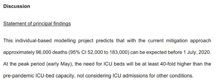
‘Principal findings’
Here’s their statement of their principal findings:
Predicted deaths
Here’s a graph from their paper on the expected Swedish death figures:
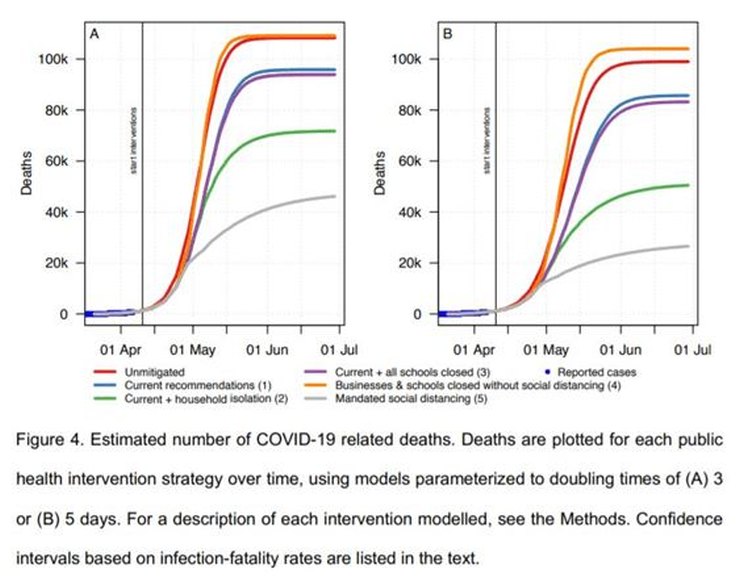
The left (A) graph is for the scenario where there is a doubling of deaths every three days (in the early and rapidly-climbing stages), and the right-hand graph (B) is for a doubling every five days.
As you can see most of the predictions were for 80 000 to around 110 000 deaths by mid-late May.
For the current government recommendations (the blue line), they predicted over 90 000 deaths just after mid-May (two-three weeks time).
Once again: the current Swedish death toll at the time of writing is 2679.
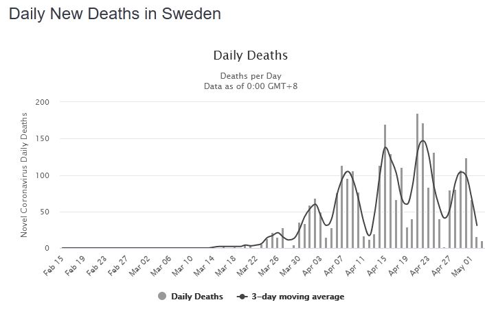
Is the death rate rapidly increasing? No.
Is the death rate flat? No.
Is the death rate decreasing? Yes.
Comparison with the UK and USA
Bear in mind that Sweden’s population is about 10 million, so Britain’s population is about six and a half times as big, so these predictions are roughly in line with Ferguson’s predictions for the UK, and the USA as well, on a per capita basis.
These computer-model predictions are not just wrong, they are stupendously and disastrously wrong.
ICU usage
Our modellers also got the ICU situation sensationally wrong. Remember that in their ‘Statement of principal findings’ they said there would be ‘a 40-fold increase in demand for ICU beds’.
Here’s their ICU graph:
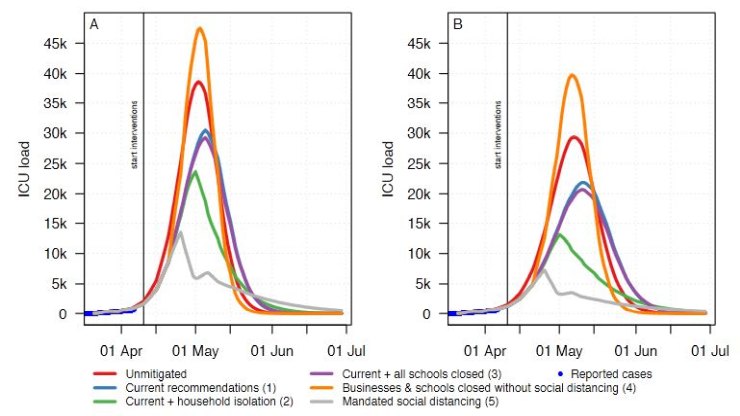
According to graph A we should have seen about 30 000 ICU beds needed now (blue line). According to graph B over 20 000.
Current number of Covid-19 patients in ICU in Sweden: 1560.
I’d say Ferguson-type models have been spectacularly debunked.
P.S. If anyone’s having any trouble with my website redesign, please let me know.
39 thoughts on “The Swedish version of Ferguson’s model turned out to be hopelessly wrong”
“I’d say Ferguson-type models have been spectacularly debunked”.
I completely agree. But why would they need to be debunked after his four previous debacles?
“Fool me once, shame on you. Fool me twice, shame on me… Fool me FIVE TIMES…???”
There’s a joke in the old Yes Minister TV series along the lines of “Something must be done. This is something. Therefore this must be done” Likewise we seem to have had a situation of “We need a pandemic prediction. Ferguson has a pandemic prediction. Therefore we’ll use this prediction”
In the recent Unherd interview, Ferguson was unequivocal in his belief that Sweden would spike as predicted by his model. From the recent data he would appear to be wrong; as stated in this article. I could not believe in the interview that he didn’t suggest any doubt in his predictions; no humility despite the number of unknowns.
As a slight aside – can anyone clarify how the numbers presented on worldometers.info for Sweden relate to those graphed on experience.arcgis.com from which worldometers state they obtain their data. The data totals to date are the same, but the graphs are very different (and I can’t read Swedish).
The Swedish for deaths is “avlidna”. “Sjukdomsfall” are cases (interestingly more women – Kvinnor – than Män, which I hope needs no translation!). Their charts for cases, deaths and intensive care are properly aged to dates of occurrence and show a much more rounded picture, rather than dates of announcement which is all that Worldometers uses – charts that are aggravated by the weekend effect of reduced reporting, and made worse by imposing a 3 day, not a centred 7 day moving average, which would remove much of the weekend effect.
Deaths are for anyone who tested positive, i.e. “with” the virus. You may need to click around the Swedish dashboard on arrows etc. to see some of the charts and reveal the underlying data.
Swedish dashboard
https://experience.arcgis.com/experience/09f821667ce64bf7be6f9f87457ed9aa
I’m surprised that it was Sweden, of all places, which stood fast and refused to cower.
Regarding the website design: my only complaint is that now, on the front page, it doesn’t show the number of comments by each blog entry. I used to find that useful to see if there were new comments.
The floating semi-transparent frame at the top is somewhat naffe. It covers half a line of previously unread text when you pagedown.
And light-grey text on a slightly lighter grey background is really, tremendously shite. It’s worst in the comment box. Low contrast webpages needs to be killed forcefully, it’s getting beyond an (unreadable) joke.
Apart from that, it’s OK.
Seconded
@It doesn’t add up.
Thanks, that is what I thought – but couldn’t be sure – it is much clearer that way. Might I ask how you know the data “are properly aged to dates of occurrence”? Does it say that on the site with the graphs?
Agreed. I can’t change that right now, but may be able to later.
It all reads fine on my screen, but I’ve changed the body text to completely black to aid those who need more contrast. As far as I can tell the background is white. I can’t change the comment box colours at the moment, but should be able to later on (will either buy the Pro version of this theme if it works okay, or try another theme).
I wouldn’t hold your breath on the government admitting they (and Neil Ferguson) have got this wrong. I wrote to my MP (a Parliamentary under-secretary of State) a fortnight ago, querying why the lockdown was still in place when the original reason for it (to prevent the NHS being overwhelmed) had been met, and today received this reply:
“At the present time, the Government’s priority is reducing the spread of coronavirus and protecting the NHS. The impact of actions taken by the public to reduce contact with others are only just beginning to be seen, and I feel it would be irresponsible to start thinking about relaxing social distancing measures until there is a significant reduction in cases of this illness.”
Effects of social distancing/lockdown “only just beginning to be seen”, 7 weeks after social distancing started & 6 weeks after the start of lockdown? What planet is the Government on???? 🙁
There is a panel of information on the statistics which explains their origins and compilation methodology. Keep clicking those arrows till you find it. All in Swedish, but if you don’t have a similar language (German is enough to get you there), you can always copy it into online translators to get the gist.
What he really means is that they’re still arguing about how to manage release from lockdown.
One website that has Swedish data inputted in graph form is https://adamaltmejd.se/covid/
That’s a very neat chart. I note reporting delays increased (as you might expect) around Easter. Perhaps we will see the same over the May Day weekend to some lesser extent. It would be nice to have a little more explanation for the basis of the forecast. I suspect it may be slightly pessimistic.
Unless there’s something substantially wrong with the Swedish interpretation of Ferguson’s model, the failure of the model in predicting Sweden’s experience seems to clearly demonstrate that its predictions are prone to be wildly wrong, too high by more than an order of magnitude. Which, from what I’ve read of Ferguson’s history of such predictions, is something that could have been, um… predicted. It seems all published predictions from epidemiological models are wrong in the same direction – gross over-estimates of casualties – it’s almost as though there’s something about the business of mass death that attracts more pessimistic personalities.
I just wanted to add something. I once shared an office (and published a paper) with the chap who supervised Ferguson’s D Phil. At that time he was working in theoretical physics and his supervisor has since mainly worked in superstring theory. I guess Ferguson found that a little hard going so moved to epidemiology. A “prediction” from quantum field theory is that the vacuum energy of the universe should be ~10^135 x higher (or something like that) than it’s found actually to be. It’s been called the worst prediction in all of science. I wonder whether Ferguson and his fellow epidemiologists are trying to making the physicists look good.
What would be useful is not only number of comment but the date of the most recent comment. It would make it easy to see if there were any more comments since I last looked.
Is “inspired by” in the first sentence intended to be ironic?
I’d replace it with “misled by”
“The impact of actions taken by the public to reduce contact with others are only just beginning to be seen…”
I think the grammar of that sentence speaks for itself. Badly educated, sloppy, lazy, uncaring.
Or perhaps “expired”…
I guess that modellers have an intellectual and emotional investment in their models and so can lose objectivity, especially when the stakes are so high in terms of reputation and real world outcomes. That’s something we’re all prone to in one way or another.
That’s the nub of it. They work on the time honoured and much used WMTUPASWGA principle. Never fails.
And that very dark upper band, wiping out half the screen is very annoying.
Thirded
It’s been reported that Ferguson’s physics supervisor said he was the best student he ever had. I wonder if this is true. We would have been better off if he had stayed in physics.
Not directly relevant but Ferguson has resigned from SAGE for breaking lockdown rules by having a woman visit him. Reported in several places including here:
https://metro.co.uk/2020/05/05/government-coronavirus-scientist-resigns-meeting-married-lover-lockdown-12659413/
We have descended into media fueled fear, even though the Chief Medical Officer for British Columbia has advised that going outside is healthy and the chances of catching covid from someone walking past you in the the park are infinitesimal the local govt has still closed parks and outdoor spaces, which just forces people to congregate more in the spaces you can access.
They have also reported 170 excess deaths vs expected of which 111 are covid related so that leaves 60 that maybe lockdown caused, not a great statistic. Also they are basing lockdown removal on some modeling of cases based on % social contact that shows a massive growth in infection from 60% social contact to 80% social contact, though even at 100% social contact the projected cases appears less than the hospital capacity
https://news.gov.bc.ca/files/Covid-19_May4_PPP.pdf
@Christopher Bowyer
“the original reason for it (to prevent the NHS being overwhelmed) had been met” – Now 5 reasons
– Defeatist Boris Johnson’s coronavirus exit strategy: Worst thing UK could do is ease up too soon. Must meet 5 tests
https://www.youtube.com/watch?v=WzsA1Z7p7MA
All except #5 met – No Spike if house arrest ended. Second spike inevitable when house arrest ended even if a vaccine developed – Flu spikes every year despite vaccine
– UK lockdown is absurd, dystopian and tyrannical – Tory MP Steve Baker warns Boris Johnson
https://www.youtube.com/watch?v=3gPuCVqvNak
imo Ferguson is a charlatan and should have been ignored. Must End This Week and should never have been done
You sum it up nicely Tom.
Thanks in anticipation Hector
That’s actually a scary answer.
It should also be pointed out that of the 2854 deaths in Sweden, 691 of those people were over the age of 90 – just over 24%..! In any other circumstances the death of someone aged 90+, though sad, would not be regarded as unusual or entirely unexpected..
Has Neil Ferguson ever even been to Sweden???
Sweden currently has 23,216 known cases of coronavirus. However a large proportion of these are in Stockholm (8686 cases), although only one tenth of the population live there. Consequently there are also more deaths in Stockholm – 1524 of the 2854 deaths so far, or 53%. (I live in Uppsala, Sweden’s 4th biggest town, which is only 40 minutes from Stockholm, so I’m obviously interested in following the stats..)
As regards graphs, Worldometers use linear graphs whereas arcgis uses logarithmic ones – although you can change the Worldometers ones to logarithmic..
“He first took my altitude by a quadrant, and then, with a rule and compasses, described the dimensions and outlines of my whole body, all which he entered upon paper; and in six days brought my clothes very ill made, and quite out of shape, by happening to mistake a figure in the calculation.” Jonathan Swift Gulliver’s Travels.
“no humility ”
the creature seems completely lacking in what are after all, sort of … human qualities: sympathy, empathy, sorrow for harm caused; acknowledgement of error, apology.
Only weak and sensitive creatures …. humans … display such characteristics.
One modeller in particular has certainly appeared today to have had an “emotional investment” in his model.
Forgive me Simon, but with the benefit of hindsight, your mention of “the Swedish interpretation of Ferguson’s model” takes on a somewhat altered meaning this morning.
The figures shown above seem to be wrongly labelled (by the paper’s authors I should say, not Hector). They show, e.g., the case for “Businesses & schools closed without social distancing (4)” the second highest level of restriction, as worse than “Unmitigated”. This is either very counter-intuitive or else the figure has been mislabelled. The obvious assumption is that deaths etc decrease as restrictions increase so the curves should be labelled from the top downward: unmitigated-current-2-3-4-5. I’ve emailed one of the authors to confirm/clarify.
Comments are closed.