
This is an article by Simon Anthony, a one-time theoretical physicist.
About a month ago, a team of researchers published their predictions for the outbreak of Covid-19 in Sweden. Its performance was discussed in an earlier post by Hector Drummond. I was aware of the paper and its poor results but hadn’t looked at it in any detail. After reading Hector’s post, I thought it would be worth trying to understand the paper to see what I might learn.
Predictions and reality
In one sense it’s a good paper: the authors firmly nail their colours to the mast and make definite predictions which can be easily checked against what’s happened over the past month.
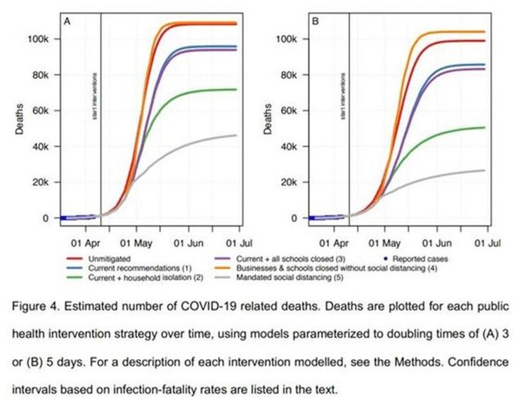
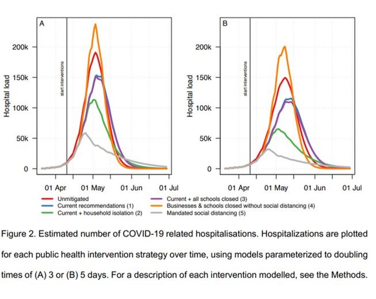
Various scenarios were considered, ranging from no mitigation, through the current ‘soft-lockdown’ (SLD) arrangements, then on through variations of lockdown severity. The principal result was the prediction that the current SLD would lead to hospital facilities being overwhelmed with a peak IC demand in early May of at least 40x pre-pandemic capacity and at least 96,000 deaths by 1 July.
In fact, the peak number of patients in IC in Sweden was 520 on 25 April. As of 7th May Sweden has 395 C-19 patients in IC. Pre-pandemic IC capacity in Sweden was (according to the paper) ~540 beds (phew!). Up to yesterday there had been 2,941 deaths with C-19 in Sweden. The model’s prediction for around now (estimated from charts provided in the paper) was between ~25,000 to ~40,000 deaths. The daily numbers of new infections (currently ~700 per day) and deaths (~100 per day) are both falling.
The model’s predictions were wrong by factors of ~40 in estimated IC requirements and ~10 in mortality. By any reasonable assessment, it’s failed badly (I was going to write ‘astronomically’ but it would have been an insult to astronomers who usually do much better than that). The Swedish government seems not to have been swayed by these predictions but instead continued with its SLD policy.
All of which invites obvious questions: why was the model so wrong and why, judged by their (in-) actions did the Swedish government apparently expect it to be wrong?
How the model works
The model is ‘agent-based’ which just means that its components are computer ‘people’ who are assigned occupations, move around and interact with one another in various probabilistically-defined ways, passing on infections as they do so. They’re infected, show symptoms, fall ill, are hospitalized, moved to ICU and die according to various statistical distributions. Known population densities and demographics are used to allocate properties to the computer people. The details are potentially very complicated and I’d thought it likely that the reasons for the model’s performance would be buried deep in the program so it wouldn’t be possible to understand without working through the code, which I really didn’t want to do.
Doubling period
Fortunately that turned out not to the case. There are various factors relevant to the spread of any infection which, when looking at the consolidated results, overwhelm any subtleties. One of the most important is the infection doubling period. The paper uses two values: 5 days and 3 days, and compares the results. Both are fairly short and that’s the underlying reason for the high peak requirement for IC and other hospital facilities and a significant factor in the mortality rate.
I looked at the sources from which the paper says its doubling numbers were taken. The 5-day number was from Swedish government data and the 3-day from a paper which analysed the case numbers in other European countries (not including Sweden) and fitted curves to very noisy data.
I looked at Swedish case data (from Worldometers, and cross-checked with the paper’s reference) and consolidated European data (Worldometers; see next para for comments on the paper’s reference) for the dates March 21 to April 6 inclusive (which the researchers say they used). I found that the actual case numbers give a doubling period of ~7.5 days for Swedish cases and ~4.8 days for European-wide cases.
In the first case, it took me a while to realise how the authors had arrived at 5 days. Then I noticed that while I’d been using cases, the authors had used deaths. They don’t remark on the peculiarity of choosing to use data on deaths when data on cases is readily available.
In the second case, although the paper says it used data from between those dates, the reference to which they attribute the 3-day doubling period itself used data only up to 26 March when numbers, particularly for individual countries used in the assessment, were relatively small and unreliable. So both Swedish and European doubling periods used in the paper seem to have actually been shorter than the data implied.
An obvious further question is why use European data at all? The aim of the study was to estimate the effects of the outbreak on Sweden, to predict the effects of the SLD and other degrees of LD within Sweden. It’s hard to see how data on the spread of infections within other European countries would give better results than those from within Sweden itself. Again, the authors don’t comment on the reasons for their choice.
The authors several times describe their model as ‘conservative’. I’d say the most conservative choice of inputs for modelling the spread of a disease in Sweden to be based on the number of cases in that country, not its deaths or the cases in other countries. Rather than the model’s chosen doubling periods of 3 or 5 days, the most appropriate value, gathered from Swedish data readily available to the researchers, seems to be ~7.5 days.
Using the ‘right’ doubling period
This change has significant effects. The paper assumes that patients are infectious for 10.5 days. With a doubling period of 3 days, the implied R0 (= infectious period/doubling period) is 3.5. With a doubling period of 7.5 days, it’s 1.4. In the latter case (for a SIR model) the peak number of infections is about 14% of the former.
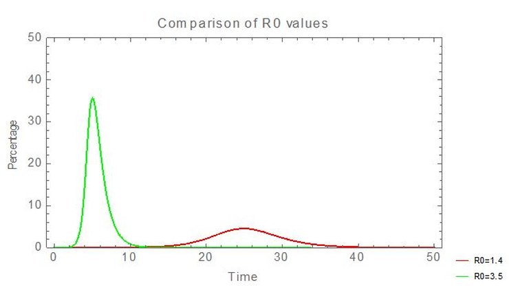
So using an accurate doubling period, directly derived from Swedish data, reduces peak medical demands by a factor of ~7 and ‘flattens the peak’.
Hospitalization rate (and the growing population of Sweden)
I’m slightly hesitant about this next point because the apparent error seems so glaring that I wonder if I’ve made an obvious but (to me) invisible mistake.
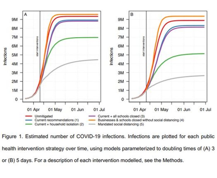
The paper says that 2.95% of patients who show symptoms are hospitalized and that 2/3 of infected people show symptoms. The paper’s Figure 2A (above) shows the number of infections requiring hospitalization peaks at ~240,000 in the worst case. Putting those numbers together requires that the number of people in Sweden infected at the peak point would be ~12.2 million. Which is about 2 million more than the current entire population of Sweden.
Using an SIR model with R0=3.5 to roughly match the model, I compared the peak number of hospitalizations to the total number of infections shown in the figures in the paper to find that the peak hospitalization rate entailed by these figures was ~8%, not the 2.95% summary number they claimed. So if the model had used the summary number, 2.95%, rather than the detailed numbers in the paper, the peak demand for the current SLD policy would have been reduced from ~190,000 to ~70,000.
But that number should also be reduced by a further factor of 7 to take account of the doubling period of 7.5 days, so the peak number of hospitalized people would come down to ~10,000.
ICU demand
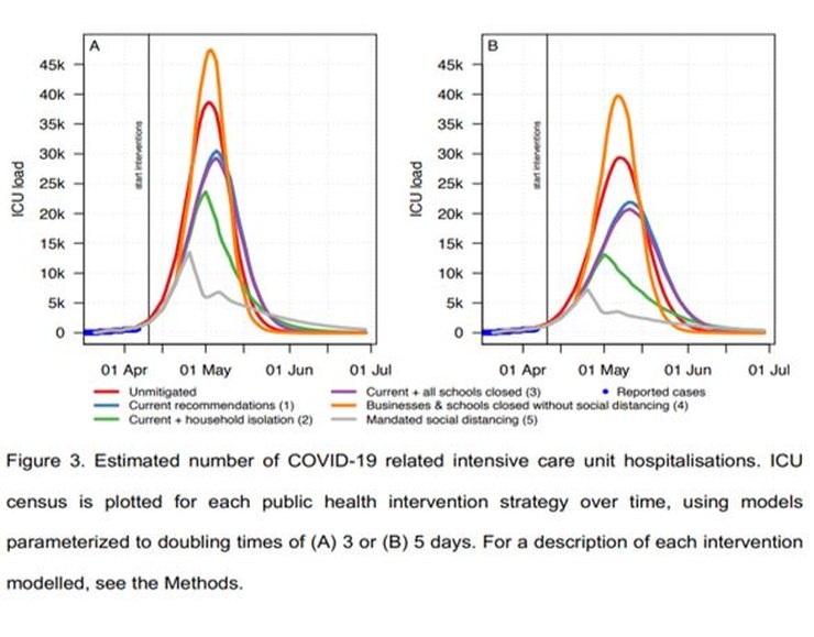
The paper predicts the peak of ICU demand for the 3-day doubling period to be ~30,000 places under Sweden’s current lockdown scenario. The previously described factors, 1/7 (extended doubling period) x 3/8 (exaggerated hospitalization rate), would reduce ICU demand; for the current SLD ~1,600 ICU places would be required. It seems that (quoting the Spectator) “Sweden’s Public Health Agency rejected the models. It instead planned for a worst-case scenario that was much less pessimistic, suggesting a peak around 1,700 ICU patients in the middle of May”, so perhaps they did similar calculations.
In reality, ICU usage peaked at ~520 beds, less than a third of this number. A possible explanation is that one or more of the paper’s rates of cases per infection (i.e. percentage of those who are infected who show symptoms), hospitalization or ICU transfer is still too high or that the estimated doubling period was too short (it’s certainly increased since the paper was written).
As I mentioned, these errors seem too obvious to have been missed, but, for the model to come anywhere near matching reality, the input data really has to have been wrong by significant factors.
Mortality
And so on to the predicted deaths. Again one might expect that a deep understanding of the innards of the computer model would be needed to understand the predictions. But again, no, it’s rather simpler than that.
From the charts in the paper – Figures 4 above and 1 below – for 3 days doubling time, the infection fatality ratio (IFR) is ~1.15%, a similar value to that suggested by early studies of the original outbreak in Wuhan which the model was tuned to emulate.
For R0=3.5, that would mean ~108,000 deaths in Sweden; for R0=1.4 (Sweden’s current policy – see above), the estimated final number of deaths is about half that, ~54,000. So far there have been ~3,300 C-19 deaths in Sweden, currently increasing at ~80 per day. Obviously that rate would have to be sustained for a long time, getting on for two years, to get close to 54,000. Currently deaths and infections are falling and it looks very unlikely that mortality will reach anything like those levels.
The implication is that either IFR is less than the assumed value of ~1%, i.e. between 0.1% and 0.2% if the number of Swedish deaths is ultimately between 5,000 and 10,000, or else R0 is less than 1.4 so as to lead to fewer infections (but the value of 1.4 fits the case numbers well so that seems less likely).
Conclusion
With hindsight the paper is obviously flawed as every significant predicted result has been badly wrong, but more interesting is that the main reason why it failed can be seen without running a complex model and without having to wait for new data to show up: too short a doubling period.
There’s a hint of what went wrong in Figure 3 for ICU cases. At the left foot of the curves, around the zero of ICU load, is a thicker blue line. It’s labelled ‘Reported cases’. Overlaid on this line are the modelled curves for the outbreak. Now, I may be wrong, but it looks to me as though the modelled curves are steeper than the ‘Reported cases’ line. That’s at the very start – the nearly flat part – of an exponential period of growth. A small difference at this point will rapidly turn into a very large difference in outcomes. ICU cases are proportional to infections, so the origin of the mismatch lies with modelled infections, leading to a significant underestimate of the doubling period.
The model itself is almost certainly quite sound. Its predictions were wrong because they were based on inaccurate inputs which were exponentially amplified. With simple arguments and a few lines of code (to run an SIR model) and Excel, along with data available to the modellers, it’s easy to see how badly wrong predictions can come from relatively small inaccuracies in assumptions. You don’t need ~16,000 lines of C++ to test its major predictions.
The implications of actual Swedish data, interpreted via a simple SIR model, are that the outbreak had an initial R0 of ~1.4 and an IFR of ~0.1%-0.2%. R0 seems now to have fallen further. With such relatively low values, the initial decision followed by the continued soft lockdown seems to have been a sound strategy.
I should emphasise that, while the too short doubling period caused the model to overestimate the rate of increase of infections (and everything that followed from that), if the IFR was ~1% (as many people thought it was, and some still do) the mortality rate even with the longer doubling period would have been much higher than it has been, possibly too high to be politically acceptable. The Swedish government’s advisers seem somehow to have judged at least 6 weeks ago that the IFR would be significantly less than 1% and politicians were convinced enough to go along with that judgement. Faced with national and international pressure to change to a hard lockdown, sticking to that position took considerable moral and intellectual courage.
15 thoughts on “Simon Anthony: Why were the predictions of the Swedish model so wrong?”
I really don’t understand why we use this detailed bottom-up models for forecasting. The key numbers can be run on a few line of Excel – R0, percentage symptomatic, percentage of those requiring hospitalisation, percentage in ICU, percentage who die. You don’t get those figures any more accurately by trying to build them up using unknown assumptions. For Sweden, let’s guess that 20% of people will get it, and of those 0.15% will die. Look, pretty good.
These complex models are useful tools when you have lots of reliable data at finding out what happened, but completely useless at forecasting.
As far as large scale predictions are concerned, I think you’re quite right. An SIR model, or variations, are as useful as detailed “agent-based” models. The precision the detailed models give for national predictions are both spurious and irrelevant.
In principle the detailed models might have an advantage if, say, lockdown procedures varied between regions. An SIR model using national parameters isn’t going to help much with that. You’d have to make local versions which would end up looking very much like the detailed model. I suspect the problem in using detailed models in these situations where they might seem to have an advantage over the simple models is that they give unreliable results – unstable predictions which change in important ways from one run to the next.
So yes, I’m not sure that the detailed models are of much practical use. Their complexity, detail and “sophistication” may however be very useful in impressing people who need advice but don’t understand mathematical models very well.
The fact that one outcome required 2 million more people to be infected than actually live in Sweden shows a lack of basic controls, should be relatively simple to have limits or check the results against boundaries.
I also agree with your final point. Many – probably most, possibly all – detailed models of human affairs are practically useless at predictions. I’m thinking particularly of economic models. They may be helpful to describe what happened in the past – giving an illusion of historical explanation – but future outcomes are so dependent on unforeseeable contingencies as to be effectively unpredictable. It’s an extreme example but I don’t think that many forecasts of world GDP for 2020 predicted a ~20%+ fall for Q2.
Models can have their uses — mainly to help us understand how complex factors can interact — but we always have to remember the first part of George Box’s statement: “All models are wrong”. Real-world data trumps models every time.
The Diamond Princess cruise ship happened in February, and involved a large sample (~4,000 passengers & crew), and a physical situation which maximized the opportunities to spread an infection. On the other hand, the group was biased towards the old and unhealthy.
Real-world results — 80% did not get infected, which sounds like a good approximation to “population immunity”, which our Betters condescendingly call “herd immunity” because that is how they think of us. Of those who did get infected, about 80% had no or minimal symptoms. About 10 deaths, all among the aged & infirm.
From March onwards, real-world data showed there was no reason to pay any attention to models, and no reason to lock down entire economies. The question is why did our Betters ignore reality and put their faith in models? Cui bono?
Simon,
Thanks for doing this work.
You say “The model itself is almost certainly quite sound” – is there any evidence for this? Given that models of human behavior in themselves affect said behavior, it becomes mightily difficult to ever demonstrate that such a model is good – unless the subject population does not know it is being modeled or chooses to ignore the findings. I identify three places where a model of this sort may be wrong: the underlying theoretical model; the implementation in code; the parameters used. You have shown that the parameters are suspect, do we have evidence that the other two products are good?
Andy Riley
You ask “I identify three places where a model of this sort may be wrong: the underlying theoretical model; the implementation in code; the parameters used. You have shown that the parameters are suspect, do we have evidence that the other two products are good?”
I think that we do, because the model can produce outputs which match reality.
The real question is why folk build models of this detailed nature when the available data is so rough and imprecise that there’s no real data to feed the model.
And I think the answer to that is that their hearts were in the right place – they wanted to be able to distinguish the effects of different lockdown strategies. But they didn’t do the required sensitivity analysis before running the models and predicting. What sensitivity analysis? The doubling rate is clearly very important. How many folk who have it who have to go to hospital is clearly very important. How long they stay in hospital and the death rate are clearly very important. And these effects swamp the detailed behavioural modeling. In principle, if you have an idea of how transmissible the disease is, the detailed model of agents wandering around and meeting folk to transmit the disease lets you model the effects of the variouscontianment strategies just fine. But if you have the number infected wrong, the transmissibility wrong, the hospitalisation rate wrong, and the occupancy period wrong, the major factors having an effect on deaths and occupancy are the big picture numbers, not individual behaviours.
So your model is buried deep in inaccuracies and provides order of magnitude errors in output.
This is similar to Nasim Taleb’s point, of course. You can’t predict sensibly beyond a limited range, and even then an unexpected event can throw everything out.
Much better to be flexible…or, as Nasim says, non-fragile…..
Bloke,
Are there examples of the code producing outputs that match reality? I’ve certainly not covered all of the literature in this field but I don;t recall seeing any evidence that the model is conceptually correct. I’ve read the Kitching et al paper on the FMD case and it is pretty damning about modelling of this nature in principle:
https://www.research.ed.ac.uk/portal/files/14288330/Use_and_abuse_of_mathematical_models_an_illustration_from_the_2001_foot_and_mouth_disease_epidemic_in_the_United_Kingdom.pdf
I used to provide and evaluate scientific advice to inform Government transport and land use policy, another area where bottom up models of human behaviour were popular (but often wrong).
In my experience complicated detailed models have no place in public policy evaluation. The complexity and detailed inputs required rarely contribute much of use to the overall conclusions, which as in this case are dominated by a small number of critically important elements.
Concentration on the details by the modellers results in neglect of adequate analysis of the important factors, so clearly revealed here.
Moreover, policy makers can be dazzled by the wonderful complexity of the model -it must be accurate because it takes everything into account. So the face validity of such a model is very high, but the reality is the opposite.
It is far better to use the simplest possible model, just using the few key inputs. That is then understandable (by the modellers – they typically do NOT really understand their own models), and importantly it can be explained to policy makers in a transparent way on a couple of sides of A4.
“Their complexity, detail and “sophistication” may however be very useful in impressing people who need advice but don’t understand mathematical models very well.”
Like the “leaders” who base decisions on them, you mean?
Cui bono indeed!
Good analysis Simon.
Standing back from the detail it just looks like a bunch of people who just kept doubling deaths until they ran out of victims (and they even got that wrong) …… and then tried to dress it up to make it look intellectual.
R0 = infectious period/doubling period
Are you sure? This paper uses R0 = 1 + (natural log 2 / doubling period) * infectious period: https://www.mdpi.com/2306-7381/7/1/2/htm
That’s looks like a linear approximation to the formula in Wikipedia’s article on basic reproduction number, which is exp(K tau) where K is the exponential growth rate and equals natural log 2 / doubling period, and tau is the serial interval (the time it takes for each infectious interval to infect R0 others).
“Faced with national and international pressure to change to a hard lockdown, sticking to that position took considerable moral and intellectual courage.”
Indeed. I applaud them for their courage.
Comments are closed.