Note: This is an update of my earlier post ‘This is what we screwed the world for‘. If you’ve read that one already you can just skip to the population-adjusted graph, which is what I’ve added in this post.
So I have taken the ONS’s annual death figures for England and Wales and graphed them all the way back to the turn of the twentieth century. Then I thought: what if we presumed that the death toll for 2020 is the five-year average plus the Covid-19 numbers? That will be a high estimate, as it’s likely that many of the people who died from Covid-19 would have died this year anyway, so the real annual total is not likely to be that high. But I thought, let’s see what that number would look like anyway.
(A complication is that lockdown itself could kill considerable people later this year with all the delayed cancer treatments, but any such deaths should not be in my graph anyway, as they are deaths caused by the lockdown, not Covid, and I’m trying to show the effect of Covid).
The five year average for 2015-19 is 531,355 deaths per year. As of writing this there were 42,462 Covid-19 deaths in the UK (from this site). There are likely to be a few more deaths in the next few weeks, but not many more, as the disease is (barring an unlikely second wave in winter), gone. Besides, the number we are adding on here is for the whole of the UK, not just England and Wales, so if anything this number is inflated. That gives us 573,817 deaths for 2020. I added that into the spreadsheet and the graph. Then I got hold of the historical population figures for England and Wales, and calculated the death rates per 1000 from it, so that population increases are taken account of. Here is the result, with 1900 on the left, and 2020 on the right. (Click to enlarge.)
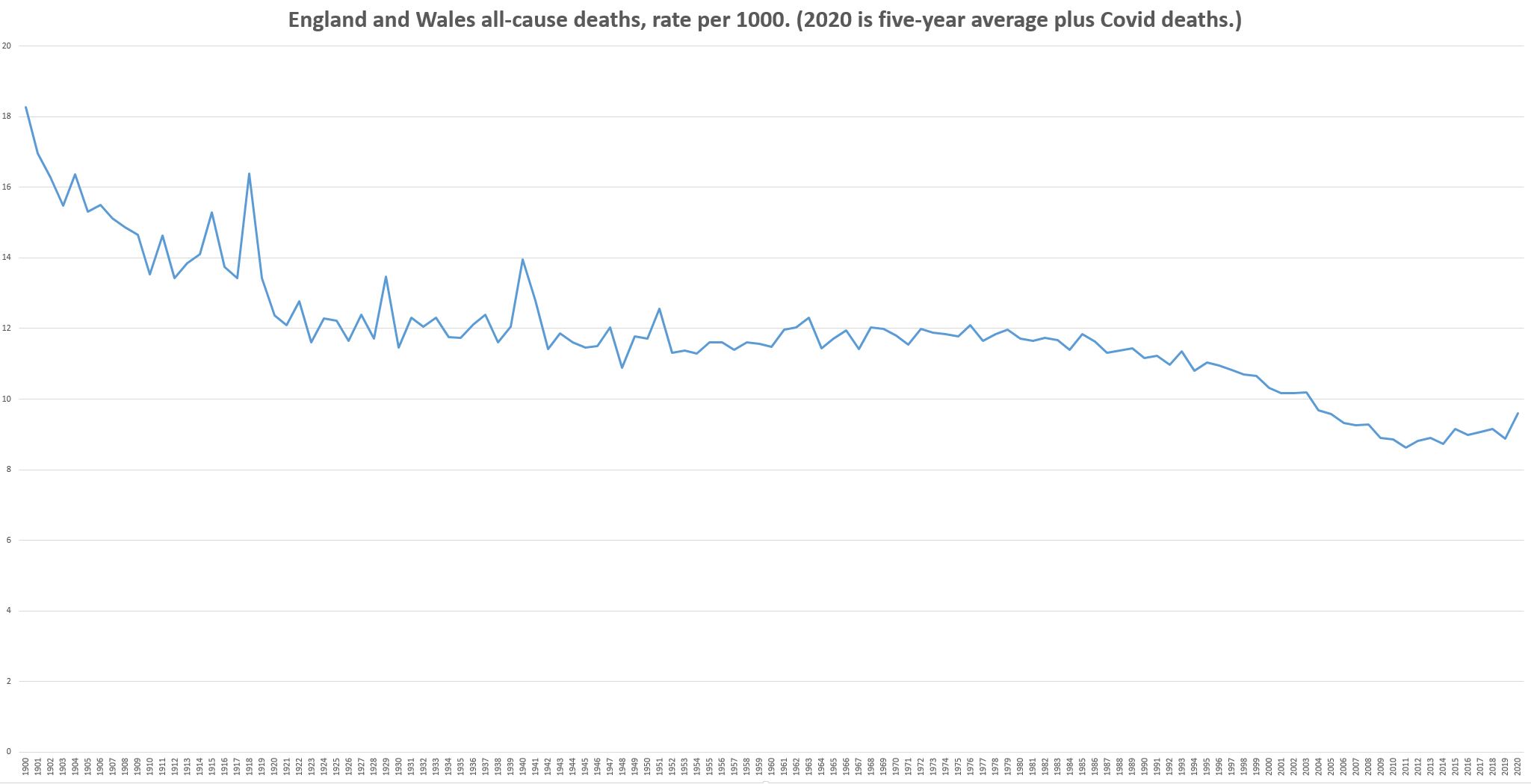
So: no gigantic, bowel-emptying spike in 2020. No jaw-dropping upwards vertical rocket-ship to match those jaw-dropping downward vertical cliffs we saw with the economic data. Just a tiny little uptick, like many other little upticks in there, indistinguishable from random noise. If you asked someone in the future who was unacquainted with the era to point to where the once-in-a-century medical disaster was, they would have no chance of picking it out.
Far from being a once-in-a-century pandemic, Covid-19 turned out to be a bad flu. We shut down the world for a bad flu. We shut down the world despite living in the safest era in the whole of history.
P.S. I’m behind on e-mail, hope to catch up soon. P.P.S. I’ll post links to the data soon.
A plea: Many thanks to those people who have supported me recently, I’m really grateful. You can do that by sending a donation my way via Ko-fi, or taking out a Patreon subscription (links on the right-hand side). Also please buy my book!
31 thoughts on “This is what we shot ourselves in the foot for”
Thanks Hector, the shape of the new chart is very interesting. I suspect the uptick in 2020 is nearly all a result of double counting Covid-19 deaths with those that would have occurred anyway this year.
Once we have full year data I think, like you, that it will be impossible to distinguish 2020 from any other.
Excellent graph Hector! If we assume that your 2020 population estimate is accurate, rather than a significant overestimate, all-cause mortality is below the levels observed in the early 2000s. Given this, the recent series of papers and twitter analysis suggesting that lockdowns were ineffectual and the fact that there has been plenty of spare ICU capacity throughout the pandemic, it is now undeniable that our response to Covid-19 in the UK was wildly disproportionate. Yet, on we go. And, when an enquiry is finally held, I wager that the government will be exonerated by the selective use of dodgy science (from London Imperial) suggesting that their measures worked and/or on the basis of the precautionary principle, which is subjectively trotted out to justify all sorts of policy measures that would be unthinkable if one were to carry out a thorough evidence-based cost-benefit-analysis.
Interesting to see that Spanish flu (is that racist?) is far more noticeable than either world war. My only fear is that lockdown induced deaths will push the figure for 2020 higher and this will be blamed on C-19. As with so much nowadays, I feel we will be frustrated if looking for a definitive answer that convinces everyone. Skeptics will believe the skeptical view and bedwetters will cling to the notion that lockdown saved lives and a stricter lockdown would have saved more.
Actually, the uptick looks quite significant to me. It is hard to tell rate by visual angle, but it looks like the last time people died at this rate was during the wars.
We need to compare deaths, NOT with what happened in 1900, but with what happened recently. Our death rate has been getting constantly better – much better than the early 1900s, and continually improving, up to about 2012. At that point we have started rising again, and this has been the greatest jump up since that point. So, yes, that looks like a worrying trend to me…..
What happened in 2010/2011? Before then there is a most definite downward trend from 1975/1976. So what changed?
NeverReady
I suspect that a comparison between the population whose families going back centuries lived here or in another developed country and those who didn’t, would be instructive.
Dodgy Geezer
Graph shows slight rise from around 9 per thousand to 9 and a bit per thousand. Please do not worry yourself. The broad point is how the majority of countries have reacted and the impacts of that are likely to produce a slow but prolonged increase in all cause mortality around the globe. This will build and build for years.
>Interesting to see that Spanish flu (is that racist?) is far more noticeable than either world war.
I’m assuming that’s because most British war deaths of soldiers were on foreign soil, and weren’t included in these stats.
>What happened in 2010/2011? Before then there is a most definite downward trend from 1975/1976. So what changed?
That’s so small that it’s barely distinguishable from randomness. Could be a result of high immigration levels since then (the population increased more rapidly in that period, and maybe there were poorer levels of health amongst the immigrants. Also, illegal immigration may explain it, those people are not part of the official population estimates but still die.
>Actually, the uptick looks quite significant to me. It is hard to tell rate by visual angle, but it looks like the last time people died at this rate was during the wars.
No, there are numerous similar upticks throughout the graph.
>We need to compare deaths, NOT with what happened in 1900, but with what happened recently.
Wrong. The justification for the lockdown was that this was an unprecedented once-in-a century medical disaster. The equivalent of a war. Now the goalposts have been changed to, well, it may be slightly worse than recent years. Or, ‘But three more children may die’. Sorry, but those don’t justify a lockdown of the whole country.
Brilliant graph. Totally tragic how we have destroyed ourselves trying to avoid that small uptick, which may well disappear by end year, if indeed many of he victims would have died anyway in 2020.
I am reminded of Einsteins quote : “There are two things which I consider may be infinite. The Universe and human stupidity. But I’m not sure about the Universe.”
The abrupt transition around 2012 looks even more distinct than on the original graph, because of the adjustment for increasing population.
Maybe one way to deal with the Covid “bed wetters” would be to divert them from their worry about a mild flu and instead get them to start demanding a serious scientific investigation into two points:
1. What changed around 2012? The UK had an accelerating decline in death rate for decades — and then it came to a screeching halt. Why? And how does the UK get back to the pre-2012 trend?
2. Why has this very significant observation about what looks like a big failure in UK health care around 2012 only now come to light — and then only thanks to the unpaid efforts of an individual author? Where were the politicians and bureaucrats who are being paid to look after such things? What explains their failure to alert the people of the UK to the 2012 “disaster” (as the BBC might call it)?
From BBC website https://www.bbc.com/news/world-europe-18028620
Assuming a lag,
“Coalition government
2010 May – General election: Conservative Party wins most seats but fails to gain an absolute majority. Conservative leader David Cameron heads first post-war coalition with the third-placed Liberal Democrats.
2010 October – Coalition announces large-scale public spending cuts aimed at reducing UK’s budget deficit, with an average 19% four-year cut in budgets of government departments.
…
2012 August-September – Britain hosts the 2012 Summer Olympics and Paralympics to widespread international acclaim.”
Not saying I think they are the issues but they are the kind of thing which will be quoted in answer to that type of inquiry. It was “Wet May and Big Bad Cameron cutting the NHS”
Hector — a very quick rough estimate of “excess deaths” since 2012 due to the “Disaster of 2012”.
Before 2012, death rates per thousand had been on a long-term decline. If we do a simple linear extrapolation to the midpoint of 2012-2020, it looks like death rate per thousand would have been lower than actual in 2016 by about 0.2 per thou — if the “Disaster” had not happened.
Take 0.2 per thou., times a conservative 55 Million E+W population, times 8 years since the 2012 “Disaster”, and excess unnecessary deaths total about 90,000. That is about twice as bad as the approx. 44,000 E+W residents whose deaths have been attributed to Covid-19.
The BBC should have been all over this! Something bad happened in 2012, when the hated David Cameron was Prime Minister, that to date has resulted in more than twice the deaths of Covid-19. And the Establishment has been silent about it. Cover-up!
My recollection, and I am sorry I cannot remember the source, is that the 2011 census was reckoned to have understated the population by over a million – many more people than at previous censuses unsurprisingly did not want to be recorded. What, if any, adjustment for the resulting inaccuracy was made I don’t know. If none – or an insufficient one – were made then the deaths/million would rise from that cause. alone.
One theory of the increase in 2012 and thereafter is that it reflects, after a suitable time lag, the sale of cheap booze at supermarkets. A hae ma doots.
If no “respectable” explanation is offered then my money is on immigration, bureaucratic incompetence, or a combination of the two. But unidentified infections is another possibility e.g. a first phase of COVID?
BBC news at 10 pm has Faisal Islam stating UK is worst in Europe for excess deaths with a made up graphic showing huge towers to represent the excess deaths of the UK.
Can someone more expert in statistics put an official complaint in about fraudulent reporting.
Hello Hetor,
The 2020 uptick may be less than shown in the graph. The Oxford Center for Evidence Based Medicine (CEBM) analysed the figures using Harmonic regression. Plus, there are more deaths per year from an aging population.
https://www.cebm.net/covid-19/covid-19-mortality-over-time-ons-update-2nd-june/
Would you be cool with it if in the excess deaths had been 500,000 instead of 50,000?
Maybe, just once, you might come out and state clearly: “This is the number of excess deaths that would have been justified by not locking down the country”, rather than hiding behind a constant stream of “but not *that many* people died” posts.
No one knows for sure how soon we’d have reached 10 x the number of deaths we’ve currently seen if we’d simply gone about our business, or what combination would have led to 250,000 or 100,000. Least of all you. I suppose it’s easy to blog incessantly about the “overreaction” when you’re not accountable.
Would you be happy to stake several hundred thousand deaths on your own certainty, ingnoring the considered medical opinion of the majority of experts – even as, yes, some disagreed?
And are we honestly pretending that we’re not seeing the alternative play out in real time over in the US, which closed down too little, too late, opened too soon, and is now seeing north of 40,000 new cases a day, while the EU is seeing 10% of that?
The US already has twice the number of cases per capita as the UK – and it’s only going to get worse there. Maybe you could let everyone know what seems like an appropriate number of US deaths before we might conclude that, actually, maybe they *should* have acted more decisively. (Not that these sorts of blogs are ever that intellectually honest.)
We really have no way of knowing whether lockdowns or “social distancing” made any positive difference at all, but we have plenty of evidence that people’s livelihoods and quality of life have been destroyed. Perhaps someone should do a study to see if there has been a huge rise in deaths among motor mechanics, emergency plumbers, takeaway and shop assistants – the businesses that have stayed open throughout. It’s not really strange that many short-sighted individuals are in favour of lockdown as I’d be happy to be paid 80% of my wages to sit around doing nothing. Not so great for those who ended up on benefits or trying to live off savings.
Hector — I would like to revise & extend my remarks about the impact of the 2012 “Disaster” — the sudden reversal in the long-term decline in the England & Wales annual death rate per thousand.
For the 15 year period from 1995 to 2010, we can fit a trendline to the data with an excellent R-squared of 0.974. Your graph showed a death rate in 2010 of about 8.8 per thousand per year. If the trend had continued out to 2019 (last year of observed data), the death rate would have dropped to about 7.1, whereas your graph showed the actual death rate was about 9.0.
Comparing the extrapolated pre-“Disaster” trend to the actual death rate and cranking the numbers, about 670,000 extra deaths occurred in the last 9 years because of the “2012 Disaster”.
Of course, this is just playing with extrapolations & numbers. However, Hector, you have uncovered a loss of life which is an order-of-magnitude larger than even the dubiously inflated Covid-19 death toll. And the UK Establishment has completely ignored it. This health disaster is worth serious study — and perhaps serious consequences for those who let it happen.
Anonymous understandably hid her identity and stated: ” the US, which closed down too little, too late, opened too soon, and is now seeing north of 40,000 new cases a day, while the EU is seeing 10% of that?”
Anonymous — silly girl — what is so bad about “cases”? If you had been paying attention to those experts you admire so much, you would have heard the detestable expression “herd immunity”. The experts’ objective is that at least 60% of the “herd” — people just like you — have to be exposed to the Covid-19 virus and develop immunity. To put that in simple terms — “cases” are good! They represent progress towards the experts’ desired population immunity.
Why is the EU under-performing so badly in the infections contest? Simply because the EU is not testing enough people to identify the “cases” which are occurring. The EU does not know what is going on — although that is hardly unusual.
You have to remember, Anonymous, that most of the people identified as “cases” are experiencing no symptoms at all — because Covid-19 is not a particularly virulent disease. It presents no life-threat to most people, only to those who are old & sick. And Europe has done a very poor job of protecting the old & sick.
Look at “deaths” (which are bad), not “cases” (which are good).
Yes, Gavin, I agree with you. Cases, especially asymptomatic cases, are good, as they indicate that the population is developing/has immunity. I just read a stupid article that said how dreadful that there are probably lots of undetected and asymptomatic cases in a state in Australia. No, to person that said that, this is not dreadful at all. This is excellent. We are heading towards community (aka herd) immunity, which is a good thing.
Could the fall to about 2012 be because there were fewer people in the death zone after WWII plus younger new arrivals? Starting to rise slowly as the boomers enter the zone and offset part of the effect of younger new arrivals?
This does not answer the question of what would the deaths have been like if we had not had the lock down? I personally doubt they would have been many more e.g. Sweden
Interesting to recall that in the 18th Century the Terror which then prevailed was led by the Committee for Public Safety.
Think the uptick since 2012 has been caused by the ageing population causing a shift in demographics to a higher proportion of over 75s. In a very real way we are victims of or own success demographically in the West.
Interesting. I came upon Hector’s excellent and (depressingly) informative chart having done a similar, smaller piece of data digging to plot the ONS death stats for E&W from the late 90s to June 2020. Does anyone remember the great die-off of 1998-2000, and the resulting societal self-destruction? No, I thought not, yet die they did (RIP) in numbers that would today have Boris & co quaking in their boots. The remarkable thing about 2020 is how unremarkably mid-table the death stats are in the context of the last 25yrs. Or perhaps, to take a different perspective, the remarkable thing about 2020 is that the ‘flu season peaked in Mar/Apr instead of Dec/Jan?
@Gavin et al
Actually the BBC has been over this “what went wrong from 2012” (they actually date it to 2011) many times, but with the perspective of a freeze in life expectancy rather than “excess deaths”. It comes down to the same figures since “life expectancy” is a synthetic statistic calculated from age-specific death rates – it isn’t how long any individual is actually expected to live, since nobody will experience today’s death rates for all stages of their life. Have a look at eg https://www.bbc.co.uk/news/health-45096074
There’s a very real issue here – it’s happened in all western countries but the UK has been particularly affected – and the demographers are divided on why it has happened.
Comments are closed.