[Update: For Breitbart readers I need to make it clear that 2020 respiratory deaths are actually below the five-year average. Yes, below, not above, as Dellers assumed in his article. I didn’t spell this out enough in the text. HD]
Two brilliant readers of this blog have taken the time to graph up the relevant ONS death figures, and they are very revealing. You can see so much more at a glance that wading through all the figures yourself.
Firstly, David Clark (himself a researcher) has done these two (click to enlarge):

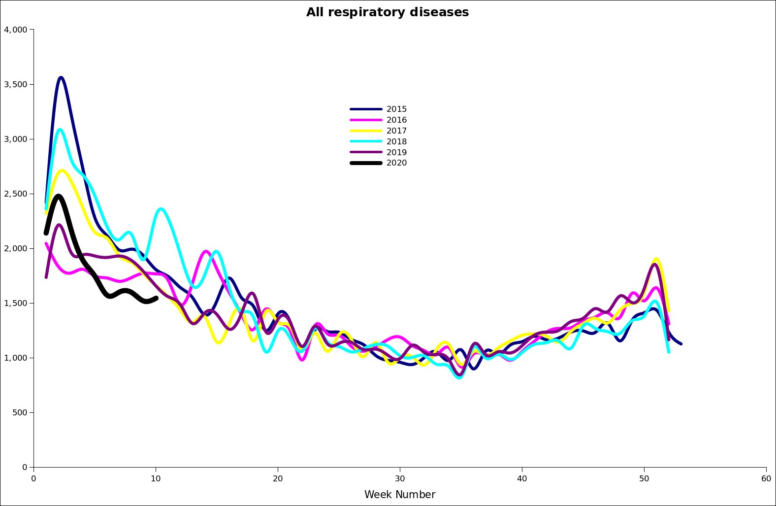
No sign of a once-in-a-century disaster there, though of course the panic merchants are saying ‘You just wait, it’s coming’.
And Robert Watson ( a retired Professor) has done this one (click to enlarge):
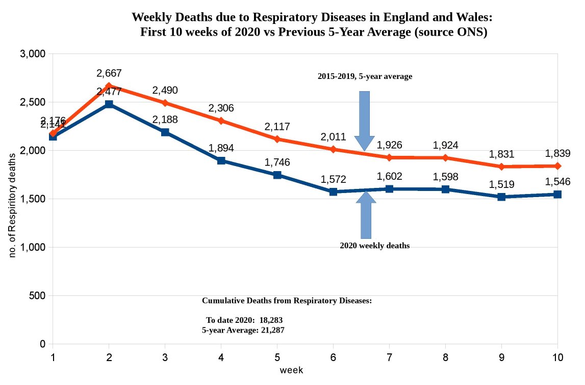
Robert notes that there is currently a gap of 3004 respiratory deaths between now and the average of the last five years. [Update: To be clearer, the 2020 respiratory deaths are 3004 below the five-year average, not above, as you would naturally assume. HD] Still think it was right to trash the economy and introduce a police state?
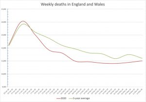
And there’s also this one I posted the other day which graphed weekly deaths for 2020 against the five-year-average (done by someone called Alistair Haimes) (click to enlarge):
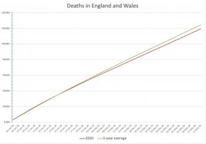
And (also from Alistair Haimes) the cumulative deaths (for all deaths, we’re 5000 deaths under the average for the last five years (click to enlarge):
On 31 March the ONS will be updating the death stats, so we can get some further info on the period when supposedly Covid-19 started to ravage the country. But it’s clear that the gap (currently 3004) is not going to disappear even with the latest Covid-19 deaths. There’s only 1019 of them in total in the UK, and even if we suppose that they really all are Covid-19 deaths, and that all of them really are excess deaths, we’d still be looking at less respiratory deaths than normal (remember that the current average deaths will also rise in that time).
Thanks very much to David and Robert for doing these graphs.
Update: I should also note that the ONS has now added a row with the respiratory death figures to their Excel death sheets, so finally someone there is doing something useful for the current situation. But why can’t they do some line graphs? Why are my readers having to do their job for them?
35 thoughts on “The graphs of nothing-much-to-see-here”
Thanks all, for the useful context.
Interesting is that today’s recorded infections are over 400 fewer than yesterday’s. Probably just a blip but indicative that the measured rise is not exponential. And this is too soon to be due to the lockdown.
PFJ,
Fewer tests but still an increase in percentage of positive results.
Yesterday: 8,911 tests, 2,921 positive (32.78%)
Today: 6,999 tests, 2,510 positive (35.86%)
Are they short of tests or short of symptomatic patients? The weekend effect?
The number of tests per day seems to have been battling upward overall, but there’s a fair bit of variability day to day.
What would be really useful to know — but seems never to be mentioned — is what are the rates of False Positives and False Negatives? Because all tests are imperfect. Think of False Positives from car alarms. Generally, a test like this would be designed to err on the side of issuing False Positives.
Suppose 10% of Positives are actually Negative, and 5% of Negatives are actually Positive — just for demonstration.
Think of yesterday’s tests applied to a group of 100 people:
36 test Positive. But 4 of those are in reality Negative, and will consume health resources needlessly.
64 test Negative. But 3 of those are in reality Positive and will go on their merry way spreading the infection.
What is the accuracy of the testing?
Good question, Gavin, that’s something I’ve been wondering about, but there’s very little on it. But from this Nic Lewis paper, it seems that false negatives are high:
“It appears that in about 30% of symptomatic cases the standard RT-PCR test for COVID-19 infection gives a negative result when the patient is in fact infected”.
https://judithcurry.com/2020/03/25/covid-19-updated-data-implies-that-uk-modelling-hugely-overestimates-the-expected-death-rates-from-infection/
I wouldn’t be surprised if there’s a high false positive result as well, it’s perhaps harder to know at this stage whether someone who tests positive isn’t in fact positive.
(I have heard stories about people being tested numerous times and getting a different result every time, but I don’t know if that’s really true.)
This doesn’t seem to have occurred to those calling for widespread testing. This retracted paper was claiming very high rate of false positives among close contacts of COVID-19 patients. https://www.ncbi.nlm.nih.gov/pubmed/32133832
Obviously different countries are applying different standards in who gets tested and what gets counted, but are we all even using the same test? And what sort of reliability would we expect of a test or tests developed rapidly and put into immediate use?
Playing Devil’s advocate here (although as a natural hypochondriac I’m genuinely a little torn; I take your point, but fear the worst), I think it’s worth bearing in mind that these figures end on Week 10/the 13th of March, when we still had fewer than 800 confirmed cases and 20 deaths (now around 20,000 and 1,200). They absolutely do represent the situation before things began to properly kick off.
The next set of figures will be interesting, but I think it’s those for April that will begin to tell the real story. And I should emphasise, again, that I don’t discount the possibility that you’re right. But… I dunno…
Fair enough, Sam. There’s no thought police around here, feel free to argue anything you want.
All I would say at this point is that even with all the recent extra deaths, 2020 respiratory deaths are unlikely to catch up with the five-year average (as that will be increasing by 2000 deaths a week itself), let alone surging ahead of it in a frightening way.
I agree that things will probably get worse for a while in April too.
Well, they didn’t get worse today. Even if they’re just a blip, the figures as a whole do indicate that there isn’t a massive rate growth occurring.
I look at https://www.worldometers.info/coronavirus/#countries
Some pretty graphs. but the histograms of daily new cases and daily deaths are hard to interpret. Surely a rolling average* would show trends better?
*Take todays and preceding 4 days numbers, take average and put on graph
The article below gives a good summation of 10 experts takes on the Corona panic
https://off-guardian.org/2020/03/28/10-more-experts-criticising-the-coronavirus-panic/
Many thanks to the compilers of these graphs……..this is the kind of data that will force the government into a more realistic position.
Hope these gents can keep us updated.
p.s.
To my post above – I am getting dog’s abuse in a WA group for urging a less radical approach to C-19, and insisting that it is neither sufficiently virulent nor deadly to justify destroying the economy.
It should be noted that almost every single critic is still on full pay/pension and living in very comfortable circumstances.
Is the lack of Respiratory Diseases deaths caused by the wash your hands advice? I had been meaning to graph this data, and mark in when the advice came in!
Another thing worth graphing is the number of deaths of over 75’s per week!
Can any fine reader manage the task of producing equivalent graphs for Italy assuming there’s a ONS substitute source? I would put my hand up but I’m sadly not competent to do so.
TJ, it may well be due to the extra hand-washing, although at this stage we don’t really know. Feel free to get in early with some research on this, it would be pretty big news if it is.
I’ve had a very good look, as have many others, they’re basically not available. But they sort of are, I’m writing a blog post on it now (summary: Covid-19 deaths look to be visible, but not to any great extent).
Very much looking forward to reading that, thanks
It would be good if the authors of this post provide a perspective now that the numbers have clearly shown that there is, indeed, quite a lot to see here. only 2 weeks down the line and the average deaths are through the roof not just comparing to average seasonal / respiratory disease, but overall, and we are going higher.
The original post was naive at best, or spreading “half facts” and misinformation at worse. The point was never about the deaths to date but about the projection, and unfortunately the experts who predicted the UK following the Italian trajectory where right. Any response or further comments highly appreciated, especially from Hector Drummond or the “professor” who compiled the data and graph in the first place.
Er… Jack, 20 seconds of looking at my blog would have revealed this recent update:
https://hectordrummond.com/2020/04/08/week-13-ons-graphs-still-nothing/
Thank you for commenting. The recent update is the same – looking at data from 2 weeks ago. If you look at death numbers, they only spike up past the 1st April https://www.worldometers.info/coronavirus/country/uk/
Instead of comparing the UK numbers that are (as I think everyone agrees) weeks late, why not get the Italian data and compare their average deaths and weekly numbers? Much better prospect of understanding the next 2-3 weeks, and keeping in mind that we locked-down later, we might surpass these.
Hmm, in previous posts in this blog the arguments where vs total deaths and 5 year average. Now that the average deaths are of the charts (even the Sun has a graph on it https://www.thesun.co.uk/news/11597257/uk-death-toll-higher-than-average-five-years/) the argument is about whether the deaths are covid-19 or not. The next argument is going to be that the average death rate is caused because of the lockdown I am sure. Amazing bias for a site that pretends it stands against it, among other things
Comments are closed.