This is an article by Rick Hayward.
[Note from Hector: this article was updated on Fri 17-7-20 to add the very interesting graph shown as figure 3(2).]
1. Introduction
‘Follow the Science’ is the phrase frequently used in both demands and justifications concerning Covid-19.
This basic analysis is not about resolving issues around wider linguistic and philosophical notions of the ‘science’ (however badly the term is abused). Nor is it concerned with promoting false certainties about what is still unclear or unknown. It is simply about clarifying one of the essential foundations of analysis, namely available real data that has a bearing on the wider issues and the policy decisions that follow. It is an attempt to go back to the fundamental evidence that has been largely forgotten in the construction of a narrative that has its own momentum.
At base, however, is the very simple proposition of scientific investigation that, unless evidence reasonably supports a proposition in terms of probability, then the alternative or null hypothesis stands. In everyday terms, clear evidence in terms of probability is required before an assertion about a phenomenon can be sustained.
Specifically, it is incumbent on those who maintain the narrative of the unprecedented danger of Covid-19 (and thus the use of extreme measures) to substantiate their case beyond reasonable doubt. It is scepticism that should be the appropriate norm – not something to be largely excluded from the public discourse.
2. Background
Even two to three months are significant ‘history’ in the context of the Corona virus and its emergence into public consciousness.
At the beginning of March 2020, this virus was perceived as an unknown quantity that had emerged in China. Clear, unadulterated information was hard to come by, and a ‘safety first’ narrative dominated – largely courtesy of the World Health Organization’s description of the situation. The narrative was given impetus by the output of one particular epidemiological model that forecast a potentially massive and unprecedented pandemic death-toll from the Covid-19 virus.
Although much still remains uncertain about the virus and its impact, key data concerning infection rates and fatality rates – as well as the nature of immunity from the virus – has steadily accumulated since the peak of in hospital deaths at the beginning of April. That accumulating knowledge has clearly pointed to a mortality much lower than originally feared. Additionally, the predictive model that supported those initial fears has been shown to be in error to a startling degree, as such models often are.
Certain ancillary issues also became clearer over time, particularly the steep age-related gradient in mortality, and, conversely, the comparatively mild effects for the majority of the population below the age of 65 in good health. Children were shown to be notably unsusceptible to the virus.
3. The Public Narrative
The tone of the public narrative about the Covid-19 virus was set in the initial weeks of comparative ignorance about its trajectory and outcomes. This ‘worst case’ scenario (apparently confirmed by the situation in Italy and Spain) set the stage for what eventually emerged as the ‘Lockdown’ policy in the UK.
This involved the implementation of measures that were, in several instances, in direct contradiction to the evaluation of evidence of their efficacy made by the WHO in October 2019 in relation to influenza epidemics (‘Non-pharmaceutical public health measures for mitigating the risk and impact of epidemic and pandemic influenza’ – World Health Organization – 2019).
Government policy was explicitly promoted by a media strategy based on the recommendations from a behavioural science sub-group of the SAGE advisory body. The aim of the policy was to influence the public in accepting severe curtailment of normal citizens’ rights with the putative aim of slowing or thwarting the spread of the virus. Fear was explicitly an important key in generating compliance.
In terms of the information provided to the public under this strategy, the following features have been consistently prominent :
(a) A focus on large numbers, quoted on a daily basis, but without any wide context or attempt at capturing relative scale.
(b) Individual cases of people affected by the virus, but again without wider context to indicate how typical or frequent such cases might be.
(c) Assumptions that the observable April spike in mortality was totally attributable to Covid-19 infection, although the revisions to the process of registering deaths had made clear attribution impossible. The mere presence of the virus could be sufficient for a death to be registered as being caused by Covid-19. Worse, in the badly affected care home sector, such an attribution could be on the basis of what was essentially guess-work. More recently, there is an increasing probability that the ‘remedy’ of Lockdown is producing increased health problems and mortality.
(d) Conversely little focus on the historical variation of infections and consequent mortality over wider timescales in order to provide a credible contextual framework. When comparative figures are quoted, there has also been little reference to proportionality in terms of a population that has grown considerably over time. The emphasis has tended to stress the exceptional nature of the current year in terms of arbitrary ‘expected’ norms.
(e) Exclusion, and in some cases direct censorship, of alternative viewpoints.
The result (whether intended or unintentional) of this media narrative has been to produce a high degree of fear and compliance amongst the population at large. Both the narrative and the consequent fear has continued, largely unabated by a changing evidence base which shows both a lesser degree of mortality (and, by extension of infection) than had been initially feared.
Bluntly: perception and reality have diverged markedly.
4. The Basis of Analysis
Against this background, and the associated perceptions generated by the partial narrative, some reference to actual comparative mortality figures is useful in order to provide context, based on real data.
The aim of the associated bar charts, therefore, is to provide some such clarity, using the actual figures for England and Wales as a basis. The reference point is simple : a description of yearly variation from the median value of mortality, aiming to provide a clear and proportionate historical context for the year of 2019/2020. The statistics involved are simply descriptive bar charts – although wider inferences do naturally arise.
No attempt is made to specifically identify deaths ‘due to’ Covid-19, since this has become impossible following the confusions that result from changes in the death registration requirements.
The figures used are those for ‘all cause’ mortality for England and Wales, issued on a weekly basis by the Office for National Statistics. These show variations over time in relative mortality which will indicate any exceptional rise related to this particular virus.
The term ‘excess mortality’ is avoided, since this tends to suggest a predictable ‘natural’ level for a given year when, in reality, it simply describes a deviation from the projection of a past trend. Turning it on its head, ‘excess mortality‘ is in fact no more than a measure of confirmed error in modelling. Death rates – as is the case for many natural phenomena – actually vary both systematically and stochastically.
The sampled time period is that of the 27 years from 1993/94 to 2019/20 and, within those years, each Winter/Spring season of 28 weeks – up to Week 20 of the second year. The total mortality for each season is the basis for analysis.
None of the following analysis depends upon inferential statistics : it is purely and simply descriptive, using data and graphics that are accessible to anyone. That is the point – the picture is so obvious and uncomplicated that it raises fundamental questions about the current standard of investigative mainstream journalism – even to the point of whether it exists in any recognisable form.
5. The Data
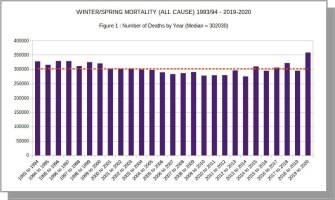
Figure 1 shows the actual number of deaths from all causes, by year, for each Winter/Spring period.

Over that period, seasonal deaths range from 275,488 to 359,141 – i.e. a range of 83,653 around the median value of 302,030 seen in 2000/01.
This 27-year range in deaths is equivalent to about a quarter of the maximum value – which maximum is, indeed, seen in the 2019/20 season, with registered deaths at a level of 57,111 (19%) above the median.
Figure 2 focuses in on the differences between seasons, detailing the variation of each year’s mortality from the median value. Again, the data are the raw figures for cumulative mortality.
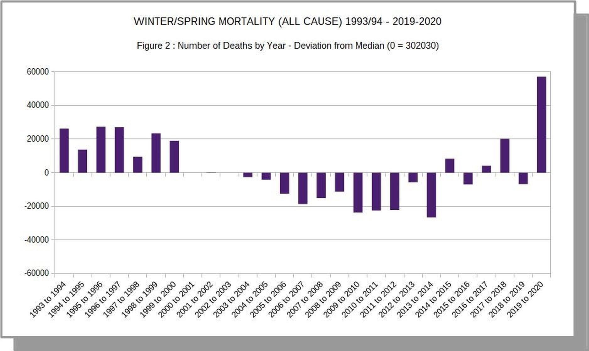
This again clearly shows the 2019/20 as the season with the highest level of absolute mortality. The next season in terms of high mortality occurred in 1995/96, with almost 30000 fewer deaths in the equivalent period.
Thus, in terms of the absolute number of deaths recorded, it is indeed the case that the winter/spring season of 2019/20 exceeded any of the preceding 27 years. This is essentially the basis upon which the ‘dominant narrative’ (above) has been formed.
HOWEVER:
Figure 3 demonstrates the marked effect of taking relative population size into account.
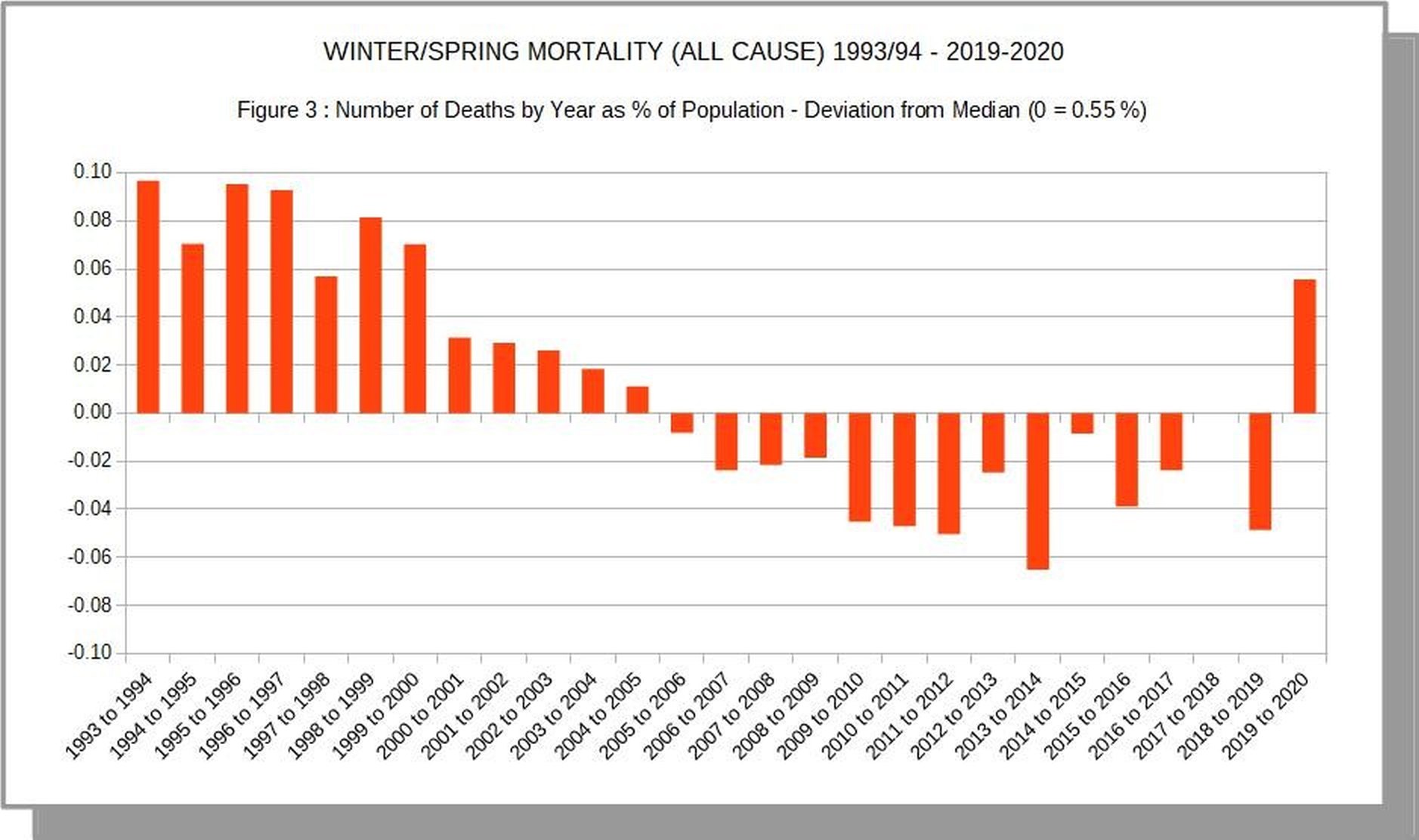
Between 1993/94 and 2019/20, the population of England and Wales increased by almost 9 million, or about 18 per cent. Adjusting for population has a critical effect on the comparisons between years, as can be seen in this bar chart, which mirrors to the previous chart, but with the crucial standardisation that presents seasonal deaths as a percentage of the relevant population.
It can be seen that during the defined winter/spring period, on average, about 0.55 per cent of the population (c. 5,500 per million) died in England and Wales, with a variation of between 0.64 and 0.48 per cent.
Within this context, it can be immediately seen that the mortality of 2019/20 is not the highest for the 27 years analysed, but instead actually ranks eighth in terms of the percentage of seasonal deaths. This clearly presents a crucially different view of the relative severity of the last season, and, by extension, the impact of the virus.
Whatever might be the proportion of deaths to be accurately attributed to Covid-19, the mortality for the year when shown proportionately drops from the 100th to the 73rd centile overall. Clearly this level of overall mortality is not unprecedented in showing the impact of a specific virus.
Figure 3(2) makes a direct comparison with Figure 1, again showing total mortality for the time period, but this time related to population size. The standardised data gives the more accurate contextual picture.

Figure 4 steps back from annual data to look at the overall pattern of mortality over the full 27-year period.
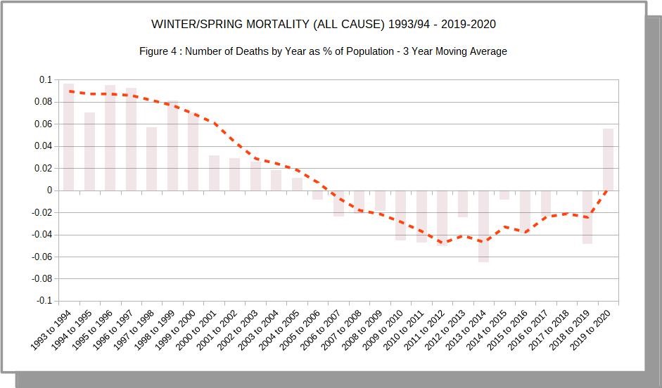
A simple 3-year moving average has been calculated. Moving averages are frequently used as the basis for defining ‘excess mortality’ at a given point in time. This graph doesn’t attempt to replicate such an exercise, but is rather meant to illustrate the caveats about such use – as has been made previously.
The picture that emerges is a description of the general pattern of the data ‘as is’, showing both a wave-like regularity and year-to-year irregularities within that overall pattern. To use it to suggest a definite predictable value of mortality would be, essentially, only mathematical guess-work – not an illustration of what ‘ought’ to be.
The inherent variation in predictions of ‘excess’ mortality are well captured in a recent item from the Oxford Centre for Evidence Based Medicine that compares the predictions of a model using using a simple moving average with that using ‘harmonic regression’ (more appropriate for time series with wave-like features) :
“The ONS 5-year average is 235,293 deaths, which gives an excess of 51,486;
Using the harmonic regression trend predicts 257,081 deaths in 2020 an excess of 29,698”
(https://www.cebm.net/covid-19/covid-19-mortality-over-time-ons-update-2nd-june/)
Clearly, definitions of ‘excess mortality’ are open to a wide range of magnitude; they are not sufficiently stable so as to provide a clear indication of what might be considered a normative baseline. This is a fact that is perfectly well appreciated by anyone (except ICL modellers) who has attempted to make future predictions based on past data; error bands tend to rapidly diverge.
That said, the shape of the curve in Figure 4 does indicate two features that provide a further confirmation of the context for the scale of deaths in 2019/2020 :
(a) The recent trend indicates a generally rising trend of mortality, following a period (from about 2005) of overall lower mortality. The higher level in the current year is not inconsistent with that overall pattern.
(b) The relatively higher level of mortality in 2019/20 follows a year when mortality was relatively low. It is quite possible that there is a balancing connection between the mortality levels of the two years as deaths among the vulnerable population (such as we have seen in the Covid-19 period) may have been delayed until the following season.
It is interesting that the mean of the mortality in the two seasons (at 0.55% of population) is very close to the central figure for the 27-year period overall. Which would reinforce the notion of an unexceptional balancing over the two seasons)
6. Summary and Conclusion
Undoubtedly, the response to the Covid-19 pandemic has been unprecedented. That unprecedented response has been framed by a narrative that has been subject to confirmation bias of initial fears about the virus as it migrated to Europe.
The fundamental question remains as to whether the actual effects of the virus itself are ‘unprecedented’.
Although emerging data and analysis (from a starting point of relative ignorance) has tended to revise downwards any rational assessment of the severity of the virus’s impact, the dominant narrative has remained biased towards sustained hyperbole and exclusion of alternative analyses.
Now that infection appears to have fallen below what is defined as an ‘epidemic’ level, emerging and more nuanced analytical viewpoints tend to contradict self-sustaining and simplistic justifications for what may have been a reasonable precautionary response at the outset of the ‘pandemic’.
A simple examination of essential time-series data for England and Wales (countries that have been relatively badly affected), corrected for population size, shows that the Winter/Spring season of 2019/20 displays relatively high mortality but does not merit the typification of being a particularly notable exception within the longer framework of the last 27 years.
The higher level of recent mortality may also be related to the low level of the previous year, in terms of the effect on the vulnerable population. But, certainly, a range of questions remain – not least that concerning the differences between countries. Advocates of the unchanging (or little changed) policy response tend to immediately resort to the explanation that such differences are attributable to variation in ‘lockdown’ and ‘social distancing’ measures – again, an example of post-hoc justification rather than evidence-based analysis, which does not support the hypothesis.
The increasing detachment from reality is seen in the mythical status attributed to mythical beasts such as a hypothetical ‘second wave’ or the status of ‘R’ values. A brief overview of the headlines in a newspaper such as The Guardian illustrates clearly the way in which an exclusive ‘Marvel Comic’ narrative has far outpaced any reference to the much-abused ‘Science’ in any meaningful sense.
In general, much remains unknown about this virus, and only time will clarify some key issues. But it is clear that even a fairly basic analysis of essential data does not support the worst case view that has been taken, or the degree of inchoate fear that afflicts a majority of the population.
24 thoughts on “Rick Hayward: Winter/Spring Mortality 1993 – 2020 in Relation to Covid-19”
“At base, however, is the very simple proposition of scientific investigation that, unless evidence reasonably supports a proposition in terms of probability, then the alternative or null hypothesis stands.”
Exactly! But then people always trot out the precautionary principle to conveniently support drastic action despite the lack of probabilistic evidence. This blasted term, which has never been adequately defined, is probably responsible for a whole raft of damaging policies enacted by governments across the western world.
Anyway, Mr Hayward, this is an excellent article – it blows the worst-case scenario narratives out of the water.
Finally, Hector, I must applaud you for your magazine content. The articles you accept contain analysis that is above and beyond anything found in the MSM or even many alternative media outlets (e.g. Quillette).
Thank you, (Mark Ashby) for your comments.
I totally agree about the abused ‘precautionary principle’. Hypothesis testing does rest on an estimation of probabilities, and the ‘precautionary’ approach to risk can be justified by using such estimates : the more severe the possible consequences, the lower the threshold probability for taking any given action. Clearly, there is also the risk assessment entailed in any ‘treatment’ that is proposed. This is central to the medical profession and its Hypocratic Oath.
There are limits – and what we have seen is an absurdity in all those terms, with many psychological and social measures that have been experimented with causing massive harm to the population at large with no observable benefit.
The corrupted mind-set of fear, coupled with ‘safety’ at all costs is a corruption of life as properly lived and properly experienced. Bluntly – it’s an induced mental illness.
‘Do no harm’ is the long-established basis of medical intervention.
The two hyped ‘crisis’ ; covid and climate change ignore the scientific method. They have to or they would be demolished overnight.
The western world loves technology but no longer practices science, or not in a meaningful way. Our society has been infantalised and the consequences will be dire.
Simple but excellent analysis, always the best.
JimW – I too am a great believer in simple analysis, which is often facilitated by the use of more robust experimental designs and clearly defined hypotheses. In fact, I believe that the computing power of modern statistical analysis packages is one of the reasons scientists and researchers have moved away from rigorous experimentation (i.e. using RCTs) and adopted correlative approaches fishing for statistical relationships. Or, even worse, predictive models based on little or low-quality input data. If such statistical packages didn’t exist, lockdown would not have been enacted (I think this argument equally applies to social media, which has stirred up the hysteria).
Re. the use of statistical packages and technology – I had an interesting experience during a Zoom meeting when I was faced with a barrage of outrage when I suggested that cowering in fearful isolation wasn’t necessary as a response to this virus.
Firstly – the technology (highly promoted by Microsoft at the present time). On-line meetings are definitely impoverished in comparison with face-to face interactions – so it is difficult to convey subtlety and nuance in a mechanical rotation of argument (even if someone is chairing). The on-line distanced life is a partial experience, not a substitute.
But , on the issue of forgetting the basics of analysis, I remember this ‘meeting’ for the claim by one participant that familiarity with the technique of Principal Component Analysis endowed that individual with statistical insight when spouting received MSM ‘wisdom’ about the virus.
I didn’t respond at the time, in the interests of winding down potential conflict. But, of course, the appropriate rejoinder was :
“What’s the point of inferential methods such as PCA, if you haven’t bothered to read the preliminary chapters on the basics of simply looking at the base data and only then testing logically derived hypotheses?”
PCA, orthoganal vectors etc etc. How to produce mumbo jumbo correlations with absolutely no idea what they mean in the real world.
Everyone now can be a statistical genius with packages they don’t understand.
Computers may end human intellect as defined as the ability to reason and gain wisdom.
“….the picture is so obvious and uncomplicated that it raises fundamental questions about the current standard of investigative mainstream journalism – even to the point of whether it exists in any recognisable form….”
Nonsense! Investigative journalists are working as hard as ever, and are coming up with stories of major impact.
It’s just that the aim of the stories has changed. It used to be the case that journalists sought the ‘truth’, and spoke it to power. Now, journalists are required to comply with quite specific directions about topics and opinions. For instance, Trump is bad, Climate Change is a dangerous threat, Racism is rife in the UK and trans-gender people are constantly oppressed.
Journalists are now required to make up stories illustrating the above points. And I think that they work hard and show considerable imagination in the creation of such fabrications….
What was lacking in Government policy over Covid (indeed it is absent from all policy it seems) was a social/economic Cost/Benefit analysis. There were no economists on SAGE, and it is reported that some weeks into the ‘crisis’ when told of unfolding economic consequences, Johnson responded, ‘Christ!’ So no prior understanding of the cost of what he had set in train.
Political cost/benefit dominates. The presumed economic and social cost of inaction is over-estimated, and it is assumed there is no cost to action. It’s Pascal’s Wager. No calculation is made to determine whether the benefit of action is less than its cost, so if it is don’t do it.
The new PM of France:
“My aim is to prepare France for a possible second wave while preserving our daily life, our economic and social life… But we’re not going to impose a lockdown like the one we did last March, because we’ve learned… that the economic and human consequences from a total lockdown are disastrous,”
‘Learned’.
It beggars belief.
This work constitutes A Good Start: thank you.
What might improve it? Just as population growth is allowed for by presenting the numbers pro rata to population, it might be attractive to allow for an ageing population (if that’s what we have) by repeating the calculations but applied only to people over (say) 70 or 75. That would both allow for ageing and focus on the age group that is at most risk of premature death by COVID.
In fact I might ask why PHE hasn’t done the sums and published the results. Do you think we should sack the bloody lot of them and replace them by Hector Drummond’s Light Horse?
I believe Robert Watsons article on 7th July on this very site breaks down the population by age and it does indeed show a marked increase in over 75’s up to 2019/20 that is certainly a factor when looking at Covid impact
In reply to dearieme :
The point is a good one.
I have thought about ways of illustrating the weighting of mortality by age, and thus the general lower true lethality of Covid-19 than the massive hyperbole perpetrated by government and the ICL nexus etc.
It becomes pretty obvious, however, when you look at the excellent CEBM data – regularly updated.
I am interested to see (BBC ‘PM’ programme) that the ‘Scare’ story is now moving its focus to South America, following the decline of the disease in Europe – and even in the UK. The reporting implied massive deaths on the sub-continent – out of proportion to anything previously seen.
The funny thing is, that I can’t find real figures that confirm this picture. Now – where have I experienced that before?
What I’d like to know is why about one in seven of people who count as cases in the UK (under what criteria I don’t know) die of Covid (their figures, not mine, but figures that the NHS embraces) whereas CFR in other countries is far smaller. Don’t tell me it’s all about the way it’s counted, who is counting in order to make the NHS look like one of the worst systems in the world? Why would they do that? Unless it’s just true, like it or not. There really is a severe excess mortality here, and nobody is looking at the why of it.
“Don’t tell me it’s all about the way it’s counted”: of course it’s all about the way it’s counted. There’s no country in the world that has an expert panel that determines Cause of Death after careful autopsies. Old, fat men, already very ill, die. A doctor makes a stab at what to write on the death certificate, perhaps swayed by some sort of official guidance, and that’s that. Science it ain’t.
Try looking up how flu deaths are computed each year. It ain’t Science either.
Here’s Kendrick on the subject:
As a doctor working in the midst of the COVID chaos, I’ve seen people die and be listed as a victim of coronavirus without ever being tested for it. But unless we have accurate data, we won’t know which has killed more: the disease or the lockdown
I suppose most people would be somewhat surprised to know that the cause of death, as written on death certificates, is often little more than an educated guess. Most people die when they are old, often over eighty. A post-mortem is very rarely carried out.
Which means that, as a doctor, you have a think about the patient’s symptoms in the last two weeks of life or so. You go back over the notes to look for existing medical conditions. Previous stroke, diabetes, chronic obstructive pulmonary disease, angina, dementia and suchlike. Then you talk to the relatives and carers and try to find out what they saw. Did they struggle for breath, were they gradually going downhill, not eating or drinking?
If I saw them in the last two weeks of life, what do I think was the most likely cause of death? There are, of course, other factors. Did they fall, did they break a leg and have an operation – in which case a post-mortem would more likely be carried out to find out if the operation was a cause.
However, out in the community, death certification is certainly not an exact science. Never was, never will be. It’s true that things are somewhat more accurate in hospitals, where there are more tests and scans, and suchlike.
Then, along comes COVID-19, and many of the rules – such as they were – went straight out of the window. At one point, it was even suggested that relatives could fill in death certificates, if no-one else was available. Though I am not sure this ever happened,
What were we now supposed to do? If an elderly person died in a care home, or at home, did they die of COVID? Well, frankly, who knows? Especially if they didn’t have a test for COVID – which for several weeks was not even allowed. Only patients entering hospital were deemed worthy of a test. No-one else.
What advice was given? It varied throughout the country, and from coroner to coroner – and from day to day. Was every person in a care home now to be diagnosed as dying of COVID? Well, that was certainly the advice given in several parts of the UK.
Where I work, things were left more open. I discussed things with colleagues and there was very little consensus. I put COVID on a couple of certificates, and not on a couple of others. Based on how the person seemed to die.
I do know that other doctors put down COVID on anyone who died from early March onwards. I didn’t. What can be made of the statistics created from data like these? And does it matter
In answer to rhoda klapp ;
1. The point of the analysis is to demonstrate that there is *no* exceptional all-cause mortality when one looks at a historical context (forget the term ‘excess mortality’ – as said, it’s a product of speculation, not fact).
2. The case fatality rates (CFR) are dependent on a numerator and a denominator (deaths from Covid over cases of Covid illness ). Both numbers are, for a range of well-explored reasons, unknown. Thus any CFR is in the realm of speculation rather than fact. It’s simply ‘Garbage In > Garbage Out’.
Clearly a widespread virus that was culling 1/7th of the population affected would cause a season with an unprecedented rise in overall mortality. That clearly hasn’t happened, despite the effect on a larger than usual vulnerable population.
Simply – the numbers don’t make sense, and never will, given the way in which the attribution of cause of death has been distorted by peculiar legislation, and the loose way in which the term ‘case’ is defined.
The distortions are equivalent to the ‘Weapons of Mass Destruction’ fiction of the early 2000’s. This year, it’s the VMD story.
What can be said
Excellent research and article.
It seems to me it’s now just become a ‘game’, being played out by behaviourists and catastrophists that infect the government and the media. They’re probably goading each other as to how ludicrous they can make the ‘regulations’, only for many of them to be reversed days later. We’re being led by frightened infants whose grasp of science extends to watching re-runs of “Contagion”
A consultant from a major hospital in the Home Counties has recently written elsewhere, that he has had patients who have tested positive for covid-19, then tested again later. But both test results were counted as separate cases. In such a way it is clear that case numbers can be increased by such repeated and logged results.
In one of the comments to that article, a person writing from the USA related the experience of three friends, two in Arizona and one in Texas, who had signed in to be tested for coronavirus, but due to the long queues and heat, decided to opt out before being tested. A week later all three were called by the test centres to confirm that they had all tested positive for covid-19 – and yet none of them were actually tested!
Rick, excellent article. Lays bare the bias and lies msm and Gov’t have been infecting our minds with
Not only forgotten, but actively rejected by many people. Facts no longer matter, only Gov’t & msm fear mongering is believed
Global C-19 Deaths after 10 months (mid Nov – mid July) 564,924 – C-19 has never been an epidemic or thus pandemic
Have a read through posts here
Belief seems to be
– “Don’t care how few have died, I’m scared.”
– “Don’t care most are asymptomatic or have mild experience, a few are hit really hard, I’m scared [those media relentlessly promote eg Garaway’s husband]”
Absolutely
Which was pure evil manipulation verging on mental torture
COVID Coercion: Boris Johnson’s Psychological Attack on the UK Public
Lamp-posts & ropes spring to mind
Figure 3 really puts C-19 in perspective
@Mark Ashby
Spot on with “precautionary principle”. It’s sibling too “if it saves one life”. Their incestuous relationship gave us “Policy based Evidence making”
OT Sunday Humour
If there is fear, it ought to be of putting oneself into the lottery of NHS treatment.
However you challenge the counts of cases and deaths you can’t get away from the high CFR in the UK. What are the cases? All positive tests, both PCR and antibody? Hospital admissions? Do people die ‘of covid’ without ever having been in the cases count? The numbers are useless but the scandal of treatment protocols which don’t save lives is real.
Did the UK really test 12million people (or test 12million times with the same people) to find 289,000 cases? Doesn’t that hint at a bad algorithm?
Deaths as a % of the total population is a poor metric. Whilst the population has increased by 9m, the age distribution has changed too. So deaths per capita has shrunk in the younger groups, but COVID1s increased deaths per capita in the older age groups. Data needs to be age-standardized for proper cross-reference.
In reply to Daren Austin :
No. Deaths as a % of the population isn’t a ‘poor metric’, even if it’s not a perfect summary. It is much better than most metrics floating around in relation to this virus.
Ia agree that the age distribution is an important additional factor – and would, of course, enhance the point that is made by the simpler analysis.
Could you post the URLs to the specific ONS data sets used?
Thanks
Comments are closed.